`) are allowed. All other markup will be removed for consistency and accessibility.\r\n\r\nThis library was generated with [Angular CLI](https://github.com/angular/angular-cli) version 12.2.0.\r\n\r\n## Index\r\n\r\n- [Installation](#installation)\r\n- [The `rootConfig()` Method](#the-rootconfig-method)\r\n- [The Tooltip Config](#the-tooltip-config)\r\n - [The Position Input](#the-position-input)\r\n - [The Positions Allowed Input](#the-positions-allowed-input)\r\n - [The Alignments Allowed Input](#the-alignments-allowed-input)\r\n - [The Position Strategy](#the-position-strategy)\r\n - [The Custom Boundary](#the-custom-boundary)\r\n - [The Safe Space](#the-safe-space)\r\n - [The Fluid Alignment](#the-fluid-alignment)\r\n - [The Arrow Size](#the-arrow-size)\r\n - [The Offset Size](#the-offset-size)\r\n - [The Fade Timeout](#the-fade-timeout)\r\n - [The Fade Delay Timeout](#the-fade-delay-timeout)\r\n - [The Delay On Event](#the-delay-on-event)\r\n - [The zIndex](#the-zindex)\r\n - [The Padding](#the-padding)\r\n - [The Shadow](#the-shadow)\r\n - [The Background Color](#the-background-color)\r\n - [The Text Color](#the-text-color)\r\n - [The Border Size](#the-border-size)\r\n - [The Border Border](#the-border-color)\r\n - [The Border Radius](#the-border-radius)\r\n - [The Max Width](#the-max-width)\r\n - [The Class Names](#the-class-names)\r\n - [Use Animate](#use-animate)\r\n - [Use Prevail](#use-prevail)\r\n - [Use As Label](#use-as-label)\r\n - [Toggle On](#toggle-on)\r\n- [The `recalculate()` Method](#the-recalculate-method)\r\n- [The Color Schemes](#the-color-schemes)\r\n - [How to Configure the Color Schemes](#how-to-configure-the-color-schemes)\r\n - [How to Force a Scheme](#how-to-force-a-scheme)\r\n - [How to add a New Color Scheme](#how-to-add-a-new-color-scheme)\r\n- [The Use with Image Maps](#the-use-with-image-maps)\r\n- [The Use with Abbreviation Elements](#the-use-with-abbreviation-elements)\r\n- [The Use with Non-Interactive Elements](#the-use-with-non-interactive-elements)\r\n\r\n## Installation\r\n\r\n1. Install npm package:\r\n\r\n `npm install @a11y-ngx/tooltip --save`\r\n\r\n2. Import `A11yTooltipModule` into your module or standalone component:\r\n\r\n```typescript\r\nimport { A11yTooltipModule } from '@a11y-ngx/tooltip';\r\n\r\n@NgModule({\r\n declarations: [...],\r\n imports: [\r\n ...\r\n A11yTooltipModule,\r\n ],\r\n})\r\nexport class AppModule { }\r\n```\r\n\r\n### The `rootConfig()` Method\r\n\r\nServes to establish and override the global default configuration.\r\n\r\nAccepts a single parameter `config` of type [`TooltipRootConfig`](#the-tooltip-config).\r\n\r\n**On Angular v12 - v14:**\r\n\r\n```typescript\r\nA11yTooltipModule.rootConfig({\r\n offsetSize: 10,\r\n safeSpace: { top: 65, left: 50 },\r\n}),\r\n```\r\n\r\n**On Angular v15+:**\r\n\r\n```typescript\r\nprovideA11yTooltip({\r\n offsetSize: 10,\r\n safeSpace: { top: 65, left: 50 },\r\n}),\r\n```\r\n\r\n## The Tooltip Config\r\n\r\nThe `TooltipConfig` provides several properties to customize.\r\n\r\n- **Input:** `tooltipConfig`.\r\n- **Type:** `TooltipConfig`.\r\n\r\n> All color related default values (★) are coming from the variables set within [the Color Scheme global configuration](https://www.npmjs.com/package/@a11y-ngx/color-scheme#user-content-global-config-basic-properties).\r\n\r\n| Property | Type | Description |\r\n| :------- | :--- | :---------- |\r\n| `position` | `OverlayPositionInput` | See [the Position Input](#the-position-input) |\r\n| `positionStrategy` | `OverlayPositionStrategy` | See [the Position Strategy](#the-position-strategy) |\r\n| `positionsAllowed` | `OverlayPositionsAllowedInput` | See [the Positions Allowed Input](#the-positions-allowed-input) |\r\n| `alignmentsAllowed` | `OverlayAlignmentsAllowedInput` | See [the Alignments Allowed Input](#the-alignments-allowed-input) |\r\n| `safeSpace` | `OverlaySafeSpace` | See [the Safe Space](#the-safe-space) |\r\n| `fluidAlignment` | `boolean` | See [the Fluid Alignment](#the-fluid-alignment) |\r\n| `arrowSize` | `number` | See [the Arrow Size](#the-arrow-size) |\r\n| `offsetSize` | `number` | See [the Offset Size](#the-offset-size) |\r\n| `fadeMs` | `number` | See [the Fade Timeout](#the-fade-timeout) |\r\n| `fadeDelayMs` | `number` | See [the Fade Delay Timeout](#the-fade-delay-timeout) |\r\n| `delayOnEvent` | `TooltipDelayEvents` | See [the Delay On Event](#the-delay-on-event) |\r\n| `animate` | `boolean` | See [Use Animate](#use-animate) |\r\n| `prevail` | `boolean` | See [Use Prevail](#use-prevail) |\r\n| `asLabel` | `boolean` | See [Use as Label](#use-as-label) |\r\n| `toggleOn` | `string[]` | See [Toggle On](#toggle-on) |\r\n| `zIndex` | `number` | See [the zIndex](#the-zindex) |\r\n| `padding` | `string` | See [the Padding](#the-padding) |\r\n| `shadow` ★ | `string` | See [the Shadow](#the-shadow) |\r\n| `shadowColor` ★ | `string` | See [the Shadow](#the-shadow) |\r\n| `backgroundColor` ★ | `string` | See [the Background Color](#the-background-color) |\r\n| `textColor` ★ | `string` | See [the Text Color](#the-text-color) |\r\n| `borderSize` | `number` | See [the Border Size](#the-border-size) |\r\n| `borderColor` ★ | `string` | See [the Border Color](#the-border-color) |\r\n| `borderRadius` | `number` | See [the Border Radius](#the-border-radius) |\r\n| `className` | `string` or `string[]` | See [the Class Names](#the-class-names) |\r\n| `maxWidth` | `string` | See [the Max Width](#the-max-width) |\r\n \r\nAs part as the config object, there is a set of properties for Color Scheme:\r\n \r\n- **Dependency:** [Color Scheme library](https://www.npmjs.com/package/@a11y-ngx/color-scheme#the-color-scheme-config-styles-config).\r\n- **Type:** `ColorSchemeStylesConfig`.\r\n- **Properties:**\r\n \r\n| Property | Type | Description |\r\n| :------- | :--- | :---------- |\r\n| `colorSchemes` | `ColorSchemesStyles` | See [how to Configure the Color Schemes](#how-to-configure-the-color-schemes) |\r\n| `forceScheme` | `ColorScheme` | See [how to Force a Scheme](#how-to-force-a-scheme) |\r\n\r\n### The Position Input\r\n\r\nTo input, in a simple way, either position or position & alignment (hyphen separated if `string` is used).\r\n\r\n- **Config Property:** `position`.\r\n- **Type:** `OverlayPositionInput`.\r\n- **Default:** `['top', 'center']`.\r\n\r\n> For more details, check [the Position Input from the Overlay library](https://www.npmjs.com/package/@a11y-ngx/overlay#the-position-input).\r\n\r\n#### The Positions Allowed Input\r\n\r\nTo establish which positions are allowed.\r\n\r\n- **Config Property:** `positionsAllowed`.\r\n- **Type:** `OverlayPositionsAllowedInput`.\r\n- **Default:** `'auto'` (all sides are allowed).\r\n- **You can use:** `'auto'`, `'opposite'`, `string` or `string[]`.\r\n\r\n> For more details, check [the Positions Allowed Input from the Overlay library](https://www.npmjs.com/package/@a11y-ngx/overlay#the-positions-allowed-input).\r\n\r\n#### The Alignments Allowed Input\r\n\r\nTo establish which alignments are allowed.\r\n\r\n- **Config Property:** `alignmentsAllowed`.\r\n- **Type:** `OverlayAlignmentsAllowedInput`.\r\n- **Default:** `'auto'` (all alignments are allowed).\r\n- **You can use:** `'auto'`, `'edges'`, an alignment value (`'start'`, `'center'`, `'end'`) or an array of them.\r\n\r\n> For more details, check [the Alignments Allowed Input from the Overlay library](https://www.npmjs.com/package/@a11y-ngx/overlay#the-alignments-allowed-input).\r\n\r\n### The Position Strategy\r\n\r\nTo establish whether a `fixed` or `absolute` strategy positioning is used in CSS.\r\n\r\n- **Config Property:** `positionStrategy`.\r\n- **Type:** `OverlayPositionStrategy`.\r\n- **Default:** `'fixed'`.\r\n- **Values:** `'fixed'` or `'absolute'`.\r\n\r\nThe `absolute` strategy was designed mainly to be utilized inside containers with overflow (such as responsive tables) and to avoid the tooltip to be seen in case of scrolling while the trigger being visually hidden.\r\n\r\n> For more details and examples, check [the Position Strategy from the Overlay library](https://www.npmjs.com/package/@a11y-ngx/overlay#the-position-strategy).\r\n\r\n### The Custom Boundary\r\n\r\nA custom boundary can be interpreted as a wrapper/container, and the tooltip will consider that boundary as the new limits for its positioning.\r\n\r\n- **Config Property:** `boundary`.\r\n- **Type:** `HTMLElement`.\r\n- **Default:** ``.\r\n\r\n> For more details and examples, check [the Custom Boundary from the Overlay library](https://www.npmjs.com/package/@a11y-ngx/overlay#the-custom-boundary).\r\n\r\n### The Safe Space\r\n\r\nTo establish an extra safe space to the viewport's edges in case some fixed areas are present, such as headers, side menus or footers.\r\n\r\nThis way, the tooltip will consider this area as the _edge limit_ and reposition itself if reached. Most useful use cases are related to scroll events.\r\n\r\n- **Config Property:** `safeSpace`.\r\n- **Type:** `OverlaySafeSpace`:\r\n - `object` with each side as a property of type `number`.\r\n- **Default:** `{ top: 0, bottom: 0, left: 0, right: 0 }`.\r\n\r\n> For more details and examples, check from the Overlay library:\r\n>\r\n> - [The Safe Space](https://www.npmjs.com/package/@a11y-ngx/overlay#the-safe-space).\r\n> - [The Safe Space Off](https://www.npmjs.com/package/@a11y-ngx/overlay#the-safe-space-off).\r\n> - [The Safe Space On](https://www.npmjs.com/package/@a11y-ngx/overlay#the-safe-space-on).\r\n> - [The Safe Space and zIndex Issues](https://www.npmjs.com/package/@a11y-ngx/overlay#the-safe-space-and-zindex-issues).\r\n\r\n### The Fluid Alignment\r\n\r\nTo establish whether the tooltip's alignment will stick to the edges of the viewport/boundary (if set to `true`) or make jumps between `start`, `center` or `end` (if set to `false`).\r\n\r\n- **Config Property:** `fluidAlignment`.\r\n- **Type:** `boolean`.\r\n- **Default:** `false`.\r\n\r\nAs you can see in the next example, the fluid alignment is set to `false` (by default), which will make the tooltip to be aligned to the \"end\" of its trigger since it's too close to the viewport's right side and doesn't have enough space to be centered (default alignment).\r\n\r\n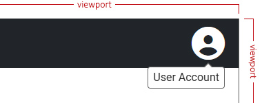\r\n\r\nIf we turn fluid alignment on, then the tooltip will stick to the right side of the viewport.\r\n\r\n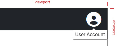\r\n\r\n> For more details and examples, check from the Overlay library\r\n>\r\n> - [The Fluid Alignment](https://www.npmjs.com/package/@a11y-ngx/overlay#the-fluid-alignment).\r\n> - [The Fluid Alignment On or Off](https://www.npmjs.com/package/@a11y-ngx/overlay#the-fluid-alignment-on-or-off).\r\n\r\n### The Arrow Size\r\n\r\nIt defines the size of the arrow.\r\n\r\n- **Config Property:** `arrowSize`.\r\n- **Type:** `number`.\r\n- **Default:** `5`.\r\n- **Accepts:** zero or greater.\r\n- **Translated to:** _pixels_.\r\n\r\n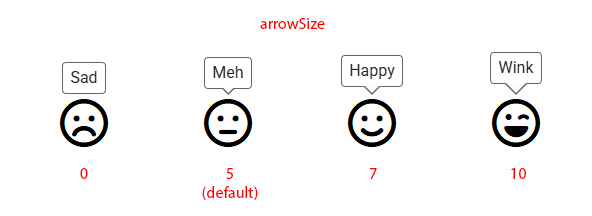\r\n\r\n### The Offset Size\r\n\r\nIt defines the space between the tooltip's arrow and its trigger.\r\n\r\n- **Config Property:** `offsetSize`.\r\n- **Type:** `number`.\r\n- **Default:** `5`.\r\n- **Accepts:** positives and negatives.\r\n- **Translated to:** _pixels_.\r\n\r\n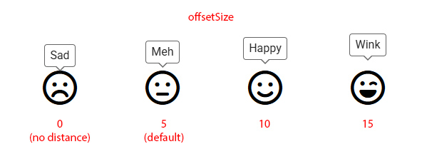\r\n\r\n### The Fade Timeout\r\n\r\nIt defines the timeout to fade in or out the tooltip.\r\n\r\n- **Config Property:** `fadeMs`.\r\n- **Type:** `number`.\r\n- **Default:** `125`.\r\n- **Translated to:** _milliseconds_.\r\n\r\n### The Fade Delay Timeout\r\n\r\nIt is the time it will take to start to fade in or out after the tooltip is shown or hidden.\r\n\r\n- **Config Property:** `fadeDelayMs`.\r\n- **Type:** `number`.\r\n- **Default:** `400`.\r\n- **Translated to:** _milliseconds_.\r\n\r\n### The Delay On Event\r\n\r\nTo establish on which events should delay (`fadeDelayMs` property) when show/hide the tooltip.\r\n\r\n- **Config Property:** `delayOnEvent`.\r\n- **Type:** `TooltipDelayEvents`.\r\n- **Default:** `{ mouse: true, keyboard: false, touch: false }`.\r\n\r\n### The zIndex\r\n\r\nIt defines the `z-index` CSS value.\r\n\r\nThis can be helpful for scenarios where the page contains fixed landmarks. See [the Safe Space and zIndex issues from the Overlay library](https://www.npmjs.com/package/@a11y-ngx/overlay#the-safe-space-and-zindex-issues).\r\n\r\n- **Config Property:** `zIndex`.\r\n- **Type:** `number`.\r\n- **Default:** `9999`.\r\n\r\n### The Padding\r\n\r\nIt defines the `padding` CSS value.\r\n\r\n- **Config Property:** `padding`.\r\n- **Type:** `string`.\r\n- **Default:** `'3px 7px'` (`3px` top & bottom, `7px` left & right).\r\n\r\n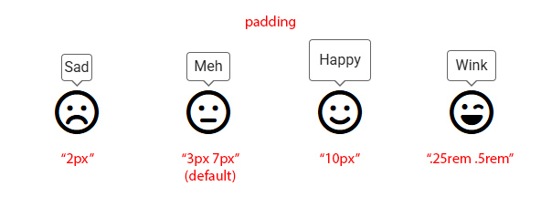\r\n\r\n### The Shadow\r\n\r\nIt defines the `box-shadow` CSS value, by combining two properties:\r\n\r\n- **Config Property:** `shadow`.\r\n - **Type:** `string`.\r\n - **Default:** `none`.\r\n- **Config Property:** `shadowColor`.\r\n - **Type:** `string`.\r\n - **Default:** `var(--a11y-shadow-color)` _(coming from the [Color Scheme library](https://www.npmjs.com/package/@a11y-ngx/color-scheme#user-content-global-config-basic-properties))_.\r\n\r\n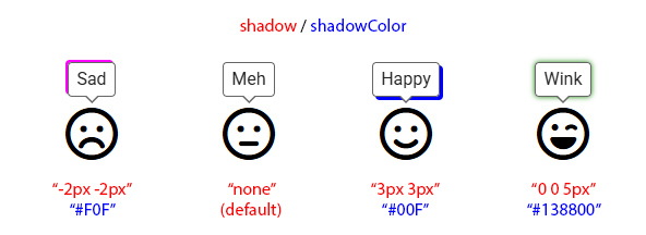\r\n\r\n### The Background Color\r\n\r\nIt defines the `background-color` CSS value.\r\n\r\n- **Config Property:** `backgroundColor`.\r\n- **Type:** `string`.\r\n- **Default:** `var(--a11y-bg-color)` _(coming from the [Color Scheme library](https://www.npmjs.com/package/@a11y-ngx/color-scheme#user-content-global-config-basic-properties))_.\r\n\r\n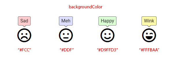\r\n\r\n### The Text Color\r\n\r\nIt defines the `color` CSS value.\r\n\r\n- **Config Property:** `textColor`.\r\n- **Type:** `string`.\r\n- **Default:** `var(--a11y-text-color)` _(coming from the [Color Scheme library](https://www.npmjs.com/package/@a11y-ngx/color-scheme#user-content-global-config-basic-properties))_.\r\n\r\n\r\n\r\n### The Border Size\r\n\r\nIt defines the `border-width` CSS value.\r\n\r\n- **Config Property:** `borderSize`.\r\n- **Type:** `number`.\r\n- **Default:** `1`.\r\n- **Translated to:** _pixels_.\r\n\r\n\r\n\r\n### The Border Color\r\n\r\nIt defines the `border-color` CSS value.\r\n\r\n- **Config Property:** `borderColor`.\r\n- **Type:** `string`.\r\n- **Default:** `var(--a11y-border-color)` _(coming from the [Color Scheme library](https://www.npmjs.com/package/@a11y-ngx/color-scheme#user-content-global-config-basic-properties))_.\r\n\r\n\r\n\r\n### The Border Radius\r\n\r\nIt defines the `border-radius` CSS value.\r\n\r\n- **Config Property:** `borderRadius`.\r\n- **Type:** `number`.\r\n- **Default:** `4` (same for each corner).\r\n- **Translated to:** _pixels_.\r\n\r\n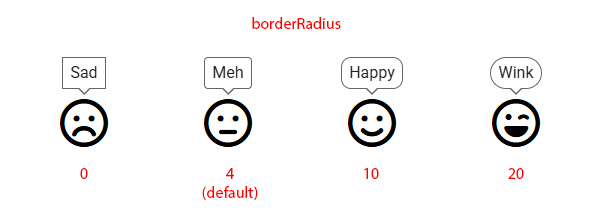\r\n\r\n### The Max Width\r\n\r\nIt defines the maximum width allowed for the tooltip.\r\n\r\n- **Config Property:** `maxWidth`.\r\n- **Type:** `string`.\r\n- **Default:** `'200px'`.\r\n- **You can use:** `px`, `em`, `%`, etc.\r\n\r\n### The Class Names\r\n\r\nIt defines custom class names for your tooltip element.\r\n\r\n- **Config Property:** `className`.\r\n- **Type:** `string` or `string[]`.\r\n- **Default:** _unset_.\r\n\r\n### Use Animate\r\n\r\nTo establish wether to use a small CSS animation when show/hide the tooltip.\r\n\r\n- **Config Property:** `animate`.\r\n- **Type:** `boolean`.\r\n- **Default:** `true`.\r\n\r\n### Use Prevail\r\n\r\nTo establish wether the tooltip will prevail open when the user hovers over it.\r\n\r\n> **NOTE:** The WCAG 2.1/2.2 - Criteria 1.4.13: Content on Hover or Focus, establishes under the \"Hoverable\" principle that: _The pointer can move over the new content without it disappearing._\r\n\r\n- **Config Property:** `prevail`.\r\n- **Type:** `boolean`.\r\n- **Default:** `true`.\r\n\r\n### Use As Label\r\n\r\nTo establish the same tooltip's text as the actual label to its trigger.\r\n\r\nIt will add an `aria-label` attribute with the same text.\r\n\r\n- **Config Property:** `asLabel`.\r\n- **Type:** `boolean`.\r\n- **Default:** `false`.\r\n\r\n> **NOTE:** Not all HTML elements are allowed to use `aria-label`, so in case the trigger does not allow it, a visually hidden text will be added after it, to keep the text within the content at all times and be reachable to all assistive technologies (such as Screen Readers).\r\n\r\n### Toggle On\r\n\r\nTo establish which keys are allowed to toggle the tooltip's visibility.\r\n\r\n- **Config Property:** `toggleOn`.\r\n- **Type:** `string[]`.\r\n- **From:** `KeyboardEvent.code`.\r\n- **Default:** `['ControlLeft', 'ControlRight']`.\r\n\r\n## The `recalculate()` Method\r\n\r\nTo recalculate the tooltip's position on demand.\r\n\r\nThis can come handy when we face scenarios where the trigger element can move after an interaction (like, by clicking on it) and it changes its original position. The tooltip doesn't know its trigger moved, so we have to force to recalculate by using this method.\r\n\r\nA bit forced example: let's say we have a calendar with the typical \"Previous Month\" and \"Next Month\" buttons, with the current month in between, and all centered in the screen. Unless that current month's wrapper has a fixed width, it will change its size and, therefore, the buttons will change their positions.\r\n\r\nTo access the tooltip, we can use the exported instance from `a11yTooltip`:\r\n\r\n**TypeScript:**\r\n\r\n```typescript\r\ncurrentMonth: number = 0;\r\nreadonly months: string[] = [\r\n 'January', 'February', 'March', 'April', 'May', 'June', 'July',\r\n 'August', 'September', 'October', 'November', 'December'\r\n];\r\n\r\nchangeMonth(monthToAdd: number): void {\r\n const newMonth: number = this.currentMonth + monthToAdd;\r\n if (monthToAdd === -1 && newMonth < 0) this.currentMonth = 11;\r\n else if (newMonth > 11) this.currentMonth = 0;\r\n else this.currentMonth = newMonth;\r\n}\r\n```\r\n\r\n**Template:**\r\n\r\n```html\r\n
{{ months[currentMonth] }}
\r\n\r\n❌ If the image has been resized after the map was generated (based on its original size, duh!), events like hover and focus will no longer match\r\n\r\nFor the next example, we are working with an image with an original size of 1344px x 768px, downsized to 700px width.\r\n\r\n```html\r\n
 \r\n\r\n\r\n```\r\n\r\nAs seen in the next screenshot, there are two issues:\r\n\r\n- The _beautiful_ (for visual purpose) red square is the focus ring for the monitor (since the coordinates of the polygon were generated for its original size), so the focused element is respecting _that_ size\r\n- The tooltip has no \"surface\" to attach to, so it's kind of \"floating around\"\r\n\r\n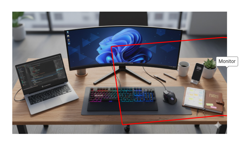\r\n\r\nTo fix this, you can make use of the [Responsive Image Maps library](https://www.npmjs.com/package/@a11y-ngx/responsive-image-maps) (if you have Image Maps in your website, of course).\r\n\r\n✔️ It will readjust the coordinates for each `` element to the current image size
\r\n\r\n\r\n```\r\n\r\nAs seen in the next screenshot, there are two issues:\r\n\r\n- The _beautiful_ (for visual purpose) red square is the focus ring for the monitor (since the coordinates of the polygon were generated for its original size), so the focused element is respecting _that_ size\r\n- The tooltip has no \"surface\" to attach to, so it's kind of \"floating around\"\r\n\r\n\r\n\r\nTo fix this, you can make use of the [Responsive Image Maps library](https://www.npmjs.com/package/@a11y-ngx/responsive-image-maps) (if you have Image Maps in your website, of course).\r\n\r\n✔️ It will readjust the coordinates for each `` element to the current image size\r\n✔️ The tooltip will make use of the new coordinates to position itself properly\r\n\r\n```typescript\r\nimport { A11yTooltipModule } from '@a11y-ngx/tooltip';\r\nimport { A11yResponsiveImageMapsModule } from '@a11y-ngx/responsive-image-maps';\r\n\r\n@NgModule({\r\n declarations: [...],\r\n imports: [\r\n ...\r\n A11yTooltipModule,\r\n A11yResponsiveImageMapsModule,\r\n ],\r\n})\r\nexport class MyCustomModule { }\r\n```\r\n\r\nNow, we can observe that:\r\n\r\n✔️ The focus ring matches the original coordinates in the new downsized image
\r\n✔️ The tooltip is correctly located to its default position/alignment (top-center)\r\n\r\n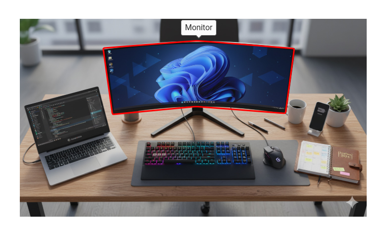\r\n\r\n## The Use with Abbreviation Elements\r\n\r\nAbbreviations (``) are one of the few elements where using the native `title` attribute is both expected and \"accessible\".\r\n\r\nWhile this is semantically correct, screen readers (as far as I know, all of them) won't read the title at all, that's why the library will add a visually hidden text after the ``.\r\n\r\n**Template:**\r\n\r\n```html\r\nGood UX design focuses on how a product feels,\r\nwhile UI design focuses on how it looks.\r\nBoth are essential to creating intuitive digital experiences.\r\n```\r\n\r\n**Result for the Tooltip:**\r\n\r\n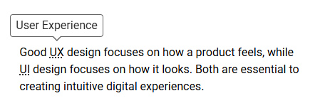\r\n\r\n**Result for the NVDA Screen Reader:**\r\n\r\n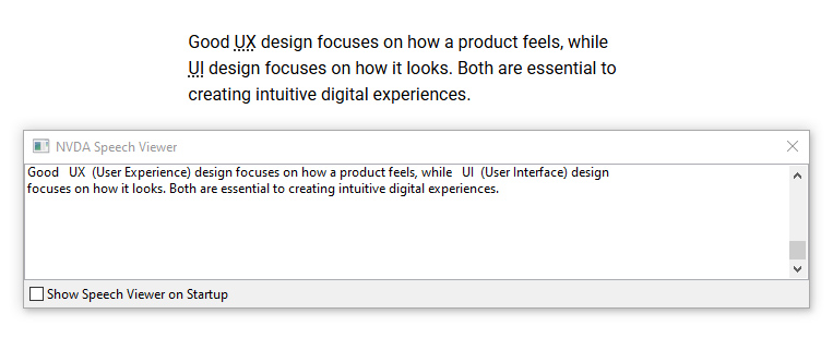\r\n\r\n## The Use with Non-Interactive Elements\r\n\r\nIn case you are using the tooltip in a non-interactive element (not recommended), the same thing will happen as with the use of the `` element, it will add a visually hidden text after it.\r\n\r\n**Template:**\r\n\r\n```html\r\nYou can use any of the available alignments:\r\n,\r\n,\r\n or\r\n.\r\n```\r\n\r\n**Result for the Tooltip:**\r\n\r\n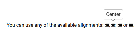\r\n\r\n**Result for the NVDA Screen Reader:**\r\n\r\n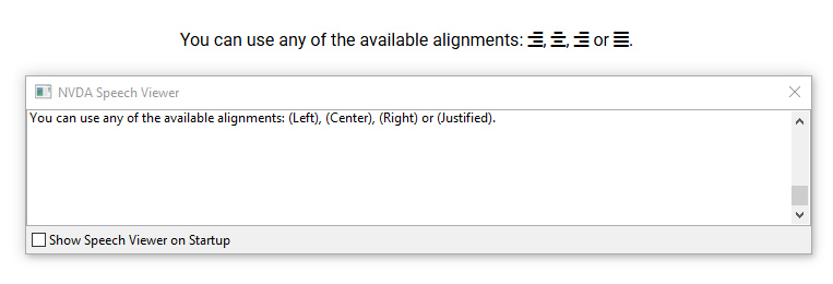\r\n\r\n> **IMPORTANT:** Remember that this is **NOT** recommended, since keyboard users can't reach the tooltip at all. Making the element focusable (`tabindex=\"0\"`) might seem to \"fix\" the keyboard scenario, but it's **NOT** accessible, since users expect that focusable elements to be interactive.\r\n","readmeFilename":"README.md"}