{"_id":"@ahmad_honeycomb-labs/react-native-calendar-picker","name":"@ahmad_honeycomb-labs/react-native-calendar-picker","dist-tags":{"latest":"7.1.5"},"versions":{"7.1.5":{"name":"@ahmad_honeycomb-labs/react-native-calendar-picker","version":"7.1.5","description":"Calendar Picker Component for React Native","engines":{"node":">=4.0.0"},"peerDependencies":{"moment":">=2.0.0","react":"*","react-native":"*"},"main":"./CalendarPicker","scripts":{"start":"echo \"example folder contains sample app (see README)\" && exit 1","test":"echo \"example folder contains the tests (see README)\" && exit 1","lint":"eslint CalendarPicker --fix","postinstall":"node-git-hooks"},"repository":{"type":"git","url":"git+https://github.com/stephy/CalendarPicker.git"},"keywords":["calendar","picker","calendar","picker","date","picker","day","picker"],"author":{"name":"Stephani Alves","email":"alves@stephanimoroni.com"},"license":"MIT","bugs":{"url":"https://github.com/stephy/CalendarPicker/issues"},"homepage":"https://github.com/stephy/CalendarPicker","maintainers":[{"name":"ahmad_honeycomb-labs","email":"ahmad@honeycomb-labs.com"}],"directories":{},"dependencies":{"node-git-hooks":"^1.0.1","prop-types":"^15.6.0","recyclerlistview":"^3.0.0"},"devDependencies":{"babel-eslint":"^10.1.0","eslint":"^6.8.0","eslint-plugin-react":"^7.19.0"},"gitHead":"f6ef86b9867db374f8430f9afa38f5d6885e1be8","_id":"@ahmad_honeycomb-labs/react-native-calendar-picker@7.1.5","_nodeVersion":"19.2.0","_npmVersion":"8.19.3","dist":{"integrity":"sha512-n7qvpFhkdmxD6a/DMC0xwhuxagrtcyFwjK6thOROuASTxfDkvxV/CEw5P9eGiTfIvLB2hRqwQKpEEGZ9GV7WXQ==","shasum":"df49f5a58bad903a64f1e8fead55090e06cee924","tarball":"https://registry.npmjs.org/@ahmad_honeycomb-labs/react-native-calendar-picker/-/react-native-calendar-picker-7.1.5.tgz","fileCount":32,"unpackedSize":103752,"signatures":[{"keyid":"SHA256:jl3bwswu80PjjokCgh0o2w5c2U4LhQAE57gj9cz1kzA","sig":"MEUCIQDRR+Pxg49boVn/MK4cdgSPFvoSgk6XvxlqN9lxGiZMRgIgUQo4naISUXiLt63gZusX2vpm2t8IxtS2zOHPdQLwJZI="}],"npm-signature":"-----BEGIN PGP SIGNATURE-----\r\nVersion: OpenPGP.js v4.10.10\r\nComment: https://openpgpjs.org\r\n\r\nwsFzBAEBCAAGBQJj2aYcACEJED1NWxICdlZqFiEECWMYAoorWMhJKdjhPU1b\r\nEgJ2Vmoupw/+OM93Lmf85GEHoF77sxfn4xKrYwczw8/jE2Mi1YqokYpa6lgO\r\n9mKrhMk1ztHPREaKFtpxhkzeqTsryuV/x29I56GdwMsKrIbhKBpgVR9GDp0N\r\nYDKDhx7qclfH/143eJjkhiXMA/bjEBk64uOMuUmEBIlgURkpzX0gct1FCROI\r\nX7deskAvL/JI/Mtz4bKFh7bFMfft3rYtAw74O+D4K8YL7iNRfnjL1u8hbAYq\r\nt9OmaKF16KhiE3477rD55wVuo3uZ2gImSc6rftjlzE2G/TG1NaV9F1Zry31e\r\np5tjMrX2ZCbsqmn802EQuUwWPL6zCKBCQL5LEdYqlNXQVLCF21i9M6GFfhwg\r\n7JU+Ogu3w+8sIniWo+7Yik90ka/5GEIdqtJ0qE2XvFKNiJeETf1DXHT8quoF\r\nm308C4Vhr6p1mJZxEP1uqNpUBy5EuRD090rvwCVw5tA643RIK+5fU5lSO4WU\r\nm3tEZSIs2bWRMSmF29Tn7SpPKLCNLYVLsuxiDyK2Fvqe+Izt7lrQlMh11AYD\r\nE1/BMXUXRNzCap03foaUuBnZjV0j5GAk2W/a56QqAuDSoG2qogyRr6SywGkq\r\n9Mh5+lPmXO1XesKkgZMCqF6GuZweuckxp2j4ylWXaYhJ3eenNsOYMuHeOaXM\r\n4IkI51Ay3q51CNpL5L5QZr/9eTgMGGMHvdY=\r\n=BwCJ\r\n-----END PGP SIGNATURE-----\r\n"},"_npmUser":{"name":"ahmad_honeycomb-labs","email":"ahmad@honeycomb-labs.com"},"_npmOperationalInternal":{"host":"s3://npm-registry-packages","tmp":"tmp/react-native-calendar-picker_7.1.5_1675208219832_0.2026007935731997"},"_hasShrinkwrap":false}},"time":{"created":"2023-01-31T23:36:59.768Z","7.1.5":"2023-01-31T23:36:59.996Z","modified":"2023-01-31T23:37:00.172Z"},"maintainers":[{"name":"ahmad_honeycomb-labs","email":"ahmad@honeycomb-labs.com"}],"description":"Calendar Picker Component for React Native","homepage":"https://github.com/stephy/CalendarPicker","keywords":["calendar","picker","calendar","picker","date","picker","day","picker"],"repository":{"type":"git","url":"git+https://github.com/stephy/CalendarPicker.git"},"author":{"name":"Stephani Alves","email":"alves@stephanimoroni.com"},"bugs":{"url":"https://github.com/stephy/CalendarPicker/issues"},"license":"MIT","readme":"# react-native-calendar-picker\n\n[](https://badge.fury.io/js/react-native-calendar-picker) [](https://www.npmjs.com/package/react-native-calendar-picker) [](https://travis-ci.org/stephy/CalendarPicker)\n\nThis is a Calendar Picker Component for React Native\n\n### Scrollable CalendarPicker — New in 7.x\n\nThe `scrollable` prop was introduced in 7.0.0 and features a bi-directional infinite scroller. It recycles months using RecyclerListView, shifting them as the ends are reached. If the Chrome debugger is used during development, month shifting may be erratic due to a [RN setTimeout bug](https://github.com/facebook/react-native/issues/4470). To prevent month shifts at the ends of the scroller, set `restrictMonthNavigation`, `minDate`, and `maxDate` range to 5 years or less.\n\n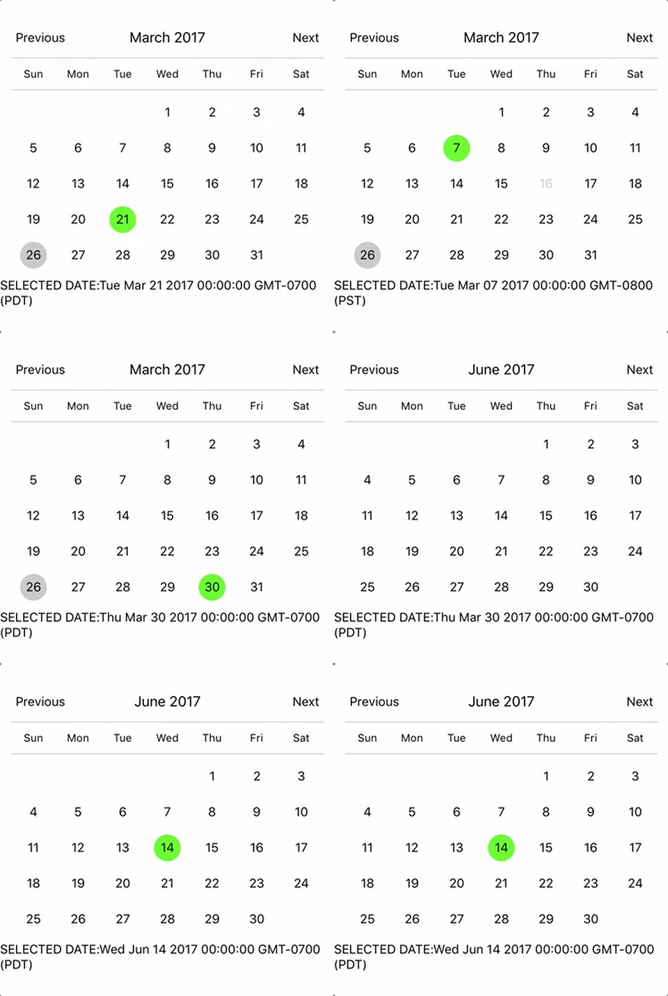\n\nTo use the calendar you just need to:\n```sh\nnpm install --save react-native-calendar-picker\n```\n\n# Prerequisites\n\nCalendarPicker requires Moment JS >=2.0. Date props may be anything parseable by Moment: Javascript Date, Moment date, or ISO8601 datetime string.\n\n```\nnpm install --save moment\n```\n\n# Example\n\n```js\nimport React, { Component } from 'react';\nimport {\n StyleSheet,\n Text,\n View\n} from 'react-native';\nimport CalendarPicker from 'react-native-calendar-picker';\n\nexport default class App extends Component {\n constructor(props) {\n super(props);\n this.state = {\n selectedStartDate: null,\n };\n this.onDateChange = this.onDateChange.bind(this);\n }\n\n onDateChange(date) {\n this.setState({\n selectedStartDate: date,\n });\n }\n render() {\n const { selectedStartDate } = this.state;\n const startDate = selectedStartDate ? selectedStartDate.toString() : '';\n return (\n \n \n\n \n SELECTED DATE:{ startDate }\n \n \n );\n }\n}\n\nconst styles = StyleSheet.create({\n container: {\n flex: 1,\n backgroundColor: '#FFFFFF',\n marginTop: 100,\n },\n});\n```\n## CalendarPicker Props\n| Prop | Type | Description |\n:------------ |:---------------| :-----|\n| **`weekdays`** | `Array` | Optional. List of week days. Eg. `['Mon', 'Tue', ...]` Must be 7 days |\n| **`months`** | `Array` | Optional. List of months names. Eg. `['Jan', 'Feb', ...]` Must be 12 months |\n| **`firstDay`** | `Number` | Optional. Default first day of week will be Sunday. You can set start of week with number from `0` to `6`. Default is `0` or Sunday |\n| **`startFromMonday`** | `Boolean` | Optional. Default first day of week will be Sunday. You can set start of week from Monday by setting this to true. Default is `false` |\n| **`showDayStragglers`** | `Boolean` | Optional. Populate previous & next month days in empty slots. Default is `false` |\n| **`allowRangeSelection`** | `Boolean` | Optional. Allow to select date ranges. Default is `false` |\n| **`allowBackwardRangeSelect`** | `Boolean` | Optional. Allow selecting range in reverse. Default is `false` |\n| **`previousTitle`** | `String` | Optional. Title of button for previous month. Default is `Previous` |\n| **`nextTitle`** | `String` | Optional. Title of button for next month. Default is `Next` |\n| **`previousTitleStyle`** | `TextStyle` | Optional. Text styling for Previous text.|\n| **`nextTitleStyle`** | `TextStyle` | Optional. Text styling for Next text.|\n| **`previousComponent`** | `Object` | Optional. Component to use in `Previous` button. Overrides `previousTitle` & `previousTitleStyle`. |\n| **`nextComponent`** | `Object` | Optional. Component to use in `Next` button. Overrides `nextTitle` & `nextTitleStyle`. |\n| **`selectedDayColor`** | `String` | Optional. Color for selected day |\n| **`selectedDayStyle`** | `ViewStyle` | Optional. Style for selected day. May override selectedDayColor.|\n| **`selectedDayTextColor`** | `String` | Optional. Text color for selected day |\n| **`selectedDayTextStyle`** | `Object` | Optional. Text style for selected day (including all days in range) |\n| **`selectedRangeStartTextStyle`** | `Object` | Optional. Text style for start day of range |\n| **`selectedRangeEndTextStyle`** | `Object` | Optional. Text style for end day of range |\n| **`selectedRangeStartStyle`** | `ViewStyle` | Optional. Container style for start day of range. |\n| **`selectedRangeEndStyle`** | `ViewStyle` | Optional. Container style for end day of range. |\n| **`selectedRangeStyle`** | `ViewStyle` | Optional. Container style for all days in range selection. |\n| **`selectedDisabledDatesTextStyle`** | `Object` | Optional. Text style for ineligible dates during range selection. |\n| **`disabledDates`** | `Array` or `Function` | Optional. Specifies dates that cannot be selected. Array of Dates, or a function that returns true for a given Moment date (apologies for the inverted logic). |\n| **`disabledDatesTextStyle`** | `TextStyle` | Optional. Text styling for disabled dates. |\n| **`selectedStartDate`** | `Date` | Optional. Specifies a selected Start Date. |\n| **`selectedEndDate`** | `Date` | Optional. Specifies a selected End Date. |\n| **`minRangeDuration`** | `Number or Array` | Optional. Specifies a minimum range duration when using allowRangeSelection. Can either pass a number to be used for all dates or an Array of objects if the minimum range duration depends on the date `{date: Moment-parsable date, minDuration: Number}` |\n| **`maxRangeDuration`** | `Number or Array` | Optional. Specifies a maximum range duration when using allowRangeSelection. Can either pass a number to be used for all dates or an Array of objects if the maximum range duration depends on the date `{date: Moment-parsable date, maxDuration: Number}` |\n| **`todayBackgroundColor`** | `String` | Optional. Background color for today. Default is `#cccccc` |\n| **`todayTextStyle`** | `TextStyle` | Optional. Text styling for today. |\n| **`textStyle`** | `TextStyle` | Optional. Style overall text. Change fontFamily, color, etc. |\n| **`customDatesStyles`** | `Array` or `Func` | Optional. Style individual date(s). Supports an array of objects `{date: Moment-parseable date, containerStyle: ViewStyle, style: ViewStyle, textStyle: TextStyle, allowDisabled: Boolean}`, or a callback which receives a date param and returns `{containerStyle: ViewStyle, style: ViewStyle, textStyle: TextStyle, allowDisabled: Boolean}` for that date. |\n| **`customDayHeaderStyles`** | `Func` | Optional. Style day of week header (Monday - Sunday). Callback that receives ISO `{dayOfWeek, month, year}` and should return `{style: ViewStyle, textStyle: TextStyle}` |\n| **`scaleFactor`** | `Number` | Optional. Default (375) scales to window width |\n| **`minDate`** | `Date` | Optional. Specifies minimum date to be selected |\n| **`maxDate`** | `Date` | Optional. Specifies maximum date to be selected |\n| **`initialDate`** | `Date` | Optional. Date that calendar opens to. Defaults to today. |\n| **`width`** | `Number` | Optional. Width of CalendarPicker's container. Defaults to Dimensions width.|\n| **`height`** | `Number` | Optional. Height of CalendarPicker's container. Defaults to Dimensions height.|\n| **`scrollable`** | `Boolean` | Optional. Months are scrollable if true. Default is `false` |\n| **`horizontal`** | `Boolean` | Optional. Scroll axis when `scrollable` set. Default is `true` |\n| **`enableDateChange`** | `Boolean` | Optional. Whether to enable pressing on day. Default is `true` |\n| **`restrictMonthNavigation`** | `Boolean` | Optional. Whether to disable Previous month button if it is before minDate or Next month button if it is after MaxDate. Default is `false` |\n| **`onDateChange`** | `Function` | Optional. Callback when a date is selected. Returns Moment `date` as first param; `START_DATE` or `END_DATE` as second param.|\n| **`onMonthChange`** | `Function` | Optional. Callback when Previous / Next month is pressed. Returns Moment `date` as first parameter.|\n| **`dayShape`** | `String` | Optional. Shape of the Day component. Default is `circle`. Available options are `circle` and `square`.|\n| **`headingLevel`** | `Number` | Optional. Sets the aria-level for the calendar title heading when on Web. Default is `1`.|\n| **`selectMonthTitle`** | `String` | Optional. Title of month selector view. Default is \"Select Month in \" + {year}.|\n| **`selectYearTitle`** | `String` | Optional. Title of year selector view. Default is \"Select Year\".|\n| **`dayLabelsWrapper`** | `ViewStyle` | Optional. Style for weekdays wrapper. E.g If you want to remove top and bottom divider line.|\n| **`enableSwipe`** | `Deprecated` | Use `scrollable`. |\n| **`swipeConfig`** | `Deprecated` | Use `scrollable`. |\n| **`onSwipe`** | `Deprecated` | Use `onMonthChange`. |\n| **`dayOfWeekStyles`** | `Deprecated` | Use `customDatesStyles` & `customDayHeaderStyles` callbacks to style individual dates, days of week, and/or header. |\n| **`customDatesStylesPriority`** | `Deprecated` | Use `customDatesStyles` & `customDayHeaderStyles` callbacks to style individual dates, days of week, and/or header. |\n| **`monthYearHeaderWrapperStyle`** | `ViewStyle` | Optional. Style for header MonthYear title wrapper. E.g If you want to change the order of year and month.|\n| **`headerWrapperStyle`** | `ViewStyle` | Optional. Style for entire header controls wrapper. This contains the previous / next controls plus month & year.|\n| **`monthTitleStyle`** | `TextStyle` | Optional. Text styling for header's month text.|\n| **`yearTitleStyle`** | `TextStyle` | Optional. Text styling for header's year text.|\n\n# Styles\nSome styles will overwrite some won't. For instance:\n- If you provide textStyle with fontFamily and color, out of ranges dates will not apply your color, just fontFamily.\n\nOrder of precedence:\n\n- defaultColor => textStyle => selectedDayColor\n- defaultTodayBackgroundColor => todayBackgroundColor\n- defaultBackgroundColor => selectedDayColor\n- defaultTextStyles => textStyle => selectedDayTextColor\n\n# More Examples\n\n### Start from Monday, allowRangeSelection, Min and Max Dates and Styles Changes Example\n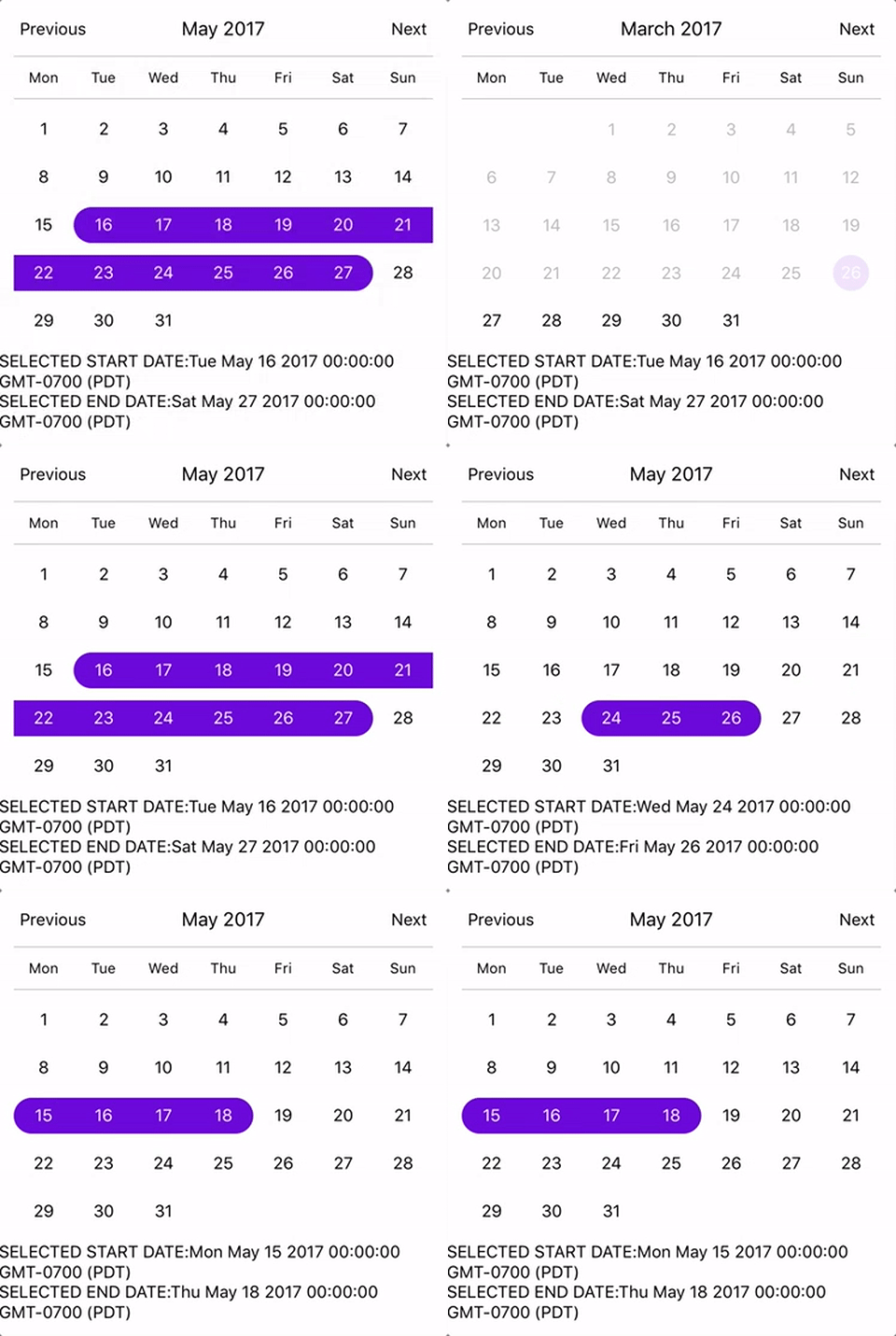\n```js\nimport React, { Component } from 'react';\nimport {\n StyleSheet,\n Text,\n View\n} from 'react-native';\nimport CalendarPicker from 'react-native-calendar-picker';\n\nexport default class App extends Component {\n constructor(props) {\n super(props);\n this.state = {\n selectedStartDate: null,\n selectedEndDate: null,\n };\n this.onDateChange = this.onDateChange.bind(this);\n }\n\n onDateChange(date, type) {\n if (type === 'END_DATE') {\n this.setState({\n selectedEndDate: date,\n });\n } else {\n this.setState({\n selectedStartDate: date,\n selectedEndDate: null,\n });\n }\n }\n\n render() {\n const { selectedStartDate, selectedEndDate } = this.state;\n const minDate = new Date(); // Today\n const maxDate = new Date(2017, 6, 3);\n const startDate = selectedStartDate ? selectedStartDate.toString() : '';\n const endDate = selectedEndDate ? selectedEndDate.toString() : '';\n\n return (\n \n \n\n \n SELECTED START DATE:{ startDate }\n SELECTED END DATE:{ endDate }\n \n \n );\n }\n}\n\nconst styles = StyleSheet.create({\n container: {\n flex: 1,\n backgroundColor: '#FFFFFF',\n marginTop: 100,\n },\n});\n```\n\n### Complex Example, Changing Fonts and Colors, Language and etc...\n\n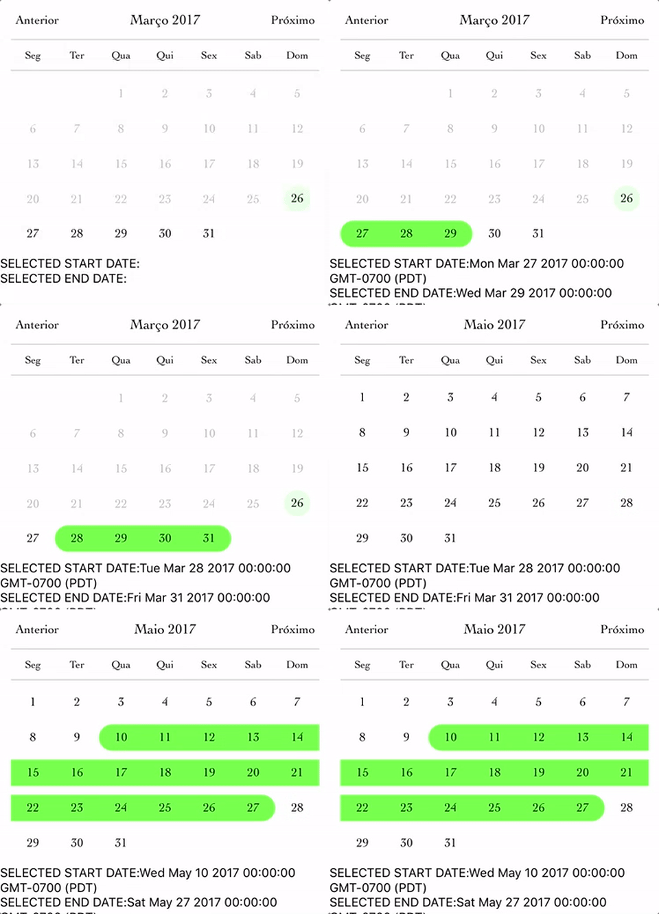\n\n```js\nimport React, { Component } from 'react';\nimport {\n StyleSheet,\n Text,\n View\n} from 'react-native';\nimport CalendarPicker from 'react-native-calendar-picker';\n\nexport default class App extends Component {\n constructor(props) {\n super(props);\n this.state = {\n selectedStartDate: null,\n selectedEndDate: null,\n };\n this.onDateChange = this.onDateChange.bind(this);\n }\n\n onDateChange(date, type) {\n if (type === 'END_DATE') {\n this.setState({\n selectedEndDate: date,\n });\n } else {\n this.setState({\n selectedStartDate: date,\n selectedEndDate: null,\n });\n }\n }\n\n render() {\n const { selectedStartDate, selectedEndDate } = this.state;\n const minDate = new Date(); // Today\n const maxDate = new Date(2017, 6, 3);\n const startDate = selectedStartDate ? selectedStartDate.toString() : '';\n const endDate = selectedEndDate ? selectedEndDate.toString() : '';\n\n return (\n \n \n\n \n SELECTED START DATE:{ startDate }\n SELECTED END DATE:{ endDate }\n \n \n );\n }\n}\n\nconst styles = StyleSheet.create({\n container: {\n flex: 1,\n backgroundColor: '#FFFFFF',\n marginTop: 100,\n },\n});\n```\n\n\n### Custom styling individual dates\n\n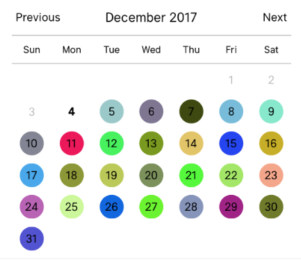\n\n```js\n\nlet today = moment();\nlet day = today.clone().startOf('month');\nlet customDatesStyles = [];\nwhile(day.add(1, 'day').isSame(today, 'month')) {\n customDatesStyles.push({\n date: day.clone(),\n // Random colors\n style: {backgroundColor: '#'+('#00000'+(Math.random()*(1<<24)|0).toString(16)).slice(-6)},\n textStyle: {color: 'black'}, // sets the font color\n containerStyle: [], // extra styling for day container\n allowDisabled: true, // allow custom style to apply to disabled dates\n });\n}\n\nrender() {\n return (\n \n );\n}\n```\n\n### Styling each day of the week and the day name header.\n\n```js\n\nconst customDayHeaderStylesCallback = {dayOfWeek, month, year} => {\n switch(dayOfWeek) { // can also evaluate month, year\n case 4: // Thursday\n return {\n style: {\n borderRadius: 12,\n backgroundColor: 'cyan',\n },\n textStyle: {\n color: 'blue',\n fontSize: 22,\n fontWeight: 'bold',\n }\n };\n }\n}\n\nconst customDatesStylesCallback = date => {\n switch(date.isoWeekday()) {\n case 1: // Monday\n return {\n style:{\n backgroundColor: '#909',\n },\n textStyle: {\n color: '#0f0',\n fontWeight: 'bold',\n }\n };\n case 7: // Sunday\n return {\n textStyle: {\n color: 'red',\n }\n };\n }\n}\n\n\n```\n\n## Methods\n\nThese internal methods may be accessed through a ref to the CalendarPicker.\n\n| Name | Params | Description |\n:------------ |:---------------| :-----|\n| **`handleOnPressDay`** | `{year, month, day} (Integers)` | Programmatically select date. `year`, `month` and `day` are numbers. `day` is the day of the current month. Moment example for today's day of month: `moment().date()` |\n| **`handleOnPressNext`** | | Programmatically advance to next month. |\n| **`handleOnPressPrevious`** | | Programmatically advance to previous month. |\n| **`resetSelections`** | | Clear date selections. Useful for resetting date range selection when user has picked a start date but not an end date. |\n\n## TypeScript\n\nDefinitions are available at https://www.npmjs.com/package/@types/react-native-calendar-picker courtesy of [automatensalat](https://github.com/automatensalat).\n```\nnpm install --save @types/react-native-calendar-picker\n```\n\n\n# Suggestions?\n\nOpen Issues. Submit PRs.\n\n# Special Thanks\n\nI would like to call out some contributors who have been helping with this project\n\n- [peacechen](https://github.com/peacechen)\n- [edvinerikson](https://github.com/edvinerikson)\n- [thomaswright](https://github.com/thomaswright)\n- [brentvatne](https://github.com/brentvatne)\n- [kesha-antonov](https://github.com/kesha-antonov)\n- [jthestupidkid](https://github.com/jthestupidkid)\n- [adamkrell](https://github.com/adamkrell)\n- [joshuapinter](https://github.com/joshuapinter)\n\n\n# Sample Application\n\nThe sample app is an Expo project created with `create-react-native-app`.\n```sh\ncd example\nnpm run cp\nnpm install\nnpm start\n```\n\n## Development\n\nThe source files are copied from the project root directory into `example` using `npm run cp`. If a source file is modified, it must be copied over again with `npm run cp`.\n","readmeFilename":"README.md"}