\n\n> **Note:** This is a fork of [`react-native-ui-datepicker`](https://github.com/farhoudshapouran/react-native-ui-datepicker) by Farhoud Shapouran, published as [`@danielsenorjan/react-native-ui-datepicker`](https://www.npmjs.com/package/@danielsenorjan/react-native-ui-datepicker) with additional fixes. Install with `npm install @danielsenorjan/react-native-ui-datepicker`. All credit for the original library goes to the upstream author.\n\nDateTimePicker component for React Native that allows you to create a customizable datetime picker. The component uses extensive set of props that allows you to customizing the calendar based on your own UI design. Please visit [demo](https://farhoudshapouran.github.io/react-native-ui-datepicker/).\n\n## Features\n\n- 📅 Supports different selection modes: single, range, and multiple days.\n- 🌿 Unstyled by default, every component is minimally styled and fully customizable.\n- 🛠️ Extensive set of props for fine-tuned calendar customization.\n- 🎨 Fully compatible with [NativeWind](https://www.nativewind.dev/).\n- 🌎 Easily localizable into any language.\n- 🕗 Handles different time zones seamlessly.\n- ⚙️ Customizable components allow extending rendered elements. \n- ⚡ Fast & lightweight, only re-renders the elements that actually change.\n\n## Installation\n\n```sh\nnpm install react-native-ui-datepicker\n```\n\nOr\n\n```sh\nyarn add react-native-ui-datepicker\n```\n\n## Basic Usage\n\n1. Import the component and default styles or classNames from `react-native-ui-datepicker`.\n2. Choose a selection mode using the `mode` prop. The available modes are: `single`, `range`, and `multiple`.\n\n```jsx\nimport { useState } from 'react';\nimport DateTimePicker, { DateType, useDefaultStyles } from 'react-native-ui-datepicker';\n\nexport function Calendar() {\n const defaultStyles = useDefaultStyles();\n const [selected, setSelected] = useState();\n\n return (\n setSelected(date)}\n styles={defaultStyles}\n />\n );\n}\n```\n\n## Calendar Base Props\n\n| Name | Type | Description |\n| ------------------ | --------------------------------- | -------------------------------------------------- |\n| `mode` | `\"single\"` \\| `\"range\"` \\| `\"multiple\"` | Defines the DatePicker mode. |\n| `calendar` | `\"gregory\"` \\| `\"jalali\"` | Defines the calendar type of DatePicker. |\n| `minDate` | `DateType` | Defines the minimum selectable date in the DatePicker. |\n| `maxDate` | `DateType` | Defines the maximum selectable date in the DatePicker. |\n| `enabledDates` | `DateType[]` \\| `(date: DateType) => boolean` | Defines an array of enabled dates or a function that returns `true` for enabled dates. It takes precedence over disabledDates. |\n| `disabledDates` | `DateType[]` \\| `(date: DateType) => boolean` | Defines an array of disabled dates or a function that returns `true` for disabled dates. |\n| `firstDayOfWeek` | `number` | Defines the first day of the week: 0-6 (0 = Sunday, 6 = Saturday). |\n| `initialView` | `\"day\"` \\| `\"month\"` \\| `\"year\"` \\| `\"time\"` | Defines the initial view of the DatePicker |\n| `month` | `number` | Defines the currently selected month. |\n| `year` | `number` | Defines the currently selected year. |\n| `onMonthChange` | `(month: number) => void` | Callback function triggered when the current month changes. |\n| `onYearChange` | `(year: number) => void` | Callback function triggered when the current year changes. |\n\n## Example\n\n```jsx\nexport function Calendar() {\n let today = new Date();\n const [selected, setSelected] = useState();\n\n return (\n setSelected(date)}\n minDate={today} // Set the minimum selectable date to today\n enabledDates={(date) => dayjs(date).day() === 1} // Enable only Mondays (takes precedence over disabledDates)\n disabledDates={(date) => [0, 6].includes(dayjs(date).day())} // Disable weekends\n />\n );\n}\n```\n\n
\n\n
\n\n## Single Mode props\n\n| Name | Type | Description |\n| ------------ | ------------------ | ------------------------------------------------------------- |\n| `date` | `DateType` | Specifies the currently selected date. |\n| `onChange` | `({date}) => void` | Callback function triggered when the date change. |\n| `timePicker` | `boolean` | Whether to enable the time picker. |\n| `use12Hours` | `boolean` | Whether to use a 12-hour format (AM/PM) in the time picker. |\n\n## Range Mode props\n\n| Name | Type | Description |\n| ----------- | -------------------------------- | -----------------------------------------------------------|\n| `startDate` | `DateType` | Defines the start date for a range selection. |\n| `endDate` | `DateType` | Defines the end date for a range selection. |\n| `onChange` | `({startDate, endDate}) => void` | Callback function triggered when the start and end change. |\n| `min` | `number` | Defines the minimum allowed nights. |\n| `max` | `number` | Defines the maximum allowed nights. |\n| `allowRangeReset` | `boolean` | When `true`, tapping any date while a complete range is selected clears the end date and starts a fresh selection from the tapped date. Defaults to `false`. |\n\n## Multiple Mode props\n\n| Name | Type | Description |\n| ----------------- | ------------------- | ----------------------------------------------------------- |\n| `dates` | `DateType[]` | Defines the selected dates for multiple date selection. |\n| `onChange` | `({dates}) => void` | Callback function triggered when the dates change. |\n| `max` | `number` | Defines the maximum allowed days to select. |\n| `multiRangeMode` | `boolean` | Whether to display selecting multiple dates in a range row. |\n\n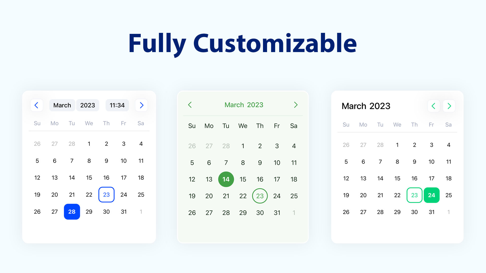\n\n## Customization\n\n| Name | Type | Description |\n| -------------------- | ----------------------------------- | --------------------------------------------------------- |\n| `showOutsideDays` | `boolean` | Whether to show the days of the previous and next months. |\n| `navigationPosition` | `\"around\"` \\| `\"right\"` \\| `\"left\"` | Defines the position of the navigation. |\n| `containerHeight` | `number` | Defines the height of the calendar days container. |\n| `weekdaysHeight` | `number` | Defines the height of the weekdays row. |\n| `weekdaysFormat` | `\"short\"` \\| `\"full\"` \\| `\"min\"` | Defines the format for displaying weekdays. |\n| `monthsFormat` | `\"short\"` \\| `\"full\"` | Defines the format for displaying months. |\n| `monthCaptionFormat` | `\"short\"` \\| `\"full\"` | Defines the format for displaying the month caption. |\n| `hideHeader` | `boolean` | Whether to hide the calendar header. |\n| `hideWeekdays` | `boolean` | Whether to hide the weekdays row. |\n| `showMonthSelector` | `boolean` | When `true`, always show the month selector (including in year view). When `false`, hide it. When omitted, show except in year view. |\n| `disableMonthPicker` | `boolean` | Whether to disable the month picker. |\n| `disableYearPicker` | `boolean` | Whether to disable the year picker. |\n\n## Styling\n\nDateTimePicker comes with a minimal style, making it easy to extend and customize according to your needs.\n\n| Name | Type | Description |\n| ----------------- | --------------- | --------------------------------------------------------------- |\n| `style` | `ViewStyle` | Style for the outer calendar container (header and body). |\n| `containerStyle` | `ViewStyle` | Style for the inner calendar body (day, month, year, or time view). Does not override `containerHeight`. |\n| `className` | `string` | className for the calendar container. |\n| `styles` | `Styles` | Custom styles for specific components inside the calendar. |\n| `classNames` | `ClassNames` | Custom classNames for specific components inside the calendar. |\n\n## Custom Styles\n\nUse the `styles` prop to apply custom styles instead of the default ones.\n\nThese styles are mapped to the values of the [UI Theme](https://github.com/farhoudshapouran/react-native-ui-datepicker/blob/main/src/ui.ts) enums.\n\n```jsx\nimport DateTimePicker, { useDefaultStyles } from 'react-native-ui-datepicker';\n\nexport function Calendar() {\n const defaultStyles = useDefaultStyles();\n\n return (\n \n );\n}\n```\n\n## NativeWind (Tailwind CSS)\n\nIf you're using [NativeWind](https://www.nativewind.dev/) in your project, apply Tailwind CSS class names to style the calendar.\nUse the `classNames` prop to apply custom class names instead of the default ones.\n\nThese class names are mapped to the values of the [UI Theme](https://github.com/farhoudshapouran/react-native-ui-datepicker/blob/main/src/ui.ts) enums.\n\n```jsx\nimport DateTimePicker, { useDefaultClassNames } from 'react-native-ui-datepicker';\n\nexport function Calendar() {\n const defaultClassNames = useDefaultClassNames();\n\n return (\n \n );\n}\n```\n\n## Time Zones\n\nUse the `timeZone` prop to set the time zone for the calendar.\n\n| Name | Type | Description |\n| -------------- | ------------------ | ------------------------------------------ |\n| `timeZone` | `string` | Defines the timezone for the DatePicker. |\n\nThe time zone can be set using either an [IANA time zone](https://en.wikipedia.org/wiki/List_of_tz_database_time_zones) identifier or a UTC offset.\n\n```jsx\n // Use Coordinated Universal Time\n // Use Japan Standard Time (JST)\n```\n\n## Localization\n\nDateTimePicker offers multiple options to customize the calendar for different languages.\n\n| Name | Type | Description |\n| ------------ | ------------------------------------ | ------------------------------------------------------------ |\n| `locale` | `string` | Defines the locale of the DateTimePicker. Default is `en` |\n| `numerals` | [Numerals](#list-of-numeral-systems) | Specifies the numeral system to use (e.g., Arabic, Persian). |\n\n## Custom Components\n\nUse the `components` prop to replace the default rendered elements with your own custom components.\n\n| Name | Type | Description |\n| --------------- | ------------------------- | -------------------------------------------------------- |\n| `components` | `CalendarComponents` | Custom components to replace default calendar elements. |\n\n\n## Implementing a Custom Component\n\nPass the custom components to the `components` prop. Refer to the list below for available [custom components](#list-of-custom-components).\n\n```jsx\nimport DateTimePicker, {\n CalendarDay,\n CalendarMonth,\n CalendarComponents,\n} from 'react-native-ui-datepicker';\n\nconst components: CalendarComponents = {\n Day: (day: CalendarDay) => ,\n Month: (month: CalendarMonth) => \n // etc\n};\n\nexport function Calendar() {\n return (\n \n );\n}\n```\n\n## List of Custom Components\n\n| Name | Type | Description |\n| ---------- | -------------------------------------- | ------------------------------------------------------ |\n| `Day` | `(day: CalendarDay) => ReactNode` | The component containing the day in the days grid. |\n| `Month` | `(month: CalendarMonth) => ReactNode` | The component containing the month in the months grid. |\n| `Year` | `(year: CalendarYear) => ReactNode` | The component containing the year in the years grid. |\n| `Weekday` | `(weekday: CalendarWeek) => ReactNode` | The component containing the weekday in the header. |\n| `IconPrev` | `ReactNode` | The previous month/year button icon in the header. |\n| `IconNext` | `ReactNode` | The next month button/year icon in the header. |\n\n## Type Definitions\n\n```typescript\ntype DateType = string | number | Dayjs | Date | null | undefined;\n\ntype CalendarMode = 'single' | 'range' | 'multiple';\n\ntype NavigationPosition = 'around' | 'right' | 'left';\n\ntype WeekdayFormat = 'min' | 'short' | 'full';\n\ntype MonthFormat = 'short' | 'full';\n\ntype CalendarDay = {\n number: number;\n text: string;\n date: string;\n isDisabled: boolean;\n isCurrentMonth: boolean;\n dayOfMonth?: number;\n isToday: boolean;\n isSelected: boolean;\n inRange: boolean;\n leftCrop: boolean;\n rightCrop: boolean;\n isStartOfWeek: boolean;\n isEndOfWeek: boolean;\n isCrop: boolean;\n inMiddle: boolean;\n rangeStart: boolean;\n rangeEnd: boolean;\n};\n\ntype CalendarWeek = {\n index: number;\n name: {\n full: string;\n short: string;\n min: string;\n };\n};\n\ntype CalendarMonth = {\n index: number;\n name: {\n full: string;\n short: string;\n };\n isSelected: boolean;\n};\n\ntype CalendarYear = {\n number: number;\n text: string;\n isSelected: boolean;\n isActivated: boolean;\n};\n```\n\n## List of Numeral Systems\n\n| Name | Description |\n| ---------- | --------------------------------------------- |\n| `latn` | Western Latin. |\n| `arab` | Standard Arabic. |\n| `arabext` | Eastern Arabic-Indic (Persian). |\n| `deva` | Devanagari, used in Indian languages. |\n| `beng` | Bengali, used in Bengali and Assamese. |\n| `guru` | Gurmukhi, used in Punjab, India. |\n| `gujr` | Gujarati, used in Gujarat, India. |\n| `orya` | Odia, used in Odisha, India. |\n| `tamldec` | Tamil, used in Tamil-speaking regions. |\n| `telu` | Telugu, used in Andhra Pradesh and Telangana. |\n| `knda` | Kannada, used in Karnataka, India. |\n| `mlym` | Malayalam, used in Kerala, India. |\n\n
\n\n
\n\n## License\n\nMIT. See the [LICENSE](https://github.com/farhoudshapouran/react-native-ui-datepicker/blob/main/LICENSE) file for more details.\n\n## Contributing\n\nContributions are welcome! Please feel free to submit a PR.\n","readmeFilename":"README.md","_rev":"1-2706810986f535657d5ea0b3a5676739"}
 \n
\n \n
\n \n
\n