 Checkout the storybook at https://msa.bio.sh
Getting started
---------------
```jsx
import MSAViewer from '@plotly/react-msa-viewer';
function MSA() {
const options = {
sequences: [
{
name: "seq.1",
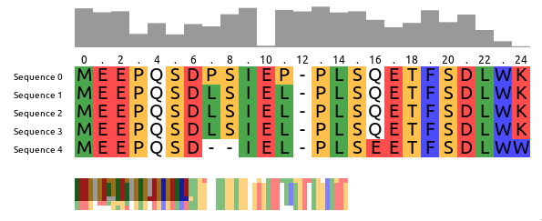
sequence: "MEEPQSDPSIEP-PLSQETFSDLWKLLPENNVLSPLPS-QA-VDDLMLSPDDLAQWLTED"
},
{
name: "seq.2",
sequence: "MEEPQSDLSIEL-PLSQETFSDLWKLLPPNNVLSTLPS-SDSIEE-LFLSENVAGWLEDP"
},
{
name: "seq.3",
sequence: "MEEPQSDLSIEL-PLSQETFSDLWKLLPPNNVLSTLPS-SDSIEE-LFLSENVAGWLEDP"
},
],
colorScheme: "zappo",
};
return (
Checkout the storybook at https://msa.bio.sh
Getting started
---------------
```jsx
import MSAViewer from '@plotly/react-msa-viewer';
function MSA() {
const options = {
sequences: [
{
name: "seq.1",
sequence: "MEEPQSDPSIEP-PLSQETFSDLWKLLPENNVLSPLPS-QA-VDDLMLSPDDLAQWLTED"
},
{
name: "seq.2",
sequence: "MEEPQSDLSIEL-PLSQETFSDLWKLLPPNNVLSTLPS-SDSIEE-LFLSENVAGWLEDP"
},
{
name: "seq.3",
sequence: "MEEPQSDLSIEL-PLSQETFSDLWKLLPPNNVLSTLPS-SDSIEE-LFLSENVAGWLEDP"
},
],
colorScheme: "zappo",
};
return (