weekStart has been removed. This directive uses the locale aware
[moment.js day of week](http://momentjs.com/docs/#/get-set/weekday/) to
determine which day is the first day of the week. If you would like a first
day of week that is not standard for the locale you can create a
[custom locale](http://momentjs.com/docs/#/customization/)
## Easier to control width
The width of the entire control is set in css, which you can easily override.
## Better localization support
This directive uses localized date formats when available. One exception is the title
of the month view - moment does not (yet) have a localized format for month and year.
# (Almost) Complete re-write
This project started as an AngularJS specific re-write of the [bootstrap-datetimepicker project](https://github.com/smalot/bootstrap-datetimepicker).
Only the CSS file from the bootstrap-datetimepicker project was re-used.
#Dependencies
Requires:
* AngularJS 1.2.26 or higher (1.0.x will not work)
* moment.js 2.8.3 or higher for date parsing and formatting
* bootstrap's glyphicons for arrows (Can be overridden in css)
optional:
* bootstrap's dropdown component (`dropdowns.less`)
#Testing
We use karma and jshint to ensure the quality of the code. The easiest way to run these checks is to use grunt:
```
npm install -g grunt-cli
npm install
```
The karma task will try to open Chrome as a browser in which to run the tests. Make sure this is available or change the configuration in test\test.config.js
#Usage
We use bower for dependency management. Add
```json
dependencies: {
"angular-bootstrap-datetimepicker": "latest"
}
```
To your bower.json file. Then run
```html
bower install
```
This will copy the angular-bootstrap-datetimepicker files into your components folder, along with its dependencies.
Add the css:
```html
```
Load the script files in your application:
```html
```
Add the date module as a dependency to your application module:
```html
var myAppModule = angular.module('MyApp', ['ui.bootstrap.datetimepicker'])
```
Apply the directive to your form elements:
```html
minuteStep minutes.
### dropdownSelector
When used within a Bootstrap dropdown and jQuery, the selector specified in dropdownSelector will toggle the dropdown when a date/time is selected.
**NOTE:** dropdownSelector **requires** jquery and bootstrap.js. If do not have these available do not specify this option. If you do, an error will
be logged and this option will be removed.
## Working with ng-model
The angular-bootstrap-datetimepicker directive requires ng-model and the picked date/time is automatically synchronized with the model value.
This directive also plays nicely with validation directives such as ng-required.
The angular-bootstrap-datetimepicker directive stores and expects the model value to be a standard javascript Date object.
## ng-required directive
If you apply the required directive to element then the form element is invalid until a date is picked.
Note: Remember that the ng-required directive must be explicitly set, i.e. to "true".
## Examples
### Inline component.
```html
Selected Date: {{ data.date | date:'yyyy-MM-dd HH:mm' }}
``` Display formatting of the date field is controlled by Angular filters. ### As a drop-down: ```html ``` In this example, the drop-down functionality is controlled by Twitter Bootstrap. ThedropdownSelector tells the datetimepicker which element is bound to the Twitter Bootstrap drop-down so
the drop-down is toggled closed after the user selectes a date/time.
### Drop-down component with associated input box.
```html
```
In this example, the drop-down functionality is controlled by Twitter Bootstrap.
The dropdownSelector tells the datetimepicker which element is bound to the Twitter Bootstrap drop-down so
the drop-down is toggled closed after the user selectes a date/time.
## I18N
All internationalization is handled by Moment.js, see Moment's documention for details.
# Screenshots
## Year view
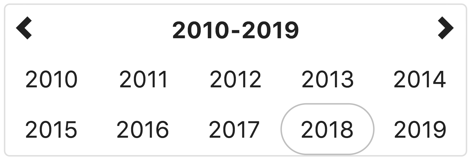
This view allows the user to select the year for the target date.
If the year view is the minView, the date will be set to midnight on the first day of the year
## Month view
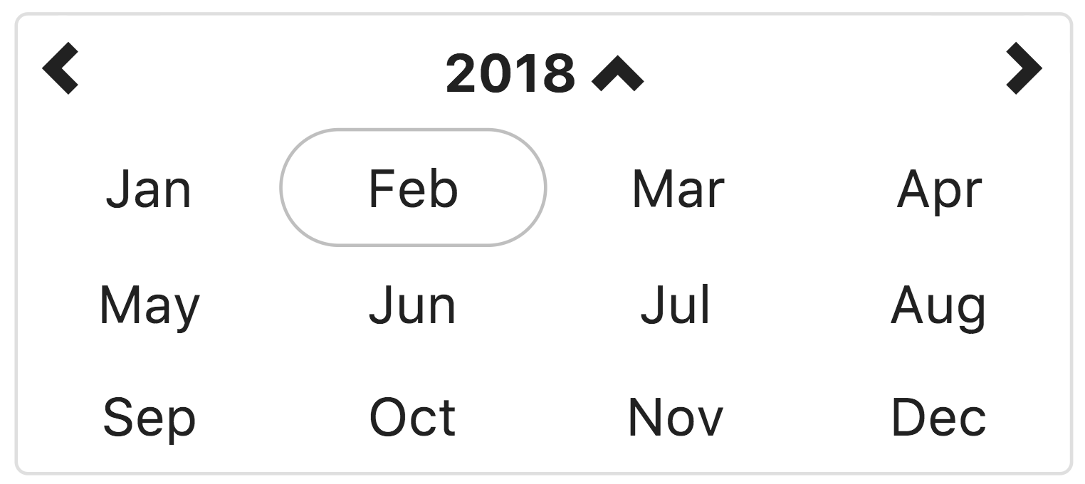
This view allows the user to select the month in the selected year.
If the month view is the minView, the date will be set to midnight on the first day of the month.
## Day view (Default)
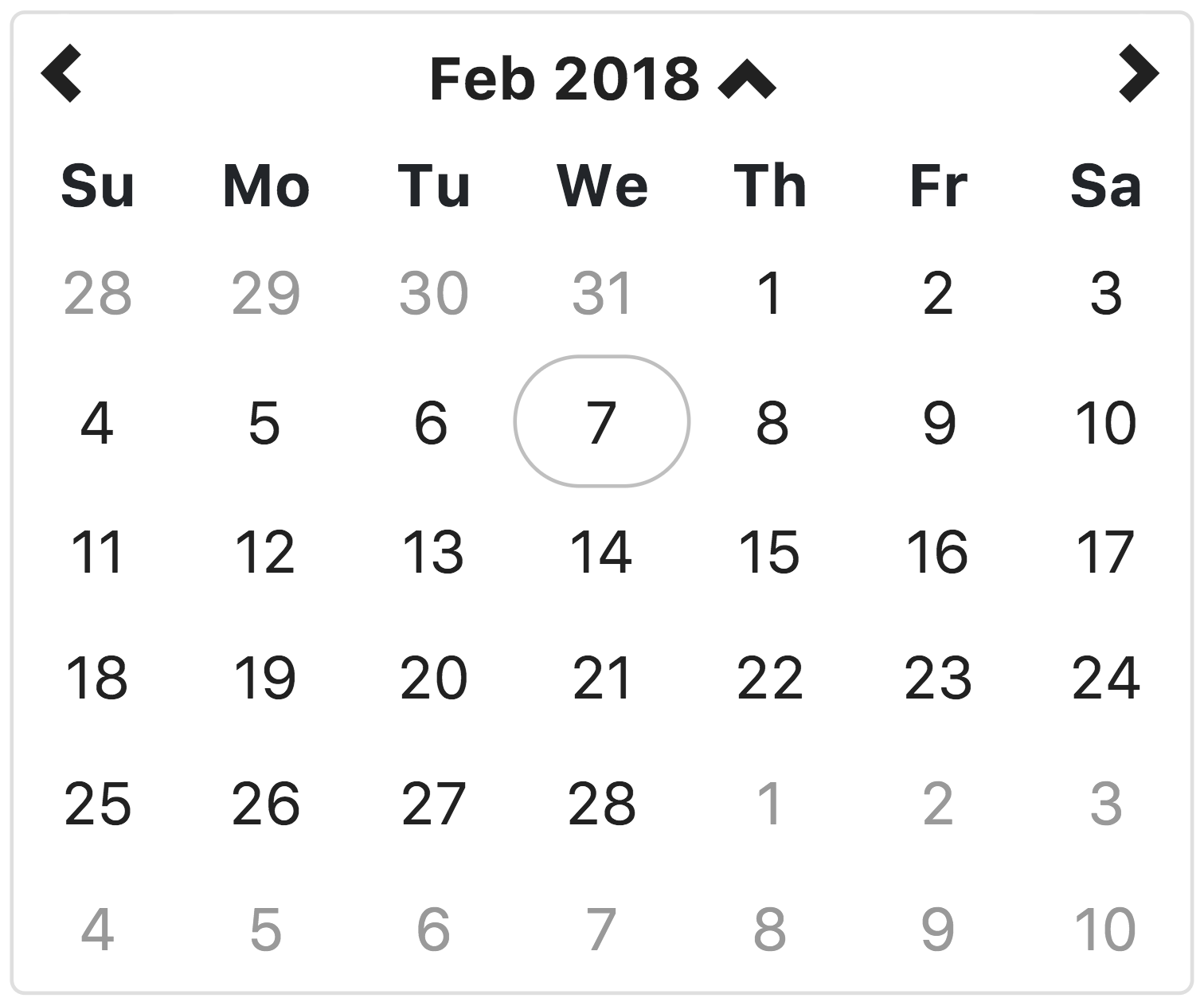
This view allows the user to select the the day of the month, in the selected month.
If the day view is the minView, the date will be set to midnight on the day selected.
## Hour view
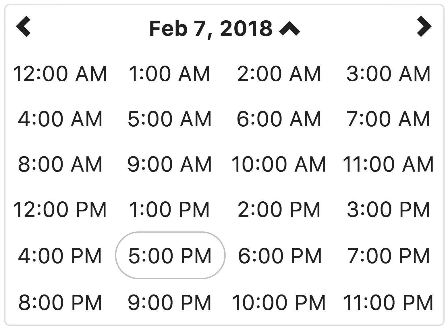
This view allows the user to select the hour of the day, on the selected day.
If the hour view is the minView, the date will be set to the beginning of the hour on the day selected.
## Minute view
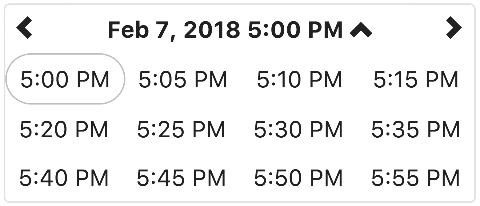
This view allows the user to select a specific time of day, in the selected hour.
By default, the time is displayed in 5 minute increments. The minuteStep property controls the increments of time displayed.
If the minute view is the minView, which is is by default, the date will be set to the beginning of the hour on the day selected.
## License
angular-bootstrap-datetimepicker is freely distributable under the terms of the [MIT license](LICENSE).
## Donating
Support this project and other work by Dale Lotts via [gittip][gittip-dalelotts].
[![Support via Gittip][gittip-badge]][gittip-dalelotts]
[gittip-badge]: https://rawgithub.com/twolfson/gittip-badge/master/dist/gittip.png
[gittip-dalelotts]: https://www.gittip.com/dalelotts/
[license-image]: http://img.shields.io/badge/license-MIT-blue.svg?style=flat
[license-url]: LICENSE
������������������������������������������������������������������������������������������������������������������������������������������������������������������������������������������������������������������������������������������������������������������������������������������������������������������������������������������������������������������������������������������������������������������������������������������������������������������������������������������������������������������������������package/LICENSE�������������������������������������������������������������������������������������000644 �000765 �000024 �0000002043 �12500277063�011535 �0����������������������������������������������������������������������������������������������������ustar�00����������������������������������������������������������������000000 �000000 ������������������������������������������������������������������������������������������������������������������������������������������������������������������������Copyright (c) 2013-2014 Dale Lotts
Permission is hereby granted, free of charge, to any person obtaining a copy of
this software and associated documentation files (the "Software"), to deal in
the Software without restriction, including without limitation the rights to
use, copy, modify, merge, publish, distribute, sublicense, and/or sell copies of
the Software, and to permit persons to whom the Software is furnished to do so,
subject to the following conditions:
The above copyright notice and this permission notice shall be included in all
copies or substantial portions of the Software.
THE SOFTWARE IS PROVIDED "AS IS", WITHOUT WARRANTY OF ANY KIND, EXPRESS OR
IMPLIED, INCLUDING BUT NOT LIMITED TO THE WARRANTIES OF MERCHANTABILITY, FITNESS
FOR A PARTICULAR PURPOSE AND NONINFRINGEMENT. IN NO EVENT SHALL THE AUTHORS OR
COPYRIGHT HOLDERS BE LIABLE FOR ANY CLAIM, DAMAGES OR OTHER LIABILITY, WHETHER
IN AN ACTION OF CONTRACT, TORT OR OTHERWISE, ARISING FROM, OUT OF OR IN
CONNECTION WITH THE SOFTWARE OR THE USE OR OTHER DEALINGS IN THE SOFTWARE.
���������������������������������������������������������������������������������������������������������������������������������������������������������������������������������������������������������������������������������������������������������������������������������������������������������������������������������������������������������������������������������������������������������������������������������������������������������������������������������������������package/Gruntfile.js��������������������������������������������������������������������������������000644 �000765 �000024 �0000004317 �12500277063�013033 �0����������������������������������������������������������������������������������������������������ustar�00����������������������������������������������������������������000000 �000000 ������������������������������������������������������������������������������������������������������������������������������������������������������������������������/*globals module, require, process */
/*jslint vars:true */
module.exports = function (grunt) {
'use strict';
// load all grunt tasks
require('matchdep').filterDev('grunt-*').forEach(grunt.loadNpmTasks);
// Default task.
grunt.registerTask('default', ['jshint', 'complexity', 'karma', 'coverage']);
var testConfig = function (configFile, customOptions) {
var options = {configFile: configFile, keepalive: true};
var travisOptions = process.env.TRAVIS && {
browsers: ['Firefox'],
reporters: ['dots', 'coverage'],
singleRun: true
};
return grunt.util._.extend(options, customOptions, travisOptions);
};
// Project configuration.
grunt.initConfig({
bump: {
options: {
files: ['package.json', 'bower.json', 'README.md', 'src/js/*.js', 'src/css/*.css'],
updateConfigs: [],
commit: false,
createTag: false,
push: false,
globalReplace: false
}
},
complexity: {
generic: {
src: ['src/**/*.js'],
options: {
breakOnErrors: false,
jsLintXML: 'complexity/report.xml', // create XML JSLint-like report
errorsOnly: false, // show only maintainability errors
cyclomatic: [3, 7, 12], // or optionally a single value, like 3
halstead: [8, 13, 20], // or optionally a single value, like 8
maintainability: 100
}
}
},
coverage: {
options: {
thresholds: {
'statements': 100,
'branches': 96.9,
'lines': 100,
'functions': 100
},
dir: 'coverage',
root: ''
}
},
karma: {
unit: {
options: testConfig('karma.conf.js', {
singleRun: true,
autoWatch: true,
keepalive: true,
browsers: ['Chrome']
})
}
},
jshint: {
files: ['src/**/*.js', 'test/**/*.js', 'demo/**/*.js'],
options: {
curly: true,
eqeqeq: true,
immed: true,
latedef: true,
newcap: true,
noarg: true,
sub: true,
boss: true,
eqnull: true,
globals: {}
}
}
});
};
�����������������������������������������������������������������������������������������������������������������������������������������������������������������������������������������������������������������������������������������������������������������������������������������������������������������package/gulpfile.js���������������������������������������������������������������������������������000644 �000765 �000024 �0000002070 �12500277063�012675 �0����������������������������������������������������������������������������������������������������ustar�00����������������������������������������������������������������000000 �000000 ������������������������������������������������������������������������������������������������������������������������������������������������������������������������/*globals require, __dirname */
/* jshint node:true */
'use strict';
var gulp = require('gulp');
var jshint = require('gulp-jshint');
var karma = require('karma').server;
var bump = require('gulp-bump');
var plato = require('gulp-plato');
var karmaConfig = __dirname + '/karma.conf.js';
var paths = require('./paths');
gulp.task('bump', function () {
return gulp.src(paths.bump)
.pipe(bump())
.pipe(gulp.dest('./'));
});
gulp.task('complexity', function () {
return gulp.src('src/**/*.js')
.pipe(plato('complexity'));
});
gulp.task('test', function (done) {
karma.start({
configFile: karmaConfig,
singleRun: true,
reporters: ['progress', 'coverage', 'threshold']
}, done);
});
gulp.task('tdd', function (done) {
gulp.watch(paths.all, ['lint']);
karma.start({
configFile: paths.karmaConfig
}, done);
});
gulp.task('lint', function () {
return gulp
.src(paths.lint)
.pipe(jshint())
.pipe(jshint.reporter('jshint-stylish'))
.pipe(jshint.reporter('fail'));
});
gulp.task('default', ['lint', 'complexity', 'test']);
������������������������������������������������������������������������������������������������������������������������������������������������������������������������������������������������������������������������������������������������������������������������������������������������������������������������������������������������������������������������������������������������������������������������������������������������������������������������package/karma.conf.js�������������������������������������������������������������������������������000644 �000765 �000024 �0000004014 �12500277063�013105 �0����������������������������������������������������������������������������������������������������ustar�00����������������������������������������������������������������000000 �000000 ������������������������������������������������������������������������������������������������������������������������������������������������������������������������/*globals require */
/* jshint node:true */
/**
* @license angular-bootstrap-datetimepicker
* (c) 2013 Knight Rider Consulting, Inc. http://www.knightrider.com
* License: MIT
*/
/**
*
* @author Dale "Ducky" Lotts
* @since 7/21/13
*/
var paths = require('./paths');
module.exports = function (config) {
'use strict';
config.set({
frameworks: ['jasmine'],
plugins: [
'karma-jasmine',
'karma-chrome-launcher',
'karma-firefox-launcher',
'karma-phantomjs-launcher',
'karma-coverage',
'karma-threshold-reporter'
],
files: paths.all,
// list of files to exclude
exclude: [],
preprocessors: {
'src/**/*.js': ['coverage']
},
// optionally, configure the reporter
coverageReporter: {
reporters: [
{type: 'json', dir: 'coverage/'},
{type: 'html', dir: 'coverage/'}
]
},
// test results reporter to use
// possible values: 'dots', 'progress', 'junit'
reporters: ['progress', 'coverage'],
// the configure thresholds
thresholdReporter: {
statements: 100,
branches: 96.9,
functions: 100,
lines: 100
},
// web server port
port: 9876,
// cli runner port
runnerPort: 9100,
// enable / disable colors in the output (reporters and logs)
colors: true,
// level of logging
// possible values: LOG_DISABLE || LOG_ERROR || LOG_WARN || LOG_INFO || LOG_DEBUG
logLevel: config.LOG_INFO,
// enable / disable watching file and executing tests whenever any file changes
autoWatch: false,
// Start these browsers, currently available:
// - Chrome
// - ChromeCanary
// - Firefox
// - Opera
// - Safari (only Mac)
// - PhantomJS
// - IE (only Windows)
browsers: ['Chrome'],
// If browser does not capture in given timeout [ms], kill it
captureTimeout: 60000,
// Continuous Integration mode
// if true, it capture browsers, run tests and exit
singleRun: false
});
};
��������������������������������������������������������������������������������������������������������������������������������������������������������������������������������������������������������������������������������������������������������������������������������������������������������������������������������������������������������������������������������������������������������������������������������������������������������������������������������������������������������������������package/paths.js������������������������������������������������������������������������������������000644 �000765 �000024 �0000001363 �12500277063�012211 �0����������������������������������������������������������������������������������������������������ustar�00����������������������������������������������������������������000000 �000000 ������������������������������������������������������������������������������������������������������������������������������������������������������������������������/* jshint node:true */
var bower = [
'bower_components/jquery/dist/jquery.js',
'bower_components/moment/moment.js',
'bower_components/moment/locale/*.js',
'bower_components/bootstrap/dist/js/bootstrap.js',
'bower_components/angular/angular.js',
'bower_components/angular-mocks/angular-mocks.js'
];
var sourceFiles = ['src/**/*.js'];
var testFiles = ['test/**/*.js'];
var miscFiles = ['karma.conf.js', 'demo/**/*.js'];
var bumpFiles = ['package.json', 'bower.json', 'README.md', 'src/js/*.js', 'src/css/*.css'];
module.exports = {
all: bower.concat(sourceFiles).concat(testFiles).concat(miscFiles),
app: sourceFiles,
bump: bumpFiles,
lint: ['gulpfile.js'].concat(sourceFiles).concat(testFiles).concat(miscFiles),
test: testFiles
};
�����������������������������������������������������������������������������������������������������������������������������������������������������������������������������������������������������������������������������������������������������������������������������package/contributing.md�����������������������������������������������������������������������������000644 �000765 �000024 �0000002227 �12500277063�013565 �0����������������������������������������������������������������������������������������������������ustar�00����������������������������������������������������������������000000 �000000 ������������������������������������������������������������������������������������������������������������������������������������������������������������������������Submitting Issues
=================
If you are submitting a bug, please create a [jsfiddle](http://jsfiddle.net/) demonstrating the issue.
Contributing code
=================
To contribute, fork the library and install grunt and dependencies. You need [node](http://nodejs.org/); use [nvm](https://github.com/creationix/nvm) or [nenv](https://github.com/ryuone/nenv) to install it.
```bash
git clone https://github.com/dalelotts/angular-bootstrap-datetimepicker.git
cd angular-bootstrap-datetimepicker
npm install -g grunt-cli
npm install
git checkout develop # all patches against develop branch, please!
grunt # this runs tests and jshint
```
Very important notes
====================
* **Pull pull requests to the `master` branch will be closed.** Please submit all pull requests to the `develop` branch.
* **Pull requests will not be merged without unit tests.**
* **Do not include the minified files in your pull request.**
Grunt tasks
===========
We use Grunt for managing the build. Here are some useful Grunt tasks:
* `grunt` The default task lints the code and runs the tests. You should make sure you do this before submitting a PR.�������������������������������������������������������������������������������������������������������������������������������������������������������������������������������������������������������������������������������������������������������������������������������������������������������������������������������������������������������������������������package/demo/demo-app.js����������������������������������������������������������������������������000644 �000765 �000024 �0000000323 �12500277063�013513 �0����������������������������������������������������������������������������������������������������ustar�00����������������������������������������������������������������000000 �000000 ������������������������������������������������������������������������������������������������������������������������������������������������������������������������/*globals angular */
angular.module('demo',
[
'demo.demoController',
'ui.bootstrap.datetimepicker'
])
.config([
function () {
'use strict';
// Configure the app here.
}
]);
�������������������������������������������������������������������������������������������������������������������������������������������������������������������������������������������������������������������������������������������������������������������������������������������������������������package/demo/demo-controller.js���������������������������������������������������������������������000644 �000765 �000024 �0000003412 �12500277063�015120 �0����������������������������������������������������������������������������������������������������ustar�00����������������������������������������������������������������000000 �000000 ������������������������������������������������������������������������������������������������������������������������������������������������������������������������/*globals angular, moment, $, console*/
angular.module('demo.demoController', [])
.controller('demoController', [
'$scope',
function ($scope) {
'use strict';
$scope.controllerName = 'demoController';
moment.locale('en');
$scope.data = {
guardians: [
{
name: 'Peter Quill',
dob: null
},
{
name: 'Groot',
dob: null
}
]
};
$scope.checkboxOnTimeSet = function () {
$scope.data.checked = false;
};
$scope.inputOnTimeSet = function (newDate) {
// If you are not using jQuery or bootstrap.js,
// this will throw an error.
// However, can write this function to take any
// action necessary once the user has selected a
// date/time using the picker
console.log(newDate);
$('#dropdown3').dropdown('toggle');
};
$scope.getLocale = function () {
return moment.locale();
};
$scope.setLocale = function (newLocale) {
moment.locale(newLocale);
};
$scope.guardianOnSetTime = function ($index, guardian, newDate, oldDate) {
console.log($index);
console.log(guardian.name);
console.log(newDate);
console.log(oldDate);
angular.element('#guardian' + $index).dropdown('toggle');
};
$scope.beforeRender = function ($dates) {
var index = Math.floor(Math.random() * $dates.length);
console.log(index);
$dates[index].selectable = false;
};
$scope.config = {
datetimePicker: {
startView: 'year'
}
};
$scope.configFunction = function configFunction() {
return {startView: 'month'};
};
}
]);
������������������������������������������������������������������������������������������������������������������������������������������������������������������������������������������������������������������������������������������������������package/demo/index.html�����������������������������������������������������������������������������000644 �000765 �000024 �0000034520 �12500277063�013456 �0����������������������������������������������������������������������������������������������������ustar�00����������������������������������������������������������������000000 �000000 ������������������������������������������������������������������������������������������������������������������������������������������������������������������������
Notice that you cannot enter a date with the keyboard.
dropdownSelector: '#dropdown1' to toggle the dropdown.
Default configuration
data-on-set-time='inputOnTimeSet()' to toggle the dropdown.
dropdownSelector: '#dropdown4' to toggle the dropdown.
This example shows a date picker that has the required attribute. Note that the user must type into the input to toggle dirty/pristine.
dropdownSelector: '#dropdown5' to toggle the dropdown.
Formatted Date: {{ data.linkCalendar | date:'medium' }}
startView: 'day' and minuteStep: 15
data-on-set-time='checkboxOnTimeSet()' to toggle visibility.
Formatted Date: {{ data.checkboxCalendar | date:'medium' }}
Click me to show/hide via ng-show:Default configuration
Formatted Date: {{ data.embeddedYear | date:'yyyy-MM-dd h:mm a' }}
This example shows a date picker that has the required attribute. Note that without an input, only validity is tracked by ngModel.
data-datetimepicker-config="config.datetimePicker"
which returns { startView: 'year' }
Formatted Date: {{ data.embeddedPropertyConfig | date:'yyyy-MM-dd h:mm a' }}
data-datetimepicker-config="configFunction()"
which returns { startView: 'month' }
Formatted Date: {{ data.embeddedFunctionConfig | date:'yyyy-MM-dd h:mm a' }}
data-on-set-time="guardianOnSetTime($index, guardian, newDate, oldDate)"
| ' + ' | {{ data.previousViewDate.display }} | ' + '' + ' | ||||
|---|---|---|---|---|---|---|
| {{ day }} | ' + '||||||
| ' + ' {{ dateObject.display }} ' + ' | ' + '||||||
| {{ dateObject.display }} | ' + '||||||
| element', function () { expect(jQuery('th[class*=left]', element).length).toBe(1); }); it('has a ` | ` that contains a element', function () {
expect(jQuery('th[class*=left] > i[class*=icon-arrow-left]', element).length).toBe(1);
});
it('has a `| element', function () {
expect(jQuery('th[class*=switch][colspan=5]', element).length).toBe(1);
});
it('has a ` | element', function () {
expect(jQuery('th[class*=right]', element).length).toBe(1);
});
it('has a ` | ` that contains a element', function () {
expect(jQuery('th[class*=right] > i[class*=icon-arrow-right]', element).length).toBe(1);
});
it('has a ` |
| |||||||||||||||||||||||||||||||||||||
|---|---|---|---|---|---|---|---|---|---|---|---|---|---|---|---|---|---|---|---|---|---|---|---|---|---|---|---|---|---|---|---|---|---|---|---|---|---|---|---|---|---|