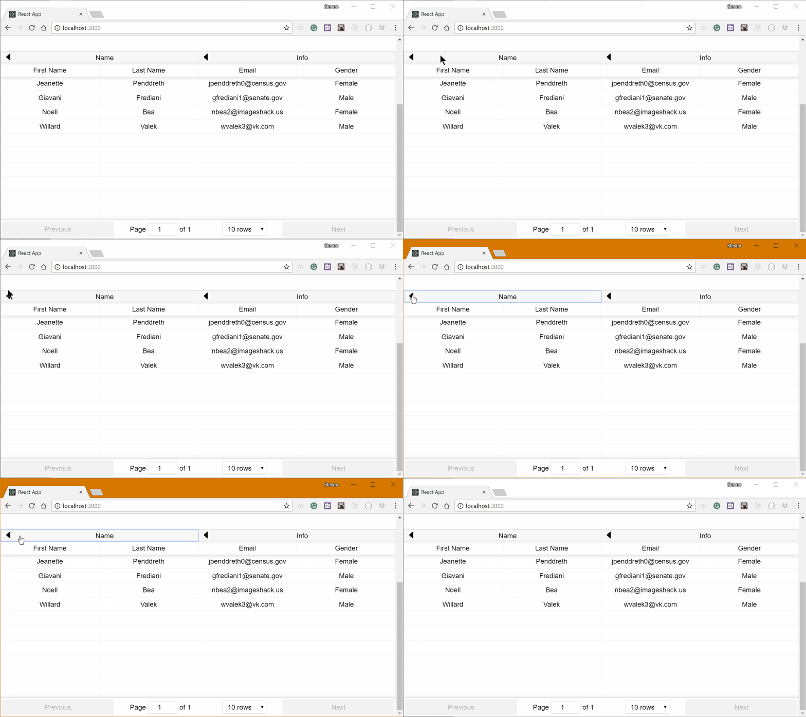
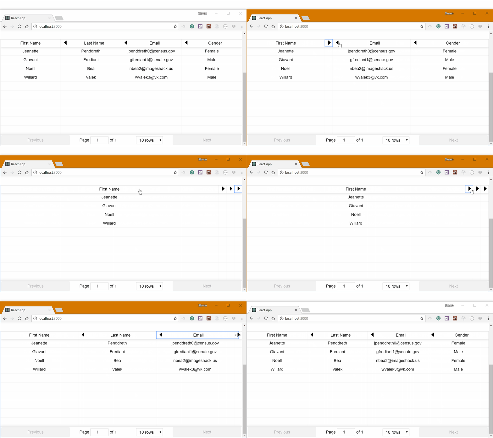
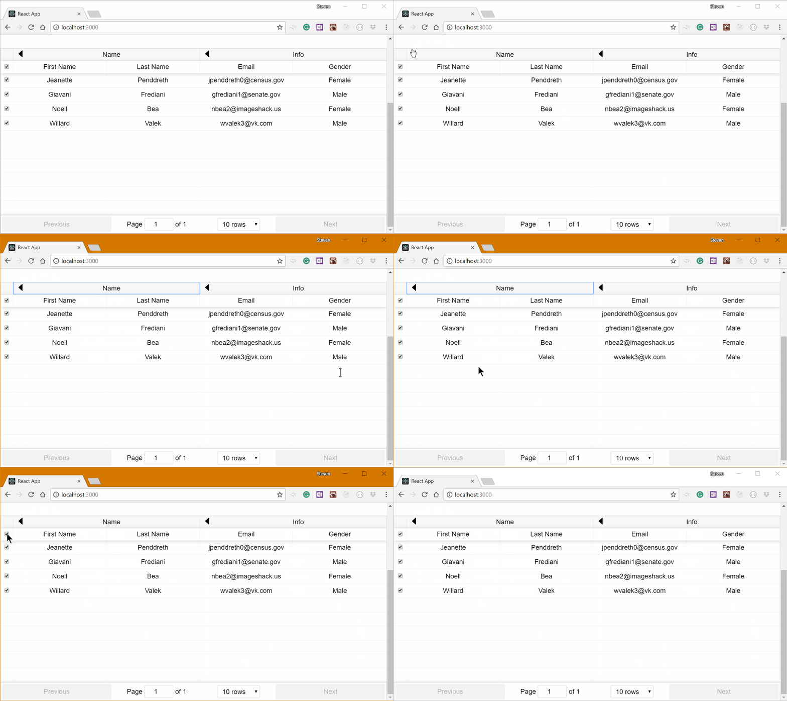
{"_id":"react-table-6","_rev":"2-c3c54da8c8d81535081993cc60ae7f6a","name":"react-table-6","dist-tags":{"latest":"6.11.0"},"versions":{"6.11.0":{"name":"react-table-6","version":"6.11.0","description":"A fast, lightweight, opinionated table and datagrid built on React","license":"MIT","homepage":"https://github.com/tannerlinsley/react-table/tree/v6#readme","repository":{"type":"git","url":"git+https://github.com/tannerlinsley/react-table.git"},"keywords":["react","table","react-table","datagrid"],"main":"lib/index.js","module":"es/index.js","scripts":{"build:cjs":"babel src --out-dir lib --source-maps inline --copy-files","build:es":"cross-env BABEL_ENV=es babel src --out-dir es --source-maps inline","build:umd":"cross-env BABEL_ENV=umd rollup -c","build:umd-min":"cross-env BABEL_ENV=umd NODE_ENV=production rollup -c","build:css":"rimraf react-table.css && stylus src/index.styl --compress -o react-table.css && yarn css:autoprefix","css:autoprefix":"postcss --use autoprefixer react-table.css -r","watch":"npm-run-all --parallel watch:*","watch:js":"onchange 'src/**/*.js' -i -- yarn build:cjs","watch:css":"onchange 'src/**/*.styl' -i -- yarn build:css","test":"eslint src","build":"npm-run-all build:*","docs":"yarn watch & cd docs && yarn && yarn start","docs:build":"yarn build && cd docs && yarn && yarn build"},"dependencies":{"classnames":"^2.2.5"},"peerDependencies":{"prop-types":"^15.5.0","react":"^16.x.x","react-dom":"^16.x.x"},"devDependencies":{"autoprefixer":"^6.7.0","babel-cli":"6.14.0","babel-eslint":"6.1.2","babel-plugin-external-helpers":"^6.22.0","babel-plugin-transform-class-properties":"^6.24.1","babel-plugin-transform-object-rest-spread":"^6.26.0","babel-preset-env":"^1.6.1","babel-preset-react":"^6.24.1","cross-env":"^5.1.4","eslint":"^4.1.1","eslint-config-react-tools":"^1.0.10","eslint-plugin-class-property":"^1.0.6","eslint-plugin-import":"^2.7.0","eslint-plugin-jsx-a11y":"^6.0.2","eslint-plugin-react":"^7.4.0","match-sorter":"^1.8.0","npm-run-all":"^4.1.2","onchange":"^3.0.2","postcss-cli":"^2.6.0","prop-types":"^15.7.2","react":"^16.3.2","react-dom":"^16.3.2","react-json-tree":"^0.10.9","rimraf":"^2.6.1","rollup":"^0.55.3","rollup-plugin-babel":"^3.0.3","rollup-plugin-commonjs":"^8.3.0","rollup-plugin-node-resolve":"^3.0.2","rollup-plugin-replace":"^2.0.0","rollup-plugin-uglify":"^3.0.0","standard":"^10.0.2","stylus":"^0.54.5"},"babel":{"env":{"development":{"presets":[["env",{"modules":"commonjs"}],"react"],"plugins":["transform-object-rest-spread","transform-class-properties"]},"es":{"presets":[["env",{"modules":false}],"react"],"plugins":["transform-object-rest-spread","transform-class-properties"]},"umd":{"presets":[["env",{"modules":false}],"react"],"plugins":["transform-object-rest-spread","transform-class-properties","external-helpers"]}}},"licenseText":"MIT License\n\nCopyright (c) 2016 Tanner Linsley\n\nPermission is hereby granted, free of charge, to any person obtaining a copy\nof this software and associated documentation files (the \"Software\"), to deal\nin the Software without restriction, including without limitation the rights\nto use, copy, modify, merge, publish, distribute, sublicense, and/or sell\ncopies of the Software, and to permit persons to whom the Software is\nfurnished to do so, subject to the following conditions:\n\nThe above copyright notice and this permission notice shall be included in all\ncopies or substantial portions of the Software.\n\nTHE SOFTWARE IS PROVIDED \"AS IS\", WITHOUT WARRANTY OF ANY KIND, EXPRESS OR\nIMPLIED, INCLUDING BUT NOT LIMITED TO THE WARRANTIES OF MERCHANTABILITY,\nFITNESS FOR A PARTICULAR PURPOSE AND NONINFRINGEMENT. IN NO EVENT SHALL THE\nAUTHORS OR COPYRIGHT HOLDERS BE LIABLE FOR ANY CLAIM, DAMAGES OR OTHER\nLIABILITY, WHETHER IN AN ACTION OF CONTRACT, TORT OR OTHERWISE, ARISING FROM,\nOUT OF OR IN CONNECTION WITH THE SOFTWARE OR THE USE OR OTHER DEALINGS IN THE\nSOFTWARE.\n","_id":"react-table-6@6.11.0","dist":{"shasum":"727de5d9f0357a35816a1bbc2e9c9868f8c5b2c4","integrity":"sha512-zO24J+1Qg2AHxtSNMfHeGW1dxFcmLJQrAeLJyCAENdNdwJt+YolDDtJEBdZlukon7rZeAdB3d5gUH6eb9Dn5Ug==","tarball":"https://registry.npmjs.org/react-table-6/-/react-table-6-6.11.0.tgz","fileCount":72,"unpackedSize":1419811,"npm-signature":"-----BEGIN PGP SIGNATURE-----\r\nVersion: OpenPGP.js v3.0.4\r\nComment: https://openpgpjs.org\r\n\r\nwsFcBAEBCAAQBQJd1Aw+CRA9TVsSAnZWagAAbe0P/2f7BDWRrV+Gw7wTaIY0\nqHnoKYM9mSJBUfs37DDG4zjeqzoN/xfdm8aTJncTWz7dlIMuG6TFxoH/NACq\nGmKR1+u0wZwL4UfQTYjA2pp14sBtaQDB4ZGtHPoQOLlIKRC3KQM4xATzV5kb\n9Go4/atIuILhUmvw+y40GAezAKWu0pR/R3bj5bvFwty5WoI6aWxirvBwlNwF\nAf2bqJ2FG4wV9cRyPmSbsX4WOi7KOQx25re6LDhl08h5uFHMxP5J6oZXtAsR\nY2m9zEbU7OOicog6YHgQiTIK6jABXrpdNR5hy9dA1hr8bLlRTOQPUNn63lig\nIPfAEySTEkw/d4DEZLeWRAc0ZHeJ5dCFs74iy0uf7CZVnHJJW7iQGc4mBkiL\nfIgqaPSL54Czt17HN7m3+HSkXq18ge/3dVNIGJRj0/KmxMdhBnlbxsSPnnxT\npjbDN8561WaKknMV1ApMoY6OkPAlr7Zfk8np7dQ/+fWkMNesaYnGVlGNEr2t\naPmekyN+eFU+25ECDH2/3Ngl9vht5ygd2hFQxnL2ppV2rlmVqvSJHToUn16o\n8oTrONFKaHUN4NKm469d8Z2+T9HHr4FTAU717rUQwFsL4uS9/20ybBkWL8gV\niqBL2IoWEBi/CyiWFahP/YWPnjEf49Yf6Pd8tAqFfxiavKx3AQ5btcoJzGvK\nKy1k\r\n=uTh1\r\n-----END PGP SIGNATURE-----\r\n","signatures":[{"keyid":"SHA256:jl3bwswu80PjjokCgh0o2w5c2U4LhQAE57gj9cz1kzA","sig":"MEUCIQCj6qPOWPX4m9xm6PjgFYlFUtKzBn15w6VDgQe7epS2mwIgaxM2uUh9Td10oqJfFjo44wQqV5cGDv8fnlWxHwuQijo="}]},"maintainers":[{"name":"kizu","email":"kizmarh@ya.ru"}],"_npmUser":{"name":"kizu","email":"kizmarh@ya.ru"},"directories":{},"_npmOperationalInternal":{"host":"s3://npm-registry-packages","tmp":"tmp/react-table-6_6.11.0_1574177853970_0.9092355037462998"},"_hasShrinkwrap":false}},"time":{"created":"2019-11-19T15:37:33.969Z","6.11.0":"2019-11-19T15:37:34.148Z","modified":"2022-05-15T05:36:44.225Z"},"maintainers":[{"email":"kizmarh@ya.ru","name":"kizu"},{"email":"tannerlinsley@gmail.com","name":"tannerlinsley"}],"description":"A fast, lightweight, opinionated table and datagrid built on React","homepage":"https://github.com/tannerlinsley/react-table/tree/v6#readme","keywords":["react","table","react-table","datagrid"],"repository":{"type":"git","url":"git+https://github.com/tannerlinsley/react-table.git"},"license":"MIT","readme":"<div style=\"text-align:center;\">\n  <a href=\"https://github.com/tannerlinsley/react-table\" target=\"\\_parent\"><img src=\"https://github.com/react-tools/media/raw/master/logo-react-table.png\" alt=\"React Table Logo\" style=\"width:450px;\"/></a>\n</div>\n\n# React Table v6\n\n`react-table` is a **lightweight, fast and extendable datagrid** built for React\n\n<a href=\"https://travis-ci.org/tannerlinsley/react-table\" target=\"\\_parent\">\n  <img alt=\"\" src=\"https://travis-ci.org/tannerlinsley/react-table.svg?branch=v6\" />\n</a>\n<a href=\"https://npmjs.com/package/react-table\" target=\"\\_parent\">\n  <img alt=\"\" src=\"https://img.shields.io/npm/dm/react-table.svg\" />\n</a>\n<a href=\"https://spectrum.chat/react-table\">\n  <img alt=\"Join the community on Spectrum\" src=\"https://withspectrum.github.io/badge/badge.svg\" />\n</a>\n<a href=\"https://github.com/react-tools/react-table\" target=\"\\_parent\">\n  <img alt=\"\" src=\"https://img.shields.io/github/stars/react-tools/react-table.svg?style=social&label=Star\" />\n</a>\n<a href=\"https://twitter.com/tannerlinsley\" target=\"\\_parent\">\n  <img alt=\"\" src=\"https://img.shields.io/twitter/follow/tannerlinsley.svg?style=social&label=Follow\" />\n</a>\n<a href=\"https://cash.me/$tannerlinsley\" target=\"\\_parent\">\n  <img alt=\"\" src=\"https://img.shields.io/badge/%24-Donate-brightgreen.svg\" />\n</a>\n\n<br />\n<br />\n\n## v6\n\nThis is a v6 of react-table, due to the incredibly massive differences from v7 this branch exists as a way to access its docs and source. I do not intend on offering any long-term support for it. If you intend to keep using v6, I recommend maintaining your own fork of the library and keeping it up to date for your version of React. Otherwise, look into using [the most recent version](https://github.com/tannerlinsley/react-table) of react-table!\n\n## Features\n\n- Lightweight at 11kb (and just 2kb more for styles)\n- Fully customizable (JSX, templates, state, styles, callbacks)\n- Client-side & Server-side pagination\n- Multi-sort\n- Filters\n- Pivoting & Aggregation\n- Minimal design & easily themeable\n- Fully controllable via optional props and callbacks\n- <a href=\"https://medium.com/@tannerlinsley/why-i-wrote-react-table-and-the-problems-it-has-solved-for-nozzle-others-445c4e93d4a8#.axza4ixba\" target=\"\\_parent\">\"Why I wrote React Table and the problems it has solved for Nozzle.io\"</a> by Tanner Linsley\n\n## CodeSandbox Examples\n\n- [100k-rows-aggregation](https://codesandbox.io/s/github/tannerlinsley/react-table/tree/master/archives/v6-examples/react-table-100k-rows-aggregation)\n- [cell-renderers](https://codesandbox.io/s/github/tannerlinsley/react-table/tree/master/archives/v6-examples/react-table-cell-renderers)\n- [controlled-table](https://codesandbox.io/s/github/tannerlinsley/react-table/tree/master/archives/v6-examples/react-table-controlled-table)\n- [custom-column-widths](https://codesandbox.io/s/github/tannerlinsley/react-table/tree/master/archives/v6-examples/react-table-custom-column-widths)\n- [custom-component-props](https://codesandbox.io/s/github/tannerlinsley/react-table/tree/master/archives/v6-examples/react-table-custom-component-props)\n- [custom-expander-position](https://codesandbox.io/s/github/tannerlinsley/react-table/tree/master/archives/v6-examples/react-table-custom-expander-position)\n- [custom-filtering](https://codesandbox.io/s/github/tannerlinsley/react-table/tree/master/archives/v6-examples/react-table-custom-filtering)\n- [custom-no-data-text](https://codesandbox.io/s/github/tannerlinsley/react-table/tree/master/archives/v6-examples/react-table-custom-no-data-text)\n- [custom-sorting](https://codesandbox.io/s/github/tannerlinsley/react-table/tree/master/archives/v6-examples/react-table-custom-sorting)\n- [default-sorting](https://codesandbox.io/s/github/tannerlinsley/react-table/tree/master/archives/v6-examples/react-table-default-sorting)\n- [editable-content](https://codesandbox.io/s/github/tannerlinsley/react-table/tree/master/archives/v6-examples/react-table-editable-content)\n- [fixed-header-vertical-scroll](https://codesandbox.io/s/github/tannerlinsley/react-table/tree/master/archives/v6-examples/react-table-fixed-header-vertical-scroll)\n- [footers](https://codesandbox.io/s/github/tannerlinsley/react-table/tree/master/archives/v6-examples/react-table-footers)\n- [functional-rendering](https://codesandbox.io/s/github/tannerlinsley/react-table/tree/master/archives/v6-examples/react-table-functional-rendering)\n- [multiple-pagination-bars](https://codesandbox.io/s/github/tannerlinsley/react-table/tree/master/archives/v6-examples/react-table-multiple-pagination-bars)\n- [pivoting-and-aggregation](https://codesandbox.io/s/github/tannerlinsley/react-table/tree/master/archives/v6-examples/react-table-pivoting-and-aggregation)\n- [pivoting-options](https://codesandbox.io/s/github/tannerlinsley/react-table/tree/master/archives/v6-examples/react-table-pivoting-options)\n- [pivoting-sub-components](https://codesandbox.io/s/github/tannerlinsley/react-table/tree/master/archives/v6-examples/react-table-pivoting-sub-components)\n- [server-side-data](https://codesandbox.io/s/github/tannerlinsley/react-table/tree/master/archives/v6-examples/react-table-server-side-data)\n- [simple-table](https://codesandbox.io/s/github/tannerlinsley/react-table/tree/master/archives/v6-examples/react-table-simple-table)\n- [sub-components](https://codesandbox.io/s/github/tannerlinsley/react-table/tree/master/archives/v6-examples/react-table-sub-components)\n\n## Versions\n\n- [The most recent version](https://github.com/tannerlinsley/react-table)\n- This documentation is for version 6 of react-table.\n- [View the Changelog](https://github.com/react-tools/react-table/blob/master/CHANGELOG.md)\n- Previous versions:\n  - [5.x.x Readme](https://github.com/react-tools/react-table/blob/ad7d31cd3978eb45da7c6194dbab93c1e9a8594d/README.md)\n\n## Sponsors\n\n**React Table v7** is mostly planned and I (@tannerlinsley) am looking for Patreon support to make it a reality. It will require a decent time commitment on my part to not only implement it, but also help people migrate and continue to maintain it. If you would like to contribute to my Patreon goal for v7 and beyond, [visit my Patreon and help me out!](https://patreon.com/tannerlinsley).\n\n<table>\n  <tbody>\n    <tr>\n      <td align=\"center\" valign=\"middle\">\n        <a href=\"https://patreon.com/tannerlinsley\" target=\"_blank\">\n          <img src=\"https://raw.githubusercontent.com/tannerlinsley/files/master/images/patreon/platinum.png\">\n        </a>\n      </td>\n      <td align=\"center\" valign=\"middle\">\n        <a href=\"https://tryretool.com/?utm_source=sponsor&utm_campaign=react_table\" target=\"_blank\">\n          <img src=\"https://raw.githubusercontent.com/tannerlinsley/files/master/images/patreon/sponsor-retool.png\">\n        </a>\n      </td>\n    </tr>\n  </tbody>\n</table>\n\n<table>\n  <tbody>\n    <tr>\n      <td align=\"center\" valign=\"middle\">\n        <a href=\"https://patreon.com/tannerlinsley\" target=\"_blank\">\n          <img src=\"https://raw.githubusercontent.com/tannerlinsley/files/master/images/patreon/gold.png\">\n        </a>\n      </td>\n      <td align=\"center\" valign=\"middle\">\n        <a href=\"https://nozzle.io\" target=\"_blank\">\n          <img width=\"300\" src=\"https://nozzle.io/img/logo-blue.png\">\n        </a>\n      </td>\n      <td align=\"center\" valign=\"middle\">\n        <a href=\"https://zappi.io/web\" target=\"_blank\">\n          <img width=\"300\" src=\"https://raw.githubusercontent.com/tannerlinsley/files/master/images/patreon/sponsor-zappi.png\">\n        </a>\n      </td>\n    </tr>\n  </tbody>\n</table>\n\n<table>\n  <tbody>\n    <tr>\n      <td align=\"center\" valign=\"middle\">\n        <a href=\"https://patreon.com/tannerlinsley\" target=\"_blank\">\n          <img src=\"https://raw.githubusercontent.com/tannerlinsley/files/master/images/patreon/silver.png\">\n        </a>\n      </td>\n      <td align=\"center\" valign=\"middle\">\n        <a href=\"https://tryretool.com/?utm_source=sponsor&utm_campaign=react_table\" target=\"_blank\">\n          <img src=\"https://raw.githubusercontent.com/tannerlinsley/files/master/images/patreon/silver-placeholder.png\">\n        </a>\n      </td>\n      <td align=\"center\" valign=\"middle\">\n        <a href=\"https://tryretool.com/?utm_source=sponsor&utm_campaign=react_table\" target=\"_blank\">\n          <img src=\"https://raw.githubusercontent.com/tannerlinsley/files/master/images/patreon/silver-placeholder.png\">\n        </a>\n      </td>\n      <td align=\"center\" valign=\"middle\">\n        <a href=\"https://tryretool.com/?utm_source=sponsor&utm_campaign=react_table\" target=\"_blank\">\n          <img src=\"https://raw.githubusercontent.com/tannerlinsley/files/master/images/patreon/silver-placeholder.png\">\n        </a>\n      </td>\n    </tr>\n  </tbody>\n</table>\n\n**React Table v7** is mostly planned and I (@tannerlinsley) am looking for Patreon support to make it a reality. It will require a decent time commitment on my part to not only implement it, but also help people migrate and maintain it. If you would like to contribute to my Patreon goal for v7, [visit my Patreon and help me out!](https://patreon.com/tannerlinsley). Gold\n\n## Table of Contents\n\n- [Installation](#installation)\n- [Example](#example)\n- [Data](#data)\n- [Props](#props)\n- [Columns](#columns)\n- [Column Header Groups](#column-header-groups)\n- [Custom Cell and Header and Footer Rendering](#custom-cell-header-and-footer-rendering)\n- [Styles](#styles)\n- [Custom Props](#custom-props)\n- [Pivoting and Aggregation](#pivoting-and-aggregation)\n- [Sub Tables and Sub Components](#sub-tables-and-sub-components)\n- [Server-side Data](#server-side-data)\n- [Fully Controlled Component](#fully-controlled-component)\n- [Functional Rendering](#functional-rendering)\n- [Multi-Sort](#multi-sort)\n- [Filtering](#filtering)\n- [Component Overrides](#component-overrides)\n- [HOC Extensions](#hoc-extensions)\n- [Contributing](#contributing)\n- [Scripts](#scripts)\n- [Used By](#used-by)\n\n## Installation\n\nNote that this installation guide uses the `react-table-6` version of the package; while you could access the earier versions of the package by `react-table` name, in order to provide a better migration workflow from v6 to the most recent version of the 6.x.x exists as `react-table-6`.\n\n1.  Install React Table as a dependency\n\n```bash\n# Yarn\n$ yarn add react-table-6\n\n# NPM\n$ npm install react-table-6\n```\n\n## Usage\n\n2.  Import the `react-table-6` module\n\n```javascript\n// ES6\nimport ReactTable from 'react-table-6'\n// ES5\nvar ReactTable = require('react-table-6').default\n```\n\n3.  Import styles by including `react-table.css`\n\n```javascript\n// JS (Webpack)\nimport 'react-table-6/react-table.css'\n// Old-school\n<link rel=\"stylesheet\" href=\"node_modules/react-table-6/react-table.css\">\n```\n\nSee the example below for further usage.\n\n##### CDN\n\n```html\n<!-- CSS -->\n<link\n  rel=\"stylesheet\"\n  href=\"https://unpkg.com/react-table-6@latest/react-table.css\"\n/>\n\n<!-- JS -->\n<script src=\"https://unpkg.com/react-table-6@latest/react-table.js\"></script>\n<script src=\"https://unpkg.com/react-table-6@latest/react-table.min.js\"></script>\n\n<script>\n  var ReactTable = window.ReactTable.default\n</script>\n```\n\n## Example\n\n```javascript\nimport ReactTable from 'react-table-6'\nimport 'react-table-6/react-table.css'\n\nrender() {\n  const data = [{\n    name: 'Tanner Linsley',\n    age: 26,\n    friend: {\n      name: 'Jason Maurer',\n      age: 23,\n    }\n  },{\n    ...\n  }]\n\n  const columns = [{\n    Header: 'Name',\n    accessor: 'name' // String-based value accessors!\n  }, {\n    Header: 'Age',\n    accessor: 'age',\n    Cell: props => <span className='number'>{props.value}</span> // Custom cell components!\n  }, {\n    id: 'friendName', // Required because our accessor is not a string\n    Header: 'Friend Name',\n    accessor: d => d.friend.name // Custom value accessors!\n  }, {\n    Header: props => <span>Friend Age</span>, // Custom header components!\n    accessor: 'friend.age'\n  }]\n\n  return <ReactTable\n    data={data}\n    columns={columns}\n  />\n}\n```\n\n## Data\n\nSimply pass the `data` prop anything that resembles an array or object. Client-side sorting and pagination are built in, and your table will update gracefully as you change any props. [Server-side data](#server-side-data) is also supported!\n\n```javascript\n<ReactTable\n  data={[...]}\n/>\n```\n\n**Pro Tip: Using the `resolveData` prop** - Any time the `data` prop value changes (using a `===` comparison), the table will update, but sometimes you need to materialize, alter, or shape this data before it enters the table. To do this, you can use the `resolveData` prop! It receives the `data` prop as the only parameter and returns the resolved data.\n\n```javascript\n<ReactTable\n  data={myData} // The data prop should be immutable and only change when you want to update the table\n  resolveData={data => data.map(row => row)} // But you can break immutability here because `resolveData` runs when the `data` prop changes!\n/>\n```\n\n## Props\n\nThese are all of the available props (and their default values) for the main `<ReactTable />` component.\n\n```javascript\n{\n  // General\n  data: [],\n  resolveData: data => resolvedData,\n  loading: false,\n  showPagination: true,\n  showPaginationTop: false,\n  showPaginationBottom: true\n  showPageSizeOptions: true,\n  pageSizeOptions: [5, 10, 20, 25, 50, 100],\n  defaultPageSize: 20,\n  minRows: undefined, // controls the minimum number of rows to display - default will be `pageSize`\n  // NOTE: if you set minRows to 0 then you get rid of empty padding rows BUT your table formatting will also look strange when there are ZERO rows in the table\n  showPageJump: true,\n  collapseOnSortingChange: true,\n  collapseOnPageChange: true,\n  collapseOnDataChange: true,\n  freezeWhenExpanded: false,\n  sortable: true,\n  multiSort: true,\n  resizable: true,\n  filterable: false,\n  defaultSortDesc: false,\n  defaultSorted: [],\n  defaultFiltered: [],\n  defaultResized: [],\n  defaultExpanded: {},\n  defaultFilterMethod: (filter, row, column) => {\n    const id = filter.pivotId || filter.id\n    return row[id] !== undefined ? String(row[id]).startsWith(filter.value) : true\n  },\n  defaultSortMethod: (a, b, desc) => {\n    // force null and undefined to the bottom\n    a = a === null || a === undefined ? '' : a\n    b = b === null || b === undefined ? '' : b\n    // force any string values to lowercase\n    a = typeof a === 'string' ? a.toLowerCase() : a\n    b = typeof b === 'string' ? b.toLowerCase() : b\n    // Return either 1 or -1 to indicate a sort priority\n    if (a > b) {\n      return 1\n    }\n    if (a < b) {\n      return -1\n    }\n    // returning 0, undefined or any falsey value will use subsequent sorts or\n    // the index as a tiebreaker\n    return 0\n  },\n  PadRowComponent: () => <span>&nbsp;</span>, // the content rendered inside of a padding row\n\n  // Controlled State Overrides (see Fully Controlled Component section)\n  page: undefined,\n  pageSize: undefined,\n  sorted: [],\n  filtered: [],\n  resized: [],\n  expanded: {},\n\n  // Controlled State Callbacks\n  onPageChange: undefined,\n  onPageSizeChange: undefined,\n  onSortedChange: undefined,\n  onFilteredChange: undefined,\n  onResizedChange: undefined,\n  onExpandedChange: undefined,\n\n  // Pivoting\n  pivotBy: undefined,\n\n  // Key Constants\n  pivotValKey: '_pivotVal',\n  pivotIDKey: '_pivotID',\n  subRowsKey: '_subRows',\n  aggregatedKey: '_aggregated',\n  nestingLevelKey: '_nestingLevel',\n  originalKey: '_original',\n  indexKey: '_index',\n  groupedByPivotKey: '_groupedByPivot',\n\n  // Server-side callbacks\n  onFetchData: () => null,\n\n  // Classes\n  className: '',\n  style: {},\n\n  // Component decorators\n  getProps: () => ({}),\n  getTableProps: () => ({}),\n  getTheadGroupProps: () => ({}),\n  getTheadGroupTrProps: () => ({}),\n  getTheadGroupThProps: () => ({}),\n  getTheadProps: () => ({}),\n  getTheadTrProps: () => ({}),\n  getTheadThProps: () => ({}),\n  getTheadFilterProps: () => ({}),\n  getTheadFilterTrProps: () => ({}),\n  getTheadFilterThProps: () => ({}),\n  getTbodyProps: () => ({}),\n  getTrGroupProps: () => ({}),\n  getTrProps: () => ({}),\n  getTdProps: () => ({}),\n  getTfootProps: () => ({}),\n  getTfootTrProps: () => ({}),\n  getTfootTdProps: () => ({}),\n  getPaginationProps: () => ({}),\n  getLoadingProps: () => ({}),\n  getNoDataProps: () => ({}),\n  getResizerProps: () => ({}),\n\n  // Custom pagination rendering\n  renderPageJump: ({ onChange, value, onBlur, onKeyPress, inputType, pageJumpText }) => component,\n  renderCurrentPage: page => component,\n  renderTotalPagesCount: pages => component,\n  renderPageSizeOptions: ({\n      pageSize,\n      pageSizeOptions,\n      rowsSelectorText,\n      onPageSizeChange,\n      rowsText,\n    }) => component\n\n  // Global Column Defaults\n  // To override only some values, import { ReactTableDefaults } from 'react-table-6'\n  // and construct your overrides (e.g. {...ReactTableDefaults.column, className: 'react-table-cell'})\n  column: {\n    // Renderers\n    Cell: undefined,\n    Header: undefined,\n    Footer: undefined,\n    Aggregated: undefined,\n    Pivot: undefined,\n    PivotValue: undefined,\n    Expander: undefined,\n    Filter: undefined,\n    // Standard options\n    sortable: undefined, // use table default\n    resizable: undefined, // use table default\n    filterable: undefined, // use table default\n    show: true,\n    minWidth: 100,\n    // Cells only\n    className: '',\n    style: {},\n    getProps: () => ({}),\n    // Headers only\n    headerClassName: '',\n    headerStyle: {},\n    getHeaderProps: () => ({})\n    // Footers only\n    footerClassName: '',\n    footerStyle: {},\n    getFooterProps: () => ({}),\n    filterAll: false,\n    filterMethod: undefined,\n    sortMethod: undefined,\n    defaultSortDesc: undefined,\n  },\n\n  // Global Expander Column Defaults\n  // To override only some values, import { ReactTableDefaults } from 'react-table-6\n  // and construct your overrides (e.g. {...ReactTableDefaults.expanderDefaults, sortable: true})\n  expanderDefaults: {\n    sortable: false,\n    resizable: false,\n    filterable: false,\n    width: 35\n  },\n\n  // Global Pivot Column Defaults\n  pivotDefaults: {},\n\n  // Text\n  previousText: 'Previous',\n  nextText: 'Next',\n  loadingText: 'Loading...',\n  noDataText: 'No rows found',\n  pageText: 'Page',\n  ofText: 'of',\n  rowsText: 'rows',\n\n  // Accessibility Labels\n  pageJumpText: 'jump to page',\n  rowsSelectorText: 'rows per page',\n}\n```\n\nYou can easily override the core defaults like so:\n\n```javascript\nimport { ReactTableDefaults } from 'react-table-6'\n\nObject.assign(ReactTableDefaults, {\n  defaultPageSize: 10,\n  minRows: 3\n  // etc...\n})\n```\n\nOr just define them as props\n\n```javascript\n<ReactTable\n  defaultPageSize={10}\n  minRows={3}\n  // etc...\n/>\n```\n\n## Columns\n\n`<ReactTable />` requires a `columns` prop, which is an array of objects containing the following properties\n\n```javascript\n[{\n  // Renderers - For more information, see \"Renderers\" section below\n  Cell: JSX | String | Function // Used to render a standard cell, defaults to the accessed value\n  Header: JSX | String | Function // Used to render the header of a column or column group\n  Footer: JSX | String | Function // Used to render the footer of a column\n  Filter: JSX | cellInfo => ( // Used to render the filter UI of a filter-enabled column\n    <select onChange={event => onFiltersChange(event.target.value)} value={filter ? filter.value : ''}></select>\n    // The value passed to onFiltersChange will be the value passed to filter.value of the filterMethod\n  )\n  Aggregated: JSX | String | Function // Used to render aggregated cells. Defaults to a comma separated list of values.\n  Pivot: JSX | String | Function | cellInfo => ( // Used to render a pivoted cell\n    <span>\n      <Expander /><PivotValue /> // By default, will utilize the the PivotValue and Expander components at run time\n    </span>\n  ),\n  PivotValue: JSX | String | Function // Used to render the value inside of a Pivot cell\n  Expander: JSX | String | Function // Used to render the expander in both Pivot and Expander cells\n\n  // General\n  accessor: 'propertyName', // or Accessor eg. (row) => row.propertyName (see \"Accessors\" section for more details)\n  id: 'myProperty', // Conditional - A unique ID is required if the accessor is not a string or if you would like to override the column name used in server-side calls\n  sortable: boolean, // Overrides the table option\n  resizable: boolean, // Overrides the table option\n  filterable: boolean, // Overrides the table option\n  show: true, // can be used to hide a column\n  width: undefined, // A hardcoded width for the column. This overrides both min and max width options\n  minWidth: 100, // A minimum width for this column. If there is extra room, column will flex to fill available space (up to the max-width, if set)\n  maxWidth: undefined, // A maximum width for this column.\n\n  // Special\n  pivot: false,\n  // Turns this column into a special column for specifying pivot position in your column definitions.\n  // The `pivotDefaults` options will be applied on top of this column's options.\n  // It will also let you specify rendering of the header (and header group if this special column is placed in the `columns` option of another column)\n  expander: false,\n  // Turns this column into a special column for specifying expander position and options in your column definitions.\n  // The `expanderDefaults` options will be applied on top of this column's options.\n  // It will also let you specify rendering of the header (and header group if this special column is placed in the `columns` option of another column) and\n  // the rendering of the expander itself via the `Expander` property\n\n  // Cell Options\n  className: '', // Set the classname of the `td` element of the column\n  style: {}, // Set the style of the `td` element of the column\n  // Header & HeaderGroup Options\n  headerClassName: '', // Set the classname of the `th` element of the column\n  headerStyle: {}, // Set the style of the `th` element of the column\n  getHeaderProps: (state, rowInfo, column, instance) => ({}), // a function that returns props to decorate the `th` element of the column\n\n  // Header Groups only\n  columns: [...], // See Header Groups section below\n\n  // Footer\n  footerClassName: '', // Set the classname of the `td` element of the column's footer\n  footerStyle: {}, // Set the style of the `td` element of the column's footer\n  getFooterProps: (state, rowInfo, column, instance) => ({}), // A function that returns props to decorate the `td` element of the column's footer\n\n  // Filtering\n  filterMethod: (filter, row || rows, column) => {return true}, // A function returning a boolean that specifies the filtering logic for the column\n    // 'filter' == an object specifying which filter is being applied. Format: {id: [the filter column's id], value: [the value the user typed in the filter field], pivotId: [if filtering on a pivot column, the pivotId will be set to the pivot column's id and the `id` field will be set to the top level pivoting column]}\n    // 'row' || 'rows' == the row (or rows, if filterAll is set to true) of data supplied to the table\n    // 'column' == the column that the filter is on\n  filterAll: false\n}]\n```\n\n## Renderers\n\nReact Table supports very flexible renderers for just about everything:\n\n- `Cell` - Renders a standard cell\n- `Header` - Renders a column header or column group header\n- `Footer` - Renders a column footer\n- `Filter` - Renders a column's filter UI\n- `Aggregated` - Renders an aggregated cell\n- `Pivot` - Renders a pivoted cell (by default, will utilize `Expander` and `PivotValue` renderers)\n- `PivotValue` - Renders the value inside a `Pivot` renderer\n- `Expander` - Renders the Expander used in both the default `Pivot` renderer and any expander-designated column\n\nAny of these renderers can be one of the following:\n\n- A React Class\n- JSX or any rendered react component\n- Stateless functional component\n- Function that returns any primitive\n\nAll of these formats receive the following props:\n\n```javascript\n{\n  // Row-level props\n  row: Object, // the materialized row of data\n  original: , // the original row of data\n  index: '', // the index of the row in the original array\n  viewIndex: '', // the index of the row relative to the current view\n  level: '', // the nesting level of this row\n  nestingPath: '', // the nesting path of this row\n  aggregated: '', // true if this row's values were aggregated\n  groupedByPivot: '', // true if this row was produced by a pivot\n  subRows: '', // any sub rows defined by the `subRowKey` prop\n\n  // Cells-level props\n  isExpanded: '', // true if this row is expanded\n  value: '', // the materialized value of this cell\n  resized: '', // the resize information for this cell's column\n  show: '', // true if the column is visible\n  width: '', // the resolved width of this cell\n  maxWidth: '', // the resolved maxWidth of this cell\n  tdProps: '', // the resolved tdProps from `getTdProps` for this cell\n  columnProps: '', // the resolved column props from 'getProps' for this cell's column\n  classes: '', // the resolved array of classes for this cell\n  styles: '' // the resolved styles for this cell\n}\n```\n\n## Accessors\n\nAccessors are functions that return the value to populate the row's value for the column.\nThis lets the render function not have to worry about accessing the correct data, the value is automatically populated in it's props.\n\nIf a `string` or `array` is passed the default accessor is used.\nThe default accessor will parse the input into an array and recursively flatten it.\nAny values that contain a dot (`.`) will be split.\nAny values that contain bracket (`[]`) will be split.\nThis array is then used as the path to the value to return.\n\n(\"\\$\" is the placeholder value that would be returned by the default accessor)\n\n| value        | path            | data                    |\n| ------------ | --------------- | ----------------------- |\n| \"a\"          | [\"a\"]           | {\"a\": \\$}               |\n| \"a.b\"        | [\"a\", \"b\"]      | {\"a\": {\"b\": \\$}}        |\n| \"a[0]\"       | [\"a\", \"0\"]      | {\"a\": [$]}              |\n| [\"a.b\", \"c\"] | [\"a\", \"b\", \"c\"] | {\"a\": {\"b\": {\"c\": \\$}}} |\n\n_NOTE_\nIf your data has a field/key with a dot (`.`) you will need to supply a custom accessor.\n\n## Column Header Groups\n\nTo group columns with another header column, just nest your columns in a header column. Header columns utilize the same header properties as regular columns.\n\n```javascript\nconst columns = [{\n  Header: 'Favorites',\n  headerClassName: 'my-favorites-column-header-group'\n  columns: [{\n    Header: 'Color',\n    accessor: 'favorites.color'\n  }, {\n    Header: 'Food',\n    accessor: 'favorites.food'\n  }, {\n    Header: 'Actor',\n    accessor: 'favorites.actor'\n  }]\n}]\n```\n\n## Custom Cell, Header and Footer Rendering\n\nYou can use any react component or JSX to display content in column headers, cells and footers. Any component you use will be passed the following props (if available):\n\n- `row` - Original row from your data\n- `original` - The post-accessed values from the original row\n- `index` - The index of the row\n- `viewIndex` - the index of the row relative to the current page\n- `level` - The nesting depth (zero-indexed)\n- `nestingPath` - The nesting path of the row\n- `aggregated` - A boolean stating if the row is an aggregation row\n- `subRows` - An array of any expandable sub-rows contained in this row\n\n```javascript\n// This column uses a stateless component to produce a different colored bar depending on the value\n// You can also use stateful components or any other function that returns JSX\nconst columns = [\n  {\n    Header: () => (\n      <span>\n        <i className=\"fa-tasks\" /> Progress\n      </span>\n    ),\n    accessor: 'progress',\n    Cell: row => (\n      <div\n        style={{\n          width: '100%',\n          height: '100%',\n          backgroundColor: '#dadada',\n          borderRadius: '2px'\n        }}\n      >\n        <div\n          style={{\n            width: `${row.value}%`,\n            height: '100%',\n            backgroundColor:\n              row.value > 66\n                ? '#85cc00'\n                : row.value > 33\n                ? '#ffbf00'\n                : '#ff2e00',\n            borderRadius: '2px',\n            transition: 'all .2s ease-out'\n          }}\n        />\n      </div>\n    )\n  }\n]\n```\n\n## Styles\n\n- React-table ships with a minimal and clean stylesheet to get you on your feet quickly.\n- The stylesheet is located at `react-table-6/react-table.css`.\n- There are countless ways to import a stylesheet. If you have questions on how to do so, consult the documentation of your build system.\n\n#### Classes\n\n- Adding a `-striped` className to ReactTable will slightly color odd numbered rows for legibility\n- Adding a `-highlight` className to ReactTable will highlight any row as you hover over it\n\n#### CSS\n\nWe think the default styles looks great! But, if you prefer a more custom look, all of the included styles are easily overridable. Every single component contains a unique class that makes it super easy to customize. Just go for it!\n\n#### JS Styles\n\nEvery single react-table element and `get[ComponentName]Props` callback supports `classname` and `style` props.\n\n## Custom Props\n\n#### Built-in Components\n\nEvery single built-in component's props can be dynamically extended using any one of these prop-callbacks:\n\n```javascript\n<ReactTable\n  getProps={fn}\n  getTableProps={fn}\n  getTheadGroupProps={fn}\n  getTheadGroupTrProps={fn}\n  getTheadGroupThProps={fn}\n  getTheadProps={fn}\n  getTheadTrProps={fn}\n  getTheadThProps={fn}\n  getTheadFilterProps={fn}\n  getTheadFilterTrProps={fn}\n  getTheadFilterThProps={fn}\n  getTbodyProps={fn}\n  getTrGroupProps={fn}\n  getTrProps={fn}\n  getTdProps={fn}\n  getPaginationProps={fn}\n  getLoadingProps={fn}\n  getNoDataProps={fn}\n  getResizerProps={fn}\n/>\n```\n\nIf used, **a callback prop must return a valid object**, even if it's an empty one.\n\nThese callbacks are executed with each render of the element with four parameters:\n\n1.  Table State\n2.  RowInfo (undefined if not applicable)\n3.  Column (undefined if not applicable)\n4.  React Table Instance\n\nThis makes it extremely easy to add, say... a row click callback!\n\n```javascript\n// When any Td element is clicked, we'll log out some information\n<ReactTable\n  getTdProps={(state, rowInfo, column, instance) => {\n    return {\n      onClick: (e, handleOriginal) => {\n        console.log('A Td Element was clicked!')\n        console.log('it produced this event:', e)\n        console.log('It was in this column:', column)\n        console.log('It was in this row:', rowInfo)\n        console.log('It was in this table instance:', instance)\n\n        // IMPORTANT! React-Table uses onClick internally to trigger\n        // events like expanding SubComponents and pivots.\n        // By default a custom 'onClick' handler will override this functionality.\n        // If you want to fire the original onClick handler, call the\n        // 'handleOriginal' function.\n        if (handleOriginal) {\n          handleOriginal()\n        }\n      }\n    }\n  }}\n/>\n```\n\nYou can use these callbacks for dynamic styling as well!\n\n```javascript\n// Any Tr element will be green if its (row.age > 20)\n<ReactTable\n  getTrProps={(state, rowInfo, column) => {\n    return {\n      style: {\n        background: rowInfo.row.age > 20 ? 'green' : 'red'\n      }\n    }\n  }}\n/>\n```\n\n#### Column Components\n\nJust as core components can have dynamic props, columns and column headers can too!\n\nYou can utilize either of these prop callbacks on columns:\n\n```javascript\nconst columns = [{\n  getHeaderProps: () => (...),\n  getProps: () => (...)\n}]\n```\n\nIn a similar fashion these can be used to dynamically style just about anything!\n\n```javascript\n// This columns cells will be red if (row.name === Santa Clause)\nconst columns = [\n  {\n    getProps: (state, rowInfo, column) => {\n      return {\n        style: {\n          background: rowInfo.row.name === 'Santa Clause' ? 'red' : null\n        }\n      }\n    }\n  }\n]\n```\n\n## Pivoting and Aggregation\n\nPivoting the table will group records together based on their accessed values and allow the rows in that group to be expanded underneath it.\nTo pivot, pass an array of `columnID`'s to `pivotBy`. Remember, a column's `id` is either the one that you assign it (when using a custom accessors) or its `accessor` string.\n\n```javascript\n<ReactTable\n  ...\n  pivotBy={['lastName', 'age']}\n/>\n```\n\nNaturally when grouping rows together, you may want to aggregate the rows inside it into the grouped column. No aggregation is done by default, however, it is very simple to aggregate any pivoted columns:\n\n```javascript\n// In this example, we use lodash to sum and average the values, but you can use whatever you want to aggregate.\nconst columns = [\n  {\n    Header: 'Age',\n    accessor: 'age',\n    aggregate: (values, rows) => _.round(_.mean(values)),\n    Aggregated: row => {\n      // You can even render the cell differently if it's an aggregated cell\n      return <span>row.value (avg)</span>\n    }\n  },\n  {\n    Header: 'Visits',\n    accessor: 'visits',\n    aggregate: (values, rows) => _.sum(values)\n  }\n]\n```\n\nPivoted columns can be sorted just like regular columns including holding down the `<shift>` button to multi-sort.\n\n## Sub Tables and Sub Components\n\nBy adding a `SubComponent` props, you can easily add an expansion level to all root-level rows:\n\n```javascript\n<ReactTable\n  data={data}\n  columns={columns}\n  defaultPageSize={10}\n  SubComponent={row => {\n    return (\n      <div>\n        You can put any component you want here, even another React Table! You\n        even have access to the row-level data if you need! Spark-charts,\n        drill-throughs, infographics... the possibilities are endless!\n      </div>\n    )\n  }}\n/>\n```\n\n## Server-side Data\n\nIf you want to handle pagination, sorting, and filtering on the server, `react-table` makes it easy on you.\n\n1.  Feed React Table `data` from somewhere dynamic. eg. `state`, a redux store, etc...\n1.  Add `manual` as a prop. This informs React Table that you'll be handling sorting and pagination server-side\n1.  Subscribe to the `onFetchData` prop. This function is called at `componentDidMount` and any time sorting, pagination or filterting is changed in the table\n1.  In the `onFetchData` callback, request your data using the provided information in the params of the function (current state and instance)\n1.  Update your data with the rows to be displayed\n1.  Optionally set how many pages there are total\n\n```javascript\n<ReactTable\n  ...\n  data={this.state.data} // should default to []\n  pages={this.state.pages} // should default to -1 (which means we don't know how many pages we have)\n  loading={this.state.loading}\n  manual // informs React Table that you'll be handling sorting and pagination server-side\n  onFetchData={(state, instance) => {\n    // show the loading overlay\n    this.setState({loading: true})\n    // fetch your data\n    Axios.post('mysite.com/data', {\n      page: state.page,\n      pageSize: state.pageSize,\n      sorted: state.sorted,\n      filtered: state.filtered\n    })\n      .then((res) => {\n        // Update react-table\n        this.setState({\n          data: res.data.rows,\n          pages: res.data.pages,\n          loading: false\n        })\n      })\n  }}\n/>\n```\n\nFor a detailed example, take a peek at our <a href=\"https://react-table.js.org/#/story/server-side-data\" target=\"\\_parent\">async table mockup</a>\n\n## Fully Controlled Component\n\nReact Table by default works fantastically out of the box, but you can achieve even more control and customization if you choose to maintain the state yourself. It is very easy to do, even if you only want to manage _parts_ of the state.\n\nHere are the props and their corresponding callbacks that control the state of the a table:\n\n```javascript\n<ReactTable\n  // Props\n  page={0} // the index of the page you wish to display\n  pageSize={20} // the number of rows per page to be displayed\n  sorted={[{ // the sorting model for the table\n      id: 'lastName',\n      desc: true\n    }, {\n      id: 'firstName',\n      desc: true\n  }]}\n  expanded={{ // The nested row indexes on the current page that should appear expanded\n    1: true,\n    4: true,\n    5: {\n      2: true,\n      3: true\n    }\n  }}\n  filtered={[{ // the current filters model\n    id: 'lastName',\n    value: 'linsley'\n  }]}\n  resized={[{ // the current resized column model\n    \"id\": \"lastName\",\n    \"value\": 446.25\n  }]}\n\n  // Callbacks\n  onPageChange={(pageIndex) => {...}} // Called when the page index is changed by the user\n  onPageSizeChange={(pageSize, pageIndex) => {...}} // Called when the pageSize is changed by the user. The resolve page is also sent to maintain approximate position in the data\n  onSortedChange={(newSorted, column, shiftKey) => {...}} // Called when a sortable column header is clicked with the column itself and if the shiftkey was held. If the column is a pivoted column, `column` will be an array of columns\n  onExpandedChange={(newExpanded, index, event) => {...}} // Called when an expander is clicked. Use this to manage `expanded`\n  onFilteredChange={(filtered, column) => {...}} // Called when a user enters a value into a filter input field or the value passed to the onFiltersChange handler by the Filter option.\n  onResizedChange={(newResized, event) => {...}} // Called when a user clicks on a resizing component (the right edge of a column header)\n/>\n```\n\n## Functional Rendering\n\nPossibly one of the coolest features of React-Table is its ability to expose internal components and state for custom render logic. The easiest way to do this is to pass a function as the child of `<ReactTable />`.\n\nThe function you pass will be called with the following items:\n\n- Fully-resolved state of the table\n- A function that returns the standard table component\n- The instance of the component\n\nYou can then return any JSX or react you want! This turns out to be perfect for:\n\n- Accessing the internal state of the table without a `ref`\n- Decorating the table or extending it with your own UI\n- Building your own custom display logic\n\nAccessing internal state and wrapping with more UI:\n\n```javascript\n<ReactTable data={data} columns={columns}>\n  {(state, makeTable, instance) => {\n    return (\n      <div\n        style={{\n          background: '#ffcf00',\n          borderRadius: '5px',\n          overflow: 'hidden',\n          padding: '5px'\n        }}\n      >\n        <pre>\n          <code>\n            state.allVisibleColumns ==={' '}\n            {JSON.stringify(state.allVisibleColumns, null, 4)}\n          </code>\n        </pre>\n        {makeTable()}\n      </div>\n    )\n  }}\n</ReactTable>\n```\n\nThe possibilities are endless!\n\n## Sorting\n\nSorting comes built in with React-Table.\n\n- Click a column header to sort by its accessor.\n- Click it again to reverse the sort.\n- Set `defaultSortDesc` property to `true` to make the first sort direction default to descending.\n- Override a specific column's default sort direction by using the same `defaultSortDesc` property on a column, set to `true`\n\n## Multi-Sort\n\nWhen clicking on a column header, hold shift to multi-sort! You can toggle `ascending` `descending` and `none` for multi-sort columns. Clicking on a header without holding shift will clear the multi-sort and replace it with the single sort of that column. It's quite handy!\n\nYou can set the `multiSort` prop to `false` to disable this feature (which may be useful for server-side sorting when you are not\ngoing to sort multiple columns).\n\n## Custom Sorting Algorithm\n\nTo override the default sorting algorithm for the whole table use the `defaultSortMethod` prop.\n\nTo override the sorting algorithm for a single column, use the `sortMethod` column property.\n\nSupply a function that implements the native javascript [`Array.sort`](https://developer.mozilla.org/en-US/docs/Web/JavaScript/Reference/Global_Objects/Array/sort) interface. This is React Table's default sorting algorithm:\n\n- `a` the first value to compare\n- `b` the second value to compare\n- `desc` true if sort is descending, false if ascending\n\n```javascript\ndefaultSortMethod = (a, b, desc) => {\n  // force null and undefined to the bottom\n  a = a === null || a === undefined ? -Infinity : a\n  b = b === null || b === undefined ? -Infinity : b\n  // force any string values to lowercase\n  a = typeof a === 'string' ? a.toLowerCase() : a\n  b = typeof b === 'string' ? b.toLowerCase() : b\n  // Return either 1 or -1 to indicate a sort priority\n  if (a > b) {\n    return 1\n  }\n  if (a < b) {\n    return -1\n  }\n  // returning 0 or undefined will use any subsequent column sorting methods or the row index as a tiebreaker\n  return 0\n}\n```\n\n## Filtering\n\nFiltering can be enabled by setting the `filterable` option on the table.\n\nIf you don't want particular column to be filtered you can set the `filterable={false}` option on the column.\n\nBy default the table tries to filter by checking if the row's value starts with the filter text. The default method for filtering the table can be set with the table's `defaultFilterMethod` option.\n\nIf you want to override a particular column's filtering method, you can set the `filterMethod` option on a column.\n\nBy default, `filterMethod` is passed a single row of data at a time, and you are responsible for returning `true` or `false`, indicating whether it should be shown.\n\nAlternatively, you can set `filterAll` to `true`, and `filterMethod` will be passed the entire array of rows to be filtered, and you will then be responsible for returning the new filtered array. This is extremely handy when you need to utilize a utility like fuzzy matching that requires the entire array of items.\n\nTo completely override the filter that is shown, you can set the `Filter` column option. Using this option you can specify the JSX that is shown. The option is passed an `onChange` method which must be called with the the value that you want to pass to the `filterMethod` option whenever the filter has changed.\n\nSee <a href=\"http://react-table.js.org/#/story/custom-filtering\" target=\"\\_parent\">Custom Filtering</a> demo for examples.\n\n## Component Overrides\n\nThough we confidently stand by the markup and architecture behind it, `react-table` does offer the ability to change the core componentry it uses to render everything. You can extend or override these internal components by passing a react component to it's corresponding prop on either the global props or on a one-off basis like so:\n\n```javascript\n// Change the global default\nimport { ReactTableDefaults } from 'react-table-6'\nObject.assign(ReactTableDefaults, {\n  TableComponent: component,\n  TheadComponent: component,\n  TbodyComponent: component,\n  TrGroupComponent: component,\n  TrComponent: component,\n  ThComponent: component,\n  TdComponent: component,\n  TfootComponent: component,\n  ExpanderComponent: component,\n  AggregatedComponent: component,\n  PivotValueComponent: component,\n  PivotComponent: component,\n  FilterComponent: component,\n  PaginationComponent: component,\n  PreviousComponent: undefined,\n  NextComponent: undefined,\n  LoadingComponent: component,\n  NoDataComponent: component,\n  ResizerComponent: component\n})\n\n// Or change per instance\n<ReactTable\n  TableComponent={Component},\n  TheadComponent={Component},\n  // etc...\n  />\n```\n\nIf you choose to change the core components React-Table uses to render, you must make sure your replacement components consume and utilize all of the supplied and inherited props that are needed for that component to function properly. We would suggest investigating <a href=\"https://github.com/tannerlinsley/react-table/blob/v6/src/index.js\" target=\"\\_parent\">the source</a> for the component you wish to replace.\n\n# HOC Extensions\n\nThis section is about expanding ReactTable using Higher Order Components/Functions.\n\n## Covered in this section\n\n- A Brief explanation of HOCs and why they are a good approach for ReactTable enhancements\n- Documentation of the currently available HOCs\n- TreeTable\n- SelectTable\n- Documentation of the standard for writing HOCs with ReactTable\n\n## What are HOCs and why use them with ReactTable\n\nHOCs (or Higher Order Components/Functions) are either a React Component (or a function that returns a React Component)\nthat are used to enhance the functionality of an existing component. How much you can enhance depends on the props that\nthe component exposes.\n\nFortunately, ReactTable exposes a LOT of functionality as props to the component. In some cases there are too many\nprops to keep track of and that is where HOCs come in.\n\nYou can write a HOC that just focusses on the additional functionality you want to enhance and keep those enhancements to\nreuse over and over again when you need them. You don't have to edit the ReactTable source code, just wrap ReactTable in one or\nmore HOCs (more on some issues related to chaining HOCs later) that provide the additional functionality you want to expose.\n\nThe most obvious HOC is one that can add `checkbox` or select functionality. The HOC included provides `select` functionality\nthat allows the developer to specify if they want a `checkbox` or `radio` style of select column. The implementation of the\nselection is recorded (e.g. in component state, Redux, etc.) and how to manage multiple selections. The HOC really only handles\nthe rendering pieces.\n\nBut there is more documentation on the `select` HOC below.\n\n## Currently Available HOCs\n\nAny of the below HOCs can be imported from react-table like so:\n\n```javascript\nimport ReactTable from \"react-table-6\";\nimport treeTableHOC from \"react-table-6/lib/hoc/treeTable\";\n\nconst TreeTable = treeTableHOC(ReactTable);\n```\n\nSwap `treeTable` and `TreeTable` with any of the other HOC names as necessary.\n\n### TreeTable\n\nTreeTable takes over the rendering of the generated pivot rows of ReactTable so that they appear more like an expandable Tree.\n\nIt accomplishes this by rendering a 100% wide div and then only rendering the cell that controls the pivot at that level.\n\nUsing it is as simple as doing the following:\n\n```javascript\nconst TreeTable = treeTableHOC(ReactTable);\n```\n\nAfter you have done the above, you can then use `TreeTable` just as you would `ReactTable` but it will render pivots using\nthe Tree style described above.\n\n### SelectTable\n\nSelectTable is a little trickier. The HOCs attempt to avoid adding additional state and, as there is no internal ID for a row that\ncan be relied on to be static (ReactTable just reuses indexes when rendering) the developer has to maintain the state outside of even\nthe wrapped component. So it is largely based on callbacks.\n\nYou include the HOC in the same manner as you would for the treeTableHOC but then need to provide the following overrides:\n\n- isSelected - returns `true` if the key passed is selected otherwise it should return `false`\n- selectAll - a property that indicates if the selectAll is set (`true|false`)\n- toggleAll - called when the user clicks the `selectAll` checkbox/radio\n- toggleSelection - called when the use clicks a specific checkbox/radio in a row\n- selectType - either `checkbox|radio` to indicate what type of selection is required\n\n**Note:** The select field defaults to the accessor `_id` property in order to render the select field for that particular row. If your objects have different\nunique ID fields, make sure to tell React Table that by passing it the `keyField` property.\n\n```javascript\n<ReactTable keyField=\"id\" />\n```\n\nIn the case of `radio` there is no `selectAll` displayed but the developer is responsible for only making one selection in\nthe controlling component's state. You could select multiple but it wouldn't make sense and you should use `checkbox` instead.\n\nYou also have to decide what `selectAll` means. Given ReactTable is a paged solution there are other records off-page. When someone\nselects the `selectAll` checkbox, should it mark every possible record, only what might be visible to due a Filter or only those items\non the current page?\n\nThe example opts for the middle approach so it gets a `ref` to the ReactTable instance and pulls the `sortedData` out of the resolved\nstate (then walks through those records and pulls their ID into the `selection` state of the controlling component).\n\nYou can also replace the input component that is used to render the select box and select all box:\n\n- SelectAllInputComponent - the checkbox in the top left corner\n- SelectInputComponent - the checkbox used on a row\n\n### SelectTreeTable\n\nSelectTreeTable is a combination of TreeTable and SelectTable.\n\nTo function correctly the chain has to be in the correct order as follows (see the comments in the guid on HOCs below).\n\n```javascript\nconst SelectTreeTable = selectTableHOC(treeTableHOC(ReactTable));\n```\n\nIn this particular instance it is (probably) because the functions need access to the state on the wrapped component to manage\nthe selected items. Although that is not totally clearly the issue.\n\n### FoldableTable\n\nFoldableTable is a HOC that make the columns are foldable. The reason I developed this HOC because when working on the real project related to the financial which display so many columns for validation and comparison.\n\nSo foldable columns allow users to temporary hidden the unwanted to columns so that they can focus on the data that they want to see.\n\n#### How it works\n\n```javascript\nconst FoldableTable = FoldableTableHOC(ReactTable);\n```\n\nIt will scan all the columns which `foldable` is `true` and apply the foldable column feature. This feature will work for both normal columns and header columns as samples below.\n\n- With Header Columns\n\n```javascript\nrender(){\n  return <FoldableTable\n           columns={[{\n              Header: \"Name\",\n              foldable: true,\n              columns: [{\n                  Header: \"First Name\",\n                  accessor: \"first_name\"\n                },{\n                  Header: \"Last Name\",\n                  accessor: \"last_name\"\n                }]\n              },{\n              Header: \"Info\",\n              foldable: true,\n              columns: [{\n                  Header: \"Email\",\n                  accessor: \"email\"\n                },{\n                  Header: \"Gender\",\n                  accessor: \"gender\"\n               }]\n            }]\n        }/>\n}\n```\n\n![With Header Columns](https://raw.githubusercontent.com/baoduy/Images/master/Wordpress/JavaScripts/react-table%20foldableHOC/FoldableTable%20With%20Header.gif)\n\n- With Nornal Columns\n\n```javascript\nrender() {\n    return <FoldableTable\n        columns={[{\n                Header: \"First Name\",\n                accessor: \"first_name\"\n            },\n            {\n                Header: \"Last Name\",\n                accessor: \"last_name\",\n                foldable: true,\n            },\n            {\n                Header: \"Email\",\n                accessor: \"email\",\n                foldable: true,\n            },\n            {\n                Header: \"Gender\",\n                accessor: \"gender\",\n                foldable: true,\n            }]}></FoldableTable>\n}\n```\n\n![With Normal Columns](https://raw.githubusercontent.com/baoduy/Images/master/Wordpress/JavaScripts/react-table%20foldableHOC/FoldableTable%20Without%20Header.gif)\n\n- The `FoldableTable` also fully compatible with existing HOCs, below is with selectTableHOC.\n\n![With Normal Columns](https://raw.githubusercontent.com/baoduy/Images/master/Wordpress/JavaScripts/react-table%20foldableHOC/FoldableTable%20With%20selectTable.gif)\n\n#### State management\n\nIf you would like to manage the state of FoldableTable, then add the following codes.\n\n```javascript\nrender() {\n    return <FoldableTable\n        onFoldChange={newFolded => this.setState(p => { return { folded: newFolded } })}\n       folded={this.state.folded}\n       />\n}\n```\n\n#### Custom Components\n\n- FoldIconComponent: to render the Icon of buttons.\n- FoldButtonComponent: to render the folding buttons for each Column.\n  With default rendering as below.\n\n```javascript\nconst defaultFoldIconComponent = ({ collapsed }) => {\n  //Render your Icon here\n};\n\nconst defaultFoldButtonComponent = ({ header, collapsed, icon, onClick }) => {\n  //Render your button here.\n};\n```\n\n### AdvancedExpandTable\n\nHOC which allows any Cell in the row to toggle the row's\nSubComponent (expand/collapse). Also allows the SubComponent to toggle itself. Technically supports toggling any row's SubComponent.\n\nThese are the expand functions available to any SubComponent or Column Cell:\n\n```\ntoggleRowSubComponent\nshowRowSubComponent\nhideRowSubComponent\n```\n\nThey are available through the `props.columnProps.rest` object.\n\nOn any change to the props, the table will reset the expanded state.\n\nAccepts a onExpandedChange callback to be called whenever the table expanded state changes\n\nNote: only supports 1 level of nesting.\n\nExample usage in a Column Cell Renderer:\n\n```javascript\n    Cell: props => {\n      const {\n        value\n        columnProps: { rest: { showRowSubComponent } },\n        nestingPath\n      } = props;\n      return (\n        <div>\n          <button\n            onClick={e => showRowSubComponent(nestingPath, e)}\n          >\n            {value}\n          </button>\n        </div>\n      );\n    }\n```\n\nExample usage in the ReactTable SubComponent (toggle itself):\n\n```javascript\n  const AdvancedExpandReactTable = advancedExpandTableHOC(ReactTable);\n\n  <AdvancedExpandReactTable>\n  ...\n  SubComponent={({ row, nestingPath, toggleRowSubComponent }) => {\n    return (\n      <div>\n        <button\n          onClick={e => toggleRowSubComponent({ nestingPath }, e)}\n        >\n          {row.value}\n        </button>\n      </div>\n    );\n  }}\n  />\n```\n\nEach Column Renderer (E.g. Cell ) gets the expand functions in its props and each SubComponent gets the expand functions in its props\n\nExpand functions takes the `nestingPath` or `rowInfo` given to each\nColumn Renderer and SubComponent already by ReactTable.\n\n## HOC Guide for ReactTable\n\nThere are a few rules required when writing a HOC for ReactTable (other than meeting the normal lint standards - which are\nstill being developed).\n\nFirstly, there are issues with `ref` when you write a HOC. Consider a deeply nested component wrapped in multiple HOCs...\n\nA HOC in the middle of the chain requires access to the instance of the component it thinks it is wrapping but there is at\nleast one other wrapper in the way. The challenge is: How do I get to the actual wrapped component?\n\nEach HOC is required to be a React Class so that a `ref` can be obtained against each component:\n\n```Javascript\n<Component ... ref={r => this.wrappedInstance = r} />\n```\n\n_NOTE:_ \"Component\" can also be the `<ReactTable />` instance.\n\nThen the following method needs\nto be placed on the class so that it exposes the correct instance of ReactTable:\n\n```Javascript\ngetWrappedInstance() {\n  if (!this.wrappedInstance) console.warn('<component name here> - No wrapped instance')\n  if (this.wrappedInstance.getWrappedInstance) return this.wrappedInstance.getWrappedInstance()\n  else return this.wrappedInstance\n}\n```\n\nEssentially this will walk down the chain (if there are chained HOCs) and stop when it gets to the end and return the wrapped instance.\n\nFinally, sometimes the chains need to be in a specific order to function correctly. It is not clear if this is just an architectural\nissue or if it would be better solved using a library like `recompose`. Anyone who is able to contribute a reliable solution to this\nis welcome to submit a PR.\n\n## Contributing\n\nTo suggest a feature, create an issue if it does not already exist.\nIf you would like to help develop a suggested feature follow these steps:\n\n- Fork this repo\n- Install dependencies with `$ yarn`\n- Auto-build files as you edit with `$ yarn run watch`\n- Implement your changes to files in the `src/` directory\n- Run the <a href=\"https://github.com/tannerlinsley/react-story\">React Story</a> locally with `$ yarn run docs`\n- View changes as you edit `docs/src`\n- Submit PR for review\n\n#### Scripts\n\n- `$ yarn run watch` Watches files and builds via babel\n- `$ yarn run docs` Runs the storybook server\n- `$ yarn run test` Runs the test suite\n\n## Used By\n\n<a href='https://nozzle.io' target=\"\\_parent\">\n  <img src='https://nozzle.io/img/logo-blue.png' alt='Nozzle Logo' style='width:300px;'/>\n</a>\n","readmeFilename":"README.md"}