{"_id":"storybook-addon-material-ui","_rev":"61-eba5c45295ab790c9cc9155edc33b9b5","name":"storybook-addon-material-ui","description":"Storybook Addon for Material UI Library","dist-tags":{"latest":"0.9.0-alpha.24","next":"0.9.0-alpha.16","test":"0.9.0-alpha.13"},"versions":{"0.6.0":{"name":"storybook-addon-material-ui","version":"0.6.0","description":"Storybook Addon for Material Ui Library","main":"dist/index.js","scripts":{"publish-storybook":".scripts\\publish_storybook.cmd","prepublish":".scripts\\prepublish.cmd","lint":".scripts\\lint.cmd src","lintfix":".scripts\\lint.cmd src --fix","testonly":".scripts\\test.cmd","test":"npm run lint && npm run testonly","test-watch":"bash .scripts\\test-watch.sh","storybook":"start-storybook -p 9010","start":"start-storybook -p 9001"},"repository":{"type":"git","url":"git+https://github.com/sm-react/storybook-addon-material-ui.git"},"keywords":["storybook","react","material","ui","material-ui","addon","decorator","theme","editor","customization","dark theme","light theme"],"license":"MIT","bugs":{"url":"https://github.com/sm-react/storybook-addon-material-ui/issues"},"homepage":"https://github.com/sm-react/storybook-addon-material-ui","devDependencies":{"@kadira/react-storybook-addon-info":"^3.2.1","@kadira/storybook":"^2.5.2","@kadira/storybook-addons":"^1.5.0","@kadira/storybook-ui":"^3.0.0","babel-cli":"^6.11.4","babel-core":"^6.5.0","babel-eslint":"^6.0.2","babel-loader":"^6.2.4","babel-plugin-transform-runtime":"^6.5.0","babel-polyfill":"^6.5.0","babel-preset-es2015":"^6.9.0","babel-preset-react":"^6.11.1","babel-preset-stage-0":"^6.5.0","chai":"^3.5.0","enzyme":"^2.2.0","eslint":"^3.5.0","eslint-config-airbnb":"^11.1.0","eslint-plugin-babel":"^3.2.0","eslint-plugin-import":"^1.15.0","eslint-plugin-jsx-a11y":"^2.2.2","eslint-plugin-react":"^6.2.1","git-url-parse":"^6.0.1","jsdom":"^9.5.0","material-ui":"^0.15.4","mocha":"^3.0.2","node-sass":"^3.10.0","raw-loader":"^0.5.1","react":"^15.3.0","react-addons-test-utils":"^15.0.0","react-dom":"^15.3.0","sass-loader":"^4.0.2","shelljs":"^0.7.3","sinon":"^1.17.3","style-loader":"^0.13.1"},"peerDependencies":{"@kadira/storybook-addons":"^1.3.0","material-ui":"^0.15.4","react":"^0.14.7 || ^15.0.0","react-dom":"^0.14.7 || ^15.0.0"},"dependencies":{"@kadira/storybook":"^2.14.0","eslint-plugin-react":"^6.2.2","react-material-color-picker":"^1.1.0","react-tap-event-plugin":"^1.0.0"},"gitHead":"d93b5a3d66de9c6b813036bbb48a5f6245f4921e","_id":"storybook-addon-material-ui@0.6.0","_shasum":"5f49862b672ce7b398db101bda228a1b13abf64c","_from":".","_npmVersion":"3.10.3","_nodeVersion":"6.3.1","_npmUser":{"name":"usulpro","email":"regx@usul.su"},"dist":{"shasum":"5f49862b672ce7b398db101bda228a1b13abf64c","tarball":"https://registry.npmjs.org/storybook-addon-material-ui/-/storybook-addon-material-ui-0.6.0.tgz","integrity":"sha512-Cq5mVRHcinYP04PUanLkuqjgXoN+JcWtNbBxTecZpdlwEsCwIisnG67NxiQQ9YzZVvm8Qcmv/eSJkUHfCA/a0g==","signatures":[{"keyid":"SHA256:jl3bwswu80PjjokCgh0o2w5c2U4LhQAE57gj9cz1kzA","sig":"MEUCIDJTs5FOMDcq7SE94bdjURWzAx1d+DVbT7E9qlPmp4CkAiEAnI+4PbLhH1rTiT91vqTB9kXUCIKx9RmFV99ZcRJe6NE="}]},"maintainers":[{"name":"usulpro","email":"regx@usul.su"}],"_npmOperationalInternal":{"host":"packages-16-east.internal.npmjs.com","tmp":"tmp/storybook-addon-material-ui-0.6.0.tgz_1474166351289_0.5226265741512179"},"directories":{}},"0.6.1":{"name":"storybook-addon-material-ui","version":"0.6.1","description":"Storybook Addon for Material Ui Library","main":"dist/index.js","scripts":{"publish-storybook":".scripts\\publish_storybook.cmd","prepublish":".scripts\\prepublish.cmd","lint":".scripts\\lint.cmd src","lintfix":".scripts\\lint.cmd src --fix","testonly":".scripts\\test.cmd","test":"npm run lint && npm run testonly","test-watch":"bash .scripts\\test-watch.sh","storybook":"start-storybook -p 9010","start":"start-storybook -p 9001"},"repository":{"type":"git","url":"git+https://github.com/sm-react/storybook-addon-material-ui.git"},"keywords":["storybook","react","material","ui","material-ui","addon","decorator","theme","editor","customization","dark theme","light theme"],"license":"MIT","bugs":{"url":"https://github.com/sm-react/storybook-addon-material-ui/issues"},"homepage":"https://github.com/sm-react/storybook-addon-material-ui","devDependencies":{"@kadira/react-storybook-addon-info":"^3.2.1","@kadira/storybook":"^2.5.2","@kadira/storybook-addons":"^1.5.0","@kadira/storybook-ui":"^3.0.0","babel-cli":"^6.11.4","babel-core":"^6.5.0","babel-eslint":"^6.0.2","babel-loader":"^6.2.4","babel-plugin-transform-runtime":"^6.5.0","babel-polyfill":"^6.5.0","babel-preset-es2015":"^6.9.0","babel-preset-react":"^6.11.1","babel-preset-stage-0":"^6.5.0","chai":"^3.5.0","enzyme":"^2.2.0","eslint":"^3.5.0","eslint-config-airbnb":"^11.1.0","eslint-plugin-babel":"^3.2.0","eslint-plugin-import":"^1.15.0","eslint-plugin-jsx-a11y":"^2.2.2","eslint-plugin-react":"^6.2.1","git-url-parse":"^6.0.1","jsdom":"^9.5.0","material-ui":"^0.15.4","mocha":"^3.0.2","node-sass":"^3.10.0","raw-loader":"^0.5.1","react":"^15.3.0","react-addons-test-utils":"^15.0.0","react-dom":"^15.3.0","sass-loader":"^4.0.2","shelljs":"^0.7.3","sinon":"^1.17.3","style-loader":"^0.13.1"},"peerDependencies":{"@kadira/storybook-addons":"^1.3.0","material-ui":"^0.15.4","react":"^0.14.7 || ^15.0.0","react-dom":"^0.14.7 || ^15.0.0"},"dependencies":{"eslint-plugin-react":"^6.2.2","react-material-color-picker":"^1.1.0","react-tap-event-plugin":"^1.0.0"},"gitHead":"d93b5a3d66de9c6b813036bbb48a5f6245f4921e","_id":"storybook-addon-material-ui@0.6.1","_shasum":"e1e096f4182dc3844a7418cc685a9f87c9ca04bb","_from":".","_npmVersion":"3.10.3","_nodeVersion":"6.3.1","_npmUser":{"name":"usulpro","email":"regx@usul.su"},"dist":{"shasum":"e1e096f4182dc3844a7418cc685a9f87c9ca04bb","tarball":"https://registry.npmjs.org/storybook-addon-material-ui/-/storybook-addon-material-ui-0.6.1.tgz","integrity":"sha512-/0bXslHXfLBFjijK86q4Ja9pSAcnve7lez5Rka9jHP2nFh0apjOeCyMBZ648hW6VI3I1kngczq3B5pw5CHZxMw==","signatures":[{"keyid":"SHA256:jl3bwswu80PjjokCgh0o2w5c2U4LhQAE57gj9cz1kzA","sig":"MEYCIQDmxoGkVSza5MKB2eoRRsvLBg2P7bBD+SYwDWBHxV4KpgIhAJP28s5aAmeRv5ltPgfX+w7eOaadst9GrC93w6QKr1Fk"}]},"maintainers":[{"name":"usulpro","email":"regx@usul.su"}],"_npmOperationalInternal":{"host":"packages-12-west.internal.npmjs.com","tmp":"tmp/storybook-addon-material-ui-0.6.1.tgz_1474172637477_0.8097853320650756"},"directories":{}},"0.6.2":{"name":"storybook-addon-material-ui","version":"0.6.2","description":"Storybook Addon for Material Ui Library","main":"dist/index.js","scripts":{"publish-storybook":".scripts\\publish_storybook.cmd","prepublish":".scripts\\prepublish.cmd","lint":".scripts\\lint.cmd src","lintfix":".scripts\\lint.cmd src --fix","testonly":".scripts\\test.cmd","test":"npm run lint && npm run testonly","test-watch":"bash .scripts\\test-watch.sh","storybook":"start-storybook -p 9010","start":"start-storybook -p 9001"},"repository":{"type":"git","url":"git+https://github.com/sm-react/storybook-addon-material-ui.git"},"keywords":["storybook","react","material","ui","material-ui","addon","decorator","theme","editor","customization","dark theme","light theme"],"license":"MIT","bugs":{"url":"https://github.com/sm-react/storybook-addon-material-ui/issues"},"homepage":"https://github.com/sm-react/storybook-addon-material-ui","devDependencies":{"@kadira/react-storybook-addon-info":"^3.2.1","@kadira/storybook":"^2.5.2","@kadira/storybook-addons":"^1.5.0","@kadira/storybook-ui":"^3.0.0","babel-cli":"^6.11.4","babel-core":"^6.5.0","babel-eslint":"^6.0.2","babel-loader":"^6.2.4","babel-plugin-transform-runtime":"^6.5.0","babel-polyfill":"^6.5.0","babel-preset-es2015":"^6.9.0","babel-preset-react":"^6.11.1","babel-preset-stage-0":"^6.5.0","chai":"^3.5.0","enzyme":"^2.2.0","eslint":"^3.5.0","eslint-config-airbnb":"^11.1.0","eslint-plugin-babel":"^3.2.0","eslint-plugin-import":"^1.15.0","eslint-plugin-jsx-a11y":"^2.2.2","eslint-plugin-react":"^6.2.1","git-url-parse":"^6.0.1","jsdom":"^9.5.0","material-ui":"^0.15.4","mocha":"^3.0.2","node-sass":"^3.10.0","raw-loader":"^0.5.1","react":"^15.3.0","react-addons-test-utils":"^15.0.0","react-dom":"^15.3.0","sass-loader":"^4.0.2","shelljs":"^0.7.3","sinon":"^1.17.3","style-loader":"^0.13.1"},"peerDependencies":{"@kadira/storybook-addons":"^1.3.0","material-ui":"^0.15.4","react":"^0.14.7 || ^15.0.0","react-dom":"^0.14.7 || ^15.0.0"},"dependencies":{"eslint-plugin-react":"^6.2.2","react-material-color-picker":"^1.1.0","react-tap-event-plugin":"^1.0.0"},"gitHead":"d93b5a3d66de9c6b813036bbb48a5f6245f4921e","_id":"storybook-addon-material-ui@0.6.2","_shasum":"428c2b8dadc97d5d4c94e9e4e258092e08fd9ef2","_from":".","_npmVersion":"3.10.3","_nodeVersion":"6.3.1","_npmUser":{"name":"usulpro","email":"regx@usul.su"},"dist":{"shasum":"428c2b8dadc97d5d4c94e9e4e258092e08fd9ef2","tarball":"https://registry.npmjs.org/storybook-addon-material-ui/-/storybook-addon-material-ui-0.6.2.tgz","integrity":"sha512-cNbooiQPAtsxNlEj8qJDkyncXFFDwQetlqp5n/ZjL8kH6e9Vz/4h1TQBUAAxf6fjKmLPoCOXlkFQzkHZITbu3Q==","signatures":[{"keyid":"SHA256:jl3bwswu80PjjokCgh0o2w5c2U4LhQAE57gj9cz1kzA","sig":"MEQCIHSuCCGsOMXdXIGZI/6krFXrTfM5D2yA4MttVRGxII2CAiAa4I1LL9QbtUDr8qnC0u7S+5LKfYiYDChjtIFJS/EdQw=="}]},"maintainers":[{"name":"usulpro","email":"regx@usul.su"}],"_npmOperationalInternal":{"host":"packages-16-east.internal.npmjs.com","tmp":"tmp/storybook-addon-material-ui-0.6.2.tgz_1474173202560_0.4237905954942107"},"directories":{}},"0.6.3":{"name":"storybook-addon-material-ui","version":"0.6.3","description":"Storybook Addon for Material Ui Library","main":"dist/index.js","scripts":{"publish-storybook":".scripts\\publish_storybook.cmd","prepublish":".scripts\\prepublish.cmd","lint":".scripts\\lint.cmd src","lintfix":".scripts\\lint.cmd src --fix","testonly":".scripts\\test.cmd","test":"npm run lint && npm run testonly","test-watch":"bash .scripts\\test-watch.sh","storybook":"start-storybook -p 9010","start":"start-storybook -p 9001"},"repository":{"type":"git","url":"git+https://github.com/sm-react/storybook-addon-material-ui.git"},"keywords":["storybook","react","material","ui","material-ui","addon","decorator","theme","editor","customization","dark theme","light theme"],"license":"MIT","bugs":{"url":"https://github.com/sm-react/storybook-addon-material-ui/issues"},"homepage":"https://github.com/sm-react/storybook-addon-material-ui","devDependencies":{"@kadira/react-storybook-addon-info":"^3.2.1","@kadira/storybook":"^2.5.2","@kadira/storybook-addons":"^1.5.0","@kadira/storybook-ui":"^3.0.0","babel-cli":"^6.11.4","babel-core":"^6.5.0","babel-eslint":"^6.0.2","babel-loader":"^6.2.4","babel-plugin-transform-runtime":"^6.5.0","babel-polyfill":"^6.5.0","babel-preset-es2015":"^6.9.0","babel-preset-react":"^6.11.1","babel-preset-stage-0":"^6.5.0","chai":"^3.5.0","enzyme":"^2.2.0","eslint":"^3.5.0","eslint-config-airbnb":"^11.1.0","eslint-plugin-babel":"^3.2.0","eslint-plugin-import":"^1.15.0","eslint-plugin-jsx-a11y":"^2.2.2","eslint-plugin-react":"^6.2.1","git-url-parse":"^6.0.1","jsdom":"^9.5.0","material-ui":"^0.15.4","mocha":"^3.0.2","node-sass":"^3.10.0","raw-loader":"^0.5.1","react":"^15.3.0","react-addons-test-utils":"^15.0.0","react-dom":"^15.3.0","sass-loader":"^4.0.2","shelljs":"^0.7.3","sinon":"^1.17.3","style-loader":"^0.13.1"},"peerDependencies":{"@kadira/storybook-addons":"^1.3.0","material-ui":"^0.15.4","react":"^0.14.7 || ^15.0.0","react-dom":"^0.14.7 || ^15.0.0"},"dependencies":{"eslint-plugin-react":"^6.2.2","react-material-color-picker":"^1.1.0","react-tap-event-plugin":"^1.0.0"},"gitHead":"103dddab7597e43fe95f39b6918780a92f884200","_id":"storybook-addon-material-ui@0.6.3","_shasum":"260f874620d13963e3acd06aba56b409d7f6a12f","_from":".","_npmVersion":"3.10.3","_nodeVersion":"6.3.1","_npmUser":{"name":"usulpro","email":"regx@usul.su"},"dist":{"shasum":"260f874620d13963e3acd06aba56b409d7f6a12f","tarball":"https://registry.npmjs.org/storybook-addon-material-ui/-/storybook-addon-material-ui-0.6.3.tgz","integrity":"sha512-AzyNn/3LXDQPz/uIJWrGw2HnTEM/S8ebX1DsXa/BqpOUFxzj1fBZqfwycv4Hi63hy7nTMt4ezkkjrP4YKmeNig==","signatures":[{"keyid":"SHA256:jl3bwswu80PjjokCgh0o2w5c2U4LhQAE57gj9cz1kzA","sig":"MEUCIDDzjofkwfjfu3W/rLLDw90si2sigwLI58ZcYWZGJhRlAiEAwREmiCdZQZUs9CUs35NIjMsfQpVUfcpZnU7JLWDDx+4="}]},"maintainers":[{"name":"smartlight","email":"info@sm-artlight.com"},{"name":"usulpro","email":"regx@usul.su"}],"_npmOperationalInternal":{"host":"packages-12-west.internal.npmjs.com","tmp":"tmp/storybook-addon-material-ui-0.6.3.tgz_1474186135418_0.7012980235740542"},"directories":{}},"0.6.4":{"name":"storybook-addon-material-ui","version":"0.6.4","description":"Storybook Addon for Material Ui Library","main":"dist/index.js","scripts":{"publish-storybook":".scripts\\publish_storybook.cmd","prepublish":".scripts\\prepublish.cmd","lint":".scripts\\lint.cmd src","lintfix":".scripts\\lint.cmd src --fix","testonly":".scripts\\test.cmd","test":"npm run lint && npm run testonly","test-watch":"bash .scripts\\test-watch.sh","storybook":"start-storybook -p 9010","start":"start-storybook -p 9001"},"repository":{"type":"git","url":"git+https://github.com/sm-react/storybook-addon-material-ui.git"},"keywords":["storybook","react","material","ui","material-ui","addon","decorator","theme","editor","customization","dark theme","light theme"],"license":"MIT","bugs":{"url":"https://github.com/sm-react/storybook-addon-material-ui/issues"},"homepage":"https://github.com/sm-react/storybook-addon-material-ui","devDependencies":{"@kadira/react-storybook-addon-info":"^3.2.1","@kadira/storybook":"^2.5.2","@kadira/storybook-addons":"^1.5.0","@kadira/storybook-ui":"^3.0.0","babel-cli":"^6.11.4","babel-core":"^6.5.0","babel-eslint":"^6.0.2","babel-loader":"^6.2.4","babel-plugin-transform-runtime":"^6.5.0","babel-polyfill":"^6.5.0","babel-preset-es2015":"^6.9.0","babel-preset-react":"^6.11.1","babel-preset-stage-0":"^6.5.0","chai":"^3.5.0","enzyme":"^2.2.0","eslint":"^3.5.0","eslint-config-airbnb":"^11.1.0","eslint-plugin-babel":"^3.2.0","eslint-plugin-import":"^1.15.0","eslint-plugin-jsx-a11y":"^2.2.2","eslint-plugin-react":"^6.2.1","git-url-parse":"^6.0.1","jsdom":"^9.5.0","material-ui":"^0.15.4","mocha":"^3.0.2","node-sass":"^3.10.0","raw-loader":"^0.5.1","react":"^15.3.0","react-addons-test-utils":"^15.0.0","react-dom":"^15.3.0","sass-loader":"^4.0.2","shelljs":"^0.7.3","sinon":"^1.17.3","style-loader":"^0.13.1"},"peerDependencies":{"@kadira/storybook-addons":"^1.3.0","material-ui":"^0.15.4","react":"^0.14.7 || ^15.0.0","react-dom":"^0.14.7 || ^15.0.0"},"dependencies":{"eslint-plugin-react":"^6.2.2","react-material-color-picker":"^1.1.0","react-tap-event-plugin":"^1.0.0"},"gitHead":"5b463d11f8b9c27a95a0fe09fc5de493a7bc6bb9","_id":"storybook-addon-material-ui@0.6.4","_shasum":"aad5fa70b380b585067ebd720e4859921b5bf8c3","_from":".","_npmVersion":"3.10.3","_nodeVersion":"6.3.1","_npmUser":{"name":"usulpro","email":"regx@usul.su"},"dist":{"shasum":"aad5fa70b380b585067ebd720e4859921b5bf8c3","tarball":"https://registry.npmjs.org/storybook-addon-material-ui/-/storybook-addon-material-ui-0.6.4.tgz","integrity":"sha512-nTwb9nEYp1XUMmz6EF9MYxkUKymhDZBDzhcURLpfZnLBmRV4PtoD88+6VvL6GNWiZO/4Ek2k5i45UnDeWPbqdw==","signatures":[{"keyid":"SHA256:jl3bwswu80PjjokCgh0o2w5c2U4LhQAE57gj9cz1kzA","sig":"MEUCICjgvbS8qBO6U5e8G/efF0TEfcixKuPIHaujUrspxICyAiEAtXGcGqcZQL9EdkISYx6cL9FjalmvC8k3me7rat2VW40="}]},"maintainers":[{"name":"smartlight","email":"info@sm-artlight.com"},{"name":"usulpro","email":"regx@usul.su"}],"_npmOperationalInternal":{"host":"packages-12-west.internal.npmjs.com","tmp":"tmp/storybook-addon-material-ui-0.6.4.tgz_1474187994492_0.6999025028198957"},"directories":{}},"0.6.5":{"name":"storybook-addon-material-ui","version":"0.6.5","description":"Storybook Addon for Material Ui Library","main":"dist/index.js","scripts":{"publish-storybook":".scripts\\publish_storybook.cmd","prepublish":".scripts\\prepublish.cmd","lint":".scripts\\lint.cmd src","lintfix":".scripts\\lint.cmd src --fix","testonly":".scripts\\test.cmd","test":"npm run lint && npm run testonly","test-watch":"bash .scripts\\test-watch.sh","storybook":"start-storybook -p 9010","start":"start-storybook -p 9001"},"repository":{"type":"git","url":"git+https://github.com/sm-react/storybook-addon-material-ui.git"},"keywords":["storybook","react","material","ui","material-ui","addon","decorator","theme","editor","customization","dark theme","light theme"],"license":"MIT","bugs":{"url":"https://github.com/sm-react/storybook-addon-material-ui/issues"},"homepage":"https://github.com/sm-react/storybook-addon-material-ui","devDependencies":{"@kadira/react-storybook-addon-info":"^3.2.1","@kadira/storybook":"^2.5.2","@kadira/storybook-addons":"^1.5.0","@kadira/storybook-ui":"^3.0.0","babel-cli":"^6.11.4","babel-core":"^6.5.0","babel-eslint":"^6.0.2","babel-loader":"^6.2.4","babel-plugin-transform-runtime":"^6.5.0","babel-polyfill":"^6.5.0","babel-preset-es2015":"^6.9.0","babel-preset-react":"^6.11.1","babel-preset-stage-0":"^6.5.0","chai":"^3.5.0","enzyme":"^2.2.0","eslint":"^3.5.0","eslint-config-airbnb":"^11.1.0","eslint-plugin-babel":"^3.2.0","eslint-plugin-import":"^1.15.0","eslint-plugin-jsx-a11y":"^2.2.2","eslint-plugin-react":"^6.2.1","git-url-parse":"^6.0.1","jsdom":"^9.5.0","material-ui":"^0.15.4","mocha":"^3.0.2","node-sass":"^3.10.0","raw-loader":"^0.5.1","react":"^15.3.0","react-addons-test-utils":"^15.0.0","react-dom":"^15.3.0","sass-loader":"^4.0.2","shelljs":"^0.7.3","sinon":"^1.17.3","style-loader":"^0.13.1"},"peerDependencies":{"@kadira/storybook-addons":"^1.3.0","material-ui":"^0.15.4","react":"^0.14.7 || ^15.0.0","react-dom":"^0.14.7 || ^15.0.0"},"dependencies":{"eslint-plugin-react":"^6.2.2","react-material-color-picker":"^1.1.0","react-tap-event-plugin":"^1.0.0"},"gitHead":"bcce6f0e986a67cc476e792a90d35264714cf72c","_id":"storybook-addon-material-ui@0.6.5","_shasum":"03ebc9bd6836d9b15abccc780ac2938213b9102b","_from":".","_npmVersion":"3.10.3","_nodeVersion":"6.3.1","_npmUser":{"name":"usulpro","email":"regx@usul.su"},"dist":{"shasum":"03ebc9bd6836d9b15abccc780ac2938213b9102b","tarball":"https://registry.npmjs.org/storybook-addon-material-ui/-/storybook-addon-material-ui-0.6.5.tgz","integrity":"sha512-nbrOzAmmkvHBGu9TMKGDHjH5VQJikdsKADMyNnwKu+Q349z9FZbIdpIxJ8QWLJkGYwyXtOA8qFM6KZTcV52OWA==","signatures":[{"keyid":"SHA256:jl3bwswu80PjjokCgh0o2w5c2U4LhQAE57gj9cz1kzA","sig":"MEUCIQD80d18PcEQs8luxas3xa+PKmXtI4AAzqyFytaoVRmSMwIgHiFiLVmigeBW1mleK6nMeCuM3/KNSPzYkuVctfdSfaI="}]},"maintainers":[{"name":"smartlight","email":"info@sm-artlight.com"},{"name":"usulpro","email":"regx@usul.su"}],"_npmOperationalInternal":{"host":"packages-16-east.internal.npmjs.com","tmp":"tmp/storybook-addon-material-ui-0.6.5.tgz_1474208853984_0.7431083922274411"},"directories":{}},"0.6.6":{"name":"storybook-addon-material-ui","version":"0.6.6","description":"Storybook Addon for Material Ui Library","main":"dist/index.js","scripts":{"publish-storybook":".scripts\\publish_storybook.cmd","prepublish":".scripts\\prepublish.cmd","lint":".scripts\\lint.cmd src","lintfix":".scripts\\lint.cmd src --fix","testonly":".scripts\\test.cmd","test":"npm run lint && npm run testonly","test-watch":"bash .scripts\\test-watch.sh","storybook":"start-storybook -p 9010","start":"start-storybook -p 9001"},"repository":{"type":"git","url":"git+https://github.com/sm-react/storybook-addon-material-ui.git"},"keywords":["storybook","react","material","ui","material-ui","addon","decorator","theme","editor","customization","dark theme","light theme"],"license":"MIT","bugs":{"url":"https://github.com/sm-react/storybook-addon-material-ui/issues"},"homepage":"https://github.com/sm-react/storybook-addon-material-ui","devDependencies":{"@kadira/react-storybook-addon-info":"^3.2.1","@kadira/storybook":"^2.5.2","@kadira/storybook-addons":"^1.5.0","@kadira/storybook-ui":"^3.0.0","babel-cli":"^6.11.4","babel-core":"^6.5.0","babel-eslint":"^6.0.2","babel-loader":"^6.2.4","babel-plugin-transform-runtime":"^6.5.0","babel-polyfill":"^6.5.0","babel-preset-es2015":"^6.9.0","babel-preset-react":"^6.11.1","babel-preset-stage-0":"^6.5.0","chai":"^3.5.0","enzyme":"^2.2.0","eslint":"^3.5.0","eslint-config-airbnb":"^11.1.0","eslint-plugin-babel":"^3.2.0","eslint-plugin-import":"^1.15.0","eslint-plugin-jsx-a11y":"^2.2.2","eslint-plugin-react":"^6.2.1","git-url-parse":"^6.0.1","jsdom":"^9.5.0","material-ui":"^0.15.4","mocha":"^3.0.2","node-sass":"^3.10.0","raw-loader":"^0.5.1","react":"^15.3.0","react-addons-test-utils":"^15.0.0","react-dom":"^15.3.0","sass-loader":"^4.0.2","shelljs":"^0.7.3","sinon":"^1.17.3","style-loader":"^0.13.1"},"peerDependencies":{"@kadira/storybook-addons":"^1.3.0","material-ui":"^0.15.4","react":"^0.14.7 || ^15.0.0","react-dom":"^0.14.7 || ^15.0.0"},"dependencies":{"eslint-plugin-react":"^6.2.2","react-material-color-picker":"^1.1.0","react-tap-event-plugin":"^1.0.0"},"gitHead":"d2566524d5c54f1c50ded262b5968649aeb547a2","_id":"storybook-addon-material-ui@0.6.6","_shasum":"bc936bd6129669e930492a2e30774837cb968abb","_from":".","_npmVersion":"3.10.3","_nodeVersion":"6.3.1","_npmUser":{"name":"usulpro","email":"regx@usul.su"},"dist":{"shasum":"bc936bd6129669e930492a2e30774837cb968abb","tarball":"https://registry.npmjs.org/storybook-addon-material-ui/-/storybook-addon-material-ui-0.6.6.tgz","integrity":"sha512-RIuK0kcd8fqZajJkvhz2FqbkoIwrQAYq7iL3kDa0c+EW0QZx7oNlerVTSSYsVNd2+G87leTfdPjC1FSO7gldug==","signatures":[{"keyid":"SHA256:jl3bwswu80PjjokCgh0o2w5c2U4LhQAE57gj9cz1kzA","sig":"MEUCIQDjgV4pz3XOre7RLFpDKhHaNi1ZgEZj02aCBVZvUw2M0wIgbGCvgH+HF2Wq0qdeh0hcZ2MNcrilNHn4QH8gbvb8rWk="}]},"maintainers":[{"name":"smartlight","email":"info@sm-artlight.com"},{"name":"usulpro","email":"regx@usul.su"}],"_npmOperationalInternal":{"host":"packages-16-east.internal.npmjs.com","tmp":"tmp/storybook-addon-material-ui-0.6.6.tgz_1474211061025_0.5445595278870314"},"directories":{}},"0.7.0":{"name":"storybook-addon-material-ui","version":"0.7.0","description":"Storybook Addon for Material Ui Library","main":"dist/index.js","scripts":{"publish-storybook":".scripts\\publish_storybook.cmd","prepublish":".scripts\\prepublish.cmd","lint":".scripts\\lint.cmd src","lintfix":".scripts\\lint.cmd src --fix","testonly":".scripts\\test.cmd","test":"npm run lint && npm run testonly","test-watch":"bash .scripts\\test-watch.sh","storybook":"start-storybook -p 9010","start":"start-storybook -p 9001"},"repository":{"type":"git","url":"git+https://github.com/sm-react/storybook-addon-material-ui.git"},"keywords":["storybook","react","material","ui","material-ui","addon","decorator","theme","editor","customization","dark theme","light theme"],"license":"MIT","bugs":{"url":"https://github.com/sm-react/storybook-addon-material-ui/issues"},"homepage":"https://github.com/sm-react/storybook-addon-material-ui","devDependencies":{"@kadira/react-storybook-addon-info":"^3.2.1","@kadira/storybook":"^2.5.2","@kadira/storybook-addons":"^1.5.0","@kadira/storybook-ui":"^3.0.0","babel-cli":"^6.11.4","babel-core":"^6.5.0","babel-eslint":"^6.0.2","babel-loader":"^6.2.4","babel-plugin-transform-runtime":"^6.5.0","babel-polyfill":"^6.5.0","babel-preset-es2015":"^6.9.0","babel-preset-react":"^6.11.1","babel-preset-stage-0":"^6.5.0","chai":"^3.5.0","enzyme":"^2.2.0","eslint":"^2.10.0","eslint-config-airbnb":"^9.0.1","eslint-plugin-babel":"^3.2.0","eslint-plugin-import":"^1.15.0","eslint-plugin-jsx-a11y":"^1.2.0","eslint-plugin-react":"^5.0.1","git-url-parse":"^6.0.1","jsdom":"^9.5.0","material-ui":"^0.15.4","mocha":"^3.0.2","node-sass":"^3.10.0","raw-loader":"^0.5.1","react":"^15.3.0","react-addons-test-utils":"^15.0.0","react-dom":"^15.3.0","sass-loader":"^4.0.2","shelljs":"^0.7.3","sinon":"^1.17.3","style-loader":"^0.13.1"},"peerDependencies":{"@kadira/storybook":"^2.18.1","@kadira/storybook-addons":"^1.3.0","material-ui":"^0.15.4","react":"^0.14.7 || ^15.0.0","react-dom":"^0.14.7 || ^15.0.0"},"dependencies":{"material-ui":"^0.15.4","react":"^15.3.2","react-material-color-picker":"^1.1.0","react-tap-event-plugin":"^1.0.0"},"gitHead":"c00ea88729b974809b1e442fd65bbc4918ba8164","_id":"storybook-addon-material-ui@0.7.0","_shasum":"770ccbf3bd83780b340142067ed8056653329a4a","_from":".","_npmVersion":"3.10.3","_nodeVersion":"6.3.1","_npmUser":{"name":"usulpro","email":"regx@usul.su"},"dist":{"shasum":"770ccbf3bd83780b340142067ed8056653329a4a","tarball":"https://registry.npmjs.org/storybook-addon-material-ui/-/storybook-addon-material-ui-0.7.0.tgz","integrity":"sha512-8BubazUiyNB9jpXFQoR631Ij8VIASo4zcPMaItYl03TtFeyiAEog+EpBlBHBnV6LT/iKfr6JiJp0qgX6HaawtQ==","signatures":[{"keyid":"SHA256:jl3bwswu80PjjokCgh0o2w5c2U4LhQAE57gj9cz1kzA","sig":"MEQCICB30gTduboku4wDIIXEv5V0Il9L8vI6RwSMhRFx7T/qAiBJHKCuAeURmHShFsPo8eDzTj4ZQ1t1MzZYHO48PLD/lw=="}]},"maintainers":[{"name":"smartlight","email":"info@sm-artlight.com"},{"name":"usulpro","email":"regx@usul.su"}],"_npmOperationalInternal":{"host":"packages-16-east.internal.npmjs.com","tmp":"tmp/storybook-addon-material-ui-0.7.0.tgz_1475075312704_0.21972204116173089"},"directories":{}},"0.7.1":{"name":"storybook-addon-material-ui","version":"0.7.1","description":"Storybook Addon for Material Ui Library","main":"dist/index.js","scripts":{"publish-storybook":".scripts\\publish_storybook.cmd","prepublish":".scripts\\prepublish.cmd","lint":".scripts\\lint.cmd src","lintfix":".scripts\\lint.cmd src --fix","testonly":".scripts\\test.cmd","test":"npm run lint && npm run testonly","test-watch":"bash .scripts\\test-watch.sh","storybook":"start-storybook -p 9010","start":"start-storybook -p 9001"},"repository":{"type":"git","url":"git+https://github.com/sm-react/storybook-addon-material-ui.git"},"keywords":["storybook","react","material","ui","material-ui","addon","decorator","theme","editor","customization","dark theme","light theme"],"license":"MIT","bugs":{"url":"https://github.com/sm-react/storybook-addon-material-ui/issues"},"homepage":"https://github.com/sm-react/storybook-addon-material-ui","devDependencies":{"@kadira/react-storybook-addon-info":"^3.2.1","@kadira/storybook":"^2.5.2","@kadira/storybook-addons":"^1.5.0","@kadira/storybook-ui":"^3.0.0","babel-cli":"^6.11.4","babel-core":"^6.5.0","babel-eslint":"^6.0.2","babel-loader":"^6.2.4","babel-plugin-transform-runtime":"^6.5.0","babel-polyfill":"^6.5.0","babel-preset-es2015":"^6.9.0","babel-preset-react":"^6.11.1","babel-preset-stage-0":"^6.5.0","chai":"^3.5.0","enzyme":"^2.2.0","eslint":"^2.10.0","eslint-config-airbnb":"^9.0.1","eslint-plugin-babel":"^3.2.0","eslint-plugin-import":"^1.15.0","eslint-plugin-jsx-a11y":"^1.2.0","eslint-plugin-react":"^5.0.1","git-url-parse":"^6.0.1","jsdom":"^9.5.0","material-ui":"^0.15.4","mocha":"^3.0.2","node-sass":"^3.10.0","raw-loader":"^0.5.1","react":"^15.3.0","react-addons-test-utils":"^15.0.0","react-dom":"^15.3.0","sass-loader":"^4.0.2","shelljs":"^0.7.3","sinon":"^1.17.3","style-loader":"^0.13.1"},"peerDependencies":{"@kadira/storybook":"^2.18.1","@kadira/storybook-addons":"^1.3.0","material-ui":"^0.15.4","react":"^0.14.7 || ^15.0.0","react-dom":"^0.14.7 || ^15.0.0"},"dependencies":{"babel-runtime":"^6.5.0","@kadira/storybook-addons":"^1.3.0","react-material-color-picker":"^1.1.0","react-tap-event-plugin":"^1.0.0"},"gitHead":"86c233f842444a7b75a43f29cb28ec302d14aadf","_id":"storybook-addon-material-ui@0.7.1","_shasum":"68b9105c5e3b9826e1536d46a8d14f494faf9486","_from":".","_npmVersion":"3.10.3","_nodeVersion":"6.3.1","_npmUser":{"name":"usulpro","email":"regx@usul.su"},"dist":{"shasum":"68b9105c5e3b9826e1536d46a8d14f494faf9486","tarball":"https://registry.npmjs.org/storybook-addon-material-ui/-/storybook-addon-material-ui-0.7.1.tgz","integrity":"sha512-MbVgzQbEiLzyr7l9dDdGCAs9YUO5WCwpaKXJKyboKdfwpCU8rJGgICxFIYlbAWYLFoBx38ikRlJD/Tq2y4DeWw==","signatures":[{"keyid":"SHA256:jl3bwswu80PjjokCgh0o2w5c2U4LhQAE57gj9cz1kzA","sig":"MEUCIGp4jUUt7DHQS4YlaP1PnXfh4IOGPg28zopA4EK/9U6YAiEAtF7uI+y3npray5XIZprazxen2ffM0wMa9ORtPA2kEUw="}]},"maintainers":[{"name":"smartlight","email":"info@sm-artlight.com"},{"name":"usulpro","email":"regx@usul.su"}],"_npmOperationalInternal":{"host":"packages-16-east.internal.npmjs.com","tmp":"tmp/storybook-addon-material-ui-0.7.1.tgz_1475145931571_0.26124341133981943"},"directories":{}},"0.7.2":{"name":"storybook-addon-material-ui","version":"0.7.2","description":"Storybook Addon for Material Ui Library","main":"dist/index.js","scripts":{"publish-storybook":".scripts\\publish_storybook.cmd","prepublish":".scripts\\prepublish.cmd","lint":".scripts\\lint.cmd src","lintfix":".scripts\\lint.cmd src --fix","testonly":".scripts\\test.cmd","test":"npm run lint && npm run testonly","test-watch":"bash .scripts\\test-watch.sh","storybook":"start-storybook -p 9010","start":"start-storybook -p 9001"},"repository":{"type":"git","url":"git+https://github.com/sm-react/storybook-addon-material-ui.git"},"keywords":["storybook","react","material","ui","material-ui","addon","decorator","theme","editor","customization","dark theme","light theme"],"license":"MIT","bugs":{"url":"https://github.com/sm-react/storybook-addon-material-ui/issues"},"homepage":"https://github.com/sm-react/storybook-addon-material-ui","devDependencies":{"@kadira/react-storybook-addon-info":"^3.2.1","@kadira/storybook":"^2.5.2","@kadira/storybook-addons":"^1.5.0","@kadira/storybook-ui":"^3.0.0","babel-cli":"^6.11.4","babel-core":"^6.5.0","babel-eslint":"^6.0.2","babel-loader":"^6.2.4","babel-plugin-transform-runtime":"^6.5.0","babel-polyfill":"^6.5.0","babel-preset-es2015":"^6.9.0","babel-preset-react":"^6.11.1","babel-preset-stage-0":"^6.5.0","chai":"^3.5.0","enzyme":"^2.2.0","eslint":"^2.10.0","eslint-config-airbnb":"^9.0.1","eslint-plugin-babel":"^3.2.0","eslint-plugin-import":"^1.15.0","eslint-plugin-jsx-a11y":"^1.2.0","eslint-plugin-react":"^5.0.1","git-url-parse":"^6.0.1","jsdom":"^9.5.0","material-ui":"^0.15.4","mocha":"^3.0.2","node-sass":"^3.10.0","raw-loader":"^0.5.1","react":"^15.3.0","react-addons-test-utils":"^15.0.0","react-dom":"^15.3.0","sass-loader":"^4.0.2","shelljs":"^0.7.3","sinon":"^1.17.3","style-loader":"^0.13.1"},"peerDependencies":{"@kadira/storybook":"^2.18.1","@kadira/storybook-addons":"^1.3.0","material-ui":"^0.15.4","react":"^0.14.7 || ^15.0.0","react-dom":"^0.14.7 || ^15.0.0"},"dependencies":{"@kadira/storybook-addons":"^1.3.0","json-stringify-safe":"^5.0.1","react-material-color-picker":"^1.1.0","react-tap-event-plugin":"^1.0.0"},"gitHead":"86c233f842444a7b75a43f29cb28ec302d14aadf","_id":"storybook-addon-material-ui@0.7.2","_shasum":"1322cb867b3020166481e28289dae2ece9a82e0f","_from":".","_npmVersion":"3.10.3","_nodeVersion":"6.3.1","_npmUser":{"name":"usulpro","email":"regx@usul.su"},"dist":{"shasum":"1322cb867b3020166481e28289dae2ece9a82e0f","tarball":"https://registry.npmjs.org/storybook-addon-material-ui/-/storybook-addon-material-ui-0.7.2.tgz","integrity":"sha512-KJIWZ1OinX++fU5F/yb4Br1/QwpW7qUpDZRlVRGI8yLGKsot0WxOm3XANILUfDAVnAju7UQYUKHUWxJ7qqplhA==","signatures":[{"keyid":"SHA256:jl3bwswu80PjjokCgh0o2w5c2U4LhQAE57gj9cz1kzA","sig":"MEQCIB97tA5r67R+jIl5FH+agVNWuMc7gNzDIJ/4J4N1A3EZAiAdmYy64nZQdQYfAWdE1XNBVLMu0yuGzoHda6ZaFuoVCw=="}]},"maintainers":[{"name":"smartlight","email":"info@sm-artlight.com"},{"name":"usulpro","email":"regx@usul.su"}],"_npmOperationalInternal":{"host":"packages-16-east.internal.npmjs.com","tmp":"tmp/storybook-addon-material-ui-0.7.2.tgz_1475149204183_0.8164484521839768"},"directories":{}},"0.7.3":{"name":"storybook-addon-material-ui","version":"0.7.3","description":"Storybook Addon for Material Ui Library","main":"dist/index.js","scripts":{"publish-storybook":".scripts\\publish_storybook.cmd","prepublish":".scripts\\prepublish.cmd","lint":".scripts\\lint.cmd src","lintfix":".scripts\\lint.cmd src --fix","testonly":".scripts\\test.cmd","test":"npm run lint && npm run testonly","test-watch":"bash .scripts\\test-watch.sh","storybook":"start-storybook -p 9010","start":"start-storybook -p 9001"},"repository":{"type":"git","url":"git+https://github.com/sm-react/storybook-addon-material-ui.git"},"keywords":["storybook","react","material","ui","material-ui","addon","decorator","theme","editor","customization","dark theme","light theme"],"license":"MIT","bugs":{"url":"https://github.com/sm-react/storybook-addon-material-ui/issues"},"homepage":"https://github.com/sm-react/storybook-addon-material-ui","devDependencies":{"@kadira/react-storybook-addon-info":"^3.2.1","@kadira/storybook":"^2.5.2","@kadira/storybook-addon-options":"^1.0.1","@kadira/storybook-addons":"^1.5.0","@kadira/storybook-ui":"^3.0.0","babel-cli":"^6.11.4","babel-core":"^6.5.0","babel-eslint":"^6.0.2","babel-loader":"^6.2.4","babel-plugin-transform-runtime":"^6.5.0","babel-polyfill":"^6.5.0","babel-preset-es2015":"^6.9.0","babel-preset-react":"^6.11.1","babel-preset-stage-0":"^6.5.0","chai":"^3.5.0","enzyme":"^2.2.0","eslint":"^2.10.0","eslint-config-airbnb":"^9.0.1","eslint-plugin-babel":"^3.2.0","eslint-plugin-import":"^1.15.0","eslint-plugin-jsx-a11y":"^1.2.0","eslint-plugin-react":"^5.0.1","git-url-parse":"^6.0.1","jsdom":"^9.5.0","material-ui":"^0.16.0","mocha":"^3.0.2","node-sass":"^3.10.0","raw-loader":"^0.5.1","react":"^15.3.0","react-addons-test-utils":"^15.0.0","react-dom":"^15.3.0","sass-loader":"^4.0.2","shelljs":"^0.7.3","sinon":"^1.17.3","style-loader":"^0.13.1"},"peerDependencies":{"@kadira/storybook":"^2.18.1","material-ui":"^0.15.0 || ^0.16.0","react":"^0.14.7 || ^15.0.0","react-dom":"^0.14.7 || ^15.0.0"},"dependencies":{"@kadira/storybook-addons":"^1.5.0","react-material-color-picker":"^1.1.0","react-split-pane":"^0.1.50","react-tap-event-plugin":"^1.0.0"},"gitHead":"3e55204c78b8c57ff0935b5849c28615f2e0afe7","_id":"storybook-addon-material-ui@0.7.3","_shasum":"5e53aba856f90cab0692b2fac6d98a000041b616","_from":".","_npmVersion":"3.10.3","_nodeVersion":"6.3.1","_npmUser":{"name":"usulpro","email":"regx@usul.su"},"dist":{"shasum":"5e53aba856f90cab0692b2fac6d98a000041b616","tarball":"https://registry.npmjs.org/storybook-addon-material-ui/-/storybook-addon-material-ui-0.7.3.tgz","integrity":"sha512-MV1FgFLXlSp2b5430Q3O8atTyAc43rsoYcvFVY2aa6tPJO/+bSlTNLtJwRuRCw+ZdjM7rH0xzrXdbCjjCuWutQ==","signatures":[{"keyid":"SHA256:jl3bwswu80PjjokCgh0o2w5c2U4LhQAE57gj9cz1kzA","sig":"MEYCIQD1q9qiGvx3I/IkTkhT1LuaacLoySrK3rOOdK2VNM4dNAIhAL3Ar/1/J/wmwgGiJtevjziEz0ohfuFJhuv8Vn4g2qIk"}]},"maintainers":[{"name":"smartlight","email":"info@sm-artlight.com"},{"name":"usulpro","email":"regx@usul.su"}],"_npmOperationalInternal":{"host":"packages-12-west.internal.npmjs.com","tmp":"tmp/storybook-addon-material-ui-0.7.3.tgz_1476547480023_0.9210550647694618"},"directories":{}},"0.7.4":{"name":"storybook-addon-material-ui","version":"0.7.4","description":"Storybook Addon for Material Ui Library","main":"dist/index.js","scripts":{"publish-storybook":".scripts\\publish_storybook.cmd","prepublish-omitted":".scripts\\prepublish.cmd","lint":".scripts\\lint.cmd src","lintfix":".scripts\\lint.cmd src --fix","testonly":".scripts\\test.cmd","test":"npm run lint && npm run testonly","test-watch":"bash .scripts\\test-watch.sh","storybook":"start-storybook -p 9010","start":"start-storybook -p 9001","lintMaterial":"eslint example/LoremMaterial --ext .jsx --ext .js","lintfixMaterial":"eslint example/LoremMaterial --ext .jsx --ext .js --fix"},"repository":{"type":"git","url":"git+https://github.com/sm-react/storybook-addon-material-ui.git"},"keywords":["storybook","react","material","ui","material-ui","addon","decorator","theme","editor","customization","dark theme","light theme"],"license":"MIT","bugs":{"url":"https://github.com/sm-react/storybook-addon-material-ui/issues"},"homepage":"https://github.com/sm-react/storybook-addon-material-ui","devDependencies":{"@kadira/react-storybook-addon-info":"^3.2.1","@kadira/storybook":"^2.32.1","@kadira/storybook-addon-options":"^1.0.1","@kadira/storybook-addons":"^1.6.1","@kadira/storybook-ui":"^3.8.0","babel-cli":"^6.11.4","babel-core":"^6.18.2","babel-eslint":"^6.0.2","babel-loader":"^6.2.8","babel-plugin-transform-runtime":"^6.5.0","babel-polyfill":"^6.5.0","babel-preset-es2015":"^6.18.0","babel-preset-react":"^6.11.1","babel-preset-stage-0":"^6.5.0","chai":"^3.5.0","enzyme":"^2.2.0","eslint":"^2.10.0","eslint-config-airbnb":"^9.0.1","eslint-plugin-babel":"^3.2.0","eslint-plugin-import":"^1.15.0","eslint-plugin-jsx-a11y":"^1.2.0","eslint-plugin-react":"^5.0.1","fifteen-kilos":"^2.0.0","git-url-parse":"^6.0.1","jsdom":"^9.5.0","material-ui":"^0.16.4","mocha":"^3.0.2","node-sass":"^3.10.0","raw-loader":"^0.5.1","react":"^15.4.0","react-addons-test-utils":"^15.0.0","react-dom":"^15.4.0","sass-loader":"^4.0.2","shelljs":"^0.7.3","sinon":"^1.17.3","style-loader":"^0.13.1"},"peerDependencies":{"@kadira/storybook":"^2.32.1","material-ui":"^0.15.0 || ^0.16.4","react":"^0.14.7 || ^15.4.0","react-dom":"^0.14.7 || ^15.4.0"},"dependencies":{"@kadira/storybook-addons":"^1.5.0","react-material-color-picker":"^1.1.0","react-split-pane":"^0.1.50","react-tap-event-plugin":"^2.0.1"},"gitHead":"688df0c7bbe6a12676aa7461c04cd4cc72a79f3c","_id":"storybook-addon-material-ui@0.7.4","_shasum":"4a68aca12f45e24343c8fd4fc925d461d7763634","_from":".","_npmVersion":"3.10.3","_nodeVersion":"6.3.1","_npmUser":{"name":"usulpro","email":"regx@usul.su"},"dist":{"shasum":"4a68aca12f45e24343c8fd4fc925d461d7763634","tarball":"https://registry.npmjs.org/storybook-addon-material-ui/-/storybook-addon-material-ui-0.7.4.tgz","integrity":"sha512-XGEeTntO6euu9sqoMOKgxU0IDU9KPe0dJptgJ/z5cjWeiOW87QAckFo2O/q20/XyaTk51PSj0AicmG4OGhQBfA==","signatures":[{"keyid":"SHA256:jl3bwswu80PjjokCgh0o2w5c2U4LhQAE57gj9cz1kzA","sig":"MEUCIQD/gjYvowsCU4o8gafD73nXPEjxyNTuQaejCGJAhWyGpgIgI4+4ey8snn6oJ9mnsT8aJch9PA5526/zSlaeKbCAct0="}]},"maintainers":[{"name":"smartlight","email":"info@sm-artlight.com"},{"name":"usulpro","email":"regx@usul.su"}],"_npmOperationalInternal":{"host":"packages-18-east.internal.npmjs.com","tmp":"tmp/storybook-addon-material-ui-0.7.4.tgz_1479810970196_0.9587480362970382"},"directories":{}},"0.7.5":{"name":"storybook-addon-material-ui","version":"0.7.5","description":"Storybook Addon for Material Ui Library","main":"dist/index.js","scripts":{"publish-storybook":".scripts\\publish_storybook.cmd","prepublish":".scripts\\prepublish.cmd","lint":".scripts\\lint.cmd src","lintfix":".scripts\\lint.cmd src --fix","testonly":".scripts\\test.cmd","test":"npm run lint && npm run testonly","test-watch":"bash .scripts\\test-watch.sh","storybook":"start-storybook -p 9010","start":"start-storybook -p 9001","lintMaterial":"eslint example/LoremMaterial --ext .jsx --ext .js","lintfixMaterial":"eslint example/LoremMaterial --ext .jsx --ext .js --fix"},"repository":{"type":"git","url":"git+https://github.com/sm-react/storybook-addon-material-ui.git"},"keywords":["storybook","react","material","ui","material-ui","addon","decorator","theme","editor","customization","dark theme","light theme"],"license":"MIT","bugs":{"url":"https://github.com/sm-react/storybook-addon-material-ui/issues"},"homepage":"https://github.com/sm-react/storybook-addon-material-ui","devDependencies":{"@kadira/react-storybook-addon-info":"^3.2.1","@kadira/storybook":"^2.32.1","@kadira/storybook-addon-options":"^1.0.1","@kadira/storybook-addons":"^1.6.1","@kadira/storybook-ui":"^3.8.0","babel-cli":"^6.11.4","babel-core":"^6.18.2","babel-eslint":"^7.1.1","babel-loader":"^6.2.8","babel-plugin-transform-runtime":"^6.5.0","babel-polyfill":"^6.5.0","babel-preset-es2015":"^6.18.0","babel-preset-react":"^6.11.1","babel-preset-stage-0":"^6.5.0","chai":"^3.5.0","enzyme":"^2.2.0","eslint":"^3.14.0","eslint-config-airbnb":"^14.0.0","eslint-plugin-babel":"^4.0.1","eslint-plugin-import":"^2.2.0","eslint-plugin-jsx-a11y":"^3.0.2","eslint-plugin-react":"^6.9.0","fifteen-kilos":"^2.0.0","git-url-parse":"^6.0.1","jsdom":"^9.5.0","material-ui":"^0.16.4","mocha":"^3.0.2","node-sass":"^4.3.0","raw-loader":"^0.5.1","react":"^15.4.0","react-addons-test-utils":"^15.0.0","react-dom":"^15.4.0","sass-loader":"^4.0.2","shelljs":"^0.7.3","sinon":"^1.17.3","style-loader":"^0.13.1"},"peerDependencies":{"@kadira/storybook":"^2.32.1","material-ui":"^0.15.0 || ^0.16.4","react":"^0.14.7 || ^15.4.0","react-dom":"^0.14.7 || ^15.4.0"},"dependencies":{"js-beautify":"^1.6.8","react-material-color-picker":"^1.1.0","react-split-pane":"^0.1.50","react-tap-event-plugin":"^2.0.1"},"gitHead":"196e7c4a6bfd0c175666e00da2c7e4aa955b595d","_id":"storybook-addon-material-ui@0.7.5","_shasum":"e50354467c9b6385ec6f3f3fd1e9b8c3fe2a78a6","_from":".","_npmVersion":"3.10.10","_nodeVersion":"6.9.4","_npmUser":{"name":"usulpro","email":"regx@usul.su"},"dist":{"shasum":"e50354467c9b6385ec6f3f3fd1e9b8c3fe2a78a6","tarball":"https://registry.npmjs.org/storybook-addon-material-ui/-/storybook-addon-material-ui-0.7.5.tgz","integrity":"sha512-VstJf/h1X5HuJy4ranEqK8UzPnWgES0Ico2Xaufuyi2hZsS04sKgfazyVzEa8BjxOIyQx6HsEpNEuY3wcJiAlA==","signatures":[{"keyid":"SHA256:jl3bwswu80PjjokCgh0o2w5c2U4LhQAE57gj9cz1kzA","sig":"MEUCIAtedNbz8FrwMC0JKve5sX/uqpLpqLh3bR2assb/Sj20AiEAuRW9xavJwMV+1L+Le223mUyvNZ+nIS/I3Ewyx7+SkcU="}]},"maintainers":[{"name":"smartlight","email":"info@sm-artlight.com"},{"name":"usulpro","email":"regx@usul.su"}],"_npmOperationalInternal":{"host":"packages-18-east.internal.npmjs.com","tmp":"tmp/storybook-addon-material-ui-0.7.5.tgz_1485359312805_0.2991026130039245"},"directories":{}},"0.7.6":{"name":"storybook-addon-material-ui","version":"0.7.6","description":"Storybook Addon for Material Ui Library","main":"dist/index.js","scripts":{"publish-storybook":".scripts\\publish_storybook.cmd","prepublish":".scripts\\prepublish.cmd","lint":".scripts\\lint.cmd src","lintfix":".scripts\\lint.cmd src --fix","testonly":".scripts\\test.cmd","test":"npm run lint && npm run testonly","test-watch":"bash .scripts\\test-watch.sh","storybook":"start-storybook -p 9010","start":"start-storybook -p 9001","lintMaterial":"eslint example/LoremMaterial --ext .jsx --ext .js","lintfixMaterial":"eslint example/LoremMaterial --ext .jsx --ext .js --fix"},"repository":{"type":"git","url":"git+https://github.com/sm-react/storybook-addon-material-ui.git"},"keywords":["storybook","react","material","ui","material-ui","addon","decorator","theme","editor","customization","dark theme","light theme"],"license":"MIT","bugs":{"url":"https://github.com/sm-react/storybook-addon-material-ui/issues"},"homepage":"https://github.com/sm-react/storybook-addon-material-ui","devDependencies":{"@kadira/react-storybook-addon-info":"^3.2.1","@kadira/storybook":"^2.32.1","@kadira/storybook-addon-options":"^1.0.1","@kadira/storybook-addons":"^1.6.1","@kadira/storybook-ui":"^3.8.0","babel-cli":"^6.11.4","babel-core":"^6.18.2","babel-eslint":"^7.1.1","babel-loader":"^6.2.8","babel-plugin-transform-runtime":"^6.5.0","babel-polyfill":"^6.5.0","babel-preset-es2015":"^6.18.0","babel-preset-react":"^6.11.1","babel-preset-stage-0":"^6.5.0","chai":"^3.5.0","enzyme":"^2.2.0","eslint":"^3.14.0","eslint-config-airbnb":"^14.0.0","eslint-plugin-babel":"^4.0.1","eslint-plugin-import":"^2.2.0","eslint-plugin-jsx-a11y":"^3.0.2","eslint-plugin-react":"^6.9.0","fifteen-kilos":"^2.0.0","git-url-parse":"^6.0.1","jsdom":"^9.5.0","material-ui":"^0.16.4","mocha":"^3.0.2","node-sass":"^4.3.0","raw-loader":"^0.5.1","react":"^15.4.0","react-addons-test-utils":"^15.0.0","react-dom":"^15.4.0","sass-loader":"^4.0.2","shelljs":"^0.7.3","sinon":"^1.17.3","style-loader":"^0.13.1"},"peerDependencies":{"@kadira/storybook":"^2.32.1","material-ui":"^0.15.0 || ^0.16.4","react":"^0.14.7 || ^15.4.0","react-dom":"^0.14.7 || ^15.4.0"},"dependencies":{"js-beautify":"^1.6.8","react-material-color-picker":"^1.1.0","react-split-pane":"^0.1.50","react-tap-event-plugin":"^2.0.1"},"gitHead":"11770de2e2a8d10e33528f2de194ada48223fbd9","_id":"storybook-addon-material-ui@0.7.6","_shasum":"76643a458c00bd548407b121f8c2c8adb1076d55","_from":".","_npmVersion":"3.10.10","_nodeVersion":"6.9.4","_npmUser":{"name":"usulpro","email":"regx@usul.su"},"dist":{"shasum":"76643a458c00bd548407b121f8c2c8adb1076d55","tarball":"https://registry.npmjs.org/storybook-addon-material-ui/-/storybook-addon-material-ui-0.7.6.tgz","integrity":"sha512-Jsx6g1ncTdF5vAh8GgTZejeMtE4uz9l3kjof5BZ3rBQ3u4Y1pPyCSn+OPZACilbLYa1u9kFtH9Fxw8FRyP2sLw==","signatures":[{"keyid":"SHA256:jl3bwswu80PjjokCgh0o2w5c2U4LhQAE57gj9cz1kzA","sig":"MEUCIFKMJTSrXCYcyCKgQnYsGHiur953IJVGemQG0U4cR3PZAiEA67HekOtnHVnX0kDvjF5ipxAQLa6nsYQHQzTqtkbV8Ok="}]},"maintainers":[{"name":"smartlight","email":"info@sm-artlight.com"},{"name":"usulpro","email":"regx@usul.su"}],"_npmOperationalInternal":{"host":"packages-12-west.internal.npmjs.com","tmp":"tmp/storybook-addon-material-ui-0.7.6.tgz_1486477218273_0.5423806142061949"},"directories":{}},"0.7.7":{"name":"storybook-addon-material-ui","version":"0.7.7","description":"Storybook Addon for Material Ui Library","main":"dist/index.js","scripts":{"publish-storybook":".scripts\\publish_storybook.cmd","prepublish":".scripts\\prepublish.cmd","lint":".scripts\\lint.cmd src","lintfix":".scripts\\lint.cmd src --fix","testonly":".scripts\\test.cmd","test":"npm run lint && npm run testonly","test-watch":"bash .scripts\\test-watch.sh","storybook":"start-storybook -p 9010","start":"start-storybook -p 9001","lintMaterial":"eslint example/LoremMaterial --ext .jsx --ext .js","lintfixMaterial":"eslint example/LoremMaterial --ext .jsx --ext .js --fix"},"repository":{"type":"git","url":"git+https://github.com/sm-react/storybook-addon-material-ui.git"},"keywords":["storybook","react","material","ui","material-ui","addon","decorator","theme","editor","customization","dark theme","light theme"],"license":"MIT","bugs":{"url":"https://github.com/sm-react/storybook-addon-material-ui/issues"},"homepage":"https://github.com/sm-react/storybook-addon-material-ui","devDependencies":{"@kadira/react-storybook-addon-info":"^3.2.1","@kadira/storybook":"^2.32.1","@kadira/storybook-addon-options":"^1.0.1","@kadira/storybook-addons":"^1.6.1","@kadira/storybook-ui":"^3.8.0","babel-cli":"^6.11.4","babel-core":"^6.18.2","babel-eslint":"^7.1.1","babel-loader":"^6.2.8","babel-plugin-transform-runtime":"^6.5.0","babel-polyfill":"^6.5.0","babel-preset-es2015":"^6.18.0","babel-preset-react":"^6.11.1","babel-preset-stage-0":"^6.5.0","chai":"^3.5.0","enzyme":"^2.2.0","eslint":"^3.14.0","eslint-config-airbnb":"^14.0.0","eslint-plugin-babel":"^4.0.1","eslint-plugin-import":"^2.2.0","eslint-plugin-jsx-a11y":"^3.0.2","eslint-plugin-react":"^6.9.0","fifteen-kilos":"^2.0.0","git-url-parse":"^6.0.1","jsdom":"^9.5.0","material-ui":"^0.17.0","mocha":"^3.0.2","node-sass":"^4.3.0","raw-loader":"^0.5.1","react":"^15.4.0","react-addons-test-utils":"^15.0.0","react-dom":"^15.4.0","sass-loader":"^4.0.2","shelljs":"^0.7.3","sinon":"^1.17.3","style-loader":"^0.13.1"},"peerDependencies":{"@kadira/storybook":"^2.32.1","material-ui":"^0.15.0 || ^0.16.4 || ^0.17.0","react":"^0.14.7 || ^15.4.0","react-dom":"^0.14.7 || ^15.4.0"},"dependencies":{"js-beautify":"^1.6.8","react-material-color-picker":"^1.1.0","react-split-pane":"^0.1.50","react-tap-event-plugin":"^2.0.1"},"gitHead":"53214610b800bae5acbdb7972a93cf65bb6e838e","_id":"storybook-addon-material-ui@0.7.7","_shasum":"492b623948ec5f1f9abfa762903ce46541204c7a","_from":".","_npmVersion":"3.10.10","_nodeVersion":"6.9.4","_npmUser":{"name":"usulpro","email":"regx@usul.su"},"dist":{"shasum":"492b623948ec5f1f9abfa762903ce46541204c7a","tarball":"https://registry.npmjs.org/storybook-addon-material-ui/-/storybook-addon-material-ui-0.7.7.tgz","integrity":"sha512-EkbzC2aGraX1KWVhJJjxNCg0I+rSBpwfherhsAgjiFpFXbv480fnuvM7JPTH6R5OM8Gut/jl/iC1FGDPxNjfZg==","signatures":[{"keyid":"SHA256:jl3bwswu80PjjokCgh0o2w5c2U4LhQAE57gj9cz1kzA","sig":"MEQCIE3tFiMrxBELkCYADNT5NHsONFp+gc+PnqIU73WC+YDmAiB+3ZS9gYVHnC6luVKrzsCfn7/fVYaiRpXD9I+FFkyvhQ=="}]},"maintainers":[{"name":"smartlight","email":"info@sm-artlight.com"},{"name":"usulpro","email":"regx@usul.su"}],"_npmOperationalInternal":{"host":"packages-12-west.internal.npmjs.com","tmp":"tmp/storybook-addon-material-ui-0.7.7.tgz_1487096653796_0.8259129289072007"},"directories":{}},"0.7.8":{"name":"storybook-addon-material-ui","version":"0.7.8","description":"Storybook Addon for Material Ui Library","main":"dist/index.js","scripts":{"publish-storybook":".scripts\\publish_storybook.cmd","prepublish":".scripts\\prepublish.cmd","lint":".scripts\\lint.cmd src","lintfix":".scripts\\lint.cmd src --fix","testonly":".scripts\\test.cmd","test":"npm run lint && npm run testonly","test-watch":"bash .scripts\\test-watch.sh","storybook":"start-storybook -p 9010","start":"start-storybook -p 9001","lintMaterial":"eslint example/LoremMaterial --ext .jsx --ext .js","lintfixMaterial":"eslint example/LoremMaterial --ext .jsx --ext .js --fix"},"repository":{"type":"git","url":"git+https://github.com/sm-react/storybook-addon-material-ui.git"},"keywords":["storybook","react","material","ui","material-ui","addon","decorator","theme","editor","customization","dark theme","light theme"],"license":"MIT","bugs":{"url":"https://github.com/sm-react/storybook-addon-material-ui/issues"},"homepage":"https://github.com/sm-react/storybook-addon-material-ui","devDependencies":{"@kadira/react-storybook-addon-info":"^3.2.1","@kadira/storybook":"^2.32.1","@kadira/storybook-addon-options":"^1.0.1","@kadira/storybook-addons":"^1.6.1","@kadira/storybook-ui":"^3.8.0","babel-cli":"^6.11.4","babel-core":"^6.18.2","babel-eslint":"^7.1.1","babel-loader":"^6.2.8","babel-plugin-transform-runtime":"^6.5.0","babel-polyfill":"^6.5.0","babel-preset-es2015":"^6.18.0","babel-preset-react":"^6.11.1","babel-preset-stage-0":"^6.5.0","chai":"^3.5.0","enzyme":"^2.2.0","eslint":"^3.14.0","eslint-config-airbnb":"^14.0.0","eslint-plugin-babel":"^4.0.1","eslint-plugin-import":"^2.2.0","eslint-plugin-jsx-a11y":"^3.0.2","eslint-plugin-react":"^6.9.0","fifteen-kilos":"^2.0.0","git-url-parse":"^6.0.1","jsdom":"^9.5.0","material-ui":"^0.18.0","mocha":"^3.0.2","node-sass":"^4.3.0","prop-types":"^15.5.8","raw-loader":"^0.5.1","react":"^15.5.4","react-addons-test-utils":"^15.0.0","react-dom":"^15.5.4","sass-loader":"^4.0.2","shelljs":"^0.7.3","sinon":"^1.17.3","style-loader":"^0.13.1"},"peerDependencies":{"@kadira/storybook":"^2.32.1","material-ui":">=0.15.0","prop-types":"^15.5.8","react":"^15.0.0","react-dom":"^15.0.0"},"dependencies":{"js-beautify":"^1.6.8","react-material-color-picker":"^1.1.0","react-split-pane":"^0.1.50","react-tap-event-plugin":"^2.0.1"},"gitHead":"3b4de4a17714f18662995df388d6f68faf0e0054","_id":"storybook-addon-material-ui@0.7.8","_shasum":"faccd8b41946185b465cc5407214dc342ccc05f8","_from":".","_npmVersion":"4.0.5","_nodeVersion":"7.4.0","_npmUser":{"name":"usulpro","email":"regx@usul.su"},"dist":{"shasum":"faccd8b41946185b465cc5407214dc342ccc05f8","tarball":"https://registry.npmjs.org/storybook-addon-material-ui/-/storybook-addon-material-ui-0.7.8.tgz","integrity":"sha512-pq3Jlw4JGzYVovc93RV+Ys88mdZ/rVfQFQreB0aYo7QLXa/TuKNgDq1i9j1KFT2e1QxC+lXBRp1VrsFJFv41FA==","signatures":[{"keyid":"SHA256:jl3bwswu80PjjokCgh0o2w5c2U4LhQAE57gj9cz1kzA","sig":"MEUCIQC5CVEOq6WoEVuSfkzHZwb8q/CLSwNKl9V1QcEseN9N1QIgdupJkpFiVdVgWZ0SqwLHEaLuHOWcs5pOqjEPhUl/Ybw="}]},"maintainers":[{"name":"smartlight","email":"info@sm-artlight.com"},{"name":"usulpro","email":"regx@usul.su"}],"_npmOperationalInternal":{"host":"packages-18-east.internal.npmjs.com","tmp":"tmp/storybook-addon-material-ui-0.7.8.tgz_1494058603228_0.34559471951797605"},"directories":{}},"0.7.9":{"name":"storybook-addon-material-ui","version":"0.7.9","description":"Storybook Addon for Material Ui Library","main":"dist/index.js","scripts":{"publish-storybook":".scripts\\publish_storybook.cmd","prepublish":".scripts\\prepublish.cmd","lint":".scripts\\lint.cmd src","lintfix":".scripts\\lint.cmd src --fix","testonly":".scripts\\test.cmd","test":"npm run lint && npm run testonly","test-watch":"bash .scripts\\test-watch.sh","storybook":"start-storybook -p 9010","start":"start-storybook -p 9001","lintMaterial":"eslint example/LoremMaterial --ext .jsx --ext .js","lintfixMaterial":"eslint example/LoremMaterial --ext .jsx --ext .js --fix"},"repository":{"type":"git","url":"git+https://github.com/sm-react/storybook-addon-material-ui.git"},"keywords":["storybook","react","material","ui","material-ui","addon","decorator","theme","editor","customization","dark theme","light theme"],"license":"MIT","bugs":{"url":"https://github.com/sm-react/storybook-addon-material-ui/issues"},"homepage":"https://github.com/sm-react/storybook-addon-material-ui","devDependencies":{"@storybook/addon-actions":"^3.0.0","@storybook/addon-info":"^3.0.0","@storybook/addon-options":"^3.0.0","@storybook/addons":"^3.0.0","@storybook/react":"^3.0.0","@storybook/ui":"^3.0.0","babel-cli":"^6.11.4","babel-core":"^6.18.2","babel-eslint":"^7.1.1","babel-loader":"^6.2.8","babel-plugin-transform-runtime":"^6.5.0","babel-polyfill":"^6.5.0","babel-preset-es2015":"^6.18.0","babel-preset-react":"^6.11.1","babel-preset-stage-0":"^6.5.0","chai":"^3.5.0","enzyme":"^2.2.0","eslint":"^3.14.0","eslint-config-airbnb":"^14.0.0","eslint-plugin-babel":"^4.0.1","eslint-plugin-import":"^2.2.0","eslint-plugin-jsx-a11y":"^3.0.2","eslint-plugin-react":"^6.9.0","fifteen-kilos":"^2.0.0","git-url-parse":"^6.0.1","jsdom":"^9.5.0","material-ui":"^0.18.0","mocha":"^3.0.2","node-sass":"^4.3.0","prop-types":"^15.5.8","raw-loader":"^0.5.1","react":"^15.5.4","react-addons-test-utils":"^15.0.0","react-dom":"^15.5.4","sass-loader":"^4.0.2","shelljs":"^0.7.3","sinon":"^1.17.3","style-loader":"^0.13.1"},"peerDependencies":{"material-ui":">=0.15.0","prop-types":"^15.5.8","react":"^15.0.0","react-dom":"^15.0.0","@storybook/react":"^3.0.0"},"dependencies":{"js-beautify":"^1.6.8","react-material-color-picker":"^1.1.0","react-split-pane":"^0.1.50","react-tap-event-plugin":"^2.0.1"},"gitHead":"be82b153426588d256cae9b5542908be0ffd51eb","_id":"storybook-addon-material-ui@0.7.9","_shasum":"e29f62487151acc51e449642eba3b87a4611cfeb","_from":".","_npmVersion":"4.0.5","_nodeVersion":"7.4.0","_npmUser":{"name":"usulpro","email":"regx@usul.su"},"dist":{"shasum":"e29f62487151acc51e449642eba3b87a4611cfeb","tarball":"https://registry.npmjs.org/storybook-addon-material-ui/-/storybook-addon-material-ui-0.7.9.tgz","integrity":"sha512-dO/w563F2USJsSbG7BomE1DuzZm0Ab9We5HBJWq1RD5op/7q1V4Kh4ZcJvryXDSYFvHiKID1XZ5rueC4VUT2+g==","signatures":[{"keyid":"SHA256:jl3bwswu80PjjokCgh0o2w5c2U4LhQAE57gj9cz1kzA","sig":"MEYCIQD8Vl6tgkQ96NWN5iTzZXnRZ0iBqc8q3Qkibth4df6HFwIhAKNz4KMl92O4f4z4qPvgu4EbmAzh3SfxDo8rAgrXjoBi"}]},"maintainers":[{"name":"smartlight","email":"info@sm-artlight.com"},{"name":"usulpro","email":"regx@usul.su"}],"_npmOperationalInternal":{"host":"s3://npm-registry-packages","tmp":"tmp/storybook-addon-material-ui-0.7.9.tgz_1496431960260_0.4324971071910113"},"directories":{}},"0.7.10":{"name":"storybook-addon-material-ui","version":"0.7.10","description":"Storybook Addon for Material Ui Library","main":"dist/index.js","scripts":{"publish-storybook":".scripts\\publish_storybook.cmd","prepublish":".scripts\\prepublish.cmd","lint":".scripts\\lint.cmd src","lintfix":".scripts\\lint.cmd src --fix","testonly":".scripts\\test.cmd","test":"npm run lint && npm run testonly","test-watch":"bash .scripts\\test-watch.sh","storybook":"start-storybook -p 9010","start":"start-storybook -p 9001","lintMaterial":"eslint example/LoremMaterial --ext .jsx --ext .js","lintfixMaterial":"eslint example/LoremMaterial --ext .jsx --ext .js --fix"},"repository":{"type":"git","url":"git+https://github.com/react-theming/storybook-addon-material-ui.git"},"keywords":["storybook","react","material","ui","material-ui","addon","decorator","theme","editor","customization","dark theme","light theme"],"license":"MIT","bugs":{"url":"https://github.com/react-theming/storybook-addon-material-ui/issues"},"homepage":"https://github.com/react-themingstorybook-addon-material-ui","devDependencies":{"@storybook/addon-actions":"^3.0.0","@storybook/addon-info":"^3.0.0","@storybook/addon-options":"^3.0.0","@storybook/addons":"^3.0.0","@storybook/react":"^3.0.0","@storybook/ui":"^3.0.0","babel-cli":"^6.11.4","babel-core":"^6.18.2","babel-eslint":"^7.1.1","babel-loader":"^6.2.8","babel-plugin-transform-runtime":"^6.5.0","babel-polyfill":"^6.5.0","babel-preset-es2015":"^6.18.0","babel-preset-react":"^6.11.1","babel-preset-stage-0":"^6.5.0","chai":"^3.5.0","enzyme":"^2.2.0","eslint":"^3.14.0","eslint-config-airbnb":"^14.0.0","eslint-plugin-babel":"^4.0.1","eslint-plugin-import":"^2.2.0","eslint-plugin-jsx-a11y":"^3.0.2","eslint-plugin-react":"^6.9.0","fifteen-kilos":"^2.0.0","git-url-parse":"^6.0.1","jsdom":"^9.5.0","material-ui":"^0.18.0","mocha":"^3.0.2","node-sass":"^4.3.0","prop-types":"^15.5.8","raw-loader":"^0.5.1","react":"^15.5.4","react-addons-test-utils":"^15.0.0","react-dom":"^15.5.4","sass-loader":"^4.0.2","shelljs":"^0.7.3","sinon":"^1.17.3","style-loader":"^0.13.1"},"peerDependencies":{"material-ui":">=0.15.0","prop-types":"^15.5.8","react":"^15.0.0","react-dom":"^15.0.0","@storybook/react":"^3.0.0"},"dependencies":{"js-beautify":"^1.6.8","react-material-color-picker":"^1.1.0","react-split-pane":"^0.1.50","react-tap-event-plugin":"^2.0.1"},"gitHead":"be82b153426588d256cae9b5542908be0ffd51eb","_id":"storybook-addon-material-ui@0.7.10","_shasum":"1308691936767138150cb8e11957e55097f2c33d","_from":".","_npmVersion":"4.0.5","_nodeVersion":"7.4.0","_npmUser":{"name":"usulpro","email":"regx@usul.su"},"dist":{"shasum":"1308691936767138150cb8e11957e55097f2c33d","tarball":"https://registry.npmjs.org/storybook-addon-material-ui/-/storybook-addon-material-ui-0.7.10.tgz","integrity":"sha512-aNrTpnsi4ynsluhDFzq8SsuRW7aoH+Y2qd2mxN+fb1XzkCyf/EFQacT/vQU+y9edTq4WECc1UyrJV4eNQ8QQ2A==","signatures":[{"keyid":"SHA256:jl3bwswu80PjjokCgh0o2w5c2U4LhQAE57gj9cz1kzA","sig":"MEUCIQDzS77WbHGGClhDb+ajaE3BKSlOuTRuX3KfenpQguVhhgIgb8n7XVszw0m6PMxG/aRrrQR0oNhS0eZ2Vt0tftrwTc8="}]},"maintainers":[{"name":"smartlight","email":"info@sm-artlight.com"},{"name":"usulpro","email":"regx@usul.su"}],"_npmOperationalInternal":{"host":"s3://npm-registry-packages","tmp":"tmp/storybook-addon-material-ui-0.7.10.tgz_1498477732005_0.9385105762630701"},"directories":{}},"0.8.0-alpha.0":{"name":"storybook-addon-material-ui","version":"0.8.0-alpha.0","description":"Storybook Addon for Material Ui Library","main":"dist/index.js","scripts":{"deploy":"node .scripts/deployer","prepublish":"node .scripts/npm-prepublish.js","postpublish":"node .scripts/npm-postpublish.js","publish":"npm publish --tag next","lint":"node .scripts/lint.js","lintfix":"node .scripts/lint.js --fix","testonly":"node .scripts/run_tests","test":"npm run lint && npm run testonly","test-watch":"node .scripts/run_tests --watch --watch-extensions jsx,json","test-storybook":"storyshots","status":"node .scripts/npm-status.js && node .scripts/lint.js -f json && node .scripts/run_tests -R min","storybook":"start-storybook -p 9010 && npm run test-watch","start":"start-storybook -p 9001"},"repository":{"type":"git","url":"git+https://github.com/react-theming/storybook-addon-material-ui.git"},"keywords":["storybook","react","material","ui","material-ui","addon","decorator","theme","editor","customization","dark theme","light theme"],"license":"MIT","bugs":{"url":"https://github.com/react-theming/storybook-addon-material-ui/issues"},"homepage":"https://github.com/react-themingstorybook-addon-material-ui","devDependencies":{"@storybook/addon-actions":"^3.0.0","@storybook/addon-info":"^3.0.0","@storybook/addon-options":"^3.0.0","@storybook/addons":"^3.0.0","@storybook/react":"^3.1.9","@storybook/ui":"^3.0.0","babel-cli":"^6.11.4","babel-core":"^6.18.2","babel-eslint":"^7.1.1","babel-loader":"^6.2.8","babel-plugin-transform-runtime":"^6.5.0","babel-polyfill":"^6.5.0","babel-preset-es2015":"^6.18.0","babel-preset-react":"^6.11.1","babel-preset-stage-0":"^6.5.0","chai":"^3.5.0","enzyme":"^2.2.0","eslint":"^3.14.0","eslint-config-airbnb":"^14.0.0","eslint-plugin-babel":"^4.0.1","eslint-plugin-import":"^2.2.0","eslint-plugin-jsx-a11y":"^3.0.2","eslint-plugin-react":"^6.9.0","fifteen-kilos":"^2.0.0","git-url-parse":"^6.0.1","jsdom":"^9.5.0","material-ui":"next","mocha":"^3.0.2","node-sass":"^4.3.0","prop-types":"^15.5.8","raw-loader":"^0.5.1","react":"^15.5.4","react-addons-test-utils":"^15.0.0","react-dom":"^15.5.4","sass-loader":"^4.0.2","shelljs":"^0.7.3","sinon":"^1.17.3","style-loader":"^0.13.1"},"peerDependencies":{"@storybook/react":"^3.0.0","material-ui":"next","prop-types":"^15.5.8","react":"^15.0.0","react-dom":"^15.0.0"},"dependencies":{"js-beautify":"^1.6.8","material-ui-icons":"^1.0.0-alpha.19","react-material-color-picker":"^1.1.0","react-split-pane":"^0.1.50","react-tap-event-plugin":"^2.0.1"},"gitHead":"ef5d271c4a2dae108ef7e318612ff23424aa9978","_id":"storybook-addon-material-ui@0.8.0-alpha.0","_shasum":"ed3910280512386996b867859640d47980acbbd5","_from":".","_npmVersion":"4.2.0","_nodeVersion":"7.10.0","_npmUser":{"name":"usulpro","email":"regx@usul.su"},"dist":{"shasum":"ed3910280512386996b867859640d47980acbbd5","tarball":"https://registry.npmjs.org/storybook-addon-material-ui/-/storybook-addon-material-ui-0.8.0-alpha.0.tgz","integrity":"sha512-WvqvrVOecX//OOdUfOeCntXUocPQ44Z/yrLfUGejsZQWfq/XbwqFJc2UGseJxsE9e0lEjI+nD6a25ssCuxRoHQ==","signatures":[{"keyid":"SHA256:jl3bwswu80PjjokCgh0o2w5c2U4LhQAE57gj9cz1kzA","sig":"MEYCIQCgikN1JSz46RH2NxfzVRyWHT9R/Enm1Eps5zz07FUIlwIhAIYjRORYT+liN3qj7BkJEJIIOH6XLbCERbqGI/F18NHS"}]},"maintainers":[{"name":"smartlight","email":"info@sm-artlight.com"},{"name":"usulpro","email":"regx@usul.su"}],"_npmOperationalInternal":{"host":"s3://npm-registry-packages","tmp":"tmp/storybook-addon-material-ui-0.8.0-alpha.0.tgz_1500241329540_0.9666398181580007"},"directories":{}},"0.8.0":{"name":"storybook-addon-material-ui","version":"0.8.0","description":"Storybook Addon for Material Ui Library","main":"dist/index.js","scripts":{"deploy":"node .scripts/deployer","prepublish":"node .scripts/npm-prepublish.js","postpublish":"node .scripts/npm-postpublish.js","publish":"npm publish --tag next","lint":"node .scripts/lint.js","lintfix":"node .scripts/lint.js --fix","testonly":"node .scripts/run_tests","test":"npm run lint && npm run testonly","test-watch":"node .scripts/run_tests --watch --watch-extensions jsx,json","test-storybook":"storyshots","status":"node .scripts/npm-status.js && node .scripts/lint.js -f json && node .scripts/run_tests -R min","storybook":"start-storybook -p 9010 && npm run test-watch","start":"start-storybook -p 9001"},"repository":{"type":"git","url":"git+https://github.com/react-theming/storybook-addon-material-ui.git"},"keywords":["storybook","react","material","ui","material-ui","addon","decorator","theme","editor","customization","dark theme","light theme"],"license":"MIT","bugs":{"url":"https://github.com/react-theming/storybook-addon-material-ui/issues"},"homepage":"https://github.com/react-themingstorybook-addon-material-ui","devDependencies":{"@storybook/addon-actions":"^3.0.0","@storybook/addon-info":"^3.0.0","@storybook/addon-options":"^3.0.0","@storybook/addons":"^3.0.0","@storybook/react":"^3.0.0","@storybook/ui":"^3.0.0","babel-cli":"^6.11.4","babel-core":"^6.18.2","babel-eslint":"^7.1.1","babel-loader":"^6.2.8","babel-plugin-transform-runtime":"^6.5.0","babel-polyfill":"^6.5.0","babel-preset-es2015":"^6.18.0","babel-preset-react":"^6.11.1","babel-preset-stage-0":"^6.5.0","chai":"^3.5.0","enzyme":"^2.2.0","eslint":"^3.14.0","eslint-config-airbnb":"^14.0.0","eslint-plugin-babel":"^4.0.1","eslint-plugin-import":"^2.2.0","eslint-plugin-jsx-a11y":"^3.0.2","eslint-plugin-react":"^6.9.0","fifteen-kilos":"^2.0.0","git-url-parse":"^6.0.1","jsdom":"^9.5.0","material-ui":"^0.18.0","mocha":"^3.0.2","node-sass":"^4.3.0","prop-types":"^15.5.8","raw-loader":"^0.5.1","react":"^15.5.4","react-addons-test-utils":"^15.0.0","react-dom":"^15.5.4","sass-loader":"^4.0.2","shelljs":"^0.7.3","sinon":"^1.17.3","style-loader":"^0.13.1"},"peerDependencies":{"material-ui":">=0.15.0","prop-types":"^15.5.8","react":"^15.0.0","react-dom":"^15.0.0","@storybook/react":"^3.0.0"},"dependencies":{"js-beautify":"^1.6.8","react-material-color-picker":"^1.1.0","react-split-pane":"^0.1.50","react-tap-event-plugin":"^2.0.1"},"gitHead":"00522644353bb6dc14101d001f384ff4a9e594a2","_id":"storybook-addon-material-ui@0.8.0","_shasum":"2779fd1a3b18308e34efb2a0587b4b1e50d97bf9","_from":".","_npmVersion":"4.2.0","_nodeVersion":"7.10.0","_npmUser":{"name":"usulpro","email":"regx@usul.su"},"dist":{"shasum":"2779fd1a3b18308e34efb2a0587b4b1e50d97bf9","tarball":"https://registry.npmjs.org/storybook-addon-material-ui/-/storybook-addon-material-ui-0.8.0.tgz","integrity":"sha512-QmeT7Uq2KaXZoPgSanFGyz+Ik68rEam6sjHzwM2Fpm84rY/Tb/I08igYLCDH5tuf+/lyXSpD9AmodNGQaYFZaA==","signatures":[{"keyid":"SHA256:jl3bwswu80PjjokCgh0o2w5c2U4LhQAE57gj9cz1kzA","sig":"MEYCIQC/zEIZr5Dgm1uyGCwcn9CFU5Wnk207twK0LBpfuBb4CQIhAPSBPb6WkhXrpJ+EaT9jx4XPTQk2P4c2+agos+1oIGAO"}]},"maintainers":[{"name":"smartlight","email":"info@sm-artlight.com"},{"name":"usulpro","email":"regx@usul.su"}],"_npmOperationalInternal":{"host":"s3://npm-registry-packages","tmp":"tmp/storybook-addon-material-ui-0.8.0.tgz_1500241910291_0.11952325166203082"},"directories":{}},"0.9.0-alpha.0":{"name":"storybook-addon-material-ui","version":"0.9.0-alpha.0","description":"Storybook Addon for Material Ui Library","main":"dist/index.js","scripts":{"deploy":"node .scripts/deployer","prepublish":"node .scripts/npm-prepublish.js","postpublish":"node .scripts/npm-postpublish.js","lint":"node .scripts/lint.js","lintfix":"node .scripts/lint.js --fix","testonly":"node .scripts/run_tests","test":"npm run lint && npm run testonly","test-watch":"node .scripts/run_tests --watch --watch-extensions jsx,json","test-storybook":"storyshots","status":"node .scripts/npm-status.js && node .scripts/lint.js -f json && node .scripts/run_tests -R min","storybook":"start-storybook -p 9010 && npm run test-watch","start":"start-storybook -p 9001"},"repository":{"type":"git","url":"git+https://github.com/react-theming/storybook-addon-material-ui.git"},"keywords":["storybook","react","material","ui","material-ui","addon","decorator","theme","editor","customization","dark theme","light theme"],"license":"MIT","bugs":{"url":"https://github.com/react-theming/storybook-addon-material-ui/issues"},"homepage":"https://github.com/react-themingstorybook-addon-material-ui","devDependencies":{"@storybook/addon-actions":"^3.0.0","@storybook/addon-info":"^3.0.0","@storybook/addon-options":"^3.0.0","@storybook/addons":"^3.0.0","@storybook/react":"^3.1.9","@storybook/ui":"^3.0.0","babel-cli":"^6.11.4","babel-core":"^6.18.2","babel-eslint":"^7.1.1","babel-loader":"^6.2.8","babel-plugin-transform-runtime":"^6.5.0","babel-polyfill":"^6.5.0","babel-preset-es2015":"^6.18.0","babel-preset-react":"^6.11.1","babel-preset-stage-0":"^6.5.0","chai":"^3.5.0","enzyme":"^2.2.0","eslint":"^3.14.0","eslint-config-airbnb":"^14.0.0","eslint-plugin-babel":"^4.0.1","eslint-plugin-import":"^2.2.0","eslint-plugin-jsx-a11y":"^3.0.2","eslint-plugin-react":"^6.9.0","fifteen-kilos":"^2.0.0","git-url-parse":"^6.0.1","jsdom":"^9.5.0","material-ui":"next","mocha":"^3.0.2","node-sass":"^4.3.0","prop-types":"^15.5.8","raw-loader":"^0.5.1","react":"^15.5.4","react-addons-test-utils":"^15.0.0","react-dom":"^15.5.4","sass-loader":"^4.0.2","shelljs":"^0.7.3","sinon":"^1.17.3","style-loader":"^0.13.1"},"peerDependencies":{"@storybook/react":"^3.0.0","material-ui":"next","prop-types":"^15.5.8","react":"^15.0.0","react-dom":"^15.0.0"},"dependencies":{"js-beautify":"^1.6.8","material-ui-icons":"^1.0.0-alpha.19","react-material-color-picker":"^1.1.0","react-split-pane":"^0.1.50","react-tap-event-plugin":"^2.0.1"},"gitHead":"ef5d271c4a2dae108ef7e318612ff23424aa9978","_id":"storybook-addon-material-ui@0.9.0-alpha.0","_shasum":"43322e5786eb5930233f8acf02745eeed1b394fb","_from":".","_npmVersion":"4.2.0","_nodeVersion":"7.10.0","_npmUser":{"name":"usulpro","email":"regx@usul.su"},"dist":{"shasum":"43322e5786eb5930233f8acf02745eeed1b394fb","tarball":"https://registry.npmjs.org/storybook-addon-material-ui/-/storybook-addon-material-ui-0.9.0-alpha.0.tgz","integrity":"sha512-z324QyYk+fQOCztMDodjqKlqZZ3WO38cNEronxs8K/5Dg1yVLuO118NZ3OM0Nc/4RbVlyiN9eoTZIOuinJXlew==","signatures":[{"keyid":"SHA256:jl3bwswu80PjjokCgh0o2w5c2U4LhQAE57gj9cz1kzA","sig":"MEUCIAioZZ3W08VbKTby1nr03nusvX9zTs81b5S8vn1QlpEJAiEAysiB69xWJfDDr+2YyRZzdQh45FVokcl86XWfYE0DWtY="}]},"maintainers":[{"name":"smartlight","email":"info@sm-artlight.com"},{"name":"usulpro","email":"regx@usul.su"}],"_npmOperationalInternal":{"host":"s3://npm-registry-packages","tmp":"tmp/storybook-addon-material-ui-0.9.0-alpha.0.tgz_1500242045750_0.21282117650844157"},"directories":{}},"0.9.0-alpha.1":{"name":"storybook-addon-material-ui","version":"0.9.0-alpha.1","description":"Storybook Addon for Material Ui Library","main":"dist/index.js","scripts":{"deploy":"node .scripts/deployer","prepublish":"node .scripts/npm-prepublish.js","postpublish":"node .scripts/npm-postpublish.js","lint":"node .scripts/lint.js","lintfix":"node .scripts/lint.js --fix","testonly":"node .scripts/run_tests","test":"npm run lint && npm run testonly","test-watch":"node .scripts/run_tests --watch --watch-extensions jsx,json","test-storybook":"storyshots","status":"node .scripts/npm-status.js && node .scripts/lint.js -f json && node .scripts/run_tests -R min","storybook":"start-storybook -p 9010 && npm run test-watch","start":"start-storybook -p 9001"},"repository":{"type":"git","url":"git+https://github.com/react-theming/storybook-addon-material-ui.git"},"keywords":["storybook","react","material","ui","material-ui","addon","decorator","theme","editor","customization","dark theme","light theme"],"license":"MIT","bugs":{"url":"https://github.com/react-theming/storybook-addon-material-ui/issues"},"homepage":"https://github.com/react-themingstorybook-addon-material-ui","devDependencies":{"@storybook/addon-actions":"^3.0.0","@storybook/addon-info":"^3.0.0","@storybook/addon-options":"^3.0.0","@storybook/addons":"^3.0.0","@storybook/react":"^3.1.9","@storybook/ui":"^3.0.0","babel-cli":"^6.11.4","babel-core":"^6.18.2","babel-eslint":"^7.1.1","babel-loader":"^6.2.8","babel-plugin-transform-runtime":"^6.5.0","babel-polyfill":"^6.5.0","babel-preset-es2015":"^6.18.0","babel-preset-react":"^6.11.1","babel-preset-stage-0":"^6.5.0","chai":"^3.5.0","enzyme":"^2.2.0","eslint":"^3.14.0","eslint-config-airbnb":"^14.0.0","eslint-plugin-babel":"^4.0.1","eslint-plugin-import":"^2.2.0","eslint-plugin-jsx-a11y":"^3.0.2","eslint-plugin-react":"^6.9.0","fifteen-kilos":"^2.0.0","git-url-parse":"^6.0.1","jsdom":"^9.5.0","material-ui":"next","mocha":"^3.0.2","node-sass":"^4.3.0","prop-types":"^15.5.8","raw-loader":"^0.5.1","react":"^15.5.4","react-addons-test-utils":"^15.0.0","react-dom":"^15.5.4","sass-loader":"^4.0.2","shelljs":"^0.7.3","sinon":"^1.17.3","style-loader":"^0.13.1"},"peerDependencies":{"@storybook/react":"^3.0.0","material-ui":"next","prop-types":"^15.5.8","react":"^15.0.0","react-dom":"^15.0.0"},"dependencies":{"js-beautify":"^1.6.8","material-ui-icons":"^1.0.0-alpha.19","react-material-color-picker":"^1.1.0","react-split-pane":"^0.1.50","react-tap-event-plugin":"^2.0.1"},"gitHead":"65291033b4cdf96120a179b75f13d07cc57af5ea","_id":"storybook-addon-material-ui@0.9.0-alpha.1","_shasum":"0e8110dd097fd75cb71534b17c65e84cd2619c2f","_from":".","_npmVersion":"4.2.0","_nodeVersion":"7.10.0","_npmUser":{"name":"usulpro","email":"regx@usul.su"},"dist":{"shasum":"0e8110dd097fd75cb71534b17c65e84cd2619c2f","tarball":"https://registry.npmjs.org/storybook-addon-material-ui/-/storybook-addon-material-ui-0.9.0-alpha.1.tgz","integrity":"sha512-DMtCIAQHYqyXf4A0tABDW5Qi2fXehM3QdeKukcTLCbjUA33odbpacVLONGszvvpl7HLwWUYz581ZnWnF29sjmA==","signatures":[{"keyid":"SHA256:jl3bwswu80PjjokCgh0o2w5c2U4LhQAE57gj9cz1kzA","sig":"MEUCIQDP/4Xm0o92JDa3dS0/FtdonKuoOluGL+9yKil94J0ytgIgE9u94/X2Ld7VWU6XLkBinMvCk9TowTeS80cszDmtfEQ="}]},"maintainers":[{"name":"smartlight","email":"info@sm-artlight.com"},{"name":"usulpro","email":"regx@usul.su"}],"_npmOperationalInternal":{"host":"s3://npm-registry-packages","tmp":"tmp/storybook-addon-material-ui-0.9.0-alpha.1.tgz_1503254757242_0.29157603345811367"},"directories":{}},"0.8.1":{"name":"storybook-addon-material-ui","version":"0.8.1","description":"Storybook Addon for Material Ui Library","main":"dist/index.js","scripts":{"deploy":"node .scripts/deployer","prepublish":"node .scripts/npm-prepublish.js","postpublish":"node .scripts/npm-postpublish.js","publish":"npm publish --tag next","lint":"node .scripts/lint.js","lintfix":"node .scripts/lint.js --fix","testonly":"node .scripts/run_tests","test":"npm run lint && npm run testonly","test-watch":"node .scripts/run_tests --watch --watch-extensions jsx,json","test-storybook":"storyshots","status":"node .scripts/npm-status.js && node .scripts/lint.js -f json && node .scripts/run_tests -R min","storybook":"start-storybook -p 9010 && npm run test-watch","start":"start-storybook -p 9001"},"repository":{"type":"git","url":"git+https://github.com/react-theming/storybook-addon-material-ui.git"},"keywords":["storybook","react","material","ui","material-ui","addon","decorator","theme","editor","customization","dark theme","light theme"],"license":"MIT","bugs":{"url":"https://github.com/react-theming/storybook-addon-material-ui/issues"},"homepage":"https://github.com/react-themingstorybook-addon-material-ui","devDependencies":{"@storybook/addon-actions":"^3.0.0","@storybook/addon-info":"^3.0.0","@storybook/addon-options":"^3.0.0","@storybook/addons":"^3.0.0","@storybook/react":"^3.2.12","@storybook/ui":"^3.0.0","babel-cli":"^6.11.4","babel-core":"^6.18.2","babel-eslint":"^7.1.1","babel-loader":"^6.2.8","babel-plugin-transform-runtime":"^6.5.0","babel-polyfill":"^6.5.0","babel-preset-es2015":"^6.18.0","babel-preset-react":"^6.11.1","babel-preset-stage-0":"^6.5.0","chai":"^3.5.0","enzyme":"^2.2.0","eslint":"^3.14.0","eslint-config-airbnb":"^14.0.0","eslint-plugin-babel":"^4.0.1","eslint-plugin-import":"^2.2.0","eslint-plugin-jsx-a11y":"^3.0.2","eslint-plugin-react":"^6.9.0","fifteen-kilos":"^2.0.0","git-url-parse":"^6.0.1","jsdom":"^9.5.0","material-ui":"^0.19.3","mocha":"^3.0.2","node-sass":"^4.3.0","prop-types":"^15.5.8","raw-loader":"^0.5.1","react":"^15.5.4","react-addons-test-utils":"^15.0.0","react-dom":"^15.5.4","sass-loader":"^4.0.2","shelljs":"^0.7.3","sinon":"^1.17.3","style-loader":"^0.13.1"},"peerDependencies":{"@storybook/react":"^3.0.0","material-ui":">=0.15.0","prop-types":"^15.5.8","react":"^15.0.0","react-dom":"^15.0.0","webpack":">=2.0.0"},"dependencies":{"@storybook/addons":"^3.2.12","js-beautify":"^1.7.3","react-material-color-picker":"^1.1.0","react-split-pane":"^0.1.66"},"gitHead":"e9a4456c171631e1f5a17bcd35f5ed6daf73c116","_id":"storybook-addon-material-ui@0.8.1","_shasum":"7db41fcc676820cefe17340c6912a81dc0f715cf","_from":".","_npmVersion":"4.2.0","_nodeVersion":"7.10.0","_npmUser":{"name":"usulpro","email":"regx@usul.su"},"dist":{"shasum":"7db41fcc676820cefe17340c6912a81dc0f715cf","tarball":"https://registry.npmjs.org/storybook-addon-material-ui/-/storybook-addon-material-ui-0.8.1.tgz","integrity":"sha512-+S12Nag28x88dukmXw08fwLHwysktESOBlDG3hnZ0ltZbGQo8UDm6c1OqvZHedvlyrw1+yB/sYsv7VwNuq4JpA==","signatures":[{"keyid":"SHA256:jl3bwswu80PjjokCgh0o2w5c2U4LhQAE57gj9cz1kzA","sig":"MEYCIQCntWgl/9gc5Hwr5kf+YtdCms8BKnC6JTPxvUscFMBjNwIhAMqfCDvVfXLiVvpMhtI++QMfebCGm6xU5u4wTsbdp2zg"}]},"maintainers":[{"name":"smartlight","email":"info@sm-artlight.com"},{"name":"usulpro","email":"regx@usul.su"}],"_npmOperationalInternal":{"host":"s3://npm-registry-packages","tmp":"tmp/storybook-addon-material-ui-0.8.1.tgz_1507033510387_0.22336272499524057"},"directories":{}},"0.8.2":{"name":"storybook-addon-material-ui","version":"0.8.2","description":"Storybook Addon for Material Ui Library","main":"dist/index.js","scripts":{"deploy":"node .scripts/deployer","prepublish":"node .scripts/npm-prepublish.js","postpublish":"node .scripts/npm-postpublish.js","lint":"node .scripts/lint.js","lintfix":"node .scripts/lint.js --fix","testonly":"node .scripts/run_tests","test":"npm run lint && npm run testonly","test-watch":"node .scripts/run_tests --watch --watch-extensions jsx,json","test-storybook":"storyshots","status":"node .scripts/npm-status.js && node .scripts/lint.js -f json && node .scripts/run_tests -R min","storybook":"start-storybook -p 9010 && npm run test-watch","start":"start-storybook -p 9001"},"repository":{"type":"git","url":"git+https://github.com/react-theming/storybook-addon-material-ui.git"},"keywords":["storybook","react","material","ui","material-ui","addon","decorator","theme","editor","customization","dark theme","light theme"],"license":"MIT","bugs":{"url":"https://github.com/react-theming/storybook-addon-material-ui/issues"},"homepage":"https://github.com/react-themingstorybook-addon-material-ui","devDependencies":{"@storybook/addon-actions":"^3.0.0","@storybook/addon-info":"^3.0.0","@storybook/addon-options":"^3.0.0","@storybook/addons":"^3.0.0","@storybook/react":"^3.2.12","@storybook/ui":"^3.0.0","babel-cli":"^6.11.4","babel-core":"^6.18.2","babel-eslint":"^7.1.1","babel-loader":"^6.2.8","babel-plugin-transform-runtime":"^6.5.0","babel-polyfill":"^6.5.0","babel-preset-es2015":"^6.18.0","babel-preset-react":"^6.11.1","babel-preset-stage-0":"^6.5.0","chai":"^3.5.0","enzyme":"^2.2.0","eslint":"^3.14.0","eslint-config-airbnb":"^14.0.0","eslint-plugin-babel":"^4.0.1","eslint-plugin-import":"^2.2.0","eslint-plugin-jsx-a11y":"^3.0.2","eslint-plugin-react":"^6.9.0","fifteen-kilos":"^2.0.0","git-url-parse":"^6.0.1","jsdom":"^9.5.0","material-ui":"^0.19.3","mocha":"^3.0.2","node-sass":"^4.3.0","prop-types":"^15.5.8","raw-loader":"^0.5.1","react":"^16.0.0","react-addons-test-utils":"^15.0.0","react-dom":"^16.0.0","sass-loader":"^4.0.2","shelljs":"^0.7.3","sinon":"^1.17.3","style-loader":"^0.13.1"},"peerDependencies":{"@storybook/react":"^3.0.0","material-ui":">=0.15.0","prop-types":"^15.5.8","react":"^15.0.0 || ^16.0.0","react-dom":"^15.0.0 || ^16.0.0","webpack":">=2.0.0"},"dependencies":{"@storybook/addons":"^3.2.12","js-beautify":"^1.7.3","react-material-color-picker":"^1.1.2","react-split-pane":"^0.1.66"},"gitHead":"bc9f7535fe1ea4a3fca4baf34d734feaa90853a9","_id":"storybook-addon-material-ui@0.8.2","_npmVersion":"5.3.0","_nodeVersion":"8.6.0","_npmUser":{"name":"usulpro","email":"regx@usul.su"},"dist":{"integrity":"sha512-RBVdOzjsb45pO5i6xtGpWotKEjkApDXspg700cJVE1I58oYnbmYGtqHCVx4YCy4BIKen0XNazOM3X0ZW5eE17w==","shasum":"913accf660c0fe4241e09f80081fd79a8dfd8591","tarball":"https://registry.npmjs.org/storybook-addon-material-ui/-/storybook-addon-material-ui-0.8.2.tgz","signatures":[{"keyid":"SHA256:jl3bwswu80PjjokCgh0o2w5c2U4LhQAE57gj9cz1kzA","sig":"MEUCIGcJtbZ9PRiR5bwD/57fO6jq/r3eXs50CPNkWuYugB4NAiEA274bA8dg3CQkhbO2wuQeSnm7dmKB6R8NlucMh1PL778="}]},"maintainers":[{"name":"smartlight","email":"info@sm-artlight.com"},{"name":"usulpro","email":"regx@usul.su"}],"_npmOperationalInternal":{"host":"s3://npm-registry-packages","tmp":"tmp/storybook-addon-material-ui-0.8.2.tgz_1507998233535_0.7070643634069711"},"directories":{}},"0.8.3":{"name":"storybook-addon-material-ui","version":"0.8.3","description":"Storybook Addon for Material Ui Library","main":"dist/index.js","scripts":{"deploy":"node .scripts/deployer","prepublish":"node .scripts/npm-prepublish.js","postpublish":"node .scripts/npm-postpublish.js","lint":"node .scripts/lint.js","lintfix":"node .scripts/lint.js --fix","testonly":"node .scripts/run_tests","test":"npm run lint && npm run testonly","test-watch":"node .scripts/run_tests --watch --watch-extensions jsx,json","test-storybook":"storyshots","status":"node .scripts/npm-status.js && node .scripts/lint.js -f json && node .scripts/run_tests -R min","storybook":"start-storybook -p 9010 && npm run test-watch","start":"start-storybook -p 9001"},"repository":{"type":"git","url":"git+https://github.com/react-theming/storybook-addon-material-ui.git"},"keywords":["storybook","react","material","ui","material-ui","addon","decorator","theme","editor","customization","dark theme","light theme"],"license":"MIT","bugs":{"url":"https://github.com/react-theming/storybook-addon-material-ui/issues"},"homepage":"https://github.com/react-themingstorybook-addon-material-ui","devDependencies":{"@storybook/addon-actions":"^3.4.6","@storybook/addon-info":"^3.4.6","@storybook/addon-options":"^3.4.6","@storybook/addons":"^3.4.6","@storybook/react":"^3.4.6","@storybook/ui":"^3.4.6","babel-cli":"^6.11.4","babel-core":"^6.18.2","babel-eslint":"^7.1.1","babel-loader":"^6.2.8","babel-plugin-transform-runtime":"^6.5.0","babel-polyfill":"^6.5.0","babel-preset-es2015":"^6.18.0","babel-preset-react":"^6.11.1","babel-preset-stage-0":"^6.5.0","chai":"^3.5.0","enzyme":"^2.2.0","eslint":"^3.14.0","eslint-config-airbnb":"^14.0.0","eslint-plugin-babel":"^4.0.1","eslint-plugin-import":"^2.2.0","eslint-plugin-jsx-a11y":"^3.0.2","eslint-plugin-react":"^6.9.0","fifteen-kilos":"^2.0.0","git-url-parse":"^6.0.1","jsdom":"^9.5.0","material-ui":"^0.20.1","mocha":"^3.0.2","prop-types":"^15.5.8","raw-loader":"^0.5.1","react":"^16.4.0","react-addons-test-utils":"^15.0.0","react-dom":"^16.4.0","shelljs":"^0.7.3","sinon":"^1.17.3","style-loader":"^0.13.1"},"peerDependencies":{"@storybook/react":"^3.0.0","material-ui":">=0.15.0","prop-types":"^15.5.8","react":"^15.0.0 || ^16.0.0","react-dom":"^15.0.0 || ^16.0.0","webpack":">=2.0.0"},"dependencies":{"@storybook/addons":"^3.4.6","js-beautify":"^1.7.3","react-material-color-picker":"^1.1.2","react-split-pane":"^0.1.66"},"gitHead":"1a7189c883aa88c7f2deb62299e59d971c5823b7","_id":"storybook-addon-material-ui@0.8.3","_npmVersion":"6.1.0","_nodeVersion":"10.3.0","_npmUser":{"name":"usulpro","email":"regx@usul.su"},"dist":{"integrity":"sha512-l6pMAA/5fCsuHDuo/mvV3UpsXe4MpqP7seCuf0F3nYmD7Lk+J7Kj++fdyHKWcEK7a94Bf1swaoRU32zVVcp3Sw==","shasum":"42f2e36ab99d4506a1db5f46269db62ea285bc45","tarball":"https://registry.npmjs.org/storybook-addon-material-ui/-/storybook-addon-material-ui-0.8.3.tgz","fileCount":24,"unpackedSize":412521,"npm-signature":"-----BEGIN PGP SIGNATURE-----\r\nVersion: OpenPGP.js v3.0.4\r\nComment: https://openpgpjs.org\r\n\r\nwsFcBAEBCAAQBQJbHDtfCRA9TVsSAnZWagAAIgUP/2w0Zk48dGskun7HZ0Wn\nRIDwJarr39j8pa6MicamdBEWWjs+dLm8v7kGh1OKclWuza/acsrKOpqu1SzX\n0gUxaM9oMYmx3M8emo234Z5YzjJAug4cksBVbsJbpK1d2OZeAc5lgtkVPiIg\n2O6iiIbBoar5JL6Cq/dcymlFAAK3n9iEnNE9VwyBTlB5ttj/5Tzz1HEfWqnC\nEBigjPcsDGvsGXcodJQ81XBK+fF5YEoFIlDYGQPgdxEiuYr4JBNu/fMotSQA\nSRI6oaMoF3caymFC4peQUY6MfR6n/JltHVa7hc3xp09c5LrQkf+wvmFW0BnH\nYCU/yoB9t0482+BX7bzOHDUDzgL9e4suJcZM1RsoPbfwwv4+w9Sqiphr6M42\nYe7gfbL8mPVoPGudHovfidfzNxTUinFp5JGXWcDNha/qlP2SFJXkw8vtWKYe\nwbQ+hJELccl+WZC5baXArs2x/IOnbJit6vsnUpkKSu2GXPgMXm4vSL5muTyT\nAZ3I+cjh1rP+Dt7EdPX2XdZX7/cwmHm986BK0vl/d5tIcpWibuGXKUFN5ME8\nHtVIowCnnpWiomJI/+zs+ZWp/0Rw6TtJO1O3avaphI7+RfupSO2vWF0m/FDA\nlOizSy8LXyeGMBrr5VGnyhzlV2aLMdNmJ8Q7N4mCFtvnuAW42yBMe2uhBfzL\nREgF\r\n=a631\r\n-----END PGP SIGNATURE-----\r\n","signatures":[{"keyid":"SHA256:jl3bwswu80PjjokCgh0o2w5c2U4LhQAE57gj9cz1kzA","sig":"MEUCIHWl3yB2og/cddpdxv/y9pQ5AX/t0A2gFCOdaX/f8FzmAiEAqBgagnC7FtKcENC42TPp4X/q2F8r4x5V1ju7kPn5cqU="}]},"maintainers":[{"name":"smartlight","email":"info@sm-artlight.com"},{"name":"usulpro","email":"regx@usul.su"}],"directories":{},"_npmOperationalInternal":{"host":"s3://npm-registry-packages","tmp":"tmp/storybook-addon-material-ui_0.8.3_1528576862024_0.6151391931139278"},"_hasShrinkwrap":false},"0.9.0-alpha.2":{"name":"storybook-addon-material-ui","version":"0.9.0-alpha.2","description":"Storybook Addon for Material Ui Library","main":"dist/index.js","scripts":{"deploy":"node .scripts/deployer","prepublish":"node .scripts/npm-prepublish.js","postpublish":"node .scripts/npm-postpublish.js","lint":"node .scripts/lint.js","lintfix":"node .scripts/lint.js --fix","testonly":"node .scripts/run_tests","test":"npm run lint && npm run testonly","test-watch":"node .scripts/run_tests --watch --watch-extensions jsx,json","test-storybook":"storyshots","status":"node .scripts/npm-status.js && node .scripts/lint.js -f json && node .scripts/run_tests -R min","storybook":"start-storybook -p 9010 && npm run test-watch","start":"start-storybook -p 9001"},"repository":{"type":"git","url":"git+https://github.com/react-theming/storybook-addon-material-ui.git"},"keywords":["storybook","react","material","ui","material-ui","addon","decorator","theme","editor","customization","dark theme","light theme"],"license":"MIT","bugs":{"url":"https://github.com/react-theming/storybook-addon-material-ui/issues"},"homepage":"https://github.com/react-themingstorybook-addon-material-ui","devDependencies":{"@material-ui/core":"^1.0.0","@storybook/addon-info":"^3.0.0","@storybook/addon-options":"^3.0.0","@storybook/react":"^3.1.9","@storybook/ui":"^3.0.0","babel-cli":"^6.11.4","babel-core":"^6.18.2","babel-eslint":"^7.1.1","babel-loader":"^6.2.8","babel-plugin-transform-runtime":"^6.5.0","babel-polyfill":"^6.5.0","babel-preset-es2015":"^6.18.0","babel-preset-react":"^6.11.1","babel-preset-stage-0":"^6.5.0","chai":"^3.5.0","dateformat":"^3.0.3","enzyme":"^3.3.0","eslint":"^3.14.0","eslint-config-airbnb":"^14.0.0","eslint-plugin-babel":"^4.0.1","eslint-plugin-import":"^2.2.0","eslint-plugin-jsx-a11y":"^3.0.2","eslint-plugin-react":"^6.9.0","fifteen-kilos":"^2.0.0","git-url-parse":"^6.0.1","jsdom":"^9.5.0","mocha":"^5.2.0","node-sass":"^4.3.0","prop-types":"^15.5.8","raw-loader":"^0.5.1","react":"^16.3.2","react-dom":"^16.3.2","sass-loader":"^4.0.2","shelljs":"^0.7.3","sinon":"^1.17.3","style-loader":"^0.13.1"},"peerDependencies":{"@material-ui/core":"^1.0.0","@storybook/react":"^3.0.0","prop-types":"^15.5.8","react":"^16.3.0","react-dom":"^16.3.0"},"dependencies":{"@material-ui/icons":"^1.0.0","@storybook/addons":"^3.0.0","@storybook/addon-actions":"^3.0.0","@storybook/addon-links":"^3.4.5","js-beautify":"^1.6.8","react-material-color-picker":"^1.1.0","react-split-pane":"^0.1.50"},"readme":"[](https://badge.fury.io/gh/react-theming%2Fstorybook-addon-material-ui)\n[](https://badge.fury.io/js/storybook-addon-material-ui)\n[](https://sm-react.github.io/storybook-boilerplate/?theme-ind=0&theme-sidebar=false&theme-full=false&knob-Title=Welcome%20to%20React-Theming&knob-Subtitle=Storybook%20Boilerplate%20Project&knob-Label1=Hello%20Button&knob-Label2=Hello%20Button&selectedKind=Material-UI&selectedStory=Components&full=0&down=1&left=1&panelRight=0&downPanel=sm%2Fstorybook-addon-material-ui%2Fmaterial-panel)\n\n# Storybook Addon Material-UI\nThe core of [**React Theming**](https://github.com/react-theming/react-theming) project\n\n## Announcement Material-UI v1 support\n\n`storybook-addon-material-ui@0.9.0-alpha.2` now supports Material-UI v1 themes. It has only basic functionality since v.1 themes are very different from the previous version. We would appreciate if you give us your feedback about the most needed features which we will reimplement.\n\n**You can do it with this anonymous [survey](https://app.qpointsurvey.com/s.aspx?c=**F2VOSpTXOlnHHqMaZKSSV5a1ylaCDoRfhut3oNCox34~**).**\n\nIt contains only 10 questions and helps us to provide you with the best DX. You are always welcome to submit an [issue](https://github.com/react-theming/storybook-addon-material-ui/issues) as well :smile:\n\n[ ](https://storybooks.js.org/docs/react-storybook/addons/addon-gallery/)\nProvides development environment wich helps creating [Material-UI Components](http://www.material-ui.com/). This is addon for [React Storybook](https://github.com/storybooks/react-storybook) wich wraps your components into MuiThemeProvider. This accelerates and simplifies the [development](#getting-started-bookmark_tabs) process for Material-UI based applications.\n\nYou can use this [project's demo page](https://sm-react.github.io/storybook-boilerplate/?theme-ind=0&theme-sidebar=false&theme-full=false&knob-Title=Welcome%20to%20React-Theming&knob-Subtitle=Storybook%20Boilerplate%20Project&knob-Label1=Hello%20Button&knob-Label2=Hello%20Button&selectedKind=Material-UI&selectedStory=Components&full=0&down=1&left=1&panelRight=0&downPanel=sm%2Fstorybook-addon-material-ui%2Fmaterial-panel) to discover `Material-UI Theme Settings` for any component and create your `own new themes` right online. But to take [full advantage](#features-dizzy) of this project [run it locally](#quick-start) in your work environment.\n\n[](https://raw.githubusercontent.com/react-theming/storybook-addon-material-ui/master/docs/WatchMe.gif)\n\n## Features :dizzy:\n\n[](https://sm-react.github.io/storybook-boilerplate/?theme-ind=0&theme-sidebar=false&theme-full=false&knob-Title=Welcome%20to%20React-Theming&knob-Subtitle=Storybook%20Boilerplate%20Project&knob-Label1=Hello%20Button&knob-Label2=Hello%20Button&selectedKind=Material-UI&selectedStory=Components&full=0&down=1&left=1&panelRight=0&downPanel=sm%2Fstorybook-addon-material-ui%2Fmaterial-panel)\n\n- Wrapped in the theme provider. Just start to develop with base light theme.\n- Injected TapEvent Plugin. Test on mobile devices.\n- Switching themes. See how it looks in one click.\n- Creating your custom theme. By code or in visual editor.\n- Dynamic visual themes editing. Discover the all avalibale theme properties.\n- Google [material color](https://material.google.com/style/color.html#color-color-palette) palette [picker](https://github.com/sm-react/react-material-color-picker)\n- Save made changes and download in JSON file\n- Part of [React Theming](https://github.com/react-theming/react-theming). Create themable React Components.\n- Works with Storybook 3.0\n\n## Quick Start\n\nThe fastest and easiest way to start hacking Material-UI from scratch is to clone [Storybook Boilerplate Project](https://github.com/sm-react/storybook-boilerplate). *You need to have `NodeJS` and `Git` installed in your machine*.\n\n```shell\ngit clone https://github.com/sm-react/storybook-boilerplate.git\ncd storybook-boilerplate\nnpm i\nnpm start\n```\n\n
](https://storybooks.js.org/docs/react-storybook/addons/addon-gallery/)\nProvides development environment wich helps creating [Material-UI Components](http://www.material-ui.com/). This is addon for [React Storybook](https://github.com/storybooks/react-storybook) wich wraps your components into MuiThemeProvider. This accelerates and simplifies the [development](#getting-started-bookmark_tabs) process for Material-UI based applications.\n\nYou can use this [project's demo page](https://sm-react.github.io/storybook-boilerplate/?theme-ind=0&theme-sidebar=false&theme-full=false&knob-Title=Welcome%20to%20React-Theming&knob-Subtitle=Storybook%20Boilerplate%20Project&knob-Label1=Hello%20Button&knob-Label2=Hello%20Button&selectedKind=Material-UI&selectedStory=Components&full=0&down=1&left=1&panelRight=0&downPanel=sm%2Fstorybook-addon-material-ui%2Fmaterial-panel) to discover `Material-UI Theme Settings` for any component and create your `own new themes` right online. But to take [full advantage](#features-dizzy) of this project [run it locally](#quick-start) in your work environment.\n\n[](https://raw.githubusercontent.com/react-theming/storybook-addon-material-ui/master/docs/WatchMe.gif)\n\n## Features :dizzy:\n\n[](https://sm-react.github.io/storybook-boilerplate/?theme-ind=0&theme-sidebar=false&theme-full=false&knob-Title=Welcome%20to%20React-Theming&knob-Subtitle=Storybook%20Boilerplate%20Project&knob-Label1=Hello%20Button&knob-Label2=Hello%20Button&selectedKind=Material-UI&selectedStory=Components&full=0&down=1&left=1&panelRight=0&downPanel=sm%2Fstorybook-addon-material-ui%2Fmaterial-panel)\n\n- Wrapped in the theme provider. Just start to develop with base light theme.\n- Injected TapEvent Plugin. Test on mobile devices.\n- Switching themes. See how it looks in one click.\n- Creating your custom theme. By code or in visual editor.\n- Dynamic visual themes editing. Discover the all avalibale theme properties.\n- Google [material color](https://material.google.com/style/color.html#color-color-palette) palette [picker](https://github.com/sm-react/react-material-color-picker)\n- Save made changes and download in JSON file\n- Part of [React Theming](https://github.com/react-theming/react-theming). Create themable React Components.\n- Works with Storybook 3.0\n\n## Quick Start\n\nThe fastest and easiest way to start hacking Material-UI from scratch is to clone [Storybook Boilerplate Project](https://github.com/sm-react/storybook-boilerplate). *You need to have `NodeJS` and `Git` installed in your machine*.\n\n```shell\ngit clone https://github.com/sm-react/storybook-boilerplate.git\ncd storybook-boilerplate\nnpm i\nnpm start\n```\n\n\n \n Few short steps to create your themable `Material-UI` Components :point_up_2:\n
\n\nOpen [http://localhost:9001/](http://localhost:9001/) in your browser.\n\nPress `Ctrl-Shft-F` to exit from `Full screen` mode.\n\nSelect `Material-UI` at the left panel. You'll see two stories with Material-UI Components: `Components` and `Card`.\n\nSelect `Material-UI` at the bottom panel. You can **switch themes** from drop-down menu. Out of the box you have tree themes: `Light Theme` _(Material-UI default)_, `Dark Theme` _(Material-UI)_, `Grey Theme` _(React Theming Complimentary :gift:)_,\n\nOpen you project folder. Find [`src/MaterialUI/`](https://github.com/sm-react/storybook-boilerplate/tree/master/src/MaterialUI) directory. You'll find `JSX` files with Material-UI based React Components. You can use them as a starting point to **create your own components**.\n\nIn oder to see your components in storybook add them to `src/MaterialUI/index.story.jsx`. You can do it [this way](https://github.com/sm-react/storybook-boilerplate/blob/master/src/MaterialUI/index.story.jsx#L30-L32). You can read more about writing stories in their [documentation](https://getstorybook.io/docs/react-storybook/basics/writing-stories).\n\nYour **themes files** are located in the [`src/.themes`](https://github.com/sm-react/storybook-boilerplate/tree/master/src/.themes) folder as a JSON files. Please note that all JSON files from this folder are [imported automatically](https://github.com/sm-react/storybook-boilerplate/blob/master/src/MaterialUI/index.story.jsx#L10-L14). So you can change them or add the new ones and you'll see this themes in your Storybook.\n\nYou can edit the theme settings in `Theme.json` files manually, but the **power** of this project is that you can _do it in your browser and see all changes immediately_ on your Material-UI Components. See **[Usage details](#usage-details)** to learn about working with themes.\n\n \n\n:triangular_flag_on_post: The [Storybook Boilerplate](https://github.com/sm-react/storybook-boilerplate) contains many additional features for creating themable React Components, allows publishing your packages to `npm` and deploying your storybooks to `Github Pages`. It includes linting and testing scripts and other useful `Storybook Addons`.\n\nIf you already using `React Storybook` and have it installed in your project you can add this addon manually. Follow [Getting Started](#getting-started-bookmark_tabs) section to install `storybook-addon-material-ui` and find detailes about using it. You can **add** `React Storybook` to your **existing project** as well, check the [documentation](https://getstorybook.io/docs/react-storybook/basics/quick-start-guide) for that.\n\n## Roadmap :mountain_cableway:\n\nWe have many plans and ideas for further development. See [**projects**](https://github.com/react-theming/storybook-addon-material-ui/projects/1) about what kind of features we plan to implement in the future. We create this tool for your convenience and productivity, so we are always happy to [**hear**](https://github.com/react-theming/storybook-addon-material-ui/issues/new) your ideas and wishes.\n\n## Getting Started :bookmark_tabs:\n\nFirst, install the addon\n\n```shell\nnpm i storybook-addon-material-ui --save-dev\n```\n\nAdd this line to your addons.js file (create this file inside your storybook config directory if needed).\n\n```js\nimport 'storybook-addon-material-ui';\n```\n\nNow, write your stories with Material-UI Addon. By default your stories will be provided with [`Light Base Theme`](https://github.com/callemall/material-ui/blob/master/src/styles/baseThemes/lightBaseTheme.js) and [`Dark Base Theme`](https://github.com/callemall/material-ui/blob/master/src/styles/baseThemes/darkBaseTheme.js)\n\n```js\nimport React from 'react';\nimport { storiesOf, addDecorator } from '@storybook/react';\nimport {muiTheme} from 'storybook-addon-material-ui';\n\n// Import some examples from material-ui\nimport CardExampleControlled from '../CardExampleControlled.jsx';\nimport RaisedButtonExampleSimple from '../RaisedButtonExampleSimple.jsx';\nimport DatePickerExampleSimple from '../DatePickerExampleSimple.jsx';\n\nstoriesOf('Material-UI', module)\n// Add the `muiTheme` decorator to provide material-ui support to your stories.\n// If you do not specify any arguments it starts with two default themes\n// You can also configure `muiTheme` as a global decorator.\n .addDecorator(muiTheme())\n .add('Card Example Controlled', () => (\n \n ))\n .add('Raised Button Example Simple', () => (\n \n ))\n .add('Date Picker Example Simple', () => (\n \n ));\n```\n> Note : You can switch between the loaded themes. Out of the box, you have two base themes, but you can simply add your custom themes like this:\n\n```js\nimport React from 'react';\nimport { storiesOf, addDecorator } from '@storybook/react';\n\nimport {muiTheme} from 'storybook-addon-material-ui';\n\nimport CardExampleControlled from '../CardExampleControlled.jsx';\nimport RaisedButtonExampleSimple from '../RaisedButtonExampleSimple.jsx';\nimport DatePickerExampleSimple from '../DatePickerExampleSimple.jsx';\n\n// Create your own theme like this.\n// Note: you can specify theme name in `themeName` field. Otherwise it will be displayed by the number.\n// you can specify only required fields overriding the `Light Base Theme`\nconst newTheme = {\n themeName: 'Grey Theme',\n palette: {\n primary1Color: '#00bcd4',\n alternateTextColor: '#4a4a4a',\n canvasColor: '#616161',\n textColor: '#bdbdbd',\n secondaryTextColor: 'rgba(255, 255, 255, 0.54)',\n disabledColor: '#757575',\n accent1Color: '#607d8b',\n },\n};\n\n\n\nstoriesOf('Material-UI', module)\n .addDecorator(muiTheme([newTheme]))\n .add('Card Example Controlled', () => (\n \n ))\n .add('Raised Button Example Simple', () => (\n \n ))\n .add('Date Picker Example Simple', () => (\n \n ));\n\n\n```\n\n## Usage details\n\nSelect `MATERIAL-UI` panel. You can select the theme you need to see and you will have all theme settings in the right sidebar. You can toggle `Theme editor` with all theme settings in a editable table. It'll appear as a right sidebar.\n\nYou can edit the value manually as a text string or via picker tool (click the icon to the right of the input)\n\n\n\nBy default you see only assigned fields of selected theme. You can switch to `Full settings` and all available settings will appear. As you override one of them it will appear in the `Theme setting` mode and in the bottom panel JSON area.\n\n\n\nAfter you have made changes in the theme, you can save it and download as *.JSON file.\n\n>You can continue to work with this file:\n```\nimport greyTheme from './greyTheme.json';\naddDecorator(greyTheme);\n```\n\n## Query string parameters\n\nAs you select themes and other options it stores in adress bar line. So this state is retained when you refresh the page and you can use direct links to the desired states.\n\n```\nhttp://localhost:9001/?theme-ind=0&theme-sidebar=true&theme-full=true\n```\n\n## CONTRIBUTING :raising_hand:\n\n[](./.eslintrc)\n[](https://www.codetriage.com/react-theming/storybook-addon-material-ui)\n\n### :wrench: Developers:\n\nOur team welcome all contributing, testing, bug fixing. If you would like\nto help contribute to the project feel free to make an issue, PR or get in touch with me.\n\n### :ribbon: Designers:\n\nWe would really welcome the involvement of designers in this project. We are very interested in your opinion about working with this tool, the possibility of joint work of the designer and developer as well as its appearance and capabilities\n\n#### Credits\n[](https://twitter.com/usulpro)\n[](https://github.com/UsulPro)\n[](https://github.com/react-theming)\n\n","readmeFilename":"README.md","gitHead":"f5a0f3e699be25d9bdf008be5e8157596c0c6c62","_id":"storybook-addon-material-ui@0.9.0-alpha.2","_npmVersion":"6.1.0","_nodeVersion":"10.3.0","_npmUser":{"name":"usulpro","email":"regx@usul.su"},"dist":{"integrity":"sha512-108xTTDo70rhTtMQo86QtUXCDO8YXeP9/pHZWWPiZIMmXHZO1q9mSrTT04lvGl0ut182pKX8WL4EuSNEshGWOg==","shasum":"7aaeabd14f4c6f54ea0d3dfe21ac8dcc77729400","tarball":"https://registry.npmjs.org/storybook-addon-material-ui/-/storybook-addon-material-ui-0.9.0-alpha.2.tgz","fileCount":26,"unpackedSize":439050,"npm-signature":"-----BEGIN PGP SIGNATURE-----\r\nVersion: OpenPGP.js v3.0.4\r\nComment: https://openpgpjs.org\r\n\r\nwsFcBAEBCAAQBQJbHO/5CRA9TVsSAnZWagAALd0P/2IlytgTORrFHaykUvhA\nEYnw8Lr+MBEWqzSpzGtz8IKAacb1HziUyFwp4tkFfmJMIEe28o9KuOCNrJkU\nPjjcJrWFfGTn5bC/PDr87ltROdSJfFyfJZlzrZTWQInQ00hH9Xqsg9pLX+DR\niqKcibkmZ5PDuEz7SxgG4LIilUnvP7w05BuRWKNJZIc+VdFwuDqkrdRSzPGo\nadSXyDkElRyhVs2tW7Lx0Apqu6tV0TqCJEU70racnEb0mAb0CjNWazTv9Q2W\nCSvCSg44ys1QlrC6afBCknd/D26p7OYoPM7BH+CW3Na0b90UO8TlLj11aLQ7\n5LU3yB1Vib8qbwVkEcmIsLLmZgBehcu4nqPSjGsHXsOsSf8kTsLh3OT4yb3Y\nHwsCSxLgfLvg/GWDtjTNP+uKAr02KY6uIRKv+hlPA5sjz4iv3z79+xR1Lfk4\nw4HaRS1K1BGKwqygDz/Vnw5iuaeLW3pkqbnDk6OxQAl5qL/OCLo4Ag4xt9un\nskl2DoADV+f3rAxZQt4w5lzn5tYgUT3AOXTfXsPttN9bznqErI9A8NJgsRP4\nAPCFrba1vTmiDr+7mMwqxUZZnGzJRjoOf3H93paAFVc2ljypIHiWGvTlcRy2\nEJSUyBzDLU8N3Zx4iEDy85qErsQldEDxiL68iQkQQF36WkJmsoo1BIUHGIhR\nGxqJ\r\n=Jv/9\r\n-----END PGP SIGNATURE-----\r\n","signatures":[{"keyid":"SHA256:jl3bwswu80PjjokCgh0o2w5c2U4LhQAE57gj9cz1kzA","sig":"MEUCIQDBKlMV+4+CxPQgoYHBoWbhlZLzckhy3R55jnM/xtv9IgIgASlgqhVm6bcvs1VDIqEyxN23tbbjX1/g8wIuHNghiZg="}]},"maintainers":[{"name":"smartlight","email":"info@sm-artlight.com"},{"name":"usulpro","email":"regx@usul.su"}],"directories":{},"_npmOperationalInternal":{"host":"s3://npm-registry-packages","tmp":"tmp/storybook-addon-material-ui_0.9.0-alpha.2_1528623096799_0.05949231410892852"},"_hasShrinkwrap":false},"0.9.0-alpha.3":{"name":"storybook-addon-material-ui","version":"0.9.0-alpha.3","description":"Storybook Addon for Material Ui Library","main":"dist/index.js","scripts":{"deploy":"node .scripts/deployer","prepublish":"node .scripts/npm-prepublish.js","postpublish":"node .scripts/npm-postpublish.js","lint":"node .scripts/lint.js","lintfix":"node .scripts/lint.js --fix","testonly":"node .scripts/run_tests","test":"npm run lint && npm run testonly","test-watch":"node .scripts/run_tests --watch --watch-extensions jsx,json","test-storybook":"storyshots","status":"node .scripts/npm-status.js && node .scripts/lint.js -f json && node .scripts/run_tests -R min","storybook":"start-storybook -p 9010 && npm run test-watch","start":"start-storybook -p 9001"},"repository":{"type":"git","url":"git+https://github.com/react-theming/storybook-addon-material-ui.git"},"keywords":["storybook","react","material","ui","material-ui","addon","decorator","theme","editor","customization","dark theme","light theme"],"license":"MIT","bugs":{"url":"https://github.com/react-theming/storybook-addon-material-ui/issues"},"homepage":"https://github.com/react-themingstorybook-addon-material-ui","devDependencies":{"@material-ui/core":"^1.0.0","@storybook/addon-info":"^3.0.0","@storybook/addon-options":"^3.0.0","@storybook/react":"^3.1.9","@storybook/ui":"^3.0.0","babel-cli":"^6.11.4","babel-core":"^6.18.2","babel-eslint":"^7.1.1","babel-loader":"^6.2.8","babel-plugin-transform-runtime":"^6.5.0","babel-polyfill":"^6.5.0","babel-preset-es2015":"^6.18.0","babel-preset-react":"^6.11.1","babel-preset-stage-0":"^6.5.0","chai":"^3.5.0","dateformat":"^3.0.3","enzyme":"^3.3.0","eslint":"^3.14.0","eslint-config-airbnb":"^14.0.0","eslint-plugin-babel":"^4.0.1","eslint-plugin-import":"^2.2.0","eslint-plugin-jsx-a11y":"^3.0.2","eslint-plugin-react":"^6.9.0","fifteen-kilos":"^2.0.0","git-url-parse":"^6.0.1","jsdom":"^9.5.0","mocha":"^5.2.0","node-sass":"^4.3.0","prop-types":"^15.5.8","raw-loader":"^0.5.1","react":"^16.3.2","react-dom":"^16.3.2","sass-loader":"^4.0.2","shelljs":"^0.7.3","sinon":"^1.17.3","style-loader":"^0.13.1"},"peerDependencies":{"@material-ui/core":"^1.0.0","@storybook/react":"^3.0.0","prop-types":"^15.5.8","react":"^16.3.0","react-dom":"^16.3.0"},"dependencies":{"@material-ui/icons":"^1.0.0","@storybook/addons":"^3.0.0","@storybook/addon-actions":"^3.0.0","@storybook/addon-links":"^3.4.5","js-beautify":"^1.6.8","react-material-color-picker":"^1.1.0","react-split-pane":"^0.1.50"},"gitHead":"d67dfd9bcd9f6321f3de8777f408f0aea72d8e30","_id":"storybook-addon-material-ui@0.9.0-alpha.3","_npmVersion":"5.6.0","_nodeVersion":"9.5.0","_npmUser":{"name":"usulpro","email":"regx@usul.su"},"dist":{"integrity":"sha512-/Bk7tVSJUDMuojKsJICT669y/ytFt71u4DgnrBt9GXbCX59lMoT7ZRc2lg1ns0AhiIrNsyDeSHZTl5Z58Rj4bQ==","shasum":"718fc1a11eae0ca26ebcc68c306361d18f61898c","tarball":"https://registry.npmjs.org/storybook-addon-material-ui/-/storybook-addon-material-ui-0.9.0-alpha.3.tgz","fileCount":27,"unpackedSize":439830,"npm-signature":"-----BEGIN PGP SIGNATURE-----\r\nVersion: OpenPGP.js v3.0.4\r\nComment: https://openpgpjs.org\r\n\r\nwsFcBAEBCAAQBQJbHQFDCRA9TVsSAnZWagAA2A0P/ju/bRv6r6TcxKA/l8p+\n6VVvoRPHddTARlZ3kjMN3yT7Zh3UvhB1cYAPLnjr7viS6Goi6RUCZCmoSziq\nv8hruuWHjTih6L8hPoszl8x2kUbUJwJDRwZZv8MT5DcfiivAbPBNUIaiYeMo\nO4rppJQU8us6RZdo8wu0YqkZgMXXQfoKM/Q6kUsPASuDZlmnXms/CMtW5XaQ\ngv9is6Me8SnXddU8MrYFi3erLnE9YrTEkDZK4wizcRtTiWgMdY25c2AP0ho8\nglvapGVxrj9UZW/+wzL4aKLX3bt1P6LJmky8QFPD/X6bvroIRDjazy4GlsTY\nMvMO7RYK8cVVWnAtuddgAS0Hz5l88wMZ3HvKk7uw8XA6PliqM4EX+MOcbNNU\ngXFU6oc3HVVroy7aqLV5PJmM/BMhUG/xp3sMVhjwUnS0lwE1udzKezYdA3Nx\nhB4pFptH+Zd/9tdQBNPKPrYAJhh4Tu3vIMsRo3GmOreoyk2QFJL8KsTJ0R7K\n9rnHy2FS1B3+1PS2P9382PMTHMgXByhyvaRAzKL+gA9HGvk2wF3slFUiQAou\n47CHvsD//o3BOM56ZTV4yUmSamR+vOr+Qyd19O4hmSYhfrHMwUVozfQjF58q\n0IW+8AQGaZFFBW/blLbcPOpCzwuzGfaZSFx2J8yvExLWe09SeHy//MHOkiBH\nqMv1\r\n=YRBj\r\n-----END PGP SIGNATURE-----\r\n","signatures":[{"keyid":"SHA256:jl3bwswu80PjjokCgh0o2w5c2U4LhQAE57gj9cz1kzA","sig":"MEYCIQDZxEqT2gyI0ykwaKHbwG5O3CaiJQXmjEGjrwOn2H1z8gIhAO6OYL9jz8Xh4Euz8rryqxAhzXHzKkYjvWqB9tTeHwrQ"}]},"maintainers":[{"name":"smartlight","email":"info@sm-artlight.com"},{"name":"usulpro","email":"regx@usul.su"}],"directories":{},"_npmOperationalInternal":{"host":"s3://npm-registry-packages","tmp":"tmp/storybook-addon-material-ui_0.9.0-alpha.3_1528627522140_0.8619260658227397"},"_hasShrinkwrap":false},"0.9.0-alpha.4":{"name":"storybook-addon-material-ui","version":"0.9.0-alpha.4","description":"Storybook Addon for Material Ui Library","main":"dist/index.js","scripts":{"deploy":"node .scripts/deployer","prepublish":"node .scripts/npm-prepublish.js","postpublish":"node .scripts/npm-postpublish.js","lint":"node .scripts/lint.js","lintfix":"node .scripts/lint.js --fix","testonly":"node .scripts/run_tests","test":"npm run lint && npm run testonly","test-watch":"node .scripts/run_tests --watch --watch-extensions jsx,json","test-storybook":"storyshots","status":"node .scripts/npm-status.js && node .scripts/lint.js -f json && node .scripts/run_tests -R min","storybook":"start-storybook -p 9010 && npm run test-watch","start":"start-storybook -p 9001"},"repository":{"type":"git","url":"git+https://github.com/react-theming/storybook-addon-material-ui.git"},"keywords":["storybook","react","material","ui","material-ui","addon","decorator","theme","editor","customization","dark theme","light theme"],"license":"MIT","bugs":{"url":"https://github.com/react-theming/storybook-addon-material-ui/issues"},"homepage":"https://github.com/react-themingstorybook-addon-material-ui","devDependencies":{"@material-ui/core":"^1.0.0","@storybook/addon-info":"^3.0.0","@storybook/addon-options":"^3.0.0","@storybook/react":"^3.1.9","@storybook/ui":"^3.0.0","babel-cli":"^6.11.4","babel-core":"^6.18.2","babel-eslint":"^7.1.1","babel-loader":"^6.2.8","babel-plugin-transform-runtime":"^6.5.0","babel-polyfill":"^6.5.0","babel-preset-es2015":"^6.18.0","babel-preset-react":"^6.11.1","babel-preset-stage-0":"^6.5.0","chai":"^3.5.0","dateformat":"^3.0.3","enzyme":"^3.3.0","eslint":"^3.14.0","eslint-config-airbnb":"^14.0.0","eslint-plugin-babel":"^4.0.1","eslint-plugin-import":"^2.2.0","eslint-plugin-jsx-a11y":"^3.0.2","eslint-plugin-react":"^6.9.0","fifteen-kilos":"^2.0.0","git-url-parse":"^6.0.1","jsdom":"^9.5.0","mocha":"^5.2.0","node-sass":"^4.3.0","prop-types":"^15.5.8","raw-loader":"^0.5.1","react":"^16.3.2","react-dom":"^16.3.2","sass-loader":"^4.0.2","shelljs":"^0.7.3","sinon":"^1.17.3","style-loader":"^0.13.1"},"peerDependencies":{"@material-ui/core":"^1.0.0","@storybook/react":"^3.0.0","prop-types":"^15.5.8","react":"^16.3.0","react-dom":"^16.3.0"},"dependencies":{"@material-ui/icons":"^1.0.0","@storybook/addons":"^3.0.0","@storybook/addon-actions":"^3.0.0","@storybook/addon-links":"^3.4.5","js-beautify":"^1.6.8","react-material-color-picker":"^1.1.0","react-split-pane":"^0.1.50"},"readme":"[](https://badge.fury.io/gh/react-theming%2Fstorybook-addon-material-ui)\n[](https://badge.fury.io/js/storybook-addon-material-ui)\n[](https://sm-react.github.io/storybook-boilerplate/?theme-ind=0&theme-sidebar=false&theme-full=false&knob-Title=Welcome%20to%20React-Theming&knob-Subtitle=Storybook%20Boilerplate%20Project&knob-Label1=Hello%20Button&knob-Label2=Hello%20Button&selectedKind=Material-UI&selectedStory=Components&full=0&down=1&left=1&panelRight=0&downPanel=sm%2Fstorybook-addon-material-ui%2Fmaterial-panel)\n\n# Storybook Addon Material-UI\nThe core of [**React Theming**](https://github.com/react-theming/react-theming) project\n\n## Announcement Material-UI v1 support\n\n`storybook-addon-material-ui@0.9.0-alpha.2` now supports Material-UI v1 themes. It has only basic functionality since v.1 themes are very different from the previous version. We would appreciate if you give us your feedback about the most needed features which we will reimplement.\n\n**You can do it with this anonymous [survey](https://app.qpointsurvey.com/s.aspx?c=**F2VOSpTXOlnHHqMaZKSSV5a1ylaCDoRfhut3oNCox34~**).**\n\nIt contains only 10 questions and helps us to provide you with the best DX. You are always welcome to submit an [issue](https://github.com/react-theming/storybook-addon-material-ui/issues) as well :smile:\n\n[](https://storybooks.js.org/docs/react-storybook/addons/addon-gallery/)\nProvides development environment wich helps creating [Material-UI Components](http://www.material-ui.com/). This is addon for [React Storybook](https://github.com/storybooks/react-storybook) wich wraps your components into MuiThemeProvider. This accelerates and simplifies the [development](#getting-started-bookmark_tabs) process for Material-UI based applications.\n\nYou can use this [project's demo page](https://sm-react.github.io/storybook-boilerplate/?theme-ind=0&theme-sidebar=false&theme-full=false&knob-Title=Welcome%20to%20React-Theming&knob-Subtitle=Storybook%20Boilerplate%20Project&knob-Label1=Hello%20Button&knob-Label2=Hello%20Button&selectedKind=Material-UI&selectedStory=Components&full=0&down=1&left=1&panelRight=0&downPanel=sm%2Fstorybook-addon-material-ui%2Fmaterial-panel) to discover `Material-UI Theme Settings` for any component and create your `own new themes` right online. But to take [full advantage](#features-dizzy) of this project [run it locally](#quick-start) in your work environment.\n\n[](https://raw.githubusercontent.com/react-theming/storybook-addon-material-ui/master/docs/WatchMe.gif)\n\n## Features :dizzy:\n\n[](https://sm-react.github.io/storybook-boilerplate/?theme-ind=0&theme-sidebar=false&theme-full=false&knob-Title=Welcome%20to%20React-Theming&knob-Subtitle=Storybook%20Boilerplate%20Project&knob-Label1=Hello%20Button&knob-Label2=Hello%20Button&selectedKind=Material-UI&selectedStory=Components&full=0&down=1&left=1&panelRight=0&downPanel=sm%2Fstorybook-addon-material-ui%2Fmaterial-panel)\n\n- Wrapped in the theme provider. Just start to develop with base light theme.\n- Injected TapEvent Plugin. Test on mobile devices.\n- Switching themes. See how it looks in one click.\n- Creating your custom theme. By code or in visual editor.\n- Dynamic visual themes editing. Discover the all avalibale theme properties.\n- Google [material color](https://material.google.com/style/color.html#color-color-palette) palette [picker](https://github.com/sm-react/react-material-color-picker)\n- Save made changes and download in JSON file\n- Part of [React Theming](https://github.com/react-theming/react-theming). Create themable React Components.\n- Works with Storybook 3.0\n\n## Quick Start\n\nThe fastest and easiest way to start hacking Material-UI from scratch is to clone [Storybook Boilerplate Project](https://github.com/sm-react/storybook-boilerplate). *You need to have `NodeJS` and `Git` installed in your machine*.\n\n```shell\ngit clone https://github.com/sm-react/storybook-boilerplate.git\ncd storybook-boilerplate\nnpm i\nnpm start\n```\n\n\n \n Few short steps to create your themable `Material-UI` Components :point_up_2:\n
\n\nOpen [http://localhost:9001/](http://localhost:9001/) in your browser.\n\nPress `Ctrl-Shft-F` to exit from `Full screen` mode.\n\nSelect `Material-UI` at the left panel. You'll see two stories with Material-UI Components: `Components` and `Card`.\n\nSelect `Material-UI` at the bottom panel. You can **switch themes** from drop-down menu. Out of the box you have tree themes: `Light Theme` _(Material-UI default)_, `Dark Theme` _(Material-UI)_, `Grey Theme` _(React Theming Complimentary :gift:)_,\n\nOpen you project folder. Find [`src/MaterialUI/`](https://github.com/sm-react/storybook-boilerplate/tree/master/src/MaterialUI) directory. You'll find `JSX` files with Material-UI based React Components. You can use them as a starting point to **create your own components**.\n\nIn oder to see your components in storybook add them to `src/MaterialUI/index.story.jsx`. You can do it [this way](https://github.com/sm-react/storybook-boilerplate/blob/master/src/MaterialUI/index.story.jsx#L30-L32). You can read more about writing stories in their [documentation](https://getstorybook.io/docs/react-storybook/basics/writing-stories).\n\nYour **themes files** are located in the [`src/.themes`](https://github.com/sm-react/storybook-boilerplate/tree/master/src/.themes) folder as a JSON files. Please note that all JSON files from this folder are [imported automatically](https://github.com/sm-react/storybook-boilerplate/blob/master/src/MaterialUI/index.story.jsx#L10-L14). So you can change them or add the new ones and you'll see this themes in your Storybook.\n\nYou can edit the theme settings in `Theme.json` files manually, but the **power** of this project is that you can _do it in your browser and see all changes immediately_ on your Material-UI Components. See **[Usage details](#usage-details)** to learn about working with themes.\n\n \n\n:triangular_flag_on_post: The [Storybook Boilerplate](https://github.com/sm-react/storybook-boilerplate) contains many additional features for creating themable React Components, allows publishing your packages to `npm` and deploying your storybooks to `Github Pages`. It includes linting and testing scripts and other useful `Storybook Addons`.\n\nIf you already using `React Storybook` and have it installed in your project you can add this addon manually. Follow [Getting Started](#getting-started-bookmark_tabs) section to install `storybook-addon-material-ui` and find detailes about using it. You can **add** `React Storybook` to your **existing project** as well, check the [documentation](https://getstorybook.io/docs/react-storybook/basics/quick-start-guide) for that.\n\n## Roadmap :mountain_cableway:\n\nWe have many plans and ideas for further development. See [**projects**](https://github.com/react-theming/storybook-addon-material-ui/projects/1) about what kind of features we plan to implement in the future. We create this tool for your convenience and productivity, so we are always happy to [**hear**](https://github.com/react-theming/storybook-addon-material-ui/issues/new) your ideas and wishes.\n\n## Getting Started :bookmark_tabs:\n\nFirst, install the addon\n\n```shell\nnpm i storybook-addon-material-ui --save-dev\n```\n\nAdd this line to your addons.js file (create this file inside your storybook config directory if needed).\n\n```js\nimport 'storybook-addon-material-ui';\n```\n\nNow, write your stories with Material-UI Addon. By default your stories will be provided with [`Light Base Theme`](https://github.com/callemall/material-ui/blob/master/src/styles/baseThemes/lightBaseTheme.js) and [`Dark Base Theme`](https://github.com/callemall/material-ui/blob/master/src/styles/baseThemes/darkBaseTheme.js)\n\n```js\nimport React from 'react';\nimport { storiesOf, addDecorator } from '@storybook/react';\nimport {muiTheme} from 'storybook-addon-material-ui';\n\n// Import some examples from material-ui\nimport CardExampleControlled from '../CardExampleControlled.jsx';\nimport RaisedButtonExampleSimple from '../RaisedButtonExampleSimple.jsx';\nimport DatePickerExampleSimple from '../DatePickerExampleSimple.jsx';\n\nstoriesOf('Material-UI', module)\n// Add the `muiTheme` decorator to provide material-ui support to your stories.\n// If you do not specify any arguments it starts with two default themes\n// You can also configure `muiTheme` as a global decorator.\n .addDecorator(muiTheme())\n .add('Card Example Controlled', () => (\n \n ))\n .add('Raised Button Example Simple', () => (\n \n ))\n .add('Date Picker Example Simple', () => (\n \n ));\n```\n> Note : You can switch between the loaded themes. Out of the box, you have two base themes, but you can simply add your custom themes like this:\n\n```js\nimport React from 'react';\nimport { storiesOf, addDecorator } from '@storybook/react';\n\nimport {muiTheme} from 'storybook-addon-material-ui';\n\nimport CardExampleControlled from '../CardExampleControlled.jsx';\nimport RaisedButtonExampleSimple from '../RaisedButtonExampleSimple.jsx';\nimport DatePickerExampleSimple from '../DatePickerExampleSimple.jsx';\n\n// Create your own theme like this.\n// Note: you can specify theme name in `themeName` field. Otherwise it will be displayed by the number.\n// you can specify only required fields overriding the `Light Base Theme`\nconst newTheme = {\n themeName: 'Grey Theme',\n palette: {\n primary1Color: '#00bcd4',\n alternateTextColor: '#4a4a4a',\n canvasColor: '#616161',\n textColor: '#bdbdbd',\n secondaryTextColor: 'rgba(255, 255, 255, 0.54)',\n disabledColor: '#757575',\n accent1Color: '#607d8b',\n },\n};\n\n\n\nstoriesOf('Material-UI', module)\n .addDecorator(muiTheme([newTheme]))\n .add('Card Example Controlled', () => (\n \n ))\n .add('Raised Button Example Simple', () => (\n \n ))\n .add('Date Picker Example Simple', () => (\n \n ));\n\n\n```\n\n## Usage details\n\nSelect `MATERIAL-UI` panel. You can select the theme you need to see and you will have all theme settings in the right sidebar. You can toggle `Theme editor` with all theme settings in a editable table. It'll appear as a right sidebar.\n\nYou can edit the value manually as a text string or via picker tool (click the icon to the right of the input)\n\n\n\nBy default you see only assigned fields of selected theme. You can switch to `Full settings` and all available settings will appear. As you override one of them it will appear in the `Theme setting` mode and in the bottom panel JSON area.\n\n\n\nAfter you have made changes in the theme, you can save it and download as *.JSON file.\n\n>You can continue to work with this file:\n```\nimport greyTheme from './greyTheme.json';\naddDecorator(greyTheme);\n```\n\n## Query string parameters\n\nAs you select themes and other options it stores in adress bar line. So this state is retained when you refresh the page and you can use direct links to the desired states.\n\n```\nhttp://localhost:9001/?theme-ind=0&theme-sidebar=true&theme-full=true\n```\n\n## CONTRIBUTING :raising_hand:\n\n[](./.eslintrc)\n[](https://www.codetriage.com/react-theming/storybook-addon-material-ui)\n\n### :wrench: Developers:\n\nOur team welcome all contributing, testing, bug fixing. If you would like\nto help contribute to the project feel free to make an issue, PR or get in touch with me.\n\n### :ribbon: Designers:\n\nWe would really welcome the involvement of designers in this project. We are very interested in your opinion about working with this tool, the possibility of joint work of the designer and developer as well as its appearance and capabilities\n\n#### Credits\n[](https://twitter.com/usulpro)\n[](https://github.com/UsulPro)\n[](https://github.com/react-theming)\n\n","readmeFilename":"README.md","gitHead":"d67dfd9bcd9f6321f3de8777f408f0aea72d8e30","_id":"storybook-addon-material-ui@0.9.0-alpha.4","_npmVersion":"5.6.0","_nodeVersion":"9.5.0","_npmUser":{"name":"usulpro","email":"regx@usul.su"},"dist":{"integrity":"sha512-SK1Fd/rS2IebWgkQpHYcZE3gTP1cUh2Hc7I6Jw8XzFNMUGYMxIZ3h38AZMfRsvVuSKc3ERv9grJRY1W+7RZ/wg==","shasum":"87d24cde82835aad24f5190468a2ec213a745daf","tarball":"https://registry.npmjs.org/storybook-addon-material-ui/-/storybook-addon-material-ui-0.9.0-alpha.4.tgz","fileCount":27,"unpackedSize":439830,"npm-signature":"-----BEGIN PGP SIGNATURE-----\r\nVersion: OpenPGP.js v3.0.4\r\nComment: https://openpgpjs.org\r\n\r\nwsFcBAEBCAAQBQJbHQGwCRA9TVsSAnZWagAAN1YP/jR3dzbBXjwY4l4TKLVy\nKBwI7FU8t38IPvsB8ZEpZVTZb0brLgQkDoeDf92alSDVA/jvcBxwL1VZvY7J\nBN4evloox6KuXr50rjbafRp0oK7Qm5my7OIctFKWn3P/s0As0R2YOZngaquY\nZMzuhCbZRpXqpRsRDlCrDtl/adIwlJ8zPapsyYBucHGFDcdc3yk2gWMSvbdY\nM9OZM2Y+COPMvDp7Msm5zPxiJiY/xVDpydHSw9lIwG7xdFKmf5aBOBToSX8Z\n1whfpv3Yo+/eJ5jNKZBwHDb05GB+m+F5IRjaw1zfFn7lb6EcCEM88okXfinV\nzS0o6C2u18tfyGPl0HoKC5RVVpZFKGFxlMEqluFLWmB/aat71+tqSw2zKIpz\n3bqdTgvZ/4QxtG69dbelxTr0UNapS8G43txHA5xP5gLBwE8mQHHpWeUXCaqL\nnmGiHCF8LYm9vVUAVmgtJqqEgE+53oesGJcUZVkIC1gloyp24hfAvsM26WMj\nI2vms8nJNKA4pv8DmZqdLwvbL65ci0W0bZH+tiUviG22JS9Z4+JkqWfwPczL\ngwD0gLefZwzSaYiCe4MgY2GNq1/bx1hBk8OqN5kSareLAwvUgJltOLPigVXS\nR5lUyRSgr1Cw1uyA5bXdY7X82ncGPlwRUArZVMCY8BhBgqtkI1/IGB74LYWc\nPR4h\r\n=vVUW\r\n-----END PGP SIGNATURE-----\r\n","signatures":[{"keyid":"SHA256:jl3bwswu80PjjokCgh0o2w5c2U4LhQAE57gj9cz1kzA","sig":"MEUCIQCGR9bTOk+wne9yutJUpFF60GCeZGgoqdL4DEyBdmngOAIga7ZogtuwlmJ5PbN+GgcXHBoEe4gb2k4v7BC/XIvtzfk="}]},"maintainers":[{"name":"smartlight","email":"info@sm-artlight.com"},{"name":"usulpro","email":"regx@usul.su"}],"directories":{},"_npmOperationalInternal":{"host":"s3://npm-registry-packages","tmp":"tmp/storybook-addon-material-ui_0.9.0-alpha.4_1528627631599_0.8921649062783064"},"_hasShrinkwrap":false},"0.8.4":{"name":"storybook-addon-material-ui","version":"0.8.4","description":"Storybook Addon for Material Ui Library","main":"dist/index.js","scripts":{"deploy":"node .scripts/deployer","prepublish":"node .scripts/npm-prepublish.js","postpublish":"node .scripts/npm-postpublish.js","lint":"node .scripts/lint.js","lintfix":"node .scripts/lint.js --fix","testonly":"node .scripts/run_tests","test":"npm run lint && npm run testonly","test-watch":"node .scripts/run_tests --watch --watch-extensions jsx,json","test-storybook":"storyshots","status":"node .scripts/npm-status.js && node .scripts/lint.js -f json && node .scripts/run_tests -R min","storybook":"start-storybook -p 9010 && npm run test-watch","start":"start-storybook -p 9001"},"repository":{"type":"git","url":"git+https://github.com/react-theming/storybook-addon-material-ui.git"},"keywords":["storybook","react","material","ui","material-ui","addon","decorator","theme","editor","customization","dark theme","light theme"],"license":"MIT","bugs":{"url":"https://github.com/react-theming/storybook-addon-material-ui/issues"},"homepage":"https://github.com/react-themingstorybook-addon-material-ui","devDependencies":{"@storybook/addon-actions":"^3.4.6","@storybook/addon-info":"^3.4.6","@storybook/addon-options":"^3.4.6","@storybook/addons":"^3.4.6","@storybook/react":"^3.4.6","@storybook/ui":"^3.4.6","babel-cli":"^6.11.4","babel-core":"^6.18.2","babel-eslint":"^7.1.1","babel-loader":"^6.2.8","babel-plugin-transform-runtime":"^6.5.0","babel-polyfill":"^6.5.0","babel-preset-es2015":"^6.18.0","babel-preset-react":"^6.11.1","babel-preset-stage-0":"^6.5.0","chai":"^3.5.0","enzyme":"^2.2.0","eslint":"^3.14.0","eslint-config-airbnb":"^14.0.0","eslint-plugin-babel":"^4.0.1","eslint-plugin-import":"^2.2.0","eslint-plugin-jsx-a11y":"^3.0.2","eslint-plugin-react":"^6.9.0","fifteen-kilos":"^2.0.0","git-url-parse":"^6.0.1","jsdom":"^9.5.0","material-ui":"^0.20.1","mocha":"^3.0.2","prop-types":"^15.5.8","raw-loader":"^0.5.1","react":"^16.4.0","react-addons-test-utils":"^15.0.0","react-dom":"^16.4.0","shelljs":"^0.7.3","sinon":"^1.17.3","style-loader":"^0.13.1"},"peerDependencies":{"@storybook/react":"^3.0.0","material-ui":">=0.15.0","prop-types":"^15.5.8","react":"^15.0.0 || ^16.0.0","react-dom":"^15.0.0 || ^16.0.0","webpack":">=2.0.0"},"dependencies":{"@storybook/addons":"^3.4.6","js-beautify":"^1.7.3","react-material-color-picker":"^1.1.2","react-split-pane":"^0.1.66"},"gitHead":"bf9a39d69dbe0c68ba96b2194e246f94d13b41d5","_id":"storybook-addon-material-ui@0.8.4","_npmVersion":"5.6.0","_nodeVersion":"9.5.0","_npmUser":{"name":"usulpro","email":"regx@usul.su"},"dist":{"integrity":"sha512-ul03BFn0gtmQHSp6j4cm8RelsWdfbRfwWIcUUH3lU2VucV+uYYHa1D0NFvIlDOmMEI7TtQhLyni5B+bbrx0UJg==","shasum":"640319bf4874a82231a73a82e5bf0bc9897d837d","tarball":"https://registry.npmjs.org/storybook-addon-material-ui/-/storybook-addon-material-ui-0.8.4.tgz","fileCount":24,"unpackedSize":414138,"npm-signature":"-----BEGIN PGP SIGNATURE-----\r\nVersion: OpenPGP.js v3.0.4\r\nComment: https://openpgpjs.org\r\n\r\nwsFcBAEBCAAQBQJbHQW3CRA9TVsSAnZWagAAlyQP/A9iNg/2qplMgl9XeUrb\n5Oj3qr7k9H9e9Jbdugi/Et/VtIsoqFjBQjriIrUG+XENozeuszx2b9uX628P\nmJnkNurrzET6GX6kho/DM9n1lWFCuZcswuAHRCjCNTHmb4ho+swGC1eim5If\nxg3C9ioXtjzDs+wUihWFSa0ZRe4bmsrxdq9dLKXhouYx8ESXEOqm6t9uT5q/\nhAZoaXFrTWWoq5U08r+SOKAT9fNvLYHL/H9BWpKDLSn46d6a03jNQHPbdbd6\nMGRJctdYaAUHUQXq4rLhcPJIHplS8dIKVlAktAs/CIAtSnBRIjVIPsn9AZDq\nYKKSmeHdnbo98VmWbsfjmYxk0mcqVJugNBOn7onN9kN3CgxoFU3jZckXev56\nhkMJcOz+tkKfDIRvqRhDTQQVk42/fom6ydPBqGWRk1h2TnyX0oMMk8hU/GKM\noCGJtY58OKuUXj+lPnXFz2qU2amTzAbZXMpIf4iv1j54AN+D+1wdtwbOt5rI\nc8BzWjrrlFcu83BRs67M0iFEv5Yl6Om5jlqdP4SYg80dRZ4BD7lt97t8JIfd\nwNPBiUIOPEmUYSY/Fg5NiUqJw5OlkUIJCBT+JSfHubP1G5MGCFnmbp2/JHpR\nf3zw+6nMnr8b92iab6kWlhcGiyEKHDuZd2krVXcAvWcTCfpnq22L9pz7J2zr\nMEnq\r\n=48kg\r\n-----END PGP SIGNATURE-----\r\n","signatures":[{"keyid":"SHA256:jl3bwswu80PjjokCgh0o2w5c2U4LhQAE57gj9cz1kzA","sig":"MEQCIAC3Eh8PVTlg17UpxcCWMteOraOoYnk+0DKW0IoViMj5AiBD6UPaDPNfW956bxR5kBI46zZM4015Q6pNPBw/YOQgKQ=="}]},"maintainers":[{"name":"smartlight","email":"info@sm-artlight.com"},{"name":"usulpro","email":"regx@usul.su"}],"directories":{},"_npmOperationalInternal":{"host":"s3://npm-registry-packages","tmp":"tmp/storybook-addon-material-ui_0.8.4_1528628662923_0.15106306289529892"},"_hasShrinkwrap":false},"0.9.0-alpha.5":{"name":"storybook-addon-material-ui","version":"0.9.0-alpha.5","description":"Storybook Addon for Material Ui Library","main":"dist/index.js","scripts":{"deploy":"node .scripts/deployer","prepublish":"node .scripts/npm-prepublish.js","postpublish":"node .scripts/npm-postpublish.js","lint":"node .scripts/lint.js","lintfix":"node .scripts/lint.js --fix","testonly":"node .scripts/run_tests","test":"npm run lint && npm run testonly","test-watch":"node .scripts/run_tests --watch --watch-extensions jsx,json","test-storybook":"storyshots","status":"node .scripts/npm-status.js && node .scripts/lint.js -f json && node .scripts/run_tests -R min","storybook":"start-storybook -p 9010 && npm run test-watch","start":"start-storybook -p 9001"},"repository":{"type":"git","url":"git+https://github.com/react-theming/storybook-addon-material-ui.git"},"keywords":["storybook","react","material","ui","material-ui","addon","decorator","theme","editor","customization","dark theme","light theme"],"license":"MIT","bugs":{"url":"https://github.com/react-theming/storybook-addon-material-ui/issues"},"homepage":"https://github.com/react-themingstorybook-addon-material-ui","devDependencies":{"@material-ui/core":"^1.0.0","@storybook/addon-info":"^3.0.0","@storybook/addon-options":"^3.0.0","@storybook/react":"^3.1.9","@storybook/ui":"^3.0.0","babel-cli":"^6.11.4","babel-core":"^6.18.2","babel-eslint":"^7.1.1","babel-loader":"^6.2.8","babel-plugin-transform-runtime":"^6.5.0","babel-polyfill":"^6.5.0","babel-preset-es2015":"^6.18.0","babel-preset-react":"^6.11.1","babel-preset-stage-0":"^6.5.0","chai":"^3.5.0","dateformat":"^3.0.3","enzyme":"^3.3.0","eslint":"^3.14.0","eslint-config-airbnb":"^14.0.0","eslint-plugin-babel":"^4.0.1","eslint-plugin-import":"^2.2.0","eslint-plugin-jsx-a11y":"^3.0.2","eslint-plugin-react":"^6.9.0","fifteen-kilos":"^2.0.0","git-url-parse":"^6.0.1","jsdom":"^9.5.0","mocha":"^5.2.0","node-sass":"^4.3.0","prop-types":"^15.5.8","raw-loader":"^0.5.1","react":"^16.3.2","react-dom":"^16.3.2","sass-loader":"^4.0.2","shelljs":"^0.7.3","sinon":"^1.17.3","style-loader":"^0.13.1"},"peerDependencies":{"@material-ui/core":"^1.0.0","@storybook/react":"^3.0.0","prop-types":"^15.5.8","react":"^16.3.0","react-dom":"^16.3.0"},"dependencies":{"@material-ui/icons":"^1.0.0","@storybook/addons":"^3.0.0","@storybook/addon-actions":"^3.0.0","@storybook/addon-links":"^3.4.5","js-beautify":"^1.6.8","react-material-color-picker":"^1.1.0","react-split-pane":"^0.1.50"},"readme":"[](https://badge.fury.io/gh/react-theming%2Fstorybook-addon-material-ui)\n[](https://badge.fury.io/js/storybook-addon-material-ui)\n[](https://sm-react.github.io/storybook-boilerplate/?theme-ind=0&theme-sidebar=false&theme-full=false&knob-Title=Welcome%20to%20React-Theming&knob-Subtitle=Storybook%20Boilerplate%20Project&knob-Label1=Hello%20Button&knob-Label2=Hello%20Button&selectedKind=Material-UI&selectedStory=Components&full=0&down=1&left=1&panelRight=0&downPanel=sm%2Fstorybook-addon-material-ui%2Fmaterial-panel)\n\n# Storybook Addon Material-UI\nThe core of [**React Theming**](https://github.com/react-theming/react-theming) project\n\n## Announcement Material-UI v1 support\n\n`storybook-addon-material-ui@0.9.0-alpha.2` now supports Material-UI v1 themes. It has only basic functionality since v.1 themes are very different from the previous version. We would appreciate if you give us your feedback about the most needed features which we will reimplement.\n\n**You can do it with this anonymous [survey](https://app.qpointsurvey.com/s.aspx?c=**F2VOSpTXOlnHHqMaZKSSV5a1ylaCDoRfhut3oNCox34~**).**\n\nIt contains only 10 questions and helps us to provide you with the best DX. You are always welcome to submit an [issue](https://github.com/react-theming/storybook-addon-material-ui/issues) as well :smile:\n\n[](https://storybooks.js.org/docs/react-storybook/addons/addon-gallery/)\nProvides development environment wich helps creating [Material-UI Components](http://www.material-ui.com/). This is addon for [React Storybook](https://github.com/storybooks/react-storybook) wich wraps your components into MuiThemeProvider. This accelerates and simplifies the [development](#getting-started-bookmark_tabs) process for Material-UI based applications.\n\nYou can use this [project's demo page](https://sm-react.github.io/storybook-boilerplate/?theme-ind=0&theme-sidebar=false&theme-full=false&knob-Title=Welcome%20to%20React-Theming&knob-Subtitle=Storybook%20Boilerplate%20Project&knob-Label1=Hello%20Button&knob-Label2=Hello%20Button&selectedKind=Material-UI&selectedStory=Components&full=0&down=1&left=1&panelRight=0&downPanel=sm%2Fstorybook-addon-material-ui%2Fmaterial-panel) to discover `Material-UI Theme Settings` for any component and create your `own new themes` right online. But to take [full advantage](#features-dizzy) of this project [run it locally](#quick-start) in your work environment.\n\n[](https://raw.githubusercontent.com/react-theming/storybook-addon-material-ui/master/docs/WatchMe.gif)\n\n## Features :dizzy:\n\n[](https://sm-react.github.io/storybook-boilerplate/?theme-ind=0&theme-sidebar=false&theme-full=false&knob-Title=Welcome%20to%20React-Theming&knob-Subtitle=Storybook%20Boilerplate%20Project&knob-Label1=Hello%20Button&knob-Label2=Hello%20Button&selectedKind=Material-UI&selectedStory=Components&full=0&down=1&left=1&panelRight=0&downPanel=sm%2Fstorybook-addon-material-ui%2Fmaterial-panel)\n\n- Wrapped in the theme provider. Just start to develop with base light theme.\n- Injected TapEvent Plugin. Test on mobile devices.\n- Switching themes. See how it looks in one click.\n- Creating your custom theme. By code or in visual editor.\n- Dynamic visual themes editing. Discover the all avalibale theme properties.\n- Google [material color](https://material.google.com/style/color.html#color-color-palette) palette [picker](https://github.com/sm-react/react-material-color-picker)\n- Save made changes and download in JSON file\n- Part of [React Theming](https://github.com/react-theming/react-theming). Create themable React Components.\n- Works with Storybook 3.0\n\n## Quick Start\n\nThe fastest and easiest way to start hacking Material-UI from scratch is to clone [Storybook Boilerplate Project](https://github.com/sm-react/storybook-boilerplate). *You need to have `NodeJS` and `Git` installed in your machine*.\n\n```shell\ngit clone https://github.com/sm-react/storybook-boilerplate.git\ncd storybook-boilerplate\nnpm i\nnpm start\n```\n\n\n \n Few short steps to create your themable `Material-UI` Components :point_up_2:\n
\n\nOpen [http://localhost:9001/](http://localhost:9001/) in your browser.\n\nPress `Ctrl-Shft-F` to exit from `Full screen` mode.\n\nSelect `Material-UI` at the left panel. You'll see two stories with Material-UI Components: `Components` and `Card`.\n\nSelect `Material-UI` at the bottom panel. You can **switch themes** from drop-down menu. Out of the box you have tree themes: `Light Theme` _(Material-UI default)_, `Dark Theme` _(Material-UI)_, `Grey Theme` _(React Theming Complimentary :gift:)_,\n\nOpen you project folder. Find [`src/MaterialUI/`](https://github.com/sm-react/storybook-boilerplate/tree/master/src/MaterialUI) directory. You'll find `JSX` files with Material-UI based React Components. You can use them as a starting point to **create your own components**.\n\nIn oder to see your components in storybook add them to `src/MaterialUI/index.story.jsx`. You can do it [this way](https://github.com/sm-react/storybook-boilerplate/blob/master/src/MaterialUI/index.story.jsx#L30-L32). You can read more about writing stories in their [documentation](https://getstorybook.io/docs/react-storybook/basics/writing-stories).\n\nYour **themes files** are located in the [`src/.themes`](https://github.com/sm-react/storybook-boilerplate/tree/master/src/.themes) folder as a JSON files. Please note that all JSON files from this folder are [imported automatically](https://github.com/sm-react/storybook-boilerplate/blob/master/src/MaterialUI/index.story.jsx#L10-L14). So you can change them or add the new ones and you'll see this themes in your Storybook.\n\nYou can edit the theme settings in `Theme.json` files manually, but the **power** of this project is that you can _do it in your browser and see all changes immediately_ on your Material-UI Components. See **[Usage details](#usage-details)** to learn about working with themes.\n\n \n\n:triangular_flag_on_post: The [Storybook Boilerplate](https://github.com/sm-react/storybook-boilerplate) contains many additional features for creating themable React Components, allows publishing your packages to `npm` and deploying your storybooks to `Github Pages`. It includes linting and testing scripts and other useful `Storybook Addons`.\n\nIf you already using `React Storybook` and have it installed in your project you can add this addon manually. Follow [Getting Started](#getting-started-bookmark_tabs) section to install `storybook-addon-material-ui` and find detailes about using it. You can **add** `React Storybook` to your **existing project** as well, check the [documentation](https://getstorybook.io/docs/react-storybook/basics/quick-start-guide) for that.\n\n## Roadmap :mountain_cableway:\n\nWe have many plans and ideas for further development. See [**projects**](https://github.com/react-theming/storybook-addon-material-ui/projects/1) about what kind of features we plan to implement in the future. We create this tool for your convenience and productivity, so we are always happy to [**hear**](https://github.com/react-theming/storybook-addon-material-ui/issues/new) your ideas and wishes.\n\n## Getting Started :bookmark_tabs:\n\nFirst, install the addon\n\n```shell\nnpm i storybook-addon-material-ui --save-dev\n```\n\nAdd this line to your addons.js file (create this file inside your storybook config directory if needed).\n\n```js\nimport 'storybook-addon-material-ui';\n```\n\nNow, write your stories with Material-UI Addon. By default your stories will be provided with [`Light Base Theme`](https://github.com/callemall/material-ui/blob/master/src/styles/baseThemes/lightBaseTheme.js) and [`Dark Base Theme`](https://github.com/callemall/material-ui/blob/master/src/styles/baseThemes/darkBaseTheme.js)\n\n```js\nimport React from 'react';\nimport { storiesOf, addDecorator } from '@storybook/react';\nimport {muiTheme} from 'storybook-addon-material-ui';\n\n// Import some examples from material-ui\nimport CardExampleControlled from '../CardExampleControlled.jsx';\nimport RaisedButtonExampleSimple from '../RaisedButtonExampleSimple.jsx';\nimport DatePickerExampleSimple from '../DatePickerExampleSimple.jsx';\n\nstoriesOf('Material-UI', module)\n// Add the `muiTheme` decorator to provide material-ui support to your stories.\n// If you do not specify any arguments it starts with two default themes\n// You can also configure `muiTheme` as a global decorator.\n .addDecorator(muiTheme())\n .add('Card Example Controlled', () => (\n \n ))\n .add('Raised Button Example Simple', () => (\n \n ))\n .add('Date Picker Example Simple', () => (\n \n ));\n```\n> Note : You can switch between the loaded themes. Out of the box, you have two base themes, but you can simply add your custom themes like this:\n\n```js\nimport React from 'react';\nimport { storiesOf, addDecorator } from '@storybook/react';\n\nimport {muiTheme} from 'storybook-addon-material-ui';\n\nimport CardExampleControlled from '../CardExampleControlled.jsx';\nimport RaisedButtonExampleSimple from '../RaisedButtonExampleSimple.jsx';\nimport DatePickerExampleSimple from '../DatePickerExampleSimple.jsx';\n\n// Create your own theme like this.\n// Note: you can specify theme name in `themeName` field. Otherwise it will be displayed by the number.\n// you can specify only required fields overriding the `Light Base Theme`\nconst newTheme = {\n themeName: 'Grey Theme',\n palette: {\n primary1Color: '#00bcd4',\n alternateTextColor: '#4a4a4a',\n canvasColor: '#616161',\n textColor: '#bdbdbd',\n secondaryTextColor: 'rgba(255, 255, 255, 0.54)',\n disabledColor: '#757575',\n accent1Color: '#607d8b',\n },\n};\n\n\n\nstoriesOf('Material-UI', module)\n .addDecorator(muiTheme([newTheme]))\n .add('Card Example Controlled', () => (\n \n ))\n .add('Raised Button Example Simple', () => (\n \n ))\n .add('Date Picker Example Simple', () => (\n \n ));\n\n\n```\n\n## Usage details\n\nSelect `MATERIAL-UI` panel. You can select the theme you need to see and you will have all theme settings in the right sidebar. You can toggle `Theme editor` with all theme settings in a editable table. It'll appear as a right sidebar.\n\nYou can edit the value manually as a text string or via picker tool (click the icon to the right of the input)\n\n\n\nBy default you see only assigned fields of selected theme. You can switch to `Full settings` and all available settings will appear. As you override one of them it will appear in the `Theme setting` mode and in the bottom panel JSON area.\n\n\n\nAfter you have made changes in the theme, you can save it and download as *.JSON file.\n\n>You can continue to work with this file:\n```\nimport greyTheme from './greyTheme.json';\naddDecorator(greyTheme);\n```\n\n## Query string parameters\n\nAs you select themes and other options it stores in adress bar line. So this state is retained when you refresh the page and you can use direct links to the desired states.\n\n```\nhttp://localhost:9001/?theme-ind=0&theme-sidebar=true&theme-full=true\n```\n\n## CONTRIBUTING :raising_hand:\n\n[](./.eslintrc)\n[](https://www.codetriage.com/react-theming/storybook-addon-material-ui)\n\n### :wrench: Developers:\n\nOur team welcome all contributing, testing, bug fixing. If you would like\nto help contribute to the project feel free to make an issue, PR or get in touch with me.\n\n### :ribbon: Designers:\n\nWe would really welcome the involvement of designers in this project. We are very interested in your opinion about working with this tool, the possibility of joint work of the designer and developer as well as its appearance and capabilities\n\n#### Credits\n[](https://twitter.com/usulpro)\n[](https://github.com/UsulPro)\n[](https://github.com/react-theming)\n\n","readmeFilename":"README.md","gitHead":"5585a16e62e3674ee448bdb79f84637974df4de6","_id":"storybook-addon-material-ui@0.9.0-alpha.5","_npmVersion":"6.1.0","_nodeVersion":"10.3.0","_npmUser":{"name":"usulpro","email":"regx@usul.su"},"dist":{"integrity":"sha512-rhMEELkp5xdJRvc5XfUhn/3cjx70wz14efz3ohfSzE7o2TxZIa2ilmIZkQe1NCqVYbh1paBO1oJmo6sg74Yw/w==","shasum":"e791c87c944ae9f0d81908db73086ed136ce3dee","tarball":"https://registry.npmjs.org/storybook-addon-material-ui/-/storybook-addon-material-ui-0.9.0-alpha.5.tgz","fileCount":27,"unpackedSize":439081,"npm-signature":"-----BEGIN PGP SIGNATURE-----\r\nVersion: OpenPGP.js v3.0.4\r\nComment: https://openpgpjs.org\r\n\r\nwsFcBAEBCAAQBQJbHQySCRA9TVsSAnZWagAAttwP/RLnUdUsPENlVqkNmFrw\nutDjcF3pBHiau0JL97zZLbzeQ7DpvwWciKL/uDTTE3gB1FI58h+MkVgqp279\nEdw4LwoH51Yewpj/o5Nxbchx1IQh+hUaD9ZCJBFNwdtcOjDB0AIDvzFt3exU\niVOlRQPl6CzIH01UgIhg6UswFUKXyxSQMjoJ82QYKbV5kDyRWVAhAejPThrG\nCSgu71L60tnQz7j4STyalSHfhXkO+0Kxkn3SNuwzU3OxwqOfwlsoOaOxdpr6\n+XvjsJ6qLzATv+gPadGmVog3DKBKRCGswcIaehWFqtIgurKoPsblZfmBzJ6C\nfSncBCHXnpW7tUvr/8bgypg4M3ke9lty14IjpFdA3YaSgN6BIExc/5i3aN8Z\nC+eq4C+Mx5nZshMRcfdrPtXrvQpGTBSWf62p3iTJiUOtY9Y5DO4I9BgWYh1h\np6RaSOC+PFBTZMfzwusnOyavLIYPJtQmWpWKVxDq12S2rT82o9Dek0dM8Ssm\nCGng4LOKbmSDVRmeGZY4zQOTWS7BXfYZZcyNp23O/jGyWCNFfQRjW5m3F6SW\nggHL7nLCGW/ugLelYKIns8HyVA8QSDDcxdefQHKRKVjsZQU2Qf8Gwpu7DiXO\nYuMGX/y4tls4iYcxHFUTPIyEu3wR0D6QJLHYmd8GU3DcE7VnLjkImBeAHE8P\nVuyB\r\n=dsNe\r\n-----END PGP SIGNATURE-----\r\n","signatures":[{"keyid":"SHA256:jl3bwswu80PjjokCgh0o2w5c2U4LhQAE57gj9cz1kzA","sig":"MEUCIQC6/3TKDHQ8HgAtA5qpFxUbZ4LXpQN6ObOHsaR14ERNEwIgAgSfn58l/TC42JS0DL6NfPiCGzqtkPWJJsUfk8oeYL0="}]},"maintainers":[{"name":"smartlight","email":"info@sm-artlight.com"},{"name":"usulpro","email":"regx@usul.su"}],"directories":{},"_npmOperationalInternal":{"host":"s3://npm-registry-packages","tmp":"tmp/storybook-addon-material-ui_0.9.0-alpha.5_1528630417330_0.5312596678121293"},"_hasShrinkwrap":false},"0.8.5":{"name":"storybook-addon-material-ui","version":"0.8.5","description":"Storybook Addon for Material Ui Library","main":"dist/index.js","scripts":{"deploy":"node .scripts/deployer","prepublish":"node .scripts/npm-prepublish.js","postpublish":"node .scripts/npm-postpublish.js","lint":"node .scripts/lint.js","lintfix":"node .scripts/lint.js --fix","testonly":"node .scripts/run_tests","test":"npm run lint && npm run testonly","test-watch":"node .scripts/run_tests --watch --watch-extensions jsx,json","test-storybook":"storyshots","status":"node .scripts/npm-status.js && node .scripts/lint.js -f json && node .scripts/run_tests -R min","storybook":"start-storybook -p 9010 && npm run test-watch","start":"start-storybook -p 9001"},"repository":{"type":"git","url":"git+https://github.com/react-theming/storybook-addon-material-ui.git"},"keywords":["storybook","react","material","ui","material-ui","addon","decorator","theme","editor","customization","dark theme","light theme"],"license":"MIT","bugs":{"url":"https://github.com/react-theming/storybook-addon-material-ui/issues"},"homepage":"https://github.com/react-themingstorybook-addon-material-ui","devDependencies":{"@storybook/addon-actions":"^3.4.6","@storybook/addon-info":"^3.4.6","@storybook/addon-options":"^3.4.6","@storybook/addons":"^3.4.6","@storybook/react":"^3.4.6","@storybook/ui":"^3.4.6","babel-cli":"^6.11.4","babel-core":"^6.18.2","babel-eslint":"^7.1.1","babel-loader":"^6.2.8","babel-plugin-transform-runtime":"^6.5.0","babel-polyfill":"^6.5.0","babel-preset-es2015":"^6.18.0","babel-preset-react":"^6.11.1","babel-preset-stage-0":"^6.5.0","chai":"^3.5.0","enzyme":"^2.2.0","eslint":"^3.14.0","eslint-config-airbnb":"^14.0.0","eslint-plugin-babel":"^4.0.1","eslint-plugin-import":"^2.2.0","eslint-plugin-jsx-a11y":"^3.0.2","eslint-plugin-react":"^6.9.0","fifteen-kilos":"^2.0.0","git-url-parse":"^6.0.1","jsdom":"^9.5.0","material-ui":"^0.20.1","mocha":"^3.0.2","prop-types":"^15.5.8","raw-loader":"^0.5.1","react":"^16.4.0","react-addons-test-utils":"^15.0.0","react-dom":"^16.4.0","shelljs":"^0.7.3","sinon":"^1.17.3","style-loader":"^0.13.1"},"peerDependencies":{"@storybook/react":"^3.0.0","material-ui":">=0.15.0","prop-types":"^15.5.8","react":"^15.0.0 || ^16.0.0","react-dom":"^15.0.0 || ^16.0.0","webpack":">=2.0.0"},"dependencies":{"@storybook/addons":"^3.4.6","js-beautify":"^1.7.3","react-material-color-picker":"^1.1.2","react-split-pane":"^0.1.66"},"gitHead":"84a3d57488915d65476b43c3f53fbf1b447ce186","_id":"storybook-addon-material-ui@0.8.5","_npmVersion":"6.1.0","_nodeVersion":"10.3.0","_npmUser":{"name":"usulpro","email":"regx@usul.su"},"dist":{"integrity":"sha512-tDbCP9dVh4XBfHDR/ozcvKWnn3LkVgvfILMDXCAUW5r1uCVxGM4rm4URc/OYLWfUNRwabI4gkSMW2WQJ3HeiXg==","shasum":"652e3b2227ac0fae3bff40b9b5edf3138d7dd142","tarball":"https://registry.npmjs.org/storybook-addon-material-ui/-/storybook-addon-material-ui-0.8.5.tgz","fileCount":24,"unpackedSize":414134,"npm-signature":"-----BEGIN PGP SIGNATURE-----\r\nVersion: OpenPGP.js v3.0.4\r\nComment: https://openpgpjs.org\r\n\r\nwsFcBAEBCAAQBQJbHQ5FCRA9TVsSAnZWagAA/+EQAKPn+5Bg/ug1520rieAn\nJklhaIKQ2xC5V3iE1Hd7D0MgqEV+AGPRl56U+r6lbOq4J4agcisvj7ex2vlu\n+rWtx1QV60+2/qETx86vz8uxcBmKjUKql5jY3r/ioqgXwRj9/iNvLnPTTDCq\nYaSLf0tBrArBBjGVZYR6XGe0koWyVZU9VXrtysyoucMQMBp32saP/kur+SwL\nhw5+/rH2dyP6/AlQhCdWcEVtCGLmnkKGlmOfjFj7gdhfH+ZJPU90I6oGPjI+\nmdnI3rTvyAabevto7UwhQ4Z1h+ovQP05cOhyTafGMIspMcQr2aKZqAe0hHib\nFjFqNS5U97tvwjxNntQg11z12F31sN9CI/yw0UEK0BO5l5vsPhOTurJ74GgY\ngTpRbhbl7uldPtisYXXt+J6nzT0vn50bKV1Xx0phq9L7NGWna8K+iNxqEPpr\nhGzeF/f0jGq8X+AOf195HayU9XThUBqLiLLQ+j700AtueJLto+G8c99UgBRK\nWqkMU9rBpcDHaq2joMG5Sw6j3wVHvUNdIO/qNGow1ueQkkIWNeO1QaRi7qVK\nejrY4+ZQpumGR6qbOIFodLuLNdupFcYfCneQfocvQnWuebg1pZVY8J/j8XiE\nTGEJvXcPPBouk1Z5PSBIgOcr85qQWV3beydVc5SMDYXsott4hFRKPqGpV9y3\n3kPL\r\n=43Ln\r\n-----END PGP SIGNATURE-----\r\n","signatures":[{"keyid":"SHA256:jl3bwswu80PjjokCgh0o2w5c2U4LhQAE57gj9cz1kzA","sig":"MEUCIGJcQ0yrbV04Yh8GZTZGHQobnKE9c+s/jX/HmmC9hToRAiEAiUiUB0XxeHpL+v3KvH+ZJCCaU7naucJQ65LH9Gq4khw="}]},"maintainers":[{"name":"smartlight","email":"info@sm-artlight.com"},{"name":"usulpro","email":"regx@usul.su"}],"directories":{},"_npmOperationalInternal":{"host":"s3://npm-registry-packages","tmp":"tmp/storybook-addon-material-ui_0.8.5_1528630852430_0.32735786627067687"},"_hasShrinkwrap":false},"0.8.6":{"name":"storybook-addon-material-ui","version":"0.8.6","description":"Storybook Addon for Material Ui Library","main":"dist/index.js","scripts":{"deploy":"node .scripts/deployer","prepublish":"node .scripts/npm-prepublish.js","postpublish":"node .scripts/npm-postpublish.js","lint":"node .scripts/lint.js","lintfix":"node .scripts/lint.js --fix","testonly":"node .scripts/run_tests","test":"npm run lint && npm run testonly","test-watch":"node .scripts/run_tests --watch --watch-extensions jsx,json","test-storybook":"storyshots","status":"node .scripts/npm-status.js && node .scripts/lint.js -f json && node .scripts/run_tests -R min","storybook":"start-storybook -p 9010 && npm run test-watch","start":"start-storybook -p 9001"},"repository":{"type":"git","url":"git+https://github.com/react-theming/storybook-addon-material-ui.git"},"keywords":["storybook","react","material","ui","material-ui","addon","decorator","theme","editor","customization","dark theme","light theme"],"license":"MIT","bugs":{"url":"https://github.com/react-theming/storybook-addon-material-ui/issues"},"homepage":"https://github.com/react-themingstorybook-addon-material-ui","devDependencies":{"@storybook/addon-actions":"^3.4.6","@storybook/addon-info":"^3.4.6","@storybook/addon-options":"^3.4.6","@storybook/react":"^3.4.6","@storybook/ui":"^3.4.6","babel-cli":"^6.11.4","babel-core":"^6.18.2","babel-eslint":"^7.1.1","babel-loader":"^6.2.8","babel-plugin-transform-runtime":"^6.5.0","babel-polyfill":"^6.5.0","babel-preset-es2015":"^6.18.0","babel-preset-react":"^6.11.1","babel-preset-stage-0":"^6.5.0","chai":"^3.5.0","enzyme":"^2.2.0","eslint":"^3.14.0","eslint-config-airbnb":"^14.0.0","eslint-plugin-babel":"^4.0.1","eslint-plugin-import":"^2.2.0","eslint-plugin-jsx-a11y":"^3.0.2","eslint-plugin-react":"^6.9.0","fifteen-kilos":"^2.0.0","git-url-parse":"^6.0.1","jsdom":"^9.5.0","material-ui":"^0.20.1","mocha":"^3.0.2","prop-types":"^15.5.8","raw-loader":"^0.5.1","react":"^16.4.0","react-addons-test-utils":"^15.0.0","react-dom":"^16.4.0","shelljs":"^0.7.3","sinon":"^1.17.3","style-loader":"^0.13.1"},"peerDependencies":{"@storybook/react":"^3.0.0","@storybook/addons":"^3.0.0","material-ui":">=0.15.0","prop-types":"^15.5.8","react":"^15.0.0 || ^16.0.0","react-dom":"^15.0.0 || ^16.0.0","webpack":">=2.0.0"},"dependencies":{"js-beautify":"^1.7.3","react-material-color-picker":"^1.1.2","react-split-pane":"^0.1.66"},"readme":"[](https://badge.fury.io/gh/react-theming%2Fstorybook-addon-material-ui)\n[](https://badge.fury.io/js/storybook-addon-material-ui)\n[](https://sm-react.github.io/storybook-boilerplate/?theme-ind=0&theme-sidebar=false&theme-full=false&knob-Title=Welcome%20to%20React-Theming&knob-Subtitle=Storybook%20Boilerplate%20Project&knob-Label1=Hello%20Button&knob-Label2=Hello%20Button&selectedKind=Material-UI&selectedStory=Components&full=0&down=1&left=1&panelRight=0&downPanel=sm%2Fstorybook-addon-material-ui%2Fmaterial-panel)\n\n# Storybook Addon Material-UI\nThe core of [**React Theming**](https://github.com/react-theming/react-theming) project\n\n\n## Announcement Material-UI v1 support\n\n`storybook-addon-material-ui@0.9.0-alpha.2` now supports Material-UI v1 themes. It has only basic functionality since v.1 themes are very different from the previous version. We would appreciate if you give us your feedback about the most needed features which we will reimplement.\n\n**You can do it with this anonymous [survey](https://app.qpointsurvey.com/s.aspx?c=F2VOSpTXOlnHHqMaZKSSV5a1ylaCDoRfhut3oNCox34~).**\n\nIt contains only 10 questions and helps us to provide you with the best DX. You are always welcome to submit an [issue](https://github.com/react-theming/storybook-addon-material-ui/issues) as well :smile:\n\nTo install alpha version type:\n\n```sh\nnpm i storybook-addon-material-ui@next --save-dev\n```\n\nthen you can create themes and add them to the panel this way:\n\n```js\n// addons.js\n\nimport 'storybook-addon-material-ui/register';\n```\n\n```js\n// stories.js\n\nimport { createMuiTheme } from '@material-ui/core/styles';\n\nconst customTheme1 = createMuiTheme({\n palette: {\n primary: {\n light: accentGreen,\n main: primaryGreen,\n dark: darkGreen,\n contrastText: '#fff',\n },\n secondary: {\n light: accentPurple,\n main: primaryPurple,\n dark: darkPurple,\n contrastText: '#fff',\n },\n },\n themeName: 'Custom Light Theme',\n});\n\nstoriesOf('Material Custom theme', module)\n .addDecorator(\n muiTheme([customTheme1]),\n )\n /* your stories */\n```\n> thanks [@laruiss](https://github.com/laruiss) for helping to make this release happen\n\n---\n\n[](https://storybooks.js.org/docs/react-storybook/addons/addon-gallery/)\nProvides development environment which helps creating [Material-UI Components](http://www.material-ui.com/). This is addon for [React Storybook](https://github.com/storybooks/react-storybook) wich wraps your components into MuiThemeProvider. This accelerates and simplifies the [development](#getting-started-bookmark_tabs) process for Material-UI based applications.\n\nYou can use this [project's demo page](https://sm-react.github.io/storybook-boilerplate/?theme-ind=0&theme-sidebar=false&theme-full=false&knob-Title=Welcome%20to%20React-Theming&knob-Subtitle=Storybook%20Boilerplate%20Project&knob-Label1=Hello%20Button&knob-Label2=Hello%20Button&selectedKind=Material-UI&selectedStory=Components&full=0&down=1&left=1&panelRight=0&downPanel=sm%2Fstorybook-addon-material-ui%2Fmaterial-panel) to discover `Material-UI Theme Settings` for any component and create your `own new themes` right online. But to take [full advantage](#features-dizzy) of this project [run it locally](#quick-start) in your work environment.\n\n[](https://raw.githubusercontent.com/react-theming/storybook-addon-material-ui/master/docs/WatchMe.gif)\n\n## Features :dizzy:\n\n[](https://sm-react.github.io/storybook-boilerplate/?theme-ind=0&theme-sidebar=false&theme-full=false&knob-Title=Welcome%20to%20React-Theming&knob-Subtitle=Storybook%20Boilerplate%20Project&knob-Label1=Hello%20Button&knob-Label2=Hello%20Button&selectedKind=Material-UI&selectedStory=Components&full=0&down=1&left=1&panelRight=0&downPanel=sm%2Fstorybook-addon-material-ui%2Fmaterial-panel)\n\n- Wrapped in the theme provider. Just start to develop with base light theme.\n- Injected TapEvent Plugin. Test on mobile devices.\n- Switching themes. See how it looks in one click.\n- Creating your custom theme. By code or in visual editor.\n- Dynamic visual themes editing. Discover the all avalibale theme properties.\n- Google [material color](https://material.google.com/style/color.html#color-color-palette) palette [picker](https://github.com/sm-react/react-material-color-picker)\n- Save made changes and download in JSON file\n- Part of [React Theming](https://github.com/react-theming/react-theming). Create themable React Components.\n- Works with Storybook 3.0\n\n## Quick Start\n\nThe fastest and easiest way to start hacking Material-UI from scratch is to clone [Storybook Boilerplate Project](https://github.com/sm-react/storybook-boilerplate). *You need to have `NodeJS` and `Git` installed in your machine*.\n\n```shell\ngit clone https://github.com/sm-react/storybook-boilerplate.git\ncd storybook-boilerplate\nnpm i\nnpm start\n```\n\n\n \n Few short steps to create your themable `Material-UI` Components :point_up_2:\n
\n\nOpen [http://localhost:9001/](http://localhost:9001/) in your browser.\n\nPress `Ctrl-Shft-F` to exit from `Full screen` mode.\n\nSelect `Material-UI` at the left panel. You'll see two stories with Material-UI Components: `Components` and `Card`.\n\nSelect `Material-UI` at the bottom panel. You can **switch themes** from drop-down menu. Out of the box you have tree themes: `Light Theme` _(Material-UI default)_, `Dark Theme` _(Material-UI)_, `Grey Theme` _(React Theming Complimentary :gift:)_,\n\nOpen you project folder. Find [`src/MaterialUI/`](https://github.com/sm-react/storybook-boilerplate/tree/master/src/MaterialUI) directory. You'll find `JSX` files with Material-UI based React Components. You can use them as a starting point to **create your own components**.\n\nIn oder to see your components in storybook add them to `src/MaterialUI/index.story.jsx`. You can do it [this way](https://github.com/sm-react/storybook-boilerplate/blob/master/src/MaterialUI/index.story.jsx#L30-L32). You can read more about writing stories in their [documentation](https://getstorybook.io/docs/react-storybook/basics/writing-stories).\n\nYour **themes files** are located in the [`src/.themes`](https://github.com/sm-react/storybook-boilerplate/tree/master/src/.themes) folder as a JSON files. Please note that all JSON files from this folder are [imported automatically](https://github.com/sm-react/storybook-boilerplate/blob/master/src/MaterialUI/index.story.jsx#L10-L14). So you can change them or add the new ones and you'll see this themes in your Storybook.\n\nYou can edit the theme settings in `Theme.json` files manually, but the **power** of this project is that you can _do it in your browser and see all changes immediately_ on your Material-UI Components. See **[Usage details](#usage-details)** to learn about working with themes.\n\n \n\n:triangular_flag_on_post: The [Storybook Boilerplate](https://github.com/sm-react/storybook-boilerplate) contains many additional features for creating themable React Components, allows publishing your packages to `npm` and deploying your storybooks to `Github Pages`. It includes linting and testing scripts and other useful `Storybook Addons`.\n\nIf you already using `React Storybook` and have it installed in your project you can add this addon manually. Follow [Getting Started](#getting-started-bookmark_tabs) section to install `storybook-addon-material-ui` and find detailes about using it. You can **add** `React Storybook` to your **existing project** as well, check the [documentation](https://storybook.js.org/basics/quick-start-guide/) for that.\n\n## Roadmap :mountain_cableway:\n\nWe have many plans and ideas for further development. See [**projects**](https://github.com/react-theming/storybook-addon-material-ui/projects/1) about what kind of features we plan to implement in the future. We create this tool for your convenience and productivity, so we are always happy to [**hear**](https://github.com/react-theming/storybook-addon-material-ui/issues/new) your ideas and wishes.\n\n## Getting Started :bookmark_tabs:\n\nFirst, install the addon\n\n```shell\nnpm i storybook-addon-material-ui --save-dev\n```\n\nAdd this line to your addons.js file (create this file inside your storybook config directory if needed).\n\n```js\nimport 'storybook-addon-material-ui';\n```\n\nNow, write your stories with Material-UI Addon. By default your stories will be provided with [`Light Base Theme`](https://github.com/callemall/material-ui/blob/master/src/styles/baseThemes/lightBaseTheme.js) and [`Dark Base Theme`](https://github.com/callemall/material-ui/blob/master/src/styles/baseThemes/darkBaseTheme.js)\n\n```js\nimport React from 'react';\nimport { storiesOf, addDecorator } from '@storybook/react';\nimport {muiTheme} from 'storybook-addon-material-ui';\n\n// Import some examples from material-ui\nimport CardExampleControlled from '../CardExampleControlled.jsx';\nimport RaisedButtonExampleSimple from '../RaisedButtonExampleSimple.jsx';\nimport DatePickerExampleSimple from '../DatePickerExampleSimple.jsx';\n\nstoriesOf('Material-UI', module)\n// Add the `muiTheme` decorator to provide material-ui support to your stories.\n// If you do not specify any arguments it starts with two default themes\n// You can also configure `muiTheme` as a global decorator.\n .addDecorator(muiTheme())\n .add('Card Example Controlled', () => (\n \n ))\n .add('Raised Button Example Simple', () => (\n \n ))\n .add('Date Picker Example Simple', () => (\n \n ));\n```\n> Note : You can switch between the loaded themes. Out of the box, you have two base themes, but you can simply add your custom themes like this:\n\n```js\nimport React from 'react';\nimport { storiesOf, addDecorator } from '@storybook/react';\n\nimport {muiTheme} from 'storybook-addon-material-ui';\n\nimport CardExampleControlled from '../CardExampleControlled.jsx';\nimport RaisedButtonExampleSimple from '../RaisedButtonExampleSimple.jsx';\nimport DatePickerExampleSimple from '../DatePickerExampleSimple.jsx';\n\n// Create your own theme like this.\n// Note: you can specify theme name in `themeName` field. Otherwise it will be displayed by the number.\n// you can specify only required fields overriding the `Light Base Theme`\nconst newTheme = {\n themeName: 'Grey Theme',\n palette: {\n primary1Color: '#00bcd4',\n alternateTextColor: '#4a4a4a',\n canvasColor: '#616161',\n textColor: '#bdbdbd',\n secondaryTextColor: 'rgba(255, 255, 255, 0.54)',\n disabledColor: '#757575',\n accent1Color: '#607d8b',\n },\n};\n\n\n\nstoriesOf('Material-UI', module)\n .addDecorator(muiTheme([newTheme]))\n .add('Card Example Controlled', () => (\n \n ))\n .add('Raised Button Example Simple', () => (\n \n ))\n .add('Date Picker Example Simple', () => (\n \n ));\n\n\n```\n\n## Usage details\n\nSelect `MATERIAL-UI` panel. You can select the theme you need to see and you will have all theme settings in the right sidebar. You can toggle `Theme editor` with all theme settings in a editable table. It'll appear as a right sidebar.\n\nYou can edit the value manually as a text string or via picker tool (click the icon to the right of the input)\n\n\n\nBy default you see only assigned fields of selected theme. You can switch to `Full settings` and all available settings will appear. As you override one of them it will appear in the `Theme setting` mode and in the bottom panel JSON area.\n\n\n\nAfter you have made changes in the theme, you can save it and download as *.JSON file.\n\n>You can continue to work with this file:\n```\nimport greyTheme from './greyTheme.json';\naddDecorator(greyTheme);\n```\n\n## Query string parameters\n\nAs you select themes and other options it stores in adress bar line. So this state is retained when you refresh the page and you can use direct links to the desired states.\n\n```\nhttp://localhost:9001/?theme-ind=0&theme-sidebar=true&theme-full=true\n```\n\n## CONTRIBUTING :raising_hand:\n\n[](./.eslintrc)\n[](https://www.codetriage.com/react-theming/storybook-addon-material-ui)\n\n### :wrench: Developers:\n\nOur team welcomes all contributions, tests, and bug fixes. If you would like\nto help contribute to the project feel free to make an issue, PR or get in touch with me.\n\n### :ribbon: Designers:\n\nWe would really welcome the involvement of designers in this project. We are very interested in your opinion about working with this tool, the possibility of joint work of the designer and developer as well as its appearance and capabilities\n\n#### Credits\n[](https://twitter.com/usulpro)\n[](https://github.com/UsulPro)\n[](https://github.com/react-theming)\n\n","readmeFilename":"README.md","gitHead":"00a9d43894e0b4413e4cdbb0b2ac11fcf0ccf619","_id":"storybook-addon-material-ui@0.8.6","_npmVersion":"6.1.0","_nodeVersion":"10.3.0","_npmUser":{"name":"usulpro","email":"regx@usul.su"},"dist":{"integrity":"sha512-nclq76sd9w4sdM3P5j9YHhI60dBWoeqvtSFEKLnF7TkCWPQUrnCs/jAN2vzP8+SjVBOyxrYBYY0uBZhw4cGZFA==","shasum":"f3128df6664869aa5943151e746216c3778418d1","tarball":"https://registry.npmjs.org/storybook-addon-material-ui/-/storybook-addon-material-ui-0.8.6.tgz","fileCount":24,"unpackedSize":414071,"npm-signature":"-----BEGIN PGP SIGNATURE-----\r\nVersion: OpenPGP.js v3.0.4\r\nComment: https://openpgpjs.org\r\n\r\nwsFcBAEBCAAQBQJbN+rhCRA9TVsSAnZWagAA6o8P/Rd7r7wpjYJPa8NMmkAm\ngJCIbLtmeTCG3pDqBCEvjZHg5bBANhcPOrxM83LXdwTXgGydn/pd89GmPu7M\nUma4+4KiE/x9rMrlvZT437uNyi7dir/dbCqFI1Pi/evBYsz19q7co3H+UErn\n3w+VPNyE0p4ewnmPoLjwDhuF4+1CiVzA/9srKvk6P50cEvH5A2qfG8bqqcSt\nwbEbQN3nT994/vQ4vVcp+RXFqZs/Wip2UZEh7BdZBcPapXxjbDpxai9IBMtt\nRJYlRVmbfYsmViknmV8TOrJXacwTY5vp5WuJg23SgwxuIoSJPi+0nQ8H3ROQ\ngMZStk32zwAUx1y57HvYyfV25z8AJYh1xu/FM1+ptYD7BBacjtJXpcStMBde\nzaWoX6th02f4vzyRaxc0S6ry6H5zGIb5eKLQahAC8HSeIsuNgvek+0jRdFKs\nK+1EPguqaM4hlb4deRtM2wH2EgfOjRDF9+nF8d2YEoX852vR8uzGhmCCDtr6\nKG8tSNGAI5mItpu7JwQBiRDgG9WJW8LxYRKmWiDKFYa/iC9+sjPAjKGvKjK0\n8BXrtiyRRmYn8LyPxqvUOlbcwP3vEtJevqD16hHnWvDtVAVdd+MerdehwbEL\nK+13M9E6uihalkXcONW0NZN9u9uil8n0Gn3pA4FbzfpcuKNwh03s/JxjgBI5\n8hV0\r\n=n730\r\n-----END PGP SIGNATURE-----\r\n","signatures":[{"keyid":"SHA256:jl3bwswu80PjjokCgh0o2w5c2U4LhQAE57gj9cz1kzA","sig":"MEUCICdZTpIjljx1FGN8/1PhXZJVeglWFyNm+wiqYwZisbcuAiEAyo/GG01ED3FVoS3IsrMjKHU2xxS/Rt6AwotdJgyCgqU="}]},"maintainers":[{"name":"smartlight","email":"info@sm-artlight.com"},{"name":"usulpro","email":"regx@usul.su"}],"directories":{},"_npmOperationalInternal":{"host":"s3://npm-registry-packages","tmp":"tmp/storybook-addon-material-ui_0.8.6_1530391265034_0.6573819468538216"},"_hasShrinkwrap":false},"0.8.7":{"name":"storybook-addon-material-ui","version":"0.8.7","description":"Storybook Addon for Material Ui Library","main":"dist/index.js","scripts":{"deploy":"node .scripts/deployer","prepublish":"node .scripts/npm-prepublish.js","postpublish":"node .scripts/npm-postpublish.js","lint":"node .scripts/lint.js","lintfix":"node .scripts/lint.js --fix","testonly":"node .scripts/run_tests","test":"npm run lint && npm run testonly","test-watch":"node .scripts/run_tests --watch --watch-extensions jsx,json","test-storybook":"storyshots","status":"node .scripts/npm-status.js && node .scripts/lint.js -f json && node .scripts/run_tests -R min","storybook":"start-storybook -p 9010 && npm run test-watch","start":"start-storybook -p 9001"},"repository":{"type":"git","url":"git+https://github.com/react-theming/storybook-addon-material-ui.git"},"keywords":["storybook","react","material","ui","material-ui","addon","decorator","theme","editor","customization","dark theme","light theme"],"license":"MIT","bugs":{"url":"https://github.com/react-theming/storybook-addon-material-ui/issues"},"homepage":"https://github.com/react-themingstorybook-addon-material-ui","devDependencies":{"@storybook/addon-actions":"^3.4.6","@storybook/addon-info":"^3.4.6","@storybook/addon-options":"^3.4.6","@storybook/react":"^3.4.6","@storybook/ui":"^3.4.6","babel-cli":"^6.11.4","babel-core":"^6.18.2","babel-eslint":"^7.1.1","babel-loader":"^6.2.8","babel-plugin-transform-runtime":"^6.5.0","babel-polyfill":"^6.5.0","babel-preset-es2015":"^6.18.0","babel-preset-react":"^6.11.1","babel-preset-stage-0":"^6.5.0","chai":"^3.5.0","enzyme":"^2.2.0","eslint":"^3.14.0","eslint-config-airbnb":"^14.0.0","eslint-plugin-babel":"^4.0.1","eslint-plugin-import":"^2.2.0","eslint-plugin-jsx-a11y":"^3.0.2","eslint-plugin-react":"^6.9.0","fifteen-kilos":"^2.0.0","git-url-parse":"^6.0.1","jsdom":"^9.5.0","material-ui":"^0.20.1","mocha":"^3.0.2","prop-types":"^15.5.8","raw-loader":"^0.5.1","react":"^16.4.0","react-addons-test-utils":"^15.0.0","react-dom":"^16.4.0","shelljs":"^0.7.3","sinon":"^1.17.3","style-loader":"^0.13.1"},"peerDependencies":{"@storybook/react":"^3.0.0","@storybook/addons":"^3.0.0","material-ui":">=0.15.0","prop-types":"^15.5.8","react":"^15.0.0 || ^16.0.0","react-dom":"^15.0.0 || ^16.0.0","webpack":">=2.0.0"},"dependencies":{"js-beautify":"^1.7.3","react-material-color-picker":"^1.1.2","react-split-pane":"^0.1.66"},"gitHead":"69656240299e908c40092ad8cae8629cbfe4b1b4","_id":"storybook-addon-material-ui@0.8.7","_npmVersion":"6.1.0","_nodeVersion":"10.3.0","_npmUser":{"name":"usulpro","email":"regx@usul.su"},"dist":{"integrity":"sha512-DKxFzy9A61G4VBk4wjPOCS1oJxtaAMIL/xsQN2J8TLtVWdSzepJBzrweSRsCDBbBDMBLWT8lgtlgEmpgdIMSAw==","shasum":"29326dd96dab68c9bdecf04b53a73593f6198cce","tarball":"https://registry.npmjs.org/storybook-addon-material-ui/-/storybook-addon-material-ui-0.8.7.tgz","fileCount":24,"unpackedSize":414071,"npm-signature":"-----BEGIN PGP SIGNATURE-----\r\nVersion: OpenPGP.js v3.0.4\r\nComment: https://openpgpjs.org\r\n\r\nwsFcBAEBCAAQBQJbN+9wCRA9TVsSAnZWagAAPv8QAI1aSugGjbb6JHH/0dd5\n4l6jQlKQQbjWTJBK37EpcwVBZXyaALq4L4s9FjkR6RL8jlg//qYdMOQp0SVs\nO1w9qlnC244Sn/eoe4s4PV+rUzAcvz02kvKhMdL6Ul81EuKi5Lj/N1gcEK8+\nw3O0KO7FJ9oMEfD4wKVl2YgmrLfthwXT9l2hFUh6TXBBfB6Os5f7HwJ0mbPx\nAWBbigKlwLmsvAstqYq83bCgKPlj3sGoHrUeCLnS996a61Iqh67hz3u8Ei0i\nssA7s6F9sq+7XOE6aKMQ+6SG2R5mJaF+1tCniJbZ8UVprTvW2YW6JJUEL0Si\nbMWN7LALKRQbzONVeS/UH+gZBCl54rgW0RAOi8Euft4W9O1cqTgptJCRKLqK\nUQySNUOhMMhGVQUF90nAGMbt9ClwkTW9WZs9/OX+uago5JMU9YTAapn2SSQ/\nN+QMcVgjCri84tXJO62qxL9xYFZEEKEz5FDUl/Q8w/T96BH0QGAGvPC3CkQk\n4ScqI7DW5WAt+fc+OwfaFro/MHCf1SC0svScFpMpFg32nsPWOTJA/81G0eiu\nbZjgdzsUbQ5y1KHvFmCmtOETQ0hn0V+h9k6OLPsgL79XVv74YkQIj5Ijl7RD\nJb2ZQwLetDj0/3pLWR+T33nILgvpQn1THedlShtCPf80cj+PgzsikRojFaPu\nQINB\r\n=ZMN5\r\n-----END PGP SIGNATURE-----\r\n","signatures":[{"keyid":"SHA256:jl3bwswu80PjjokCgh0o2w5c2U4LhQAE57gj9cz1kzA","sig":"MEYCIQDV88UyWPsVNxF64EAjI+9VYG6yQ306oxPn+loPV0UGTAIhAOdl/7NdTSdnH2ZHxMo7i+4zk7SpbQplB6IMEYARs1ID"}]},"maintainers":[{"name":"smartlight","email":"info@sm-artlight.com"},{"name":"usulpro","email":"regx@usul.su"}],"directories":{},"_npmOperationalInternal":{"host":"s3://npm-registry-packages","tmp":"tmp/storybook-addon-material-ui_0.8.7_1530392432842_0.4526549903718562"},"_hasShrinkwrap":false},"0.8.8":{"name":"storybook-addon-material-ui","version":"0.8.8","description":"Storybook Addon for Material Ui Library","main":"dist/index.js","scripts":{"deploy":"node .scripts/deployer","prepublish":"node .scripts/npm-prepublish.js","postpublish":"node .scripts/npm-postpublish.js","lint":"node .scripts/lint.js","lintfix":"node .scripts/lint.js --fix","testonly":"node .scripts/run_tests","test":"npm run lint && npm run testonly","test-watch":"node .scripts/run_tests --watch --watch-extensions jsx,json","test-storybook":"storyshots","status":"node .scripts/npm-status.js && node .scripts/lint.js -f json && node .scripts/run_tests -R min","storybook":"start-storybook -p 9010 && npm run test-watch","start":"start-storybook -p 9001"},"repository":{"type":"git","url":"git+https://github.com/react-theming/storybook-addon-material-ui.git"},"keywords":["storybook","react","material","ui","material-ui","addon","decorator","theme","editor","customization","dark theme","light theme"],"license":"MIT","bugs":{"url":"https://github.com/react-theming/storybook-addon-material-ui/issues"},"homepage":"https://github.com/react-themingstorybook-addon-material-ui","devDependencies":{"@storybook/addon-actions":"^3.4.6","@storybook/addon-info":"^3.4.6","@storybook/addon-options":"^3.4.6","@storybook/react":"^3.4.6","@storybook/ui":"^3.4.6","babel-cli":"^6.11.4","babel-core":"^6.18.2","babel-eslint":"^7.1.1","babel-loader":"^6.2.8","babel-plugin-transform-runtime":"^6.5.0","babel-polyfill":"^6.5.0","babel-preset-es2015":"^6.18.0","babel-preset-react":"^6.11.1","babel-preset-stage-0":"^6.5.0","chai":"^3.5.0","enzyme":"^2.2.0","eslint":"^3.14.0","eslint-config-airbnb":"^14.0.0","eslint-plugin-babel":"^4.0.1","eslint-plugin-import":"^2.2.0","eslint-plugin-jsx-a11y":"^3.0.2","eslint-plugin-react":"^6.9.0","fifteen-kilos":"^2.0.0","git-url-parse":"^6.0.1","jsdom":"^9.5.0","material-ui":"^0.20.1","mocha":"^3.0.2","prop-types":"^15.5.8","raw-loader":"^0.5.1","react":"^16.4.0","react-addons-test-utils":"^15.0.0","react-dom":"^16.4.0","shelljs":"^0.7.3","sinon":"^1.17.3","style-loader":"^0.13.1"},"peerDependencies":{"@storybook/react":"^3.0.0","@storybook/addons":"^3.0.0","material-ui":">=0.15.0","prop-types":"^15.5.8","react":"^15.0.0 || ^16.0.0","react-dom":"^15.0.0 || ^16.0.0","webpack":">=2.0.0"},"dependencies":{"js-beautify":"^1.7.3","react-material-color-picker":"^1.1.2","react-split-pane":"^0.1.66"},"readme":"[](https://badge.fury.io/gh/react-theming%2Fstorybook-addon-material-ui)\n[](https://badge.fury.io/js/storybook-addon-material-ui)\n[](https://sm-react.github.io/storybook-boilerplate/?theme-ind=0&theme-sidebar=false&theme-full=false&knob-Title=Welcome%20to%20React-Theming&knob-Subtitle=Storybook%20Boilerplate%20Project&knob-Label1=Hello%20Button&knob-Label2=Hello%20Button&selectedKind=Material-UI&selectedStory=Components&full=0&down=1&left=1&panelRight=0&downPanel=sm%2Fstorybook-addon-material-ui%2Fmaterial-panel)\n\n# Storybook Addon Material-UI\nThe core of [**React Theming**](https://github.com/react-theming/react-theming) project\n\n\n## Announcement Material-UI v1 support\n\n`storybook-addon-material-ui@0.9.0-alpha.2` now supports Material-UI v1 themes. It has only basic functionality since v.1 themes are very different from the previous version. We would appreciate if you give us your feedback about the most needed features which we will reimplement.\n\n**You can do it with this anonymous [survey](https://app.qpointsurvey.com/s.aspx?c=F2VOSpTXOlnHHqMaZKSSV5a1ylaCDoRfhut3oNCox34~).**\n\nIt contains only 10 questions and helps us to provide you with the best DX. You are always welcome to submit an [issue](https://github.com/react-theming/storybook-addon-material-ui/issues) as well :smile:\n\nTo install alpha version type:\n\n```sh\nnpm i storybook-addon-material-ui@next --save-dev\n```\n\nthen you can create themes and add them to the panel this way:\n\n```js\n// addons.js\n\nimport 'storybook-addon-material-ui/register';\n```\n\n```js\n// stories.js\n\nimport { createMuiTheme } from '@material-ui/core/styles';\n\nconst customTheme1 = createMuiTheme({\n palette: {\n primary: {\n light: accentGreen,\n main: primaryGreen,\n dark: darkGreen,\n contrastText: '#fff',\n },\n secondary: {\n light: accentPurple,\n main: primaryPurple,\n dark: darkPurple,\n contrastText: '#fff',\n },\n },\n themeName: 'Custom Light Theme',\n});\n\nstoriesOf('Material Custom theme', module)\n .addDecorator(\n muiTheme([customTheme1]),\n )\n /* your stories */\n```\n> thanks [@laruiss](https://github.com/laruiss) for helping to make this release happen\n\n---\n\n[](https://storybooks.js.org/docs/react-storybook/addons/addon-gallery/)\nProvides development environment which helps creating [Material-UI Components](http://www.material-ui.com/). This is addon for [React Storybook](https://github.com/storybooks/react-storybook) wich wraps your components into MuiThemeProvider. This accelerates and simplifies the [development](#getting-started-bookmark_tabs) process for Material-UI based applications.\n\nYou can use this [project's demo page](https://sm-react.github.io/storybook-boilerplate/?theme-ind=0&theme-sidebar=false&theme-full=false&knob-Title=Welcome%20to%20React-Theming&knob-Subtitle=Storybook%20Boilerplate%20Project&knob-Label1=Hello%20Button&knob-Label2=Hello%20Button&selectedKind=Material-UI&selectedStory=Components&full=0&down=1&left=1&panelRight=0&downPanel=sm%2Fstorybook-addon-material-ui%2Fmaterial-panel) to discover `Material-UI Theme Settings` for any component and create your `own new themes` right online. But to take [full advantage](#features-dizzy) of this project [run it locally](#quick-start) in your work environment.\n\n[](https://raw.githubusercontent.com/react-theming/storybook-addon-material-ui/master/docs/WatchMe.gif)\n\n## Features :dizzy:\n\n[](https://sm-react.github.io/storybook-boilerplate/?theme-ind=0&theme-sidebar=false&theme-full=false&knob-Title=Welcome%20to%20React-Theming&knob-Subtitle=Storybook%20Boilerplate%20Project&knob-Label1=Hello%20Button&knob-Label2=Hello%20Button&selectedKind=Material-UI&selectedStory=Components&full=0&down=1&left=1&panelRight=0&downPanel=sm%2Fstorybook-addon-material-ui%2Fmaterial-panel)\n\n- Wrapped in the theme provider. Just start to develop with base light theme.\n- Injected TapEvent Plugin. Test on mobile devices.\n- Switching themes. See how it looks in one click.\n- Creating your custom theme. By code or in visual editor.\n- Dynamic visual themes editing. Discover the all avalibale theme properties.\n- Google [material color](https://material.google.com/style/color.html#color-color-palette) palette [picker](https://github.com/sm-react/react-material-color-picker)\n- Save made changes and download in JSON file\n- Part of [React Theming](https://github.com/react-theming/react-theming). Create themable React Components.\n- Works with Storybook 3.0\n\n## Quick Start\n\nThe fastest and easiest way to start hacking Material-UI from scratch is to clone [Storybook Boilerplate Project](https://github.com/sm-react/storybook-boilerplate). *You need to have `NodeJS` and `Git` installed in your machine*.\n\n```shell\ngit clone https://github.com/sm-react/storybook-boilerplate.git\ncd storybook-boilerplate\nnpm i\nnpm start\n```\n\n\n \n Few short steps to create your themable `Material-UI` Components :point_up_2:\n
\n\nOpen [http://localhost:9001/](http://localhost:9001/) in your browser.\n\nPress `Ctrl-Shft-F` to exit from `Full screen` mode.\n\nSelect `Material-UI` at the left panel. You'll see two stories with Material-UI Components: `Components` and `Card`.\n\nSelect `Material-UI` at the bottom panel. You can **switch themes** from drop-down menu. Out of the box you have tree themes: `Light Theme` _(Material-UI default)_, `Dark Theme` _(Material-UI)_, `Grey Theme` _(React Theming Complimentary :gift:)_,\n\nOpen you project folder. Find [`src/MaterialUI/`](https://github.com/sm-react/storybook-boilerplate/tree/master/src/MaterialUI) directory. You'll find `JSX` files with Material-UI based React Components. You can use them as a starting point to **create your own components**.\n\nIn oder to see your components in storybook add them to `src/MaterialUI/index.story.jsx`. You can do it [this way](https://github.com/sm-react/storybook-boilerplate/blob/master/src/MaterialUI/index.story.jsx#L30-L32). You can read more about writing stories in their [documentation](https://getstorybook.io/docs/react-storybook/basics/writing-stories).\n\nYour **themes files** are located in the [`src/.themes`](https://github.com/sm-react/storybook-boilerplate/tree/master/src/.themes) folder as a JSON files. Please note that all JSON files from this folder are [imported automatically](https://github.com/sm-react/storybook-boilerplate/blob/master/src/MaterialUI/index.story.jsx#L10-L14). So you can change them or add the new ones and you'll see this themes in your Storybook.\n\nYou can edit the theme settings in `Theme.json` files manually, but the **power** of this project is that you can _do it in your browser and see all changes immediately_ on your Material-UI Components. See **[Usage details](#usage-details)** to learn about working with themes.\n\n \n\n:triangular_flag_on_post: The [Storybook Boilerplate](https://github.com/sm-react/storybook-boilerplate) contains many additional features for creating themable React Components, allows publishing your packages to `npm` and deploying your storybooks to `Github Pages`. It includes linting and testing scripts and other useful `Storybook Addons`.\n\nIf you already using `React Storybook` and have it installed in your project you can add this addon manually. Follow [Getting Started](#getting-started-bookmark_tabs) section to install `storybook-addon-material-ui` and find detailes about using it. You can **add** `React Storybook` to your **existing project** as well, check the [documentation](https://storybook.js.org/basics/quick-start-guide/) for that.\n\n## Roadmap :mountain_cableway:\n\nWe have many plans and ideas for further development. See [**projects**](https://github.com/react-theming/storybook-addon-material-ui/projects/1) about what kind of features we plan to implement in the future. We create this tool for your convenience and productivity, so we are always happy to [**hear**](https://github.com/react-theming/storybook-addon-material-ui/issues/new) your ideas and wishes.\n\n## Getting Started :bookmark_tabs:\n\nFirst, install the addon\n\n```shell\nnpm i storybook-addon-material-ui --save-dev\n```\n\nAdd this line to your addons.js file (create this file inside your storybook config directory if needed).\n\n```js\nimport 'storybook-addon-material-ui';\n```\n\nNow, write your stories with Material-UI Addon. By default your stories will be provided with [`Light Base Theme`](https://github.com/callemall/material-ui/blob/master/src/styles/baseThemes/lightBaseTheme.js) and [`Dark Base Theme`](https://github.com/callemall/material-ui/blob/master/src/styles/baseThemes/darkBaseTheme.js)\n\n```js\nimport React from 'react';\nimport { storiesOf, addDecorator } from '@storybook/react';\nimport {muiTheme} from 'storybook-addon-material-ui';\n\n// Import some examples from material-ui\nimport CardExampleControlled from '../CardExampleControlled.jsx';\nimport RaisedButtonExampleSimple from '../RaisedButtonExampleSimple.jsx';\nimport DatePickerExampleSimple from '../DatePickerExampleSimple.jsx';\n\nstoriesOf('Material-UI', module)\n// Add the `muiTheme` decorator to provide material-ui support to your stories.\n// If you do not specify any arguments it starts with two default themes\n// You can also configure `muiTheme` as a global decorator.\n .addDecorator(muiTheme())\n .add('Card Example Controlled', () => (\n \n ))\n .add('Raised Button Example Simple', () => (\n \n ))\n .add('Date Picker Example Simple', () => (\n \n ));\n```\n> Note : You can switch between the loaded themes. Out of the box, you have two base themes, but you can simply add your custom themes like this:\n\n```js\nimport React from 'react';\nimport { storiesOf, addDecorator } from '@storybook/react';\n\nimport {muiTheme} from 'storybook-addon-material-ui';\n\nimport CardExampleControlled from '../CardExampleControlled.jsx';\nimport RaisedButtonExampleSimple from '../RaisedButtonExampleSimple.jsx';\nimport DatePickerExampleSimple from '../DatePickerExampleSimple.jsx';\n\n// Create your own theme like this.\n// Note: you can specify theme name in `themeName` field. Otherwise it will be displayed by the number.\n// you can specify only required fields overriding the `Light Base Theme`\nconst newTheme = {\n themeName: 'Grey Theme',\n palette: {\n primary1Color: '#00bcd4',\n alternateTextColor: '#4a4a4a',\n canvasColor: '#616161',\n textColor: '#bdbdbd',\n secondaryTextColor: 'rgba(255, 255, 255, 0.54)',\n disabledColor: '#757575',\n accent1Color: '#607d8b',\n },\n};\n\n\n\nstoriesOf('Material-UI', module)\n .addDecorator(muiTheme([newTheme]))\n .add('Card Example Controlled', () => (\n \n ))\n .add('Raised Button Example Simple', () => (\n \n ))\n .add('Date Picker Example Simple', () => (\n \n ));\n\n\n```\n\n## Usage details\n\nSelect `MATERIAL-UI` panel. You can select the theme you need to see and you will have all theme settings in the right sidebar. You can toggle `Theme editor` with all theme settings in a editable table. It'll appear as a right sidebar.\n\nYou can edit the value manually as a text string or via picker tool (click the icon to the right of the input)\n\n\n\nBy default you see only assigned fields of selected theme. You can switch to `Full settings` and all available settings will appear. As you override one of them it will appear in the `Theme setting` mode and in the bottom panel JSON area.\n\n\n\nAfter you have made changes in the theme, you can save it and download as *.JSON file.\n\n>You can continue to work with this file:\n```\nimport greyTheme from './greyTheme.json';\naddDecorator(greyTheme);\n```\n\n## Query string parameters\n\nAs you select themes and other options it stores in adress bar line. So this state is retained when you refresh the page and you can use direct links to the desired states.\n\n```\nhttp://localhost:9001/?theme-ind=0&theme-sidebar=true&theme-full=true\n```\n\n## CONTRIBUTING :raising_hand:\n\n[](./.eslintrc)\n[](https://www.codetriage.com/react-theming/storybook-addon-material-ui)\n\n### :wrench: Developers:\n\nOur team welcomes all contributions, tests, and bug fixes. If you would like\nto help contribute to the project feel free to make an issue, PR or get in touch with me.\n\n### :ribbon: Designers:\n\nWe would really welcome the involvement of designers in this project. We are very interested in your opinion about working with this tool, the possibility of joint work of the designer and developer as well as its appearance and capabilities\n\n#### Credits\n[](https://twitter.com/usulpro)\n[](https://github.com/UsulPro)\n[](https://github.com/react-theming)\n\n","readmeFilename":"README.md","gitHead":"9f1bd1e1654930761b9124859fcf73404f3288ba","_id":"storybook-addon-material-ui@0.8.8","_npmVersion":"6.1.0","_nodeVersion":"10.3.0","_npmUser":{"name":"usulpro","email":"regx@usul.su"},"dist":{"integrity":"sha512-NeVjfVHPq8sD6N0xqDdrLq7lSGZefoBsN3Is6Cs4wpcT8w80/S8bCqC0yohqBUZx2c9Jc5hn31yh3dUwDhApzA==","shasum":"365ae782c5b0c030eb8ca7b7ed3202d9e7595ad2","tarball":"https://registry.npmjs.org/storybook-addon-material-ui/-/storybook-addon-material-ui-0.8.8.tgz","fileCount":24,"unpackedSize":414150,"npm-signature":"-----BEGIN PGP SIGNATURE-----\r\nVersion: OpenPGP.js v3.0.4\r\nComment: https://openpgpjs.org\r\n\r\nwsFcBAEBCAAQBQJbN/HNCRA9TVsSAnZWagAAJNgP/1DA59/rur+9J1U5xCZJ\nRk4dq/k9jRNKEdDhHLBhy4jmD5DSSMvpHAfTPJ3Ru3kKbwhOePPJBW6Phjyy\nJDgu/xPdhxuaJnlfeYap3hhS1Co7KqvxwuHPJNhpqI7pXAuRU8/Yk5s3SFWz\nSYjQFWNxULpQYtHczeLt1LJcal7AiHFMDE2S4yOZt4orwCiO9YFHHcPk5mfN\n2AvKHYwH2c+Mh3zrALlBIiAMtMbgsmbgOmLtK+wTRRIzy04NCDpQrN+L3+pe\n/wTTB55eX9A21dVBx62XpQlEb9WhLyNCxAtA8jRrCEoQ2rTa9tvVtNz4vzLS\ny78Dgx3qpRtCc8C+SiHAQaESm+TUu9B3jEqiMYIGJLCJoM8hrdycHmdNOw53\ndjowuWAvXSwtV3fbqB+AgU0y9BJu5U7ZirVnjyx2V8EuTwY1jyi0vkwIgX4g\ncvmSGtwJz1AbGf2y7gYEeo2g+ls+6joJLb6lJtFfl1sXacnNq5NYyq0WbMCq\nBNyP9TWPmT6r4BHbRQzscdVHh5Tf+5iOfjNxI7nPfVizJDxRK0Kbn1coegYi\nS69Lt0U6k/0Mme5Cq23nOtqk2SgRB7lK9deVQpH6ecXjj0LiGPwtaaPZey1+\nIGGLtCTzJO2MhuKXaUbq1PgfibznQ17hz8gDh6t01AuXJ5yL0p8BDOBu6L2T\nYU+Y\r\n=bD7I\r\n-----END PGP SIGNATURE-----\r\n","signatures":[{"keyid":"SHA256:jl3bwswu80PjjokCgh0o2w5c2U4LhQAE57gj9cz1kzA","sig":"MEYCIQDJDRe21n8zak4UjIpe9iOODEveXAfMCZL9lXXsB9uA3wIhAKZYdJimm0zvaf9zf0D97ZvyZBhbRLl6s4yNXxDUBuM+"}]},"maintainers":[{"name":"smartlight","email":"info@sm-artlight.com"},{"name":"usulpro","email":"regx@usul.su"}],"directories":{},"_npmOperationalInternal":{"host":"s3://npm-registry-packages","tmp":"tmp/storybook-addon-material-ui_0.8.8_1530393037178_0.43773183044576713"},"_hasShrinkwrap":false},"0.8.9":{"name":"storybook-addon-material-ui","version":"0.8.9","description":"Storybook Addon for Material Ui Library","main":"dist/index.js","scripts":{"deploy":"node .scripts/deployer","prepublish":"node .scripts/npm-prepublish.js","postpublish":"node .scripts/npm-postpublish.js","lint":"node .scripts/lint.js","lintfix":"node .scripts/lint.js --fix","testonly":"node .scripts/run_tests","test":"npm run lint && npm run testonly","test-watch":"node .scripts/run_tests --watch --watch-extensions jsx,json","test-storybook":"storyshots","status":"node .scripts/npm-status.js && node .scripts/lint.js -f json && node .scripts/run_tests -R min","storybook":"start-storybook -p 9010 && npm run test-watch","start":"start-storybook -p 9001"},"repository":{"type":"git","url":"git+https://github.com/react-theming/storybook-addon-material-ui.git"},"keywords":["storybook","react","material","ui","material-ui","addon","decorator","theme","editor","customization","dark theme","light theme"],"license":"MIT","bugs":{"url":"https://github.com/react-theming/storybook-addon-material-ui/issues"},"homepage":"https://github.com/react-themingstorybook-addon-material-ui","devDependencies":{"@storybook/addon-actions":"^3.4.6","@storybook/addon-info":"^3.4.6","@storybook/addon-options":"^3.4.6","@storybook/react":"^3.4.6","@storybook/ui":"^3.4.6","babel-cli":"^6.11.4","babel-core":"^6.18.2","babel-eslint":"^7.1.1","babel-loader":"^6.2.8","babel-plugin-transform-runtime":"^6.5.0","babel-polyfill":"^6.5.0","babel-preset-es2015":"^6.18.0","babel-preset-react":"^6.11.1","babel-preset-stage-0":"^6.5.0","chai":"^3.5.0","enzyme":"^2.2.0","eslint":"^3.14.0","eslint-config-airbnb":"^14.0.0","eslint-plugin-babel":"^4.0.1","eslint-plugin-import":"^2.2.0","eslint-plugin-jsx-a11y":"^3.0.2","eslint-plugin-react":"^6.9.0","fifteen-kilos":"^2.0.0","git-url-parse":"^6.0.1","jsdom":"^9.5.0","material-ui":"^0.20.1","mocha":"^3.0.2","prop-types":"^15.5.8","raw-loader":"^0.5.1","react":"^16.4.0","react-addons-test-utils":"^15.0.0","react-dom":"^16.4.0","shelljs":"^0.7.3","sinon":"^1.17.3","style-loader":"^0.13.1"},"peerDependencies":{"@storybook/react":"^3.0.0 || ^4.0.0","@storybook/addons":"^3.0.0 || ^4.0.0","material-ui":">=0.15.0","prop-types":"^15.5.8","react":"^15.0.0 || ^16.0.0","react-dom":"^15.0.0 || ^16.0.0","webpack":">=2.0.0"},"dependencies":{"js-beautify":"^1.7.3","react-material-color-picker":"^1.1.2","react-split-pane":"^0.1.66"},"gitHead":"1d0fdcba38d48e60efa6a614b99f104f4ad0ab9d","_id":"storybook-addon-material-ui@0.8.9","_npmVersion":"6.1.0","_nodeVersion":"10.3.0","_npmUser":{"name":"usulpro","email":"regx@usul.su"},"dist":{"integrity":"sha512-7AXdqkbwkwyRYGCM54703LKiTi7ol4dzJREvgVjUdJZmqdp44nFfMeiX2o1hUgFwB2y2bxqLKzsqeBtwQYCQWw==","shasum":"6b14daaa9c30f398caf368d6b9ea1975b5da652a","tarball":"https://registry.npmjs.org/storybook-addon-material-ui/-/storybook-addon-material-ui-0.8.9.tgz","fileCount":24,"unpackedSize":414847,"npm-signature":"-----BEGIN PGP SIGNATURE-----\r\nVersion: OpenPGP.js v3.0.4\r\nComment: https://openpgpjs.org\r\n\r\nwsFcBAEBCAAQBQJbN/xoCRA9TVsSAnZWagAAobsP/AgcENfkcn/HP0erg2+1\nKhdnLyTt3JS6eSvUirqC/yF71m9uL3pL4mv26o1z8n/io+GnRT+wyE6Y7dMu\ndQN7gUQLkO9Try+tb9E6BJecRxQujREteQhDKRUH3s1GkSEIMtrejoy9SUlN\nC3WUItYONSaTAEOdUBebchX2MJQF+Jt2MMMeVPQOiEICxvHDsQmKWzAaCKdW\nYEUHJLpCG1h6cCLnDpp8j1AoKRPDeDKrzWIwjFctnLL2qHjU3ORcdyThY+ri\nQ5G5chbcXPtUNYwwAnpmvRsXNdeI6dXOiE952axagH2Pp5Z1di1kqZETjG6s\neDEh/F5zIqG+dbsHBa8eE68KFaVZkr7HkjSJ0/eeFu3E8xGo39EI364YZkyl\nLMAo+Z45vhpdWkUcQOcEH2tIR3I8gzuEQ7awxlC2QI0bw3J36QIu7ztAOOkO\ni7TvETW78Gv8olG+Qzh3utQd4iBTvVCmiPBIlFDBjozHgy0jHBh+pZvM9GrR\nshLo/gr8z2dIHJPUtXidjBw+adypWAek86p+VKKww/A5c5sFJeTo5xlSeR6N\nWyp6SgTEOANLjX+CvCdBSTMUpB2iSu8xcQ/t47J3sZvS/5/MFV2kID+I1qG+\nvch57v1wFRcNzSOj4/BA7JEQ9nONuIAZb7pj4srQMnzYIgu6ZqsG7yNELhCV\nkddY\r\n=nCdR\r\n-----END PGP SIGNATURE-----\r\n","signatures":[{"keyid":"SHA256:jl3bwswu80PjjokCgh0o2w5c2U4LhQAE57gj9cz1kzA","sig":"MEUCIQDNTHM1uz4f9rkUC6JHWsdHsW9lscBAJr/20lfgaXi0GgIgQ+pEB74bOAdtsYx9qDj+yJBLnDMKJGmeN9rhI978Svg="}]},"maintainers":[{"name":"smartlight","email":"info@sm-artlight.com"},{"name":"usulpro","email":"regx@usul.su"}],"directories":{},"_npmOperationalInternal":{"host":"s3://npm-registry-packages","tmp":"tmp/storybook-addon-material-ui_0.8.9_1530395752635_0.6585833642923484"},"_hasShrinkwrap":false},"0.9.0-alpha.6":{"name":"storybook-addon-material-ui","version":"0.9.0-alpha.6","description":"Storybook Addon for Material Ui Library","main":"dist/index.js","scripts":{"deploy":"node .scripts/deployer","prepare":"node .scripts/npm-prepare.js","postpublish":"node .scripts/npm-postpublish.js","lint":"node .scripts/lint.js","lintfix":"node .scripts/lint.js --fix","testonly":"node .scripts/run_tests","test":"npm run lint && npm run testonly","test-watch":"node .scripts/run_tests --watch --watch-extensions jsx,json","test-storybook":"storyshots","status":"node .scripts/npm-status.js && node .scripts/lint.js -f json && node .scripts/run_tests -R min","storybook":"start-storybook -p 9010 && npm run test-watch","start":"start-storybook -p 9001"},"repository":{"type":"git","url":"git+https://github.com/react-theming/storybook-addon-material-ui.git"},"keywords":["storybook","react","material","ui","material-ui","addon","decorator","theme","editor","customization","dark theme","light theme"],"license":"MIT","bugs":{"url":"https://github.com/react-theming/storybook-addon-material-ui/issues"},"homepage":"https://github.com/react-themingstorybook-addon-material-ui","devDependencies":{"@material-ui/core":"^1.0.0","@storybook/addon-info":"^3.0.0","@storybook/addon-options":"^3.0.0","@storybook/react":"^3.1.9","autobind-decorator":"^2.1.0","babel-cli":"^6.11.4","babel-core":"^6.18.2","babel-eslint":"^7.1.1","babel-loader":"^6.2.8","babel-plugin-transform-decorators-legacy":"^1.3.5","babel-plugin-transform-runtime":"^6.5.0","babel-polyfill":"^6.5.0","babel-preset-env":"^1.7.0","babel-preset-react":"^6.11.1","babel-preset-stage-0":"^6.5.0","chai":"^3.5.0","dateformat":"^3.0.3","enzyme":"^3.3.0","eslint":"^3.14.0","eslint-config-airbnb":"^14.0.0","eslint-plugin-babel":"^4.0.1","eslint-plugin-import":"^2.2.0","eslint-plugin-jsx-a11y":"^3.0.2","eslint-plugin-react":"^6.9.0","fifteen-kilos":"^2.0.0","git-url-parse":"^6.0.1","jsdom":"^9.5.0","mocha":"^5.2.0","prop-types":"^15.5.8","raw-loader":"^0.5.1","react":"^16.3.2","react-dom":"^16.3.2","sass-loader":"^4.0.2","shelljs":"^0.7.3","sinon":"^1.17.3","style-loader":"^0.13.1"},"peerDependencies":{"@material-ui/core":"^1.0.0","@storybook/react":"^3.0.0 || ^4.0.0","@storybook/addons":"^3.0.0 || ^4.0.0","prop-types":"^15.5.8","react":"^16.3.0","react-dom":"^16.3.0"},"dependencies":{"js-beautify":"^1.6.8","react-material-color-picker":"^1.1.0"},"readme":"[](https://badge.fury.io/gh/react-theming%2Fstorybook-addon-material-ui)\n[](https://badge.fury.io/js/storybook-addon-material-ui)\n[](https://sm-react.github.io/storybook-boilerplate/?theme-ind=0&theme-sidebar=false&theme-full=false&knob-Title=Welcome%20to%20React-Theming&knob-Subtitle=Storybook%20Boilerplate%20Project&knob-Label1=Hello%20Button&knob-Label2=Hello%20Button&selectedKind=Material-UI&selectedStory=Components&full=0&down=1&left=1&panelRight=0&downPanel=sm%2Fstorybook-addon-material-ui%2Fmaterial-panel)\n\n# Storybook Addon Material-UI\nThe core of [**React Theming**](https://github.com/react-theming/react-theming) project\n\n## Announcement Material-UI v1 support\n\n`storybook-addon-material-ui@0.9.0-alpha.2` now supports Material-UI v1 themes. It has only basic functionality since v.1 themes are very different from the previous version. We would appreciate if you give us your feedback about the most needed features which we will reimplement.\n\n**You can do it with this anonymous [survey](https://app.qpointsurvey.com/s.aspx?c=**F2VOSpTXOlnHHqMaZKSSV5a1ylaCDoRfhut3oNCox34~**).**\n\nIt contains only 10 questions and helps us to provide you with the best DX. You are always welcome to submit an [issue](https://github.com/react-theming/storybook-addon-material-ui/issues) as well :smile:\n\n[](https://storybooks.js.org/docs/react-storybook/addons/addon-gallery/)\nProvides development environment wich helps creating [Material-UI Components](http://www.material-ui.com/). This is addon for [React Storybook](https://github.com/storybooks/react-storybook) wich wraps your components into MuiThemeProvider. This accelerates and simplifies the [development](#getting-started-bookmark_tabs) process for Material-UI based applications.\n\nYou can use this [project's demo page](https://sm-react.github.io/storybook-boilerplate/?theme-ind=0&theme-sidebar=false&theme-full=false&knob-Title=Welcome%20to%20React-Theming&knob-Subtitle=Storybook%20Boilerplate%20Project&knob-Label1=Hello%20Button&knob-Label2=Hello%20Button&selectedKind=Material-UI&selectedStory=Components&full=0&down=1&left=1&panelRight=0&downPanel=sm%2Fstorybook-addon-material-ui%2Fmaterial-panel) to discover `Material-UI Theme Settings` for any component and create your `own new themes` right online. But to take [full advantage](#features-dizzy) of this project [run it locally](#quick-start) in your work environment.\n\n[](https://raw.githubusercontent.com/react-theming/storybook-addon-material-ui/master/docs/WatchMe.gif)\n\n## Features :dizzy:\n\n[](https://sm-react.github.io/storybook-boilerplate/?theme-ind=0&theme-sidebar=false&theme-full=false&knob-Title=Welcome%20to%20React-Theming&knob-Subtitle=Storybook%20Boilerplate%20Project&knob-Label1=Hello%20Button&knob-Label2=Hello%20Button&selectedKind=Material-UI&selectedStory=Components&full=0&down=1&left=1&panelRight=0&downPanel=sm%2Fstorybook-addon-material-ui%2Fmaterial-panel)\n\n- Wrapped in the theme provider. Just start to develop with base light theme.\n- Injected TapEvent Plugin. Test on mobile devices.\n- Switching themes. See how it looks in one click.\n- Creating your custom theme. By code or in visual editor.\n- Dynamic visual themes editing. Discover the all avalibale theme properties.\n- Google [material color](https://material.google.com/style/color.html#color-color-palette) palette [picker](https://github.com/sm-react/react-material-color-picker)\n- Save made changes and download in JSON file\n- Part of [React Theming](https://github.com/react-theming/react-theming). Create themable React Components.\n- Works with Storybook 3.0\n\n## Quick Start\n\nThe fastest and easiest way to start hacking Material-UI from scratch is to clone [Storybook Boilerplate Project](https://github.com/sm-react/storybook-boilerplate). *You need to have `NodeJS` and `Git` installed in your machine*.\n\n```shell\ngit clone https://github.com/sm-react/storybook-boilerplate.git\ncd storybook-boilerplate\nnpm i\nnpm start\n```\n\n\n \n Few short steps to create your themable `Material-UI` Components :point_up_2:\n
\n\nOpen [http://localhost:9001/](http://localhost:9001/) in your browser.\n\nPress `Ctrl-Shft-F` to exit from `Full screen` mode.\n\nSelect `Material-UI` at the left panel. You'll see two stories with Material-UI Components: `Components` and `Card`.\n\nSelect `Material-UI` at the bottom panel. You can **switch themes** from drop-down menu. Out of the box you have tree themes: `Light Theme` _(Material-UI default)_, `Dark Theme` _(Material-UI)_, `Grey Theme` _(React Theming Complimentary :gift:)_,\n\nOpen you project folder. Find [`src/MaterialUI/`](https://github.com/sm-react/storybook-boilerplate/tree/master/src/MaterialUI) directory. You'll find `JSX` files with Material-UI based React Components. You can use them as a starting point to **create your own components**.\n\nIn oder to see your components in storybook add them to `src/MaterialUI/index.story.jsx`. You can do it [this way](https://github.com/sm-react/storybook-boilerplate/blob/master/src/MaterialUI/index.story.jsx#L30-L32). You can read more about writing stories in their [documentation](https://getstorybook.io/docs/react-storybook/basics/writing-stories).\n\nYour **themes files** are located in the [`src/.themes`](https://github.com/sm-react/storybook-boilerplate/tree/master/src/.themes) folder as a JSON files. Please note that all JSON files from this folder are [imported automatically](https://github.com/sm-react/storybook-boilerplate/blob/master/src/MaterialUI/index.story.jsx#L10-L14). So you can change them or add the new ones and you'll see this themes in your Storybook.\n\nYou can edit the theme settings in `Theme.json` files manually, but the **power** of this project is that you can _do it in your browser and see all changes immediately_ on your Material-UI Components. See **[Usage details](#usage-details)** to learn about working with themes.\n\n \n\n:triangular_flag_on_post: The [Storybook Boilerplate](https://github.com/sm-react/storybook-boilerplate) contains many additional features for creating themable React Components, allows publishing your packages to `npm` and deploying your storybooks to `Github Pages`. It includes linting and testing scripts and other useful `Storybook Addons`.\n\nIf you already using `React Storybook` and have it installed in your project you can add this addon manually. Follow [Getting Started](#getting-started-bookmark_tabs) section to install `storybook-addon-material-ui` and find detailes about using it. You can **add** `React Storybook` to your **existing project** as well, check the [documentation](https://getstorybook.io/docs/react-storybook/basics/quick-start-guide) for that.\n\n## Roadmap :mountain_cableway:\n\nWe have many plans and ideas for further development. See [**projects**](https://github.com/react-theming/storybook-addon-material-ui/projects/1) about what kind of features we plan to implement in the future. We create this tool for your convenience and productivity, so we are always happy to [**hear**](https://github.com/react-theming/storybook-addon-material-ui/issues/new) your ideas and wishes.\n\n## Getting Started :bookmark_tabs:\n\nFirst, install the addon\n\n```shell\nnpm i storybook-addon-material-ui --save-dev\n```\n\nAdd this line to your addons.js file (create this file inside your storybook config directory if needed).\n\n```js\nimport 'storybook-addon-material-ui';\n```\n\nNow, write your stories with Material-UI Addon. By default your stories will be provided with [`Light Base Theme`](https://github.com/callemall/material-ui/blob/master/src/styles/baseThemes/lightBaseTheme.js) and [`Dark Base Theme`](https://github.com/callemall/material-ui/blob/master/src/styles/baseThemes/darkBaseTheme.js)\n\n```js\nimport React from 'react';\nimport { storiesOf, addDecorator } from '@storybook/react';\nimport {muiTheme} from 'storybook-addon-material-ui';\n\n// Import some examples from material-ui\nimport CardExampleControlled from '../CardExampleControlled.jsx';\nimport RaisedButtonExampleSimple from '../RaisedButtonExampleSimple.jsx';\nimport DatePickerExampleSimple from '../DatePickerExampleSimple.jsx';\n\nstoriesOf('Material-UI', module)\n// Add the `muiTheme` decorator to provide material-ui support to your stories.\n// If you do not specify any arguments it starts with two default themes\n// You can also configure `muiTheme` as a global decorator.\n .addDecorator(muiTheme())\n .add('Card Example Controlled', () => (\n \n ))\n .add('Raised Button Example Simple', () => (\n \n ))\n .add('Date Picker Example Simple', () => (\n \n ));\n```\n> Note : You can switch between the loaded themes. Out of the box, you have two base themes, but you can simply add your custom themes like this:\n\n```js\nimport React from 'react';\nimport { storiesOf, addDecorator } from '@storybook/react';\n\nimport {muiTheme} from 'storybook-addon-material-ui';\n\nimport CardExampleControlled from '../CardExampleControlled.jsx';\nimport RaisedButtonExampleSimple from '../RaisedButtonExampleSimple.jsx';\nimport DatePickerExampleSimple from '../DatePickerExampleSimple.jsx';\n\n// Create your own theme like this.\n// Note: you can specify theme name in `themeName` field. Otherwise it will be displayed by the number.\n// you can specify only required fields overriding the `Light Base Theme`\nconst newTheme = {\n themeName: 'Grey Theme',\n palette: {\n primary1Color: '#00bcd4',\n alternateTextColor: '#4a4a4a',\n canvasColor: '#616161',\n textColor: '#bdbdbd',\n secondaryTextColor: 'rgba(255, 255, 255, 0.54)',\n disabledColor: '#757575',\n accent1Color: '#607d8b',\n },\n};\n\n\n\nstoriesOf('Material-UI', module)\n .addDecorator(muiTheme([newTheme]))\n .add('Card Example Controlled', () => (\n \n ))\n .add('Raised Button Example Simple', () => (\n \n ))\n .add('Date Picker Example Simple', () => (\n \n ));\n\n\n```\n\n## Usage details\n\nSelect `MATERIAL-UI` panel. You can select the theme you need to see and you will have all theme settings in the right sidebar. You can toggle `Theme editor` with all theme settings in a editable table. It'll appear as a right sidebar.\n\nYou can edit the value manually as a text string or via picker tool (click the icon to the right of the input)\n\n\n\nBy default you see only assigned fields of selected theme. You can switch to `Full settings` and all available settings will appear. As you override one of them it will appear in the `Theme setting` mode and in the bottom panel JSON area.\n\n\n\nAfter you have made changes in the theme, you can save it and download as *.JSON file.\n\n>You can continue to work with this file:\n```\nimport greyTheme from './greyTheme.json';\naddDecorator(greyTheme);\n```\n\n## Query string parameters\n\nAs you select themes and other options it stores in adress bar line. So this state is retained when you refresh the page and you can use direct links to the desired states.\n\n```\nhttp://localhost:9001/?theme-ind=0&theme-sidebar=true&theme-full=true\n```\n\n## CONTRIBUTING :raising_hand:\n\n[](./.eslintrc)\n[](https://www.codetriage.com/react-theming/storybook-addon-material-ui)\n\n### :wrench: Developers:\n\nOur team welcome all contributing, testing, bug fixing. If you would like\nto help contribute to the project feel free to make an issue, PR or get in touch with me.\n\n### :ribbon: Designers:\n\nWe would really welcome the involvement of designers in this project. We are very interested in your opinion about working with this tool, the possibility of joint work of the designer and developer as well as its appearance and capabilities\n\n#### Credits\n[](https://twitter.com/usulpro)\n[](https://github.com/UsulPro)\n[](https://github.com/react-theming)\n\n","readmeFilename":"README.md","gitHead":"ae47d2a3ef492c53d63a46b22871206ff6d94f14","_id":"storybook-addon-material-ui@0.9.0-alpha.6","_npmVersion":"6.1.0","_nodeVersion":"10.3.0","_npmUser":{"name":"usulpro","email":"regx@usul.su"},"dist":{"integrity":"sha512-E6h9ms7PTkyO4Qm+g022gxoo9J3HL03Bmk3xSD7U3yqeK781r91fPt0Gr77e154kZy0LRcsGWZZVbKXsMgY36Q==","shasum":"fb8a6edb2b67396ee81591f179f2bcd676455f67","tarball":"https://registry.npmjs.org/storybook-addon-material-ui/-/storybook-addon-material-ui-0.9.0-alpha.6.tgz","fileCount":26,"unpackedSize":454104,"npm-signature":"-----BEGIN PGP SIGNATURE-----\r\nVersion: OpenPGP.js v3.0.4\r\nComment: https://openpgpjs.org\r\n\r\nwsFcBAEBCAAQBQJbOTi+CRA9TVsSAnZWagAAFNAP/RqzXCLeWVty4uem0V7F\n58V6D57/iohB/kd+ugirGC6he2iQ8Ikw0uAIKH2PNfogUM+uaVf2eHAPPCYu\nBJ1y7DQtvkadWtxQ1pYUf1HzciZcowNzv3PyQ7oCySLrIX12FjwsKDbh1OGY\nnBs5z43tl3YWR4F4WpcX1Zyy9SPkand7ORqvVuEJgeH9C54nQZc5Y7AP6+KX\nj/3xJ3Kk7vi1EXP3PARi3/YFmFcAbJcjUFE/boQBIk/CeXXw3Q1iDtuhJZd1\nyFHoh5tfsw7of20kYxHQ+mRGpuZzLyu6lfK7ynZIr1L8N+vsUHLTjGtEMVrm\noj7KMtMpifMHgRfTWtNH3kIXt83jJZb9UjcxUUZ0ee5bvc5LkAxH9WnQto9/\nXMuLMfBA4HTlHTzBrMNoSz5Ls2Q0lvgdyd+9iz1qFR9NUdw0ASKT0NsNRpy4\nncQkwW/wwAr3LkbxGnLXMYyprEQQtXi706/TpS1ut7psWowKyNCRPuDwXmRO\nbqSiYxXFHc43fQqkZPnF0k9qdKhCZ7jALMHe4zSi7XiNs6fNGQyTJVQc7xp8\nGN5Fh/OkDFV6kwITvYgdV7LgrG7xcaIjqbtBLDgvLirtwNllT0m5NC3h+IRQ\n8+ZZtXiAa/TkSROTA62sYaEGP4gIG2sRm9Po6apb5Ljx4xbWY4vn6g9hHUrO\nCHrR\r\n=zLdD\r\n-----END PGP SIGNATURE-----\r\n","signatures":[{"keyid":"SHA256:jl3bwswu80PjjokCgh0o2w5c2U4LhQAE57gj9cz1kzA","sig":"MEUCIQC5z7OPZX00L9MtxjBglib/604RzhxhfZGikgqG/DeT0AIgK0ZqEFXQmF3y7JnAwJRFiOF0sfzswmqkOt2xIdV/FxE="}]},"maintainers":[{"name":"smartlight","email":"info@sm-artlight.com"},{"name":"usulpro","email":"regx@usul.su"}],"directories":{},"_npmOperationalInternal":{"host":"s3://npm-registry-packages","tmp":"tmp/storybook-addon-material-ui_0.9.0-alpha.6_1530476734332_0.04079902232825816"},"_hasShrinkwrap":false},"0.9.0-alpha.7":{"name":"storybook-addon-material-ui","version":"0.9.0-alpha.7","description":"Storybook Addon for Material Ui Library","main":"dist/index.js","scripts":{"deploy":"node .scripts/deployer","prepare":"node .scripts/npm-prepare.js","postpublish":"node .scripts/npm-postpublish.js","lint":"node .scripts/lint.js","lintfix":"node .scripts/lint.js --fix","testonly":"node .scripts/run_tests","test":"npm run lint && npm run testonly","test-watch":"node .scripts/run_tests --watch --watch-extensions jsx,json","test-storybook":"storyshots","status":"node .scripts/npm-status.js && node .scripts/lint.js -f json && node .scripts/run_tests -R min","storybook":"start-storybook -p 9010 && npm run test-watch","start":"start-storybook -p 9001"},"repository":{"type":"git","url":"git+https://github.com/react-theming/storybook-addon-material-ui.git"},"keywords":["storybook","react","material","ui","material-ui","addon","decorator","theme","editor","customization","dark theme","light theme"],"license":"MIT","bugs":{"url":"https://github.com/react-theming/storybook-addon-material-ui/issues"},"homepage":"https://github.com/react-themingstorybook-addon-material-ui","devDependencies":{"@material-ui/core":"^1.0.0","@storybook/addon-info":"^3.0.0","@storybook/addon-options":"^3.0.0","@storybook/react":"^3.1.9","babel-cli":"^6.11.4","babel-core":"^6.18.2","babel-eslint":"^7.1.1","babel-loader":"^6.2.8","babel-plugin-transform-decorators-legacy":"^1.3.5","babel-plugin-transform-runtime":"^6.5.0","babel-polyfill":"^6.5.0","babel-preset-env":"^1.7.0","babel-preset-react":"^6.11.1","babel-preset-stage-0":"^6.5.0","chai":"^3.5.0","dateformat":"^3.0.3","enzyme":"^3.3.0","eslint":"^3.14.0","eslint-config-airbnb":"^14.0.0","eslint-plugin-babel":"^4.0.1","eslint-plugin-import":"^2.2.0","eslint-plugin-jsx-a11y":"^3.0.2","eslint-plugin-react":"^6.9.0","fifteen-kilos":"^2.0.0","git-url-parse":"^6.0.1","jsdom":"^9.5.0","mocha":"^5.2.0","prop-types":"^15.5.8","raw-loader":"^0.5.1","react":"^16.3.2","react-dom":"^16.3.2","sass-loader":"^4.0.2","shelljs":"^0.7.3","sinon":"^1.17.3","style-loader":"^0.13.1"},"peerDependencies":{"@material-ui/core":"^1.0.0","@storybook/react":"^3.0.0 || ^4.0.0","@storybook/addons":"^3.0.0 || ^4.0.0","prop-types":"^15.5.8","react":"^16.3.0","react-dom":"^16.3.0"},"dependencies":{"js-beautify":"^1.6.8","autobind-decorator":"^2.1.0","react-material-color-picker":"^1.1.0"},"gitHead":"5f74a7de89e3bf044a4334e46050d61bd4641809","readme":"[](https://badge.fury.io/gh/react-theming%2Fstorybook-addon-material-ui)\n[](https://badge.fury.io/js/storybook-addon-material-ui)\n[](https://sm-react.github.io/storybook-boilerplate/?theme-ind=0&theme-sidebar=false&theme-full=false&knob-Title=Welcome%20to%20React-Theming&knob-Subtitle=Storybook%20Boilerplate%20Project&knob-Label1=Hello%20Button&knob-Label2=Hello%20Button&selectedKind=Material-UI&selectedStory=Components&full=0&down=1&left=1&panelRight=0&downPanel=sm%2Fstorybook-addon-material-ui%2Fmaterial-panel)\n\n# Storybook Addon Material-UI\nThe core of [**React Theming**](https://github.com/react-theming/react-theming) project\n\n## Announcement Material-UI v1 support\n\n`storybook-addon-material-ui@0.9.0-alpha.2` now supports Material-UI v1 themes. It has only basic functionality since v.1 themes are very different from the previous version. We would appreciate if you give us your feedback about the most needed features which we will reimplement.\n\n**You can do it with this anonymous [survey](https://app.qpointsurvey.com/s.aspx?c=**F2VOSpTXOlnHHqMaZKSSV5a1ylaCDoRfhut3oNCox34~**).**\n\nIt contains only 10 questions and helps us to provide you with the best DX. You are always welcome to submit an [issue](https://github.com/react-theming/storybook-addon-material-ui/issues) as well :smile:\n\n[](https://storybooks.js.org/docs/react-storybook/addons/addon-gallery/)\nProvides development environment wich helps creating [Material-UI Components](http://www.material-ui.com/). This is addon for [React Storybook](https://github.com/storybooks/react-storybook) wich wraps your components into MuiThemeProvider. This accelerates and simplifies the [development](#getting-started-bookmark_tabs) process for Material-UI based applications.\n\nYou can use this [project's demo page](https://sm-react.github.io/storybook-boilerplate/?theme-ind=0&theme-sidebar=false&theme-full=false&knob-Title=Welcome%20to%20React-Theming&knob-Subtitle=Storybook%20Boilerplate%20Project&knob-Label1=Hello%20Button&knob-Label2=Hello%20Button&selectedKind=Material-UI&selectedStory=Components&full=0&down=1&left=1&panelRight=0&downPanel=sm%2Fstorybook-addon-material-ui%2Fmaterial-panel) to discover `Material-UI Theme Settings` for any component and create your `own new themes` right online. But to take [full advantage](#features-dizzy) of this project [run it locally](#quick-start) in your work environment.\n\n[](https://raw.githubusercontent.com/react-theming/storybook-addon-material-ui/master/docs/WatchMe.gif)\n\n## Features :dizzy:\n\n[](https://sm-react.github.io/storybook-boilerplate/?theme-ind=0&theme-sidebar=false&theme-full=false&knob-Title=Welcome%20to%20React-Theming&knob-Subtitle=Storybook%20Boilerplate%20Project&knob-Label1=Hello%20Button&knob-Label2=Hello%20Button&selectedKind=Material-UI&selectedStory=Components&full=0&down=1&left=1&panelRight=0&downPanel=sm%2Fstorybook-addon-material-ui%2Fmaterial-panel)\n\n- Wrapped in the theme provider. Just start to develop with base light theme.\n- Injected TapEvent Plugin. Test on mobile devices.\n- Switching themes. See how it looks in one click.\n- Creating your custom theme. By code or in visual editor.\n- Dynamic visual themes editing. Discover the all avalibale theme properties.\n- Google [material color](https://material.google.com/style/color.html#color-color-palette) palette [picker](https://github.com/sm-react/react-material-color-picker)\n- Save made changes and download in JSON file\n- Part of [React Theming](https://github.com/react-theming/react-theming). Create themable React Components.\n- Works with Storybook 3.0\n\n## Quick Start\n\nThe fastest and easiest way to start hacking Material-UI from scratch is to clone [Storybook Boilerplate Project](https://github.com/sm-react/storybook-boilerplate). *You need to have `NodeJS` and `Git` installed in your machine*.\n\n```shell\ngit clone https://github.com/sm-react/storybook-boilerplate.git\ncd storybook-boilerplate\nnpm i\nnpm start\n```\n\n\n \n Few short steps to create your themable `Material-UI` Components :point_up_2:\n
\n\nOpen [http://localhost:9001/](http://localhost:9001/) in your browser.\n\nPress `Ctrl-Shft-F` to exit from `Full screen` mode.\n\nSelect `Material-UI` at the left panel. You'll see two stories with Material-UI Components: `Components` and `Card`.\n\nSelect `Material-UI` at the bottom panel. You can **switch themes** from drop-down menu. Out of the box you have tree themes: `Light Theme` _(Material-UI default)_, `Dark Theme` _(Material-UI)_, `Grey Theme` _(React Theming Complimentary :gift:)_,\n\nOpen you project folder. Find [`src/MaterialUI/`](https://github.com/sm-react/storybook-boilerplate/tree/master/src/MaterialUI) directory. You'll find `JSX` files with Material-UI based React Components. You can use them as a starting point to **create your own components**.\n\nIn oder to see your components in storybook add them to `src/MaterialUI/index.story.jsx`. You can do it [this way](https://github.com/sm-react/storybook-boilerplate/blob/master/src/MaterialUI/index.story.jsx#L30-L32). You can read more about writing stories in their [documentation](https://getstorybook.io/docs/react-storybook/basics/writing-stories).\n\nYour **themes files** are located in the [`src/.themes`](https://github.com/sm-react/storybook-boilerplate/tree/master/src/.themes) folder as a JSON files. Please note that all JSON files from this folder are [imported automatically](https://github.com/sm-react/storybook-boilerplate/blob/master/src/MaterialUI/index.story.jsx#L10-L14). So you can change them or add the new ones and you'll see this themes in your Storybook.\n\nYou can edit the theme settings in `Theme.json` files manually, but the **power** of this project is that you can _do it in your browser and see all changes immediately_ on your Material-UI Components. See **[Usage details](#usage-details)** to learn about working with themes.\n\n \n\n:triangular_flag_on_post: The [Storybook Boilerplate](https://github.com/sm-react/storybook-boilerplate) contains many additional features for creating themable React Components, allows publishing your packages to `npm` and deploying your storybooks to `Github Pages`. It includes linting and testing scripts and other useful `Storybook Addons`.\n\nIf you already using `React Storybook` and have it installed in your project you can add this addon manually. Follow [Getting Started](#getting-started-bookmark_tabs) section to install `storybook-addon-material-ui` and find detailes about using it. You can **add** `React Storybook` to your **existing project** as well, check the [documentation](https://getstorybook.io/docs/react-storybook/basics/quick-start-guide) for that.\n\n## Roadmap :mountain_cableway:\n\nWe have many plans and ideas for further development. See [**projects**](https://github.com/react-theming/storybook-addon-material-ui/projects/1) about what kind of features we plan to implement in the future. We create this tool for your convenience and productivity, so we are always happy to [**hear**](https://github.com/react-theming/storybook-addon-material-ui/issues/new) your ideas and wishes.\n\n## Getting Started :bookmark_tabs:\n\nFirst, install the addon\n\n```shell\nnpm i storybook-addon-material-ui --save-dev\n```\n\nAdd this line to your addons.js file (create this file inside your storybook config directory if needed).\n\n```js\nimport 'storybook-addon-material-ui';\n```\n\nNow, write your stories with Material-UI Addon. By default your stories will be provided with [`Light Base Theme`](https://github.com/callemall/material-ui/blob/master/src/styles/baseThemes/lightBaseTheme.js) and [`Dark Base Theme`](https://github.com/callemall/material-ui/blob/master/src/styles/baseThemes/darkBaseTheme.js)\n\n```js\nimport React from 'react';\nimport { storiesOf, addDecorator } from '@storybook/react';\nimport {muiTheme} from 'storybook-addon-material-ui';\n\n// Import some examples from material-ui\nimport CardExampleControlled from '../CardExampleControlled.jsx';\nimport RaisedButtonExampleSimple from '../RaisedButtonExampleSimple.jsx';\nimport DatePickerExampleSimple from '../DatePickerExampleSimple.jsx';\n\nstoriesOf('Material-UI', module)\n// Add the `muiTheme` decorator to provide material-ui support to your stories.\n// If you do not specify any arguments it starts with two default themes\n// You can also configure `muiTheme` as a global decorator.\n .addDecorator(muiTheme())\n .add('Card Example Controlled', () => (\n \n ))\n .add('Raised Button Example Simple', () => (\n \n ))\n .add('Date Picker Example Simple', () => (\n \n ));\n```\n> Note : You can switch between the loaded themes. Out of the box, you have two base themes, but you can simply add your custom themes like this:\n\n```js\nimport React from 'react';\nimport { storiesOf, addDecorator } from '@storybook/react';\n\nimport {muiTheme} from 'storybook-addon-material-ui';\n\nimport CardExampleControlled from '../CardExampleControlled.jsx';\nimport RaisedButtonExampleSimple from '../RaisedButtonExampleSimple.jsx';\nimport DatePickerExampleSimple from '../DatePickerExampleSimple.jsx';\n\n// Create your own theme like this.\n// Note: you can specify theme name in `themeName` field. Otherwise it will be displayed by the number.\n// you can specify only required fields overriding the `Light Base Theme`\nconst newTheme = {\n themeName: 'Grey Theme',\n palette: {\n primary1Color: '#00bcd4',\n alternateTextColor: '#4a4a4a',\n canvasColor: '#616161',\n textColor: '#bdbdbd',\n secondaryTextColor: 'rgba(255, 255, 255, 0.54)',\n disabledColor: '#757575',\n accent1Color: '#607d8b',\n },\n};\n\n\n\nstoriesOf('Material-UI', module)\n .addDecorator(muiTheme([newTheme]))\n .add('Card Example Controlled', () => (\n \n ))\n .add('Raised Button Example Simple', () => (\n \n ))\n .add('Date Picker Example Simple', () => (\n \n ));\n\n\n```\n\n## Usage details\n\nSelect `MATERIAL-UI` panel. You can select the theme you need to see and you will have all theme settings in the right sidebar. You can toggle `Theme editor` with all theme settings in a editable table. It'll appear as a right sidebar.\n\nYou can edit the value manually as a text string or via picker tool (click the icon to the right of the input)\n\n\n\nBy default you see only assigned fields of selected theme. You can switch to `Full settings` and all available settings will appear. As you override one of them it will appear in the `Theme setting` mode and in the bottom panel JSON area.\n\n\n\nAfter you have made changes in the theme, you can save it and download as *.JSON file.\n\n>You can continue to work with this file:\n```\nimport greyTheme from './greyTheme.json';\naddDecorator(greyTheme);\n```\n\n## Query string parameters\n\nAs you select themes and other options it stores in adress bar line. So this state is retained when you refresh the page and you can use direct links to the desired states.\n\n```\nhttp://localhost:9001/?theme-ind=0&theme-sidebar=true&theme-full=true\n```\n\n## CONTRIBUTING :raising_hand:\n\n[](./.eslintrc)\n[](https://www.codetriage.com/react-theming/storybook-addon-material-ui)\n\n### :wrench: Developers:\n\nOur team welcome all contributing, testing, bug fixing. If you would like\nto help contribute to the project feel free to make an issue, PR or get in touch with me.\n\n### :ribbon: Designers:\n\nWe would really welcome the involvement of designers in this project. We are very interested in your opinion about working with this tool, the possibility of joint work of the designer and developer as well as its appearance and capabilities\n\n#### Credits\n[](https://twitter.com/usulpro)\n[](https://github.com/UsulPro)\n[](https://github.com/react-theming)\n\n","readmeFilename":"README.md","_id":"storybook-addon-material-ui@0.9.0-alpha.7","_npmVersion":"6.1.0","_nodeVersion":"10.3.0","_npmUser":{"name":"usulpro","email":"regx@usul.su"},"dist":{"integrity":"sha512-a68RuVyMcJBoRuN2230TJGTf/grNdwlJR9Wy3tLjY8luJUokf5Cl0bmd3f585Wjxfutv+Uy5TieI1aCYDdC3Ug==","shasum":"5b1bd39cb642b8d60a95737032080546265077f4","tarball":"https://registry.npmjs.org/storybook-addon-material-ui/-/storybook-addon-material-ui-0.9.0-alpha.7.tgz","fileCount":26,"unpackedSize":454104,"npm-signature":"-----BEGIN PGP SIGNATURE-----\r\nVersion: OpenPGP.js v3.0.4\r\nComment: https://openpgpjs.org\r\n\r\nwsFcBAEBCAAQBQJbOULCCRA9TVsSAnZWagAAn9cQAIYspV7MPtjZqqcKFB6a\n5iH51oF4EW0PoVlfd6oCuOfSST7IJRO3vLOsPVvrsBwHSatocqn/W/g9gfJ9\n6oLzyQ36sKIl/qfh9/Feipu/V2QSqGw2SjBs4PuwDbaO4ANk0bE5X5Ggh2s8\n/lHztkJXpGLnTejlaq4tsQIfRfp5jkpYEmyspTyEnVQ0WVJhdcVzQSjTmKxA\nkLIdUIxKN3qDou6E58Zh9V1d9Ji77xHE3nuwcD0ElKaqLdnrDh9K0Xz6X9Qx\nknl4DNxCU7t39bD1FNjKHr2Bmt10VT/sKdA7QJUTtHRaftxABLj181RtuOIF\nQM/ZUXdqrhakjsB6wHl6572MLMEtMd7YBQUmDik1m1j/DWY6iR2laIPXRt+f\nDPmuGDj4BRLf32YbMu9L2w9EMDuxfTNQwiuMleGtLsl4f8DmkmczrL2ciqtn\n8XzBscy4hmPxVdiFaI6wccyIep9A0ka/BtZE3RSv6ASFuZnWIve+2qLvOkq1\nkPNTvj/YYlC1KYMSxy4Rg6/TXqkwCTRSy0L2cLtt98edSbMSh5hj8gBrptYY\nyRGaDnrbeEzDu67soukkIRldKOH8qb1xmlvG+DSlN1YFyTTiI6swUNz+MCjy\nqlxKFnGLpo+hHwx4zqCgi4h59hjFAGINDFN6RXC37IG0ero0VCpBcU2h9Lv8\nKxkq\r\n=gm8g\r\n-----END PGP SIGNATURE-----\r\n","signatures":[{"keyid":"SHA256:jl3bwswu80PjjokCgh0o2w5c2U4LhQAE57gj9cz1kzA","sig":"MEUCIQDxiBq6YuJ2hyVwtd9KcObGZumKKq6Ywt2ZgQPBoFxIwgIgemacZfRckcg37tWWoIoaUitFu3gsstg4ihcc6EkyN2M="}]},"maintainers":[{"name":"smartlight","email":"info@sm-artlight.com"},{"name":"usulpro","email":"regx@usul.su"}],"directories":{},"_npmOperationalInternal":{"host":"s3://npm-registry-packages","tmp":"tmp/storybook-addon-material-ui_0.9.0-alpha.7_1530479298518_0.201493884536595"},"_hasShrinkwrap":false},"0.9.0-alpha.8":{"name":"storybook-addon-material-ui","version":"0.9.0-alpha.8","description":"Storybook Addon for Material Ui Library","main":"dist/index.js","scripts":{"deploy":"node .scripts/deployer","prepare":"node .scripts/npm-prepare.js","postpublish":"node .scripts/npm-postpublish.js","lint":"node .scripts/lint.js","lintfix":"node .scripts/lint.js --fix","testonly":"node .scripts/run_tests","test":"npm run lint && npm run testonly","test-watch":"node .scripts/run_tests --watch --watch-extensions jsx,json","test-storybook":"storyshots","status":"node .scripts/npm-status.js && node .scripts/lint.js -f json && node .scripts/run_tests -R min","storybook":"start-storybook -p 9010 && npm run test-watch","start":"start-storybook -p 9001"},"repository":{"type":"git","url":"git+https://github.com/react-theming/storybook-addon-material-ui.git"},"keywords":["storybook","react","material","ui","material-ui","addon","decorator","theme","editor","customization","dark theme","light theme"],"license":"MIT","bugs":{"url":"https://github.com/react-theming/storybook-addon-material-ui/issues"},"homepage":"https://github.com/react-themingstorybook-addon-material-ui","devDependencies":{"@material-ui/core":"^1.0.0","@storybook/addon-info":"^3.0.0","@storybook/addon-options":"^3.0.0","@storybook/react":"^3.1.9","babel-cli":"^6.11.4","babel-core":"^6.18.2","babel-eslint":"^7.1.1","babel-loader":"^6.2.8","babel-plugin-transform-decorators-legacy":"^1.3.5","babel-plugin-transform-runtime":"^6.5.0","babel-polyfill":"^6.5.0","babel-preset-env":"^1.7.0","babel-preset-react":"^6.11.1","babel-preset-stage-0":"^6.5.0","chai":"^3.5.0","dateformat":"^3.0.3","enzyme":"^3.3.0","eslint":"^3.14.0","eslint-config-airbnb":"^14.0.0","eslint-plugin-babel":"^4.0.1","eslint-plugin-import":"^2.2.0","eslint-plugin-jsx-a11y":"^3.0.2","eslint-plugin-react":"^6.9.0","fifteen-kilos":"^2.0.0","git-url-parse":"^6.0.1","jsdom":"^9.5.0","mocha":"^5.2.0","prop-types":"^15.5.8","raw-loader":"^0.5.1","react":"^16.3.2","react-dom":"^16.3.2","sass-loader":"^4.0.2","shelljs":"^0.7.3","sinon":"^1.17.3","style-loader":"^0.13.1"},"peerDependencies":{"@material-ui/core":"^1.0.0","@storybook/react":"^3.0.0 || ^4.0.0","@storybook/addons":"^3.0.0 || ^4.0.0","prop-types":"^15.5.8","react":"^16.3.0","react-dom":"^16.3.0"},"dependencies":{"js-beautify":"^1.6.8","autobind-decorator":"^2.1.0","react-material-color-picker":"^1.1.0"},"readme":"[](https://badge.fury.io/gh/react-theming%2Fstorybook-addon-material-ui)\n[](https://badge.fury.io/js/storybook-addon-material-ui)\n[](https://sm-react.github.io/storybook-boilerplate/?theme-ind=0&theme-sidebar=false&theme-full=false&knob-Title=Welcome%20to%20React-Theming&knob-Subtitle=Storybook%20Boilerplate%20Project&knob-Label1=Hello%20Button&knob-Label2=Hello%20Button&selectedKind=Material-UI&selectedStory=Components&full=0&down=1&left=1&panelRight=0&downPanel=sm%2Fstorybook-addon-material-ui%2Fmaterial-panel)\n\n# Storybook Addon Material-UI\nThe core of [**React Theming**](https://github.com/react-theming/react-theming) project\n\n## Announcement Material-UI v1 support\n\n`storybook-addon-material-ui@0.9.0-alpha.2` now supports Material-UI v1 themes. It has only basic functionality since v.1 themes are very different from the previous version. We would appreciate if you give us your feedback about the most needed features which we will reimplement.\n\n**You can do it with this anonymous [survey](https://app.qpointsurvey.com/s.aspx?c=**F2VOSpTXOlnHHqMaZKSSV5a1ylaCDoRfhut3oNCox34~**).**\n\nIt contains only 10 questions and helps us to provide you with the best DX. You are always welcome to submit an [issue](https://github.com/react-theming/storybook-addon-material-ui/issues) as well :smile:\n\n[](https://storybooks.js.org/docs/react-storybook/addons/addon-gallery/)\nProvides development environment wich helps creating [Material-UI Components](http://www.material-ui.com/). This is addon for [React Storybook](https://github.com/storybooks/react-storybook) wich wraps your components into MuiThemeProvider. This accelerates and simplifies the [development](#getting-started-bookmark_tabs) process for Material-UI based applications.\n\nYou can use this [project's demo page](https://sm-react.github.io/storybook-boilerplate/?theme-ind=0&theme-sidebar=false&theme-full=false&knob-Title=Welcome%20to%20React-Theming&knob-Subtitle=Storybook%20Boilerplate%20Project&knob-Label1=Hello%20Button&knob-Label2=Hello%20Button&selectedKind=Material-UI&selectedStory=Components&full=0&down=1&left=1&panelRight=0&downPanel=sm%2Fstorybook-addon-material-ui%2Fmaterial-panel) to discover `Material-UI Theme Settings` for any component and create your `own new themes` right online. But to take [full advantage](#features-dizzy) of this project [run it locally](#quick-start) in your work environment.\n\n[](https://raw.githubusercontent.com/react-theming/storybook-addon-material-ui/master/docs/WatchMe.gif)\n\n## Features :dizzy:\n\n[](https://sm-react.github.io/storybook-boilerplate/?theme-ind=0&theme-sidebar=false&theme-full=false&knob-Title=Welcome%20to%20React-Theming&knob-Subtitle=Storybook%20Boilerplate%20Project&knob-Label1=Hello%20Button&knob-Label2=Hello%20Button&selectedKind=Material-UI&selectedStory=Components&full=0&down=1&left=1&panelRight=0&downPanel=sm%2Fstorybook-addon-material-ui%2Fmaterial-panel)\n\n- Wrapped in the theme provider. Just start to develop with base light theme.\n- Injected TapEvent Plugin. Test on mobile devices.\n- Switching themes. See how it looks in one click.\n- Creating your custom theme. By code or in visual editor.\n- Dynamic visual themes editing. Discover the all avalibale theme properties.\n- Google [material color](https://material.google.com/style/color.html#color-color-palette) palette [picker](https://github.com/sm-react/react-material-color-picker)\n- Save made changes and download in JSON file\n- Part of [React Theming](https://github.com/react-theming/react-theming). Create themable React Components.\n- Works with Storybook 3.0\n\n## Quick Start\n\nThe fastest and easiest way to start hacking Material-UI from scratch is to clone [Storybook Boilerplate Project](https://github.com/sm-react/storybook-boilerplate). *You need to have `NodeJS` and `Git` installed in your machine*.\n\n```shell\ngit clone https://github.com/sm-react/storybook-boilerplate.git\ncd storybook-boilerplate\nnpm i\nnpm start\n```\n\n\n \n Few short steps to create your themable `Material-UI` Components :point_up_2:\n
\n\nOpen [http://localhost:9001/](http://localhost:9001/) in your browser.\n\nPress `Ctrl-Shft-F` to exit from `Full screen` mode.\n\nSelect `Material-UI` at the left panel. You'll see two stories with Material-UI Components: `Components` and `Card`.\n\nSelect `Material-UI` at the bottom panel. You can **switch themes** from drop-down menu. Out of the box you have tree themes: `Light Theme` _(Material-UI default)_, `Dark Theme` _(Material-UI)_, `Grey Theme` _(React Theming Complimentary :gift:)_,\n\nOpen you project folder. Find [`src/MaterialUI/`](https://github.com/sm-react/storybook-boilerplate/tree/master/src/MaterialUI) directory. You'll find `JSX` files with Material-UI based React Components. You can use them as a starting point to **create your own components**.\n\nIn oder to see your components in storybook add them to `src/MaterialUI/index.story.jsx`. You can do it [this way](https://github.com/sm-react/storybook-boilerplate/blob/master/src/MaterialUI/index.story.jsx#L30-L32). You can read more about writing stories in their [documentation](https://getstorybook.io/docs/react-storybook/basics/writing-stories).\n\nYour **themes files** are located in the [`src/.themes`](https://github.com/sm-react/storybook-boilerplate/tree/master/src/.themes) folder as a JSON files. Please note that all JSON files from this folder are [imported automatically](https://github.com/sm-react/storybook-boilerplate/blob/master/src/MaterialUI/index.story.jsx#L10-L14). So you can change them or add the new ones and you'll see this themes in your Storybook.\n\nYou can edit the theme settings in `Theme.json` files manually, but the **power** of this project is that you can _do it in your browser and see all changes immediately_ on your Material-UI Components. See **[Usage details](#usage-details)** to learn about working with themes.\n\n \n\n:triangular_flag_on_post: The [Storybook Boilerplate](https://github.com/sm-react/storybook-boilerplate) contains many additional features for creating themable React Components, allows publishing your packages to `npm` and deploying your storybooks to `Github Pages`. It includes linting and testing scripts and other useful `Storybook Addons`.\n\nIf you already using `React Storybook` and have it installed in your project you can add this addon manually. Follow [Getting Started](#getting-started-bookmark_tabs) section to install `storybook-addon-material-ui` and find detailes about using it. You can **add** `React Storybook` to your **existing project** as well, check the [documentation](https://getstorybook.io/docs/react-storybook/basics/quick-start-guide) for that.\n\n## Roadmap :mountain_cableway:\n\nWe have many plans and ideas for further development. See [**projects**](https://github.com/react-theming/storybook-addon-material-ui/projects/1) about what kind of features we plan to implement in the future. We create this tool for your convenience and productivity, so we are always happy to [**hear**](https://github.com/react-theming/storybook-addon-material-ui/issues/new) your ideas and wishes.\n\n## Getting Started :bookmark_tabs:\n\nFirst, install the addon\n\n```shell\nnpm i storybook-addon-material-ui --save-dev\n```\n\nAdd this line to your addons.js file (create this file inside your storybook config directory if needed).\n\n```js\nimport 'storybook-addon-material-ui';\n```\n\nNow, write your stories with Material-UI Addon. By default your stories will be provided with [`Light Base Theme`](https://github.com/callemall/material-ui/blob/master/src/styles/baseThemes/lightBaseTheme.js) and [`Dark Base Theme`](https://github.com/callemall/material-ui/blob/master/src/styles/baseThemes/darkBaseTheme.js)\n\n```js\nimport React from 'react';\nimport { storiesOf, addDecorator } from '@storybook/react';\nimport {muiTheme} from 'storybook-addon-material-ui';\n\n// Import some examples from material-ui\nimport CardExampleControlled from '../CardExampleControlled.jsx';\nimport RaisedButtonExampleSimple from '../RaisedButtonExampleSimple.jsx';\nimport DatePickerExampleSimple from '../DatePickerExampleSimple.jsx';\n\nstoriesOf('Material-UI', module)\n// Add the `muiTheme` decorator to provide material-ui support to your stories.\n// If you do not specify any arguments it starts with two default themes\n// You can also configure `muiTheme` as a global decorator.\n .addDecorator(muiTheme())\n .add('Card Example Controlled', () => (\n \n ))\n .add('Raised Button Example Simple', () => (\n \n ))\n .add('Date Picker Example Simple', () => (\n \n ));\n```\n> Note : You can switch between the loaded themes. Out of the box, you have two base themes, but you can simply add your custom themes like this:\n\n```js\nimport React from 'react';\nimport { storiesOf, addDecorator } from '@storybook/react';\n\nimport {muiTheme} from 'storybook-addon-material-ui';\n\nimport CardExampleControlled from '../CardExampleControlled.jsx';\nimport RaisedButtonExampleSimple from '../RaisedButtonExampleSimple.jsx';\nimport DatePickerExampleSimple from '../DatePickerExampleSimple.jsx';\n\n// Create your own theme like this.\n// Note: you can specify theme name in `themeName` field. Otherwise it will be displayed by the number.\n// you can specify only required fields overriding the `Light Base Theme`\nconst newTheme = {\n themeName: 'Grey Theme',\n palette: {\n primary1Color: '#00bcd4',\n alternateTextColor: '#4a4a4a',\n canvasColor: '#616161',\n textColor: '#bdbdbd',\n secondaryTextColor: 'rgba(255, 255, 255, 0.54)',\n disabledColor: '#757575',\n accent1Color: '#607d8b',\n },\n};\n\n\n\nstoriesOf('Material-UI', module)\n .addDecorator(muiTheme([newTheme]))\n .add('Card Example Controlled', () => (\n \n ))\n .add('Raised Button Example Simple', () => (\n \n ))\n .add('Date Picker Example Simple', () => (\n \n ));\n\n\n```\n\n## Usage details\n\nSelect `MATERIAL-UI` panel. You can select the theme you need to see and you will have all theme settings in the right sidebar. You can toggle `Theme editor` with all theme settings in a editable table. It'll appear as a right sidebar.\n\nYou can edit the value manually as a text string or via picker tool (click the icon to the right of the input)\n\n\n\nBy default you see only assigned fields of selected theme. You can switch to `Full settings` and all available settings will appear. As you override one of them it will appear in the `Theme setting` mode and in the bottom panel JSON area.\n\n\n\nAfter you have made changes in the theme, you can save it and download as *.JSON file.\n\n>You can continue to work with this file:\n```\nimport greyTheme from './greyTheme.json';\naddDecorator(greyTheme);\n```\n\n## Query string parameters\n\nAs you select themes and other options it stores in adress bar line. So this state is retained when you refresh the page and you can use direct links to the desired states.\n\n```\nhttp://localhost:9001/?theme-ind=0&theme-sidebar=true&theme-full=true\n```\n\n## CONTRIBUTING :raising_hand:\n\n[](./.eslintrc)\n[](https://www.codetriage.com/react-theming/storybook-addon-material-ui)\n\n### :wrench: Developers:\n\nOur team welcome all contributing, testing, bug fixing. If you would like\nto help contribute to the project feel free to make an issue, PR or get in touch with me.\n\n### :ribbon: Designers:\n\nWe would really welcome the involvement of designers in this project. We are very interested in your opinion about working with this tool, the possibility of joint work of the designer and developer as well as its appearance and capabilities\n\n#### Credits\n[](https://twitter.com/usulpro)\n[](https://github.com/UsulPro)\n[](https://github.com/react-theming)\n\n","readmeFilename":"README.md","gitHead":"cacca59e2f037cf44da58d87b5bf2271eaafc06a","_id":"storybook-addon-material-ui@0.9.0-alpha.8","_npmVersion":"6.1.0","_nodeVersion":"10.3.0","_npmUser":{"name":"usulpro","email":"regx@usul.su"},"dist":{"integrity":"sha512-qs7QzaXXVd/mrNn1Rc469/EIQL/+EhDvTBq23YE3fBGMXCzZonA5dGxFNqvFNkr2tiLXGz0c2jGMGDl05nzcpQ==","shasum":"64a5987e802f25c385cb6f13cd696c60c5df41a2","tarball":"https://registry.npmjs.org/storybook-addon-material-ui/-/storybook-addon-material-ui-0.9.0-alpha.8.tgz","fileCount":26,"unpackedSize":454158,"npm-signature":"-----BEGIN PGP SIGNATURE-----\r\nVersion: OpenPGP.js v3.0.4\r\nComment: https://openpgpjs.org\r\n\r\nwsFcBAEBCAAQBQJbOUeSCRA9TVsSAnZWagAAE9IP/jiMc2GNAlYFfGkgbv8R\nwMhqyLiyOVi73xA9sFv9NyKfqILQkFA3nCvwCHwqSWRKtnC2jwsw623v2Ogw\nj43GmEZj/W8sX+7au1GtlAKzkMFd2359FuRLogI+fpkeVnpN+AL6Y5jFnS+o\nQC/xMKAUMxxQDCiZ7AIPiY111Hj2+4bik3xHAxqyEpx8xsQC3Ymrrzs0Ti5l\nMWJ/DP/KX62o01n7hx85QM0nwzbA+vrevKK+DK9h5/UbP2MGID8JhzkuDdNe\nURNyLmDES4pY0BwiL0XeBm1dFjeftiiwuXjhnUsFdS5I0I32tVYrXKtWtbok\nCA6KMowdi+waTSmity+Ff9Nl5Rbb2ERxv/jfjz7bAMWI8/o2mIVas+GkOUGR\nmbdA4sLYyCAdLVpT+fh49yHooo+TOue4MhlwEJoB+6Ijb9rK066VQKWsEcVl\nGvSTKb02memlBhkIvVMaV5TM5HbBI9x92bKUeCc8TLshYulBIHPVYvR59oYl\ni5jwrrhPqPoYyBvBqBkeFCIQyDCl+gjeFfHgP72a1HuTrPBG/y8W6X2y0rR7\nCfL1g31CoJ2YOASAf1kkt/vTgRtqGV5Rg8uTSEPrySkJLhTWpStZK60+ikvZ\nAQR6RbZRjuUlpu3o4q0DyRra1Rr5yBINUWjUcQhtfu0zRBfn5oPw35tdJrgE\nG8cD\r\n=kT8v\r\n-----END PGP SIGNATURE-----\r\n","signatures":[{"keyid":"SHA256:jl3bwswu80PjjokCgh0o2w5c2U4LhQAE57gj9cz1kzA","sig":"MEUCIQDrPmFvlW3QNgJiLWv63tfULvlXzhtwnR02/3wYcUSiPQIgJR4sWFC7uszPWpMGpYuEtd2MpFnKkD1iJMr4h6r1lkM="}]},"maintainers":[{"name":"smartlight","email":"info@sm-artlight.com"},{"name":"usulpro","email":"regx@usul.su"}],"directories":{},"_npmOperationalInternal":{"host":"s3://npm-registry-packages","tmp":"tmp/storybook-addon-material-ui_0.9.0-alpha.8_1530480530146_0.5866172366010522"},"_hasShrinkwrap":false},"0.8.10":{"name":"storybook-addon-material-ui","version":"0.8.10","description":"Storybook Addon for Material Ui Library","main":"dist/index.js","scripts":{"deploy":"node .scripts/deployer","prepublish":"node .scripts/npm-prepublish.js","postpublish":"node .scripts/npm-postpublish.js","lint":"node .scripts/lint.js","lintfix":"node .scripts/lint.js --fix","testonly":"node .scripts/run_tests","test":"npm run lint && npm run testonly","test-watch":"node .scripts/run_tests --watch --watch-extensions jsx,json","test-storybook":"storyshots","status":"node .scripts/npm-status.js && node .scripts/lint.js -f json && node .scripts/run_tests -R min","storybook":"start-storybook -p 9010 && npm run test-watch","start":"start-storybook -p 9001"},"repository":{"type":"git","url":"git+https://github.com/react-theming/storybook-addon-material-ui.git"},"keywords":["storybook","react","material","ui","material-ui","addon","decorator","theme","editor","customization","dark theme","light theme"],"license":"MIT","bugs":{"url":"https://github.com/react-theming/storybook-addon-material-ui/issues"},"homepage":"https://github.com/react-themingstorybook-addon-material-ui","devDependencies":{"@storybook/addon-actions":"^3.4.6","@storybook/addon-info":"^3.4.6","@storybook/addon-options":"^3.4.6","@storybook/react":"^3.4.6","@storybook/ui":"^3.4.6","babel-cli":"^6.11.4","babel-core":"^6.18.2","babel-eslint":"^7.1.1","babel-loader":"^6.2.8","babel-plugin-transform-runtime":"^6.5.0","babel-polyfill":"^6.5.0","babel-preset-es2015":"^6.18.0","babel-preset-react":"^6.11.1","babel-preset-stage-0":"^6.5.0","chai":"^3.5.0","enzyme":"^2.2.0","eslint":"^3.14.0","eslint-config-airbnb":"^14.0.0","eslint-plugin-babel":"^4.0.1","eslint-plugin-import":"^2.2.0","eslint-plugin-jsx-a11y":"^3.0.2","eslint-plugin-react":"^6.9.0","fifteen-kilos":"^2.0.0","git-url-parse":"^6.0.1","jsdom":"^9.5.0","material-ui":"^0.20.1","mocha":"^3.0.2","prop-types":"^15.5.8","raw-loader":"^0.5.1","react":"^16.4.0","react-addons-test-utils":"^15.0.0","react-dom":"^16.4.0","shelljs":"^0.7.3","sinon":"^1.17.3","style-loader":"^0.13.1"},"peerDependencies":{"@storybook/react":"^3.0.0 || ^4.0.0-alpha","@storybook/addons":"^3.0.0 || ^4.0.0-alpha","material-ui":">=0.15.0","prop-types":"^15.5.8","react":"^15.0.0 || ^16.0.0","react-dom":"^15.0.0 || ^16.0.0","webpack":">=2.0.0"},"dependencies":{"js-beautify":"^1.7.3","react-material-color-picker":"^1.1.2","react-split-pane":"^0.1.66"},"gitHead":"093c284ed890974f874db40081752781d05900ad","_id":"storybook-addon-material-ui@0.8.10","_npmVersion":"6.1.0","_nodeVersion":"10.3.0","_npmUser":{"name":"usulpro","email":"regx@usul.su"},"dist":{"integrity":"sha512-/A9OzbWvV+Mq+1TUqZnDkoXybLUhXBOmc4FbA7x/xczt/oZsb/XH5Jo9FsVUAwS1nLNyCm/d/KIucrzhU0ypcA==","shasum":"55fb1c7c1506bfd6ded926dec2b4ac042323e579","tarball":"https://registry.npmjs.org/storybook-addon-material-ui/-/storybook-addon-material-ui-0.8.10.tgz","fileCount":10,"unpackedSize":318194,"npm-signature":"-----BEGIN PGP SIGNATURE-----\r\nVersion: OpenPGP.js v3.0.4\r\nComment: https://openpgpjs.org\r\n\r\nwsFcBAEBCAAQBQJbPgPPCRA9TVsSAnZWagAAUEcP/iI7rf6llcDVBA4msHov\nxzI4po3esK4fTvR5u1D794ZDIgem4dt3q7vqrCYIjJFZ5zmDk8AZXYqVtZ3r\nwiWZlsYbkytz8VwzrCl7K11y5JJs/3zPmxI9pnt6HmVXGmHXsTcCkeJsndgT\nRDIQeMdTU5lITWTdjxq46DNj1/8j268/lPLg28OSEag6BVu2OuAe0JiWAPaz\nnQMnwoNMS8flA2H1lAunMykufRFqhCFt0mdSrF5oIP1E+8hMT+UtforBQP3P\n4Gwpvjmdt0Ut+tJBqrmOFFpVhP1DZc+kSurusvSxfSlQ9EfOscEzeNQzfOcW\nEJWpKZTyA/OjLbkgkUjTtmmrPc6C2zKKRJQuULY8DaDfDktRa+n9EbiFt2J5\niJ6P91T5ee5LSN4Avw5z2KdFw/UNheV4KvvZOzFz4jBa7zepkhne1QRC4/Nz\nV8/BaHfP16dBQnvnIB2DTE/3/MdSIla8atAvZ983mJmZwPJErN8IUWqL31Ev\nOUGn3FbjTatwk6ILZLSrIgpCs+xGKPUkOoHhe9zB5aXAftXL6sH6jrGl2wqY\nP1w929Op0jFwxRxCJKClPknam6STUSP3O/8Qq59IV4URZp4fWBHciMSrU2pi\n8Mr+A8ofJr0J0W0hLX8fdeohNLKpKb2lEAA7Ch/ty0RJ267N4HCNiQhWg3UL\nN4Id\r\n=NNJU\r\n-----END PGP SIGNATURE-----\r\n","signatures":[{"keyid":"SHA256:jl3bwswu80PjjokCgh0o2w5c2U4LhQAE57gj9cz1kzA","sig":"MEYCIQCXdSowHG+X9jofnOM13EviM4EIoAlBcKvIArZR6dVdXgIhALkAmgFlwrjMEPyxU8hETbhsu1nMnoRBBJbBrQY5hq8D"}]},"maintainers":[{"name":"smartlight","email":"info@sm-artlight.com"},{"name":"usulpro","email":"regx@usul.su"}],"directories":{},"_npmOperationalInternal":{"host":"s3://npm-registry-packages","tmp":"tmp/storybook-addon-material-ui_0.8.10_1530790862990_0.15184004133329165"},"_hasShrinkwrap":false},"0.8.11":{"name":"storybook-addon-material-ui","version":"0.8.11","description":"Storybook Addon for Material Ui Library","main":"dist/index.js","scripts":{"deploy":"node .scripts/deployer","prepublish":"node .scripts/npm-prepublish.js","postpublish":"node .scripts/npm-postpublish.js","lint":"node .scripts/lint.js","lintfix":"node .scripts/lint.js --fix","testonly":"node .scripts/run_tests","test":"npm run lint && npm run testonly","test-watch":"node .scripts/run_tests --watch --watch-extensions jsx,json","test-storybook":"storyshots","status":"node .scripts/npm-status.js && node .scripts/lint.js -f json && node .scripts/run_tests -R min","storybook":"start-storybook -p 9010 && npm run test-watch","start":"start-storybook -p 9001"},"repository":{"type":"git","url":"git+https://github.com/react-theming/storybook-addon-material-ui.git"},"keywords":["storybook","react","material","ui","material-ui","addon","decorator","theme","editor","customization","dark theme","light theme"],"license":"MIT","bugs":{"url":"https://github.com/react-theming/storybook-addon-material-ui/issues"},"homepage":"https://github.com/react-themingstorybook-addon-material-ui","devDependencies":{"@storybook/addon-actions":"^3.4.6","@storybook/addon-info":"^3.4.6","@storybook/addon-options":"^3.4.6","@storybook/react":"^3.4.6","@storybook/ui":"^3.4.6","babel-cli":"^6.11.4","babel-core":"^6.18.2","babel-eslint":"^7.1.1","babel-loader":"^6.2.8","babel-plugin-transform-runtime":"^6.5.0","babel-polyfill":"^6.5.0","babel-preset-es2015":"^6.18.0","babel-preset-react":"^6.11.1","babel-preset-stage-0":"^6.5.0","chai":"^3.5.0","enzyme":"^2.2.0","eslint":"^3.14.0","eslint-config-airbnb":"^14.0.0","eslint-plugin-babel":"^4.0.1","eslint-plugin-import":"^2.2.0","eslint-plugin-jsx-a11y":"^3.0.2","eslint-plugin-react":"^6.9.0","fifteen-kilos":"^2.0.0","git-url-parse":"^6.0.1","jsdom":"^9.5.0","material-ui":"^0.20.1","prop-types":"^15.5.8","raw-loader":"^0.5.1","react":"^16.4.0","react-addons-test-utils":"^15.0.0","react-dom":"^16.4.0","shelljs":"^0.7.3","sinon":"^1.17.3","style-loader":"^0.13.1"},"peerDependencies":{"@storybook/addons":"^3.0.0 || ^4.0.0-alpha","@storybook/react":"^3.0.0 || ^4.0.0-alpha","material-ui":">=0.15.0","prop-types":"^15.5.8","react":"^15.0.0 || ^16.0.0","react-dom":"^15.0.0 || ^16.0.0","webpack":">=2.0.0"},"dependencies":{"js-beautify":"^1.7.3","react-material-color-picker":"^1.1.2","react-split-pane":"^0.1.66"},"gitHead":"a48c0d4d3f8b1e72f848a1b03a14675f7d61fe7a","_id":"storybook-addon-material-ui@0.8.11","_npmVersion":"6.1.0","_nodeVersion":"10.3.0","_npmUser":{"name":"usulpro","email":"regx@usul.su"},"dist":{"integrity":"sha512-6al1ISUDJim2ILf3kiHY/GDzaeSoxWmmJCFepLFgXHCeIPX0GIeo9SEPgAOWfOtA+NPrreanYjpvfARs4ZgXkg==","shasum":"0aff638cb20d8c3ce062f4a7a7e4be6f1a359b1d","tarball":"https://registry.npmjs.org/storybook-addon-material-ui/-/storybook-addon-material-ui-0.8.11.tgz","fileCount":25,"unpackedSize":413744,"npm-signature":"-----BEGIN PGP SIGNATURE-----\r\nVersion: OpenPGP.js v3.0.4\r\nComment: https://openpgpjs.org\r\n\r\nwsFcBAEBCAAQBQJbPgpkCRA9TVsSAnZWagAApisP/RfCLdwTgqiBbg33lTmJ\nopY+SGZ8y2pqmWUzaM8OmdwDOSZnpm5XYLpH9WgZ5anPvr+cvV0AtIEH9kKK\nBUuGlbttJWNx7knMuaudUPFXA6qEvxFqVA/DSZwmzkasWX3s8uI4hqmSJkiX\n5mk5GczClVkpIjoBlZZMGSzfc6t3lbLQ84X2AOaPcRStKnS3BA4YvKu18R4T\nQiKN71N/IeBB1yZWEICwpfeGT6R2+3kkr7gWmPK790nd6G2hc9XHzZH+liWz\ns8Tqu+4qmMbysaR817PSHbEKg8wpHJiHzwsltTzfQvtr1QPex1nTH2RkENH6\n2OTV5r3aa30yWhglgE3szy9npDq+ILwYr/vIG3zaBhma00SwmdaxfGpYA5DT\nJLq4F6RFByZIhOUvJCGW/oiIqpFyQ0RqkJ+uRgp6Omt9hy47qIDtZAtom72H\nzNgmAsbBpF46Bh0NlZm39H2IafAdvT1Th0LdUZarY0kqa0VlfceaoZpWJdIL\nrtaJrg+F88ER8MI70JYmBiQ8vGtx96+dt3edqrVbGXWd1pf8d9J0xPgpLiEv\nzp/Q3q4A0wk0ISFTAbtXLpnbi5yvLfJYV0ZQsEMXyvjyVRRmzySGmpzg/5iU\ny+5VQ0Z4p+0re0crTaGMPt5tQewz2gqLELKXSdWN+CUrHZttY7p9Mq8bU0i+\nR37b\r\n=Xxhz\r\n-----END PGP SIGNATURE-----\r\n","signatures":[{"keyid":"SHA256:jl3bwswu80PjjokCgh0o2w5c2U4LhQAE57gj9cz1kzA","sig":"MEYCIQCsLhLLna8y3oBneDeudAQxf72H2YlZ6Dm3kh1oL5s8ewIhAJv2foKbF7l3AI1ZQxIaWcdK3hvMj162jkNpt/JQy4V8"}]},"maintainers":[{"name":"smartlight","email":"info@sm-artlight.com"},{"name":"usulpro","email":"regx@usul.su"}],"directories":{},"_npmOperationalInternal":{"host":"s3://npm-registry-packages","tmp":"tmp/storybook-addon-material-ui_0.8.11_1530792548560_0.6789131674604618"},"_hasShrinkwrap":false},"0.9.0-alpha.9":{"name":"storybook-addon-material-ui","version":"0.9.0-alpha.9","description":"Storybook Addon for Material Ui Library","main":"dist/index.js","repository":{"type":"git","url":"git+https://github.com/react-theming/storybook-addon-material-ui.git"},"keywords":["storybook","react","material","ui","material-ui","addon","decorator","theme","editor","customization","dark theme","light theme"],"license":"MIT","bugs":{"url":"https://github.com/react-theming/storybook-addon-material-ui/issues"},"homepage":"https://github.com/react-themingstorybook-addon-material-ui","dependencies":{"emotion":"^9.2.8","global":"^4.3.2","js-beautify":"^1.6.8","react-emotion":"^9.2.8","react-inspector":"^2.3.0","react-material-color-picker":"^1.1.0"},"scripts":{"start":"start-storybook -p 9001","build-storybook":"build-storybook -s public"},"devDependencies":{"@babel/core":"^7.0.0","@material-ui/core":"^3.0.3","@material-ui/icons":"^3.0.1","@storybook/addon-actions":"^4.0.0-alpha.21","@storybook/addon-links":"^4.0.0-alpha.21","@storybook/addons":"^4.0.0-alpha.21","@storybook/react":"^4.0.0-alpha.21","babel-eslint":"^8.2.6","babel-jest":"^23.4.2","babel-loader":"^8.0.2","babel-preset-env":"^1.7.0","chalk":"^2.4.1","eslint":"^5.3.0","eslint-config-airbnb":"^17.0.0","eslint-config-prettier":"^2.9.0","eslint-plugin-import":"^2.14.0","eslint-plugin-jest":"^21.21.0","eslint-plugin-json":"^1.2.1","eslint-plugin-jsx-a11y":"^6.1.1","eslint-plugin-prettier":"^2.6.2","eslint-plugin-react":"^7.10.0","gh-pages":"^1.2.0","jest":"^23.5.0","prettier":"^1.14.2","prop-types":"^15.6.2","react":"^16.5.0","react-dom":"^16.5.0","react-scripts":"1.1.5","shelljs":"^0.8.2"},"peerDependencies":{"@material-ui/core":"^1.0.0 || ^3.0.0","@storybook/addons":"^3.0.0 || ^4.0.0","@storybook/react":"^3.0.0 || ^4.0.0","prop-types":"^15.5.8","react":"^16.0.0","react-dom":"^16.0.0"},"readme":"[](https://badge.fury.io/gh/react-theming%2Fstorybook-addon-material-ui)\n[](https://badge.fury.io/js/storybook-addon-material-ui)\n[](https://sm-react.github.io/storybook-boilerplate/?theme-ind=0&theme-sidebar=false&theme-full=false&knob-Title=Welcome%20to%20React-Theming&knob-Subtitle=Storybook%20Boilerplate%20Project&knob-Label1=Hello%20Button&knob-Label2=Hello%20Button&selectedKind=Material-UI&selectedStory=Components&full=0&down=1&left=1&panelRight=0&downPanel=sm%2Fstorybook-addon-material-ui%2Fmaterial-panel)\n\n# Storybook Addon Material-UI\nThe core of [**React Theming**](https://github.com/react-theming/react-theming) project\n\n## Announcement Material-UI v1 support\n\n`storybook-addon-material-ui@0.9.0-alpha.2` now supports Material-UI v1 themes. It has only basic functionality since v.1 themes are very different from the previous version. We would appreciate if you give us your feedback about the most needed features which we will reimplement.\n\n**You can do it with this anonymous [survey](https://app.qpointsurvey.com/s.aspx?c=**F2VOSpTXOlnHHqMaZKSSV5a1ylaCDoRfhut3oNCox34~**).**\n\nIt contains only 10 questions and helps us to provide you with the best DX. You are always welcome to submit an [issue](https://github.com/react-theming/storybook-addon-material-ui/issues) as well :smile:\n\n[](https://storybooks.js.org/docs/react-storybook/addons/addon-gallery/)\nProvides development environment wich helps creating [Material-UI Components](http://www.material-ui.com/). This is addon for [React Storybook](https://github.com/storybooks/react-storybook) wich wraps your components into MuiThemeProvider. This accelerates and simplifies the [development](#getting-started-bookmark_tabs) process for Material-UI based applications.\n\nYou can use this [project's demo page](https://sm-react.github.io/storybook-boilerplate/?theme-ind=0&theme-sidebar=false&theme-full=false&knob-Title=Welcome%20to%20React-Theming&knob-Subtitle=Storybook%20Boilerplate%20Project&knob-Label1=Hello%20Button&knob-Label2=Hello%20Button&selectedKind=Material-UI&selectedStory=Components&full=0&down=1&left=1&panelRight=0&downPanel=sm%2Fstorybook-addon-material-ui%2Fmaterial-panel) to discover `Material-UI Theme Settings` for any component and create your `own new themes` right online. But to take [full advantage](#features-dizzy) of this project [run it locally](#quick-start) in your work environment.\n\n[](https://raw.githubusercontent.com/react-theming/storybook-addon-material-ui/master/docs/WatchMe.gif)\n\n## Features :dizzy:\n\n[](https://sm-react.github.io/storybook-boilerplate/?theme-ind=0&theme-sidebar=false&theme-full=false&knob-Title=Welcome%20to%20React-Theming&knob-Subtitle=Storybook%20Boilerplate%20Project&knob-Label1=Hello%20Button&knob-Label2=Hello%20Button&selectedKind=Material-UI&selectedStory=Components&full=0&down=1&left=1&panelRight=0&downPanel=sm%2Fstorybook-addon-material-ui%2Fmaterial-panel)\n\n- Wrapped in the theme provider. Just start to develop with base light theme.\n- Injected TapEvent Plugin. Test on mobile devices.\n- Switching themes. See how it looks in one click.\n- Creating your custom theme. By code or in visual editor.\n- Dynamic visual themes editing. Discover the all avalibale theme properties.\n- Google [material color](https://material.google.com/style/color.html#color-color-palette) palette [picker](https://github.com/sm-react/react-material-color-picker)\n- Save made changes and download in JSON file\n- Part of [React Theming](https://github.com/react-theming/react-theming). Create themable React Components.\n- Works with Storybook 3.0\n\n## Quick Start\n\nThe fastest and easiest way to start hacking Material-UI from scratch is to clone [Storybook Boilerplate Project](https://github.com/sm-react/storybook-boilerplate). *You need to have `NodeJS` and `Git` installed in your machine*.\n\n```shell\ngit clone https://github.com/sm-react/storybook-boilerplate.git\ncd storybook-boilerplate\nnpm i\nnpm start\n```\n\n\n \n Few short steps to create your themable `Material-UI` Components :point_up_2:\n
\n\nOpen [http://localhost:9001/](http://localhost:9001/) in your browser.\n\nPress `Ctrl-Shft-F` to exit from `Full screen` mode.\n\nSelect `Material-UI` at the left panel. You'll see two stories with Material-UI Components: `Components` and `Card`.\n\nSelect `Material-UI` at the bottom panel. You can **switch themes** from drop-down menu. Out of the box you have tree themes: `Light Theme` _(Material-UI default)_, `Dark Theme` _(Material-UI)_, `Grey Theme` _(React Theming Complimentary :gift:)_,\n\nOpen you project folder. Find [`src/MaterialUI/`](https://github.com/sm-react/storybook-boilerplate/tree/master/src/MaterialUI) directory. You'll find `JSX` files with Material-UI based React Components. You can use them as a starting point to **create your own components**.\n\nIn oder to see your components in storybook add them to `src/MaterialUI/index.story.jsx`. You can do it [this way](https://github.com/sm-react/storybook-boilerplate/blob/master/src/MaterialUI/index.story.jsx#L30-L32). You can read more about writing stories in their [documentation](https://getstorybook.io/docs/react-storybook/basics/writing-stories).\n\nYour **themes files** are located in the [`src/.themes`](https://github.com/sm-react/storybook-boilerplate/tree/master/src/.themes) folder as a JSON files. Please note that all JSON files from this folder are [imported automatically](https://github.com/sm-react/storybook-boilerplate/blob/master/src/MaterialUI/index.story.jsx#L10-L14). So you can change them or add the new ones and you'll see this themes in your Storybook.\n\nYou can edit the theme settings in `Theme.json` files manually, but the **power** of this project is that you can _do it in your browser and see all changes immediately_ on your Material-UI Components. See **[Usage details](#usage-details)** to learn about working with themes.\n\n \n\n:triangular_flag_on_post: The [Storybook Boilerplate](https://github.com/sm-react/storybook-boilerplate) contains many additional features for creating themable React Components, allows publishing your packages to `npm` and deploying your storybooks to `Github Pages`. It includes linting and testing scripts and other useful `Storybook Addons`.\n\nIf you already using `React Storybook` and have it installed in your project you can add this addon manually. Follow [Getting Started](#getting-started-bookmark_tabs) section to install `storybook-addon-material-ui` and find detailes about using it. You can **add** `React Storybook` to your **existing project** as well, check the [documentation](https://getstorybook.io/docs/react-storybook/basics/quick-start-guide) for that.\n\n## Roadmap :mountain_cableway:\n\nWe have many plans and ideas for further development. See [**projects**](https://github.com/react-theming/storybook-addon-material-ui/projects/1) about what kind of features we plan to implement in the future. We create this tool for your convenience and productivity, so we are always happy to [**hear**](https://github.com/react-theming/storybook-addon-material-ui/issues/new) your ideas and wishes.\n\n## Getting Started :bookmark_tabs:\n\nFirst, install the addon\n\n```shell\nnpm i storybook-addon-material-ui --save-dev\n```\n\nAdd this line to your addons.js file (create this file inside your storybook config directory if needed).\n\n```js\nimport 'storybook-addon-material-ui';\n```\n\nNow, write your stories with Material-UI Addon. By default your stories will be provided with [`Light Base Theme`](https://github.com/callemall/material-ui/blob/master/src/styles/baseThemes/lightBaseTheme.js) and [`Dark Base Theme`](https://github.com/callemall/material-ui/blob/master/src/styles/baseThemes/darkBaseTheme.js)\n\n```js\nimport React from 'react';\nimport { storiesOf, addDecorator } from '@storybook/react';\nimport {muiTheme} from 'storybook-addon-material-ui';\n\n// Import some examples from material-ui\nimport CardExampleControlled from '../CardExampleControlled.jsx';\nimport RaisedButtonExampleSimple from '../RaisedButtonExampleSimple.jsx';\nimport DatePickerExampleSimple from '../DatePickerExampleSimple.jsx';\n\nstoriesOf('Material-UI', module)\n// Add the `muiTheme` decorator to provide material-ui support to your stories.\n// If you do not specify any arguments it starts with two default themes\n// You can also configure `muiTheme` as a global decorator.\n .addDecorator(muiTheme())\n .add('Card Example Controlled', () => (\n \n ))\n .add('Raised Button Example Simple', () => (\n \n ))\n .add('Date Picker Example Simple', () => (\n \n ));\n```\n> Note : You can switch between the loaded themes. Out of the box, you have two base themes, but you can simply add your custom themes like this:\n\n```js\nimport React from 'react';\nimport { storiesOf, addDecorator } from '@storybook/react';\n\nimport {muiTheme} from 'storybook-addon-material-ui';\n\nimport CardExampleControlled from '../CardExampleControlled.jsx';\nimport RaisedButtonExampleSimple from '../RaisedButtonExampleSimple.jsx';\nimport DatePickerExampleSimple from '../DatePickerExampleSimple.jsx';\n\n// Create your own theme like this.\n// Note: you can specify theme name in `themeName` field. Otherwise it will be displayed by the number.\n// you can specify only required fields overriding the `Light Base Theme`\nconst newTheme = {\n themeName: 'Grey Theme',\n palette: {\n primary1Color: '#00bcd4',\n alternateTextColor: '#4a4a4a',\n canvasColor: '#616161',\n textColor: '#bdbdbd',\n secondaryTextColor: 'rgba(255, 255, 255, 0.54)',\n disabledColor: '#757575',\n accent1Color: '#607d8b',\n },\n};\n\n\n\nstoriesOf('Material-UI', module)\n .addDecorator(muiTheme([newTheme]))\n .add('Card Example Controlled', () => (\n \n ))\n .add('Raised Button Example Simple', () => (\n \n ))\n .add('Date Picker Example Simple', () => (\n \n ));\n\n\n```\n\n## Usage details\n\nSelect `MATERIAL-UI` panel. You can select the theme you need to see and you will have all theme settings in the right sidebar. You can toggle `Theme editor` with all theme settings in a editable table. It'll appear as a right sidebar.\n\nYou can edit the value manually as a text string or via picker tool (click the icon to the right of the input)\n\n\n\nBy default you see only assigned fields of selected theme. You can switch to `Full settings` and all available settings will appear. As you override one of them it will appear in the `Theme setting` mode and in the bottom panel JSON area.\n\n\n\nAfter you have made changes in the theme, you can save it and download as *.JSON file.\n\n>You can continue to work with this file:\n```\nimport greyTheme from './greyTheme.json';\naddDecorator(greyTheme);\n```\n\n## Query string parameters\n\nAs you select themes and other options it stores in adress bar line. So this state is retained when you refresh the page and you can use direct links to the desired states.\n\n```\nhttp://localhost:9001/?theme-ind=0&theme-sidebar=true&theme-full=true\n```\n\n## CONTRIBUTING :raising_hand:\n\n[](./.eslintrc)\n[](https://www.codetriage.com/react-theming/storybook-addon-material-ui)\n\n### :wrench: Developers:\n\nOur team welcome all contributing, testing, bug fixing. If you would like\nto help contribute to the project feel free to make an issue, PR or get in touch with me.\n\n### :ribbon: Designers:\n\nWe would really welcome the involvement of designers in this project. We are very interested in your opinion about working with this tool, the possibility of joint work of the designer and developer as well as its appearance and capabilities\n\n#### Credits\n[](https://twitter.com/usulpro)\n[](https://github.com/UsulPro)\n[](https://github.com/react-theming)\n\n","readmeFilename":"README.md","gitHead":"a41c23a4d319e90baf15fb23ccf598888532335a","_id":"storybook-addon-material-ui@0.9.0-alpha.9","_npmVersion":"6.1.0","_nodeVersion":"10.3.0","_npmUser":{"name":"usulpro","email":"regx@usul.su"},"dist":{"integrity":"sha512-6DRC/ajx443tyKos2JVRzzlIBtOy6/TlidvWDbQCTeJ7rOUi7/llX982QqOC/dEgP4fnTOsCU/LRgHLw4cScgw==","shasum":"02fd6c3c872dc0cd1974792143e95e3bff90c1a7","tarball":"https://registry.npmjs.org/storybook-addon-material-ui/-/storybook-addon-material-ui-0.9.0-alpha.9.tgz","fileCount":6,"unpackedSize":429004,"npm-signature":"-----BEGIN PGP SIGNATURE-----\r\nVersion: OpenPGP.js v3.0.4\r\nComment: https://openpgpjs.org\r\n\r\nwsFcBAEBCAAQBQJbl6XeCRA9TVsSAnZWagAAoL4P/Rp6wBq0bzHZOxF09Qo2\nCq5EVomnQt3JJhLjAo+iTdtKhb51LY1AUjcLNjLPBCcaN3AAjdkSdHFAvb/Y\nbBzwZCg17yTXoUUVsP9tcDf3EuDInn1fBlqKcrF1v6/MG5aHaveOgkOhUCf3\nbaH3ctlf6GgyRHuxM/3JMQWTzrUeVcaB9LEjeJmrkNJzyVuQZMKpsNYcti1V\n4cIJM7kpNV04VxUu3SmlMhullX3k3U5nTY6DcBfjT68uS4eR84NrhTiU52iM\n6H6fQseaozk1pEsGe6cG2Dlpgua01qI1jwtAd/gJ1Nmix4MHfRnSa3yABiVY\nlEMf5YH9Xe5pVzf5owPrNrW6PAKdoDptIGnTEloHHCOdOE1OTyPCCf7u1tVX\nnWP3iqZ9GyO1toOm93IzK9QEVNAkqImwPYnj8dQjFcZR/9xMGyBc3F0D2bAD\nc4h2BCeASYOp4QPiNY2YDpUo7Wpvctx2St81ITL3MaxjlITlul762J8DVXva\naQHhn2neITDy94WH/DeNO8/cOnHKo4B6uy1RyaJbwy7MLjUq3Rk8O4leAHSf\nBuS3OBjpWLRujPBdG9i5OrilA4nxdd+1R/Vcndm+GRuM80QkQoU5/bK6OOHb\nwFG9j4FLfkvsApJG7bg/COwpVrng8YGbxv44+Dyk7JV1iZHHk7wRKqKhrnZn\nS/Lb\r\n=u3Z8\r\n-----END PGP SIGNATURE-----\r\n","signatures":[{"keyid":"SHA256:jl3bwswu80PjjokCgh0o2w5c2U4LhQAE57gj9cz1kzA","sig":"MEYCIQDYCQ8RkypY4Ga5L005voxnDqVk6DMydGZ1uJ7h2y9niwIhAJ16JozxgeTY6z+zfFk4/Feby0dcobyY6Hub7uRTyB1P"}]},"maintainers":[{"name":"smartlight","email":"info@sm-artlight.com"},{"name":"usulpro","email":"regx@usul.su"}],"directories":{},"_npmOperationalInternal":{"host":"s3://npm-registry-packages","tmp":"tmp/storybook-addon-material-ui_0.9.0-alpha.9_1536665053940_0.060204997563097384"},"_hasShrinkwrap":false},"0.9.0-alpha.10":{"name":"storybook-addon-material-ui","version":"0.9.0-alpha.10","description":"Storybook Addon for Material Ui Library","main":"dist/index.js","repository":{"type":"git","url":"git+https://github.com/react-theming/storybook-addon-material-ui.git"},"keywords":["storybook","react","material","ui","material-ui","addon","decorator","theme","editor","customization","dark theme","light theme"],"license":"MIT","bugs":{"url":"https://github.com/react-theming/storybook-addon-material-ui/issues"},"homepage":"https://github.com/react-themingstorybook-addon-material-ui","dependencies":{"emotion":"^9.2.8","global":"^4.3.2","js-beautify":"^1.6.8","react-emotion":"^9.2.8","react-inspector":"^2.3.0","react-material-color-picker":"^1.1.0"},"scripts":{"start":"start-storybook -p 9001","build-storybook":"build-storybook -s public","prepublish":"node .scripts/npm-prepare.js","postpublish":"node .scripts/npm-postpublish.js"},"devDependencies":{"@babel/core":"^7.0.0","@material-ui/core":"^3.0.3","@material-ui/icons":"^3.0.1","@storybook/addon-actions":"^4.0.0-alpha.21","@storybook/addon-links":"^4.0.0-alpha.21","@storybook/addons":"^4.0.0-alpha.21","@storybook/react":"^4.0.0-alpha.21","babel-eslint":"^8.2.6","babel-jest":"^23.4.2","babel-loader":"^8.0.2","babel-preset-env":"^1.7.0","chalk":"^2.4.1","eslint":"^5.3.0","eslint-config-airbnb":"^17.0.0","eslint-config-prettier":"^2.9.0","eslint-plugin-import":"^2.14.0","eslint-plugin-jest":"^21.21.0","eslint-plugin-json":"^1.2.1","eslint-plugin-jsx-a11y":"^6.1.1","eslint-plugin-prettier":"^2.6.2","eslint-plugin-react":"^7.10.0","gh-pages":"^1.2.0","jest":"^23.5.0","prettier":"^1.14.2","prop-types":"^15.6.2","react":"^16.5.0","react-dom":"^16.5.0","react-scripts":"1.1.5","shelljs":"^0.8.2"},"peerDependencies":{"@material-ui/core":"^1.0.0 || ^3.0.0","@storybook/addons":"^3.0.0 || ^4.0.0","@storybook/react":"^3.0.0 || ^4.0.0","prop-types":"^15.5.8","react":"^16.0.0","react-dom":"^16.0.0"},"readme":"[](https://badge.fury.io/gh/react-theming%2Fstorybook-addon-material-ui)\n[](https://badge.fury.io/js/storybook-addon-material-ui)\n[](https://sm-react.github.io/storybook-boilerplate/?theme-ind=0&theme-sidebar=false&theme-full=false&knob-Title=Welcome%20to%20React-Theming&knob-Subtitle=Storybook%20Boilerplate%20Project&knob-Label1=Hello%20Button&knob-Label2=Hello%20Button&selectedKind=Material-UI&selectedStory=Components&full=0&down=1&left=1&panelRight=0&downPanel=sm%2Fstorybook-addon-material-ui%2Fmaterial-panel)\n\n# Storybook Addon Material-UI\nThe core of [**React Theming**](https://github.com/react-theming/react-theming) project\n\n## Announcement Material-UI v1 support\n\n`storybook-addon-material-ui@0.9.0-alpha.2` now supports Material-UI v1 themes. It has only basic functionality since v.1 themes are very different from the previous version. We would appreciate if you give us your feedback about the most needed features which we will reimplement.\n\n**You can do it with this anonymous [survey](https://app.qpointsurvey.com/s.aspx?c=**F2VOSpTXOlnHHqMaZKSSV5a1ylaCDoRfhut3oNCox34~**).**\n\nIt contains only 10 questions and helps us to provide you with the best DX. You are always welcome to submit an [issue](https://github.com/react-theming/storybook-addon-material-ui/issues) as well :smile:\n\n[](https://storybooks.js.org/docs/react-storybook/addons/addon-gallery/)\nProvides development environment wich helps creating [Material-UI Components](http://www.material-ui.com/). This is addon for [React Storybook](https://github.com/storybooks/react-storybook) wich wraps your components into MuiThemeProvider. This accelerates and simplifies the [development](#getting-started-bookmark_tabs) process for Material-UI based applications.\n\nYou can use this [project's demo page](https://sm-react.github.io/storybook-boilerplate/?theme-ind=0&theme-sidebar=false&theme-full=false&knob-Title=Welcome%20to%20React-Theming&knob-Subtitle=Storybook%20Boilerplate%20Project&knob-Label1=Hello%20Button&knob-Label2=Hello%20Button&selectedKind=Material-UI&selectedStory=Components&full=0&down=1&left=1&panelRight=0&downPanel=sm%2Fstorybook-addon-material-ui%2Fmaterial-panel) to discover `Material-UI Theme Settings` for any component and create your `own new themes` right online. But to take [full advantage](#features-dizzy) of this project [run it locally](#quick-start) in your work environment.\n\n[](https://raw.githubusercontent.com/react-theming/storybook-addon-material-ui/master/docs/WatchMe.gif)\n\n## Features :dizzy:\n\n[](https://sm-react.github.io/storybook-boilerplate/?theme-ind=0&theme-sidebar=false&theme-full=false&knob-Title=Welcome%20to%20React-Theming&knob-Subtitle=Storybook%20Boilerplate%20Project&knob-Label1=Hello%20Button&knob-Label2=Hello%20Button&selectedKind=Material-UI&selectedStory=Components&full=0&down=1&left=1&panelRight=0&downPanel=sm%2Fstorybook-addon-material-ui%2Fmaterial-panel)\n\n- Wrapped in the theme provider. Just start to develop with base light theme.\n- Injected TapEvent Plugin. Test on mobile devices.\n- Switching themes. See how it looks in one click.\n- Creating your custom theme. By code or in visual editor.\n- Dynamic visual themes editing. Discover the all avalibale theme properties.\n- Google [material color](https://material.google.com/style/color.html#color-color-palette) palette [picker](https://github.com/sm-react/react-material-color-picker)\n- Save made changes and download in JSON file\n- Part of [React Theming](https://github.com/react-theming/react-theming). Create themable React Components.\n- Works with Storybook 3.0\n\n## Quick Start\n\nThe fastest and easiest way to start hacking Material-UI from scratch is to clone [Storybook Boilerplate Project](https://github.com/sm-react/storybook-boilerplate). *You need to have `NodeJS` and `Git` installed in your machine*.\n\n```shell\ngit clone https://github.com/sm-react/storybook-boilerplate.git\ncd storybook-boilerplate\nnpm i\nnpm start\n```\n\n\n \n Few short steps to create your themable `Material-UI` Components :point_up_2:\n
\n\nOpen [http://localhost:9001/](http://localhost:9001/) in your browser.\n\nPress `Ctrl-Shft-F` to exit from `Full screen` mode.\n\nSelect `Material-UI` at the left panel. You'll see two stories with Material-UI Components: `Components` and `Card`.\n\nSelect `Material-UI` at the bottom panel. You can **switch themes** from drop-down menu. Out of the box you have tree themes: `Light Theme` _(Material-UI default)_, `Dark Theme` _(Material-UI)_, `Grey Theme` _(React Theming Complimentary :gift:)_,\n\nOpen you project folder. Find [`src/MaterialUI/`](https://github.com/sm-react/storybook-boilerplate/tree/master/src/MaterialUI) directory. You'll find `JSX` files with Material-UI based React Components. You can use them as a starting point to **create your own components**.\n\nIn oder to see your components in storybook add them to `src/MaterialUI/index.story.jsx`. You can do it [this way](https://github.com/sm-react/storybook-boilerplate/blob/master/src/MaterialUI/index.story.jsx#L30-L32). You can read more about writing stories in their [documentation](https://getstorybook.io/docs/react-storybook/basics/writing-stories).\n\nYour **themes files** are located in the [`src/.themes`](https://github.com/sm-react/storybook-boilerplate/tree/master/src/.themes) folder as a JSON files. Please note that all JSON files from this folder are [imported automatically](https://github.com/sm-react/storybook-boilerplate/blob/master/src/MaterialUI/index.story.jsx#L10-L14). So you can change them or add the new ones and you'll see this themes in your Storybook.\n\nYou can edit the theme settings in `Theme.json` files manually, but the **power** of this project is that you can _do it in your browser and see all changes immediately_ on your Material-UI Components. See **[Usage details](#usage-details)** to learn about working with themes.\n\n \n\n:triangular_flag_on_post: The [Storybook Boilerplate](https://github.com/sm-react/storybook-boilerplate) contains many additional features for creating themable React Components, allows publishing your packages to `npm` and deploying your storybooks to `Github Pages`. It includes linting and testing scripts and other useful `Storybook Addons`.\n\nIf you already using `React Storybook` and have it installed in your project you can add this addon manually. Follow [Getting Started](#getting-started-bookmark_tabs) section to install `storybook-addon-material-ui` and find detailes about using it. You can **add** `React Storybook` to your **existing project** as well, check the [documentation](https://getstorybook.io/docs/react-storybook/basics/quick-start-guide) for that.\n\n## Roadmap :mountain_cableway:\n\nWe have many plans and ideas for further development. See [**projects**](https://github.com/react-theming/storybook-addon-material-ui/projects/1) about what kind of features we plan to implement in the future. We create this tool for your convenience and productivity, so we are always happy to [**hear**](https://github.com/react-theming/storybook-addon-material-ui/issues/new) your ideas and wishes.\n\n## Getting Started :bookmark_tabs:\n\nFirst, install the addon\n\n```shell\nnpm i storybook-addon-material-ui --save-dev\n```\n\nAdd this line to your addons.js file (create this file inside your storybook config directory if needed).\n\n```js\nimport 'storybook-addon-material-ui';\n```\n\nNow, write your stories with Material-UI Addon. By default your stories will be provided with [`Light Base Theme`](https://github.com/callemall/material-ui/blob/master/src/styles/baseThemes/lightBaseTheme.js) and [`Dark Base Theme`](https://github.com/callemall/material-ui/blob/master/src/styles/baseThemes/darkBaseTheme.js)\n\n```js\nimport React from 'react';\nimport { storiesOf, addDecorator } from '@storybook/react';\nimport {muiTheme} from 'storybook-addon-material-ui';\n\n// Import some examples from material-ui\nimport CardExampleControlled from '../CardExampleControlled.jsx';\nimport RaisedButtonExampleSimple from '../RaisedButtonExampleSimple.jsx';\nimport DatePickerExampleSimple from '../DatePickerExampleSimple.jsx';\n\nstoriesOf('Material-UI', module)\n// Add the `muiTheme` decorator to provide material-ui support to your stories.\n// If you do not specify any arguments it starts with two default themes\n// You can also configure `muiTheme` as a global decorator.\n .addDecorator(muiTheme())\n .add('Card Example Controlled', () => (\n \n ))\n .add('Raised Button Example Simple', () => (\n \n ))\n .add('Date Picker Example Simple', () => (\n \n ));\n```\n> Note : You can switch between the loaded themes. Out of the box, you have two base themes, but you can simply add your custom themes like this:\n\n```js\nimport React from 'react';\nimport { storiesOf, addDecorator } from '@storybook/react';\n\nimport {muiTheme} from 'storybook-addon-material-ui';\n\nimport CardExampleControlled from '../CardExampleControlled.jsx';\nimport RaisedButtonExampleSimple from '../RaisedButtonExampleSimple.jsx';\nimport DatePickerExampleSimple from '../DatePickerExampleSimple.jsx';\n\n// Create your own theme like this.\n// Note: you can specify theme name in `themeName` field. Otherwise it will be displayed by the number.\n// you can specify only required fields overriding the `Light Base Theme`\nconst newTheme = {\n themeName: 'Grey Theme',\n palette: {\n primary1Color: '#00bcd4',\n alternateTextColor: '#4a4a4a',\n canvasColor: '#616161',\n textColor: '#bdbdbd',\n secondaryTextColor: 'rgba(255, 255, 255, 0.54)',\n disabledColor: '#757575',\n accent1Color: '#607d8b',\n },\n};\n\n\n\nstoriesOf('Material-UI', module)\n .addDecorator(muiTheme([newTheme]))\n .add('Card Example Controlled', () => (\n \n ))\n .add('Raised Button Example Simple', () => (\n \n ))\n .add('Date Picker Example Simple', () => (\n \n ));\n\n\n```\n\n## Usage details\n\nSelect `MATERIAL-UI` panel. You can select the theme you need to see and you will have all theme settings in the right sidebar. You can toggle `Theme editor` with all theme settings in a editable table. It'll appear as a right sidebar.\n\nYou can edit the value manually as a text string or via picker tool (click the icon to the right of the input)\n\n\n\nBy default you see only assigned fields of selected theme. You can switch to `Full settings` and all available settings will appear. As you override one of them it will appear in the `Theme setting` mode and in the bottom panel JSON area.\n\n\n\nAfter you have made changes in the theme, you can save it and download as *.JSON file.\n\n>You can continue to work with this file:\n```\nimport greyTheme from './greyTheme.json';\naddDecorator(greyTheme);\n```\n\n## Query string parameters\n\nAs you select themes and other options it stores in adress bar line. So this state is retained when you refresh the page and you can use direct links to the desired states.\n\n```\nhttp://localhost:9001/?theme-ind=0&theme-sidebar=true&theme-full=true\n```\n\n## CONTRIBUTING :raising_hand:\n\n[](./.eslintrc)\n[](https://www.codetriage.com/react-theming/storybook-addon-material-ui)\n\n### :wrench: Developers:\n\nOur team welcome all contributing, testing, bug fixing. If you would like\nto help contribute to the project feel free to make an issue, PR or get in touch with me.\n\n### :ribbon: Designers:\n\nWe would really welcome the involvement of designers in this project. We are very interested in your opinion about working with this tool, the possibility of joint work of the designer and developer as well as its appearance and capabilities\n\n#### Credits\n[](https://twitter.com/usulpro)\n[](https://github.com/UsulPro)\n[](https://github.com/react-theming)\n\n","readmeFilename":"README.md","gitHead":"a41c23a4d319e90baf15fb23ccf598888532335a","_id":"storybook-addon-material-ui@0.9.0-alpha.10","_npmVersion":"6.1.0","_nodeVersion":"10.3.0","_npmUser":{"name":"usulpro","email":"regx@usul.su"},"dist":{"integrity":"sha512-5KNt4F6lPqUybxJd9yn8oA8MTLxzMUim/hocflQr4uHFZQS2rx9/3dizzjx1hnex01vhJkpXtCPKI9bRu2dWrg==","shasum":"3128a99ab4a0c8a754537d89843d67bec04065e8","tarball":"https://registry.npmjs.org/storybook-addon-material-ui/-/storybook-addon-material-ui-0.9.0-alpha.10.tgz","fileCount":6,"unpackedSize":429110,"npm-signature":"-----BEGIN PGP SIGNATURE-----\r\nVersion: OpenPGP.js v3.0.4\r\nComment: https://openpgpjs.org\r\n\r\nwsFcBAEBCAAQBQJbl6mCCRA9TVsSAnZWagAA4+sP/Av35AcbDzya7OjLUt8I\nZzx6iENmun6FwXhS95xas25lQK5OIOD1HOcMaUkDC6OpajzS1Ctzigra95vC\n2n31xBL+An31Bapb4Y1iIR1orge8fa6jiOz7Haa+eaaCCZ5cmHyOOgA2aHSh\nisx8z0I5x1pEWx9JFF2DaYfj+XKvykI2i+WIlE8Baf0a1TapBZF9aSjuVKZp\nYdefbQUUzJoZtH7bx6U3jPJw9YRflWOZn3ODtVgSGgjQH+AlE+MdbzL1BVjh\n2kiPeYgLQP9TsXZaiQmsR0XnLt0zFtHsxchzoTgE94M0xtbw91hlG1nqJzmx\ncw9w8SjaolggLkfo5UQg1V5FVMWoG/8tMDFy3P+rccYMcFjeHS5kHjCYX7c2\nzMPy1wUSOp2hzLzScnhwNKXpQk7Pllh7rd0ll2WEobI1ruMNRI/Jw3+6yPos\n3BLouzOWZy1vSDYLyep24SWQbPbXHGnEHksCTVf1AGpligMkIpzbNmXkWMzQ\nNh7HT1WgU9cTU0TF3aH9DLXilf0LAjI7vxaVJVURoFO50H6psUAqRhPmFDy4\nTO/NjZJLIukFUOoO+AzjC5eoLvUseJhVOy/q7uQarzael+Ftp/abYnq3bMIe\nxVaQUFiCFik4yUnJoNg+iRIOM+vZ+em8C15mm0DPza+2FXZse98abPDp6hE8\n+P0U\r\n=URmN\r\n-----END PGP SIGNATURE-----\r\n","signatures":[{"keyid":"SHA256:jl3bwswu80PjjokCgh0o2w5c2U4LhQAE57gj9cz1kzA","sig":"MEUCIB1fq1gYxPnBDrJP9TcmnqQbxRH09nV9K0qNY0OHJuH0AiEApjP7oQTeZZ0DrackmDZ67MYtFkOhI9WyNUag3VQ5ZJQ="}]},"maintainers":[{"name":"smartlight","email":"info@sm-artlight.com"},{"name":"usulpro","email":"regx@usul.su"}],"directories":{},"_npmOperationalInternal":{"host":"s3://npm-registry-packages","tmp":"tmp/storybook-addon-material-ui_0.9.0-alpha.10_1536665985990_0.02283671779871721"},"_hasShrinkwrap":false},"0.9.0-alpha.11":{"name":"storybook-addon-material-ui","version":"0.9.0-alpha.11","description":"Storybook Addon for Material Ui Library","main":"dist/index.js","scripts":{"deploy":"node .scripts/deployer","prepare":"node .scripts/npm-prepare.js","postpublish":"node .scripts/npm-postpublish.js","lint":"node .scripts/lint.js","lintfix":"node .scripts/lint.js --fix","testonly":"node .scripts/run_tests","test":"npm run lint && npm run testonly","test-watch":"node .scripts/run_tests --watch --watch-extensions jsx,json","test-storybook":"storyshots","status":"node .scripts/npm-status.js && node .scripts/lint.js -f json && node .scripts/run_tests -R min","storybook":"start-storybook -p 9010 && npm run test-watch","start":"start-storybook -p 9001"},"repository":{"type":"git","url":"git+https://github.com/react-theming/storybook-addon-material-ui.git"},"keywords":["storybook","react","material","ui","material-ui","addon","decorator","theme","editor","customization","dark theme","light theme"],"license":"MIT","bugs":{"url":"https://github.com/react-theming/storybook-addon-material-ui/issues"},"homepage":"https://github.com/react-themingstorybook-addon-material-ui","devDependencies":{"@material-ui/core":"^1.0.0","@storybook/addon-info":"^3.0.0","@storybook/addon-options":"^3.0.0","@storybook/react":"^3.1.9","babel-cli":"^6.11.4","babel-core":"^6.18.2","babel-eslint":"^7.1.1","babel-loader":"^6.2.8","babel-plugin-transform-decorators-legacy":"^1.3.5","babel-plugin-transform-runtime":"^6.5.0","babel-polyfill":"^6.5.0","babel-preset-env":"^1.7.0","babel-preset-react":"^6.11.1","babel-preset-stage-0":"^6.5.0","chai":"^3.5.0","dateformat":"^3.0.3","enzyme":"^3.3.0","eslint":"^3.14.0","eslint-config-airbnb":"^14.0.0","eslint-plugin-babel":"^4.0.1","eslint-plugin-import":"^2.2.0","eslint-plugin-jsx-a11y":"^3.0.2","eslint-plugin-react":"^6.9.0","fifteen-kilos":"^2.0.0","git-url-parse":"^6.0.1","jsdom":"^9.5.0","mocha":"^5.2.0","prop-types":"^15.5.8","raw-loader":"^0.5.1","react":"^16.3.2","react-dom":"^16.3.2","sass-loader":"^4.0.2","shelljs":"^0.7.3","sinon":"^1.17.3","style-loader":"^0.13.1"},"peerDependencies":{"@material-ui/core":"^1.0.0","@storybook/react":"^3.0.0 || ^4.0.0","@storybook/addons":"^3.0.0 || ^4.0.0","prop-types":"^15.5.8","react":"^16.3.0","react-dom":"^16.3.0"},"dependencies":{"js-beautify":"^1.6.8","autobind-decorator":"^2.1.0","react-material-color-picker":"^1.1.0"},"readme":"[](https://badge.fury.io/gh/react-theming%2Fstorybook-addon-material-ui)\n[](https://badge.fury.io/js/storybook-addon-material-ui)\n[](https://sm-react.github.io/storybook-boilerplate/?theme-ind=0&theme-sidebar=false&theme-full=false&knob-Title=Welcome%20to%20React-Theming&knob-Subtitle=Storybook%20Boilerplate%20Project&knob-Label1=Hello%20Button&knob-Label2=Hello%20Button&selectedKind=Material-UI&selectedStory=Components&full=0&down=1&left=1&panelRight=0&downPanel=sm%2Fstorybook-addon-material-ui%2Fmaterial-panel)\n\n# Storybook Addon Material-UI\nThe core of [**React Theming**](https://github.com/react-theming/react-theming) project\n\n## Announcement Material-UI v1 support\n\n`storybook-addon-material-ui@0.9.0-alpha.2` now supports Material-UI v1 themes. It has only basic functionality since v.1 themes are very different from the previous version. We would appreciate if you give us your feedback about the most needed features which we will reimplement.\n\n**You can do it with this anonymous [survey](https://app.qpointsurvey.com/s.aspx?c=**F2VOSpTXOlnHHqMaZKSSV5a1ylaCDoRfhut3oNCox34~**).**\n\nIt contains only 10 questions and helps us to provide you with the best DX. You are always welcome to submit an [issue](https://github.com/react-theming/storybook-addon-material-ui/issues) as well :smile:\n\n[](https://storybooks.js.org/docs/react-storybook/addons/addon-gallery/)\nProvides development environment wich helps creating [Material-UI Components](http://www.material-ui.com/). This is addon for [React Storybook](https://github.com/storybooks/react-storybook) wich wraps your components into MuiThemeProvider. This accelerates and simplifies the [development](#getting-started-bookmark_tabs) process for Material-UI based applications.\n\nYou can use this [project's demo page](https://sm-react.github.io/storybook-boilerplate/?theme-ind=0&theme-sidebar=false&theme-full=false&knob-Title=Welcome%20to%20React-Theming&knob-Subtitle=Storybook%20Boilerplate%20Project&knob-Label1=Hello%20Button&knob-Label2=Hello%20Button&selectedKind=Material-UI&selectedStory=Components&full=0&down=1&left=1&panelRight=0&downPanel=sm%2Fstorybook-addon-material-ui%2Fmaterial-panel) to discover `Material-UI Theme Settings` for any component and create your `own new themes` right online. But to take [full advantage](#features-dizzy) of this project [run it locally](#quick-start) in your work environment.\n\n[](https://raw.githubusercontent.com/react-theming/storybook-addon-material-ui/master/docs/WatchMe.gif)\n\n## Features :dizzy:\n\n[](https://sm-react.github.io/storybook-boilerplate/?theme-ind=0&theme-sidebar=false&theme-full=false&knob-Title=Welcome%20to%20React-Theming&knob-Subtitle=Storybook%20Boilerplate%20Project&knob-Label1=Hello%20Button&knob-Label2=Hello%20Button&selectedKind=Material-UI&selectedStory=Components&full=0&down=1&left=1&panelRight=0&downPanel=sm%2Fstorybook-addon-material-ui%2Fmaterial-panel)\n\n- Wrapped in the theme provider. Just start to develop with base light theme.\n- Injected TapEvent Plugin. Test on mobile devices.\n- Switching themes. See how it looks in one click.\n- Creating your custom theme. By code or in visual editor.\n- Dynamic visual themes editing. Discover the all avalibale theme properties.\n- Google [material color](https://material.google.com/style/color.html#color-color-palette) palette [picker](https://github.com/sm-react/react-material-color-picker)\n- Save made changes and download in JSON file\n- Part of [React Theming](https://github.com/react-theming/react-theming). Create themable React Components.\n- Works with Storybook 3.0\n\n## Quick Start\n\nThe fastest and easiest way to start hacking Material-UI from scratch is to clone [Storybook Boilerplate Project](https://github.com/sm-react/storybook-boilerplate). *You need to have `NodeJS` and `Git` installed in your machine*.\n\n```shell\ngit clone https://github.com/sm-react/storybook-boilerplate.git\ncd storybook-boilerplate\nnpm i\nnpm start\n```\n\n\n \n Few short steps to create your themable `Material-UI` Components :point_up_2:\n
\n\nOpen [http://localhost:9001/](http://localhost:9001/) in your browser.\n\nPress `Ctrl-Shft-F` to exit from `Full screen` mode.\n\nSelect `Material-UI` at the left panel. You'll see two stories with Material-UI Components: `Components` and `Card`.\n\nSelect `Material-UI` at the bottom panel. You can **switch themes** from drop-down menu. Out of the box you have tree themes: `Light Theme` _(Material-UI default)_, `Dark Theme` _(Material-UI)_, `Grey Theme` _(React Theming Complimentary :gift:)_,\n\nOpen you project folder. Find [`src/MaterialUI/`](https://github.com/sm-react/storybook-boilerplate/tree/master/src/MaterialUI) directory. You'll find `JSX` files with Material-UI based React Components. You can use them as a starting point to **create your own components**.\n\nIn oder to see your components in storybook add them to `src/MaterialUI/index.story.jsx`. You can do it [this way](https://github.com/sm-react/storybook-boilerplate/blob/master/src/MaterialUI/index.story.jsx#L30-L32). You can read more about writing stories in their [documentation](https://getstorybook.io/docs/react-storybook/basics/writing-stories).\n\nYour **themes files** are located in the [`src/.themes`](https://github.com/sm-react/storybook-boilerplate/tree/master/src/.themes) folder as a JSON files. Please note that all JSON files from this folder are [imported automatically](https://github.com/sm-react/storybook-boilerplate/blob/master/src/MaterialUI/index.story.jsx#L10-L14). So you can change them or add the new ones and you'll see this themes in your Storybook.\n\nYou can edit the theme settings in `Theme.json` files manually, but the **power** of this project is that you can _do it in your browser and see all changes immediately_ on your Material-UI Components. See **[Usage details](#usage-details)** to learn about working with themes.\n\n \n\n:triangular_flag_on_post: The [Storybook Boilerplate](https://github.com/sm-react/storybook-boilerplate) contains many additional features for creating themable React Components, allows publishing your packages to `npm` and deploying your storybooks to `Github Pages`. It includes linting and testing scripts and other useful `Storybook Addons`.\n\nIf you already using `React Storybook` and have it installed in your project you can add this addon manually. Follow [Getting Started](#getting-started-bookmark_tabs) section to install `storybook-addon-material-ui` and find detailes about using it. You can **add** `React Storybook` to your **existing project** as well, check the [documentation](https://getstorybook.io/docs/react-storybook/basics/quick-start-guide) for that.\n\n## Roadmap :mountain_cableway:\n\nWe have many plans and ideas for further development. See [**projects**](https://github.com/react-theming/storybook-addon-material-ui/projects/1) about what kind of features we plan to implement in the future. We create this tool for your convenience and productivity, so we are always happy to [**hear**](https://github.com/react-theming/storybook-addon-material-ui/issues/new) your ideas and wishes.\n\n## Getting Started :bookmark_tabs:\n\nFirst, install the addon\n\n```shell\nnpm i storybook-addon-material-ui --save-dev\n```\n\nAdd this line to your addons.js file (create this file inside your storybook config directory if needed).\n\n```js\nimport 'storybook-addon-material-ui';\n```\n\nNow, write your stories with Material-UI Addon. By default your stories will be provided with [`Light Base Theme`](https://github.com/callemall/material-ui/blob/master/src/styles/baseThemes/lightBaseTheme.js) and [`Dark Base Theme`](https://github.com/callemall/material-ui/blob/master/src/styles/baseThemes/darkBaseTheme.js)\n\n```js\nimport React from 'react';\nimport { storiesOf, addDecorator } from '@storybook/react';\nimport {muiTheme} from 'storybook-addon-material-ui';\n\n// Import some examples from material-ui\nimport CardExampleControlled from '../CardExampleControlled.jsx';\nimport RaisedButtonExampleSimple from '../RaisedButtonExampleSimple.jsx';\nimport DatePickerExampleSimple from '../DatePickerExampleSimple.jsx';\n\nstoriesOf('Material-UI', module)\n// Add the `muiTheme` decorator to provide material-ui support to your stories.\n// If you do not specify any arguments it starts with two default themes\n// You can also configure `muiTheme` as a global decorator.\n .addDecorator(muiTheme())\n .add('Card Example Controlled', () => (\n \n ))\n .add('Raised Button Example Simple', () => (\n \n ))\n .add('Date Picker Example Simple', () => (\n \n ));\n```\n> Note : You can switch between the loaded themes. Out of the box, you have two base themes, but you can simply add your custom themes like this:\n\n```js\nimport React from 'react';\nimport { storiesOf, addDecorator } from '@storybook/react';\n\nimport {muiTheme} from 'storybook-addon-material-ui';\n\nimport CardExampleControlled from '../CardExampleControlled.jsx';\nimport RaisedButtonExampleSimple from '../RaisedButtonExampleSimple.jsx';\nimport DatePickerExampleSimple from '../DatePickerExampleSimple.jsx';\n\n// Create your own theme like this.\n// Note: you can specify theme name in `themeName` field. Otherwise it will be displayed by the number.\n// you can specify only required fields overriding the `Light Base Theme`\nconst newTheme = {\n themeName: 'Grey Theme',\n palette: {\n primary1Color: '#00bcd4',\n alternateTextColor: '#4a4a4a',\n canvasColor: '#616161',\n textColor: '#bdbdbd',\n secondaryTextColor: 'rgba(255, 255, 255, 0.54)',\n disabledColor: '#757575',\n accent1Color: '#607d8b',\n },\n};\n\n\n\nstoriesOf('Material-UI', module)\n .addDecorator(muiTheme([newTheme]))\n .add('Card Example Controlled', () => (\n \n ))\n .add('Raised Button Example Simple', () => (\n \n ))\n .add('Date Picker Example Simple', () => (\n \n ));\n\n\n```\n\n## Usage details\n\nSelect `MATERIAL-UI` panel. You can select the theme you need to see and you will have all theme settings in the right sidebar. You can toggle `Theme editor` with all theme settings in a editable table. It'll appear as a right sidebar.\n\nYou can edit the value manually as a text string or via picker tool (click the icon to the right of the input)\n\n\n\nBy default you see only assigned fields of selected theme. You can switch to `Full settings` and all available settings will appear. As you override one of them it will appear in the `Theme setting` mode and in the bottom panel JSON area.\n\n\n\nAfter you have made changes in the theme, you can save it and download as *.JSON file.\n\n>You can continue to work with this file:\n```\nimport greyTheme from './greyTheme.json';\naddDecorator(greyTheme);\n```\n\n## Query string parameters\n\nAs you select themes and other options it stores in adress bar line. So this state is retained when you refresh the page and you can use direct links to the desired states.\n\n```\nhttp://localhost:9001/?theme-ind=0&theme-sidebar=true&theme-full=true\n```\n\n## CONTRIBUTING :raising_hand:\n\n[](./.eslintrc)\n[](https://www.codetriage.com/react-theming/storybook-addon-material-ui)\n\n### :wrench: Developers:\n\nOur team welcome all contributing, testing, bug fixing. If you would like\nto help contribute to the project feel free to make an issue, PR or get in touch with me.\n\n### :ribbon: Designers:\n\nWe would really welcome the involvement of designers in this project. We are very interested in your opinion about working with this tool, the possibility of joint work of the designer and developer as well as its appearance and capabilities\n\n#### Credits\n[](https://twitter.com/usulpro)\n[](https://github.com/UsulPro)\n[](https://github.com/react-theming)\n\n","readmeFilename":"README.md","gitHead":"4c2ed750051a4e521c99e9c08e4e4be41ceaf42c","_id":"storybook-addon-material-ui@0.9.0-alpha.11","_npmVersion":"6.1.0","_nodeVersion":"10.3.0","_npmUser":{"name":"usulpro","email":"regx@usul.su"},"dist":{"integrity":"sha512-lx+x5VfVrQf1qDved8M6elEqHw+hV5qnQj2fBdyewkkZz0z1hsFbodgFWwKjLp9N7fCLnpy7mr+p8pc1DxAyDg==","shasum":"ff7584eedd5f7afcefc9c8145322c7cfc70f8b8c","tarball":"https://registry.npmjs.org/storybook-addon-material-ui/-/storybook-addon-material-ui-0.9.0-alpha.11.tgz","fileCount":26,"unpackedSize":454159,"npm-signature":"-----BEGIN PGP SIGNATURE-----\r\nVersion: OpenPGP.js v3.0.4\r\nComment: https://openpgpjs.org\r\n\r\nwsFcBAEBCAAQBQJbl6vdCRA9TVsSAnZWagAA5mEP/362W/olIkV5xxz6elNC\ntyNUq6vpk9e3XY/RWDhVF9U7Vt3YQWdmSrCHDetX5rtt/8E2eJ4QkagNTSmu\nNXX0aZ/8OwIDiuS/5PQNHHfXQuCJDWA/ZGecorimZqEqKTk60JdtXclolV2U\nZANGNma9A1jXK5M5xM63fZcHMhIPYjlT657aAvGSytwY+ufKbMONgwKYEi1+\nPWEISuBsE8w0XbIgz8fQIL36PKwQhek550Xst5D44ejni6Dzr8F+CHRxHPqO\nfIoiLZOJalfcURo8TN4Hy+2r/cQE+edzPC+HHU2P+otjinDlefHCS9lOWmna\n+gxPxna/kk97y0okn0fNbVWWrwV++Dnw9fZi3pMd/INEdFgOovPoJmlaZS5L\ngt8xWSjnT05nNHNJXDoQ3In/PbO+fHy6n7IV/8SRkTj7GIbtuC7DcCzcd0zf\nXaNX8N+Eeg1IsvDlCxnlZNAiCpDjxD97PvCb4MGxdDePm5kRTsH68XqvFl/u\nbxrXondLw3Op34GQ29A7yNH9DkUxied362TI63Mqac2CDf986TRa9DFu+8uu\nefg4p6spY68xsnzil6wcMbnHP4vFZnYw+3MmOqfFx8ClFxwR/YGWpoQ0wo4O\nNtAc4MVQNZqmgPQCmp30TlpcPyRXd71lh5uOcoi/EzrChJQyOIGGxzwLXq/D\nPXNj\r\n=4oIW\r\n-----END PGP SIGNATURE-----\r\n","signatures":[{"keyid":"SHA256:jl3bwswu80PjjokCgh0o2w5c2U4LhQAE57gj9cz1kzA","sig":"MEQCIBNu7zYEqcY0OkniINYvnr1bK8yYGli5rDAKkm5CpZELAiAN2uEQ3cEQBpnhaqao+aA+PWCkjtRz2MvgG727ACFzeQ=="}]},"maintainers":[{"name":"smartlight","email":"info@sm-artlight.com"},{"name":"usulpro","email":"regx@usul.su"}],"directories":{},"_npmOperationalInternal":{"host":"s3://npm-registry-packages","tmp":"tmp/storybook-addon-material-ui_0.9.0-alpha.11_1536666588606_0.44840678943574974"},"_hasShrinkwrap":false},"0.9.0-alpha.12":{"name":"storybook-addon-material-ui","version":"0.9.0-alpha.12","description":"Storybook Addon for Material Ui Library","main":"dist/index.js","repository":{"type":"git","url":"git+https://github.com/react-theming/storybook-addon-material-ui.git"},"keywords":["storybook","react","material","ui","material-ui","addon","decorator","theme","editor","customization","dark theme","light theme"],"license":"MIT","bugs":{"url":"https://github.com/react-theming/storybook-addon-material-ui/issues"},"homepage":"https://github.com/react-themingstorybook-addon-material-ui","dependencies":{"emotion":"^9.2.8","global":"^4.3.2","js-beautify":"^1.6.8","react-emotion":"^9.2.8","react-inspector":"^2.3.0","react-material-color-picker":"^1.1.0"},"scripts":{"start":"start-storybook -p 9001","build-storybook":"build-storybook -s public","deploy":"node .scripts/deployer","prepare":"node .scripts/npm-prepare.js","postpublish":"node .scripts/npm-postpublish.js"},"devDependencies":{"@babel/cli":"^7.0.0","@babel/core":"^7.0.0","@babel/plugin-proposal-class-properties":"^7.0.0","@babel/preset-env":"^7.0.0","@babel/preset-react":"^7.0.0","@material-ui/core":"^3.0.3","@material-ui/icons":"^3.0.1","@storybook/addon-actions":"^4.0.0-alpha.21","@storybook/addon-links":"^4.0.0-alpha.21","@storybook/addons":"^4.0.0-alpha.21","@storybook/react":"^4.0.0-alpha.21","babel-eslint":"^8.2.6","babel-jest":"^23.4.2","babel-loader":"^8.0.2","chalk":"^2.4.1","eslint":"^5.3.0","eslint-config-airbnb":"^17.0.0","eslint-config-prettier":"^2.9.0","eslint-plugin-import":"^2.14.0","eslint-plugin-jest":"^21.21.0","eslint-plugin-json":"^1.2.1","eslint-plugin-jsx-a11y":"^6.1.1","eslint-plugin-prettier":"^2.6.2","eslint-plugin-react":"^7.10.0","gh-pages":"^1.2.0","jest":"^23.5.0","prettier":"^1.14.2","prop-types":"^15.6.2","react":"^16.5.0","react-dom":"^16.5.0","react-scripts":"1.1.5","shelljs":"^0.8.2"},"peerDependencies":{"@material-ui/core":"^1.0.0 || ^3.0.0","@storybook/addons":"^3.0.0 || ^4.0.0","@storybook/react":"^3.0.0 || ^4.0.0","prop-types":"^15.5.8","react":"^16.0.0","react-dom":"^16.0.0"},"readme":"[](https://badge.fury.io/gh/react-theming%2Fstorybook-addon-material-ui)\n[](https://badge.fury.io/js/storybook-addon-material-ui)\n[](https://sm-react.github.io/storybook-boilerplate/?theme-ind=0&theme-sidebar=false&theme-full=false&knob-Title=Welcome%20to%20React-Theming&knob-Subtitle=Storybook%20Boilerplate%20Project&knob-Label1=Hello%20Button&knob-Label2=Hello%20Button&selectedKind=Material-UI&selectedStory=Components&full=0&down=1&left=1&panelRight=0&downPanel=sm%2Fstorybook-addon-material-ui%2Fmaterial-panel)\n\n# Storybook Addon Material-UI\nThe core of [**React Theming**](https://github.com/react-theming/react-theming) project\n\n## Announcement Material-UI v1 support\n\n`storybook-addon-material-ui@0.9.0-alpha.2` now supports Material-UI v1 themes. It has only basic functionality since v.1 themes are very different from the previous version. We would appreciate if you give us your feedback about the most needed features which we will reimplement.\n\n**You can do it with this anonymous [survey](https://app.qpointsurvey.com/s.aspx?c=**F2VOSpTXOlnHHqMaZKSSV5a1ylaCDoRfhut3oNCox34~**).**\n\nIt contains only 10 questions and helps us to provide you with the best DX. You are always welcome to submit an [issue](https://github.com/react-theming/storybook-addon-material-ui/issues) as well :smile:\n\n[](https://storybooks.js.org/docs/react-storybook/addons/addon-gallery/)\nProvides development environment wich helps creating [Material-UI Components](http://www.material-ui.com/). This is addon for [React Storybook](https://github.com/storybooks/react-storybook) wich wraps your components into MuiThemeProvider. This accelerates and simplifies the [development](#getting-started-bookmark_tabs) process for Material-UI based applications.\n\nYou can use this [project's demo page](https://sm-react.github.io/storybook-boilerplate/?theme-ind=0&theme-sidebar=false&theme-full=false&knob-Title=Welcome%20to%20React-Theming&knob-Subtitle=Storybook%20Boilerplate%20Project&knob-Label1=Hello%20Button&knob-Label2=Hello%20Button&selectedKind=Material-UI&selectedStory=Components&full=0&down=1&left=1&panelRight=0&downPanel=sm%2Fstorybook-addon-material-ui%2Fmaterial-panel) to discover `Material-UI Theme Settings` for any component and create your `own new themes` right online. But to take [full advantage](#features-dizzy) of this project [run it locally](#quick-start) in your work environment.\n\n[](https://raw.githubusercontent.com/react-theming/storybook-addon-material-ui/master/docs/WatchMe.gif)\n\n## Features :dizzy:\n\n[](https://sm-react.github.io/storybook-boilerplate/?theme-ind=0&theme-sidebar=false&theme-full=false&knob-Title=Welcome%20to%20React-Theming&knob-Subtitle=Storybook%20Boilerplate%20Project&knob-Label1=Hello%20Button&knob-Label2=Hello%20Button&selectedKind=Material-UI&selectedStory=Components&full=0&down=1&left=1&panelRight=0&downPanel=sm%2Fstorybook-addon-material-ui%2Fmaterial-panel)\n\n- Wrapped in the theme provider. Just start to develop with base light theme.\n- Injected TapEvent Plugin. Test on mobile devices.\n- Switching themes. See how it looks in one click.\n- Creating your custom theme. By code or in visual editor.\n- Dynamic visual themes editing. Discover the all avalibale theme properties.\n- Google [material color](https://material.google.com/style/color.html#color-color-palette) palette [picker](https://github.com/sm-react/react-material-color-picker)\n- Save made changes and download in JSON file\n- Part of [React Theming](https://github.com/react-theming/react-theming). Create themable React Components.\n- Works with Storybook 3.0\n\n## Quick Start\n\nThe fastest and easiest way to start hacking Material-UI from scratch is to clone [Storybook Boilerplate Project](https://github.com/sm-react/storybook-boilerplate). *You need to have `NodeJS` and `Git` installed in your machine*.\n\n```shell\ngit clone https://github.com/sm-react/storybook-boilerplate.git\ncd storybook-boilerplate\nnpm i\nnpm start\n```\n\n\n \n Few short steps to create your themable `Material-UI` Components :point_up_2:\n
\n\nOpen [http://localhost:9001/](http://localhost:9001/) in your browser.\n\nPress `Ctrl-Shft-F` to exit from `Full screen` mode.\n\nSelect `Material-UI` at the left panel. You'll see two stories with Material-UI Components: `Components` and `Card`.\n\nSelect `Material-UI` at the bottom panel. You can **switch themes** from drop-down menu. Out of the box you have tree themes: `Light Theme` _(Material-UI default)_, `Dark Theme` _(Material-UI)_, `Grey Theme` _(React Theming Complimentary :gift:)_,\n\nOpen you project folder. Find [`src/MaterialUI/`](https://github.com/sm-react/storybook-boilerplate/tree/master/src/MaterialUI) directory. You'll find `JSX` files with Material-UI based React Components. You can use them as a starting point to **create your own components**.\n\nIn oder to see your components in storybook add them to `src/MaterialUI/index.story.jsx`. You can do it [this way](https://github.com/sm-react/storybook-boilerplate/blob/master/src/MaterialUI/index.story.jsx#L30-L32). You can read more about writing stories in their [documentation](https://getstorybook.io/docs/react-storybook/basics/writing-stories).\n\nYour **themes files** are located in the [`src/.themes`](https://github.com/sm-react/storybook-boilerplate/tree/master/src/.themes) folder as a JSON files. Please note that all JSON files from this folder are [imported automatically](https://github.com/sm-react/storybook-boilerplate/blob/master/src/MaterialUI/index.story.jsx#L10-L14). So you can change them or add the new ones and you'll see this themes in your Storybook.\n\nYou can edit the theme settings in `Theme.json` files manually, but the **power** of this project is that you can _do it in your browser and see all changes immediately_ on your Material-UI Components. See **[Usage details](#usage-details)** to learn about working with themes.\n\n \n\n:triangular_flag_on_post: The [Storybook Boilerplate](https://github.com/sm-react/storybook-boilerplate) contains many additional features for creating themable React Components, allows publishing your packages to `npm` and deploying your storybooks to `Github Pages`. It includes linting and testing scripts and other useful `Storybook Addons`.\n\nIf you already using `React Storybook` and have it installed in your project you can add this addon manually. Follow [Getting Started](#getting-started-bookmark_tabs) section to install `storybook-addon-material-ui` and find detailes about using it. You can **add** `React Storybook` to your **existing project** as well, check the [documentation](https://getstorybook.io/docs/react-storybook/basics/quick-start-guide) for that.\n\n## Roadmap :mountain_cableway:\n\nWe have many plans and ideas for further development. See [**projects**](https://github.com/react-theming/storybook-addon-material-ui/projects/1) about what kind of features we plan to implement in the future. We create this tool for your convenience and productivity, so we are always happy to [**hear**](https://github.com/react-theming/storybook-addon-material-ui/issues/new) your ideas and wishes.\n\n## Getting Started :bookmark_tabs:\n\nFirst, install the addon\n\n```shell\nnpm i storybook-addon-material-ui --save-dev\n```\n\nAdd this line to your addons.js file (create this file inside your storybook config directory if needed).\n\n```js\nimport 'storybook-addon-material-ui';\n```\n\nNow, write your stories with Material-UI Addon. By default your stories will be provided with [`Light Base Theme`](https://github.com/callemall/material-ui/blob/master/src/styles/baseThemes/lightBaseTheme.js) and [`Dark Base Theme`](https://github.com/callemall/material-ui/blob/master/src/styles/baseThemes/darkBaseTheme.js)\n\n```js\nimport React from 'react';\nimport { storiesOf, addDecorator } from '@storybook/react';\nimport {muiTheme} from 'storybook-addon-material-ui';\n\n// Import some examples from material-ui\nimport CardExampleControlled from '../CardExampleControlled.jsx';\nimport RaisedButtonExampleSimple from '../RaisedButtonExampleSimple.jsx';\nimport DatePickerExampleSimple from '../DatePickerExampleSimple.jsx';\n\nstoriesOf('Material-UI', module)\n// Add the `muiTheme` decorator to provide material-ui support to your stories.\n// If you do not specify any arguments it starts with two default themes\n// You can also configure `muiTheme` as a global decorator.\n .addDecorator(muiTheme())\n .add('Card Example Controlled', () => (\n \n ))\n .add('Raised Button Example Simple', () => (\n \n ))\n .add('Date Picker Example Simple', () => (\n \n ));\n```\n> Note : You can switch between the loaded themes. Out of the box, you have two base themes, but you can simply add your custom themes like this:\n\n```js\nimport React from 'react';\nimport { storiesOf, addDecorator } from '@storybook/react';\n\nimport {muiTheme} from 'storybook-addon-material-ui';\n\nimport CardExampleControlled from '../CardExampleControlled.jsx';\nimport RaisedButtonExampleSimple from '../RaisedButtonExampleSimple.jsx';\nimport DatePickerExampleSimple from '../DatePickerExampleSimple.jsx';\n\n// Create your own theme like this.\n// Note: you can specify theme name in `themeName` field. Otherwise it will be displayed by the number.\n// you can specify only required fields overriding the `Light Base Theme`\nconst newTheme = {\n themeName: 'Grey Theme',\n palette: {\n primary1Color: '#00bcd4',\n alternateTextColor: '#4a4a4a',\n canvasColor: '#616161',\n textColor: '#bdbdbd',\n secondaryTextColor: 'rgba(255, 255, 255, 0.54)',\n disabledColor: '#757575',\n accent1Color: '#607d8b',\n },\n};\n\n\n\nstoriesOf('Material-UI', module)\n .addDecorator(muiTheme([newTheme]))\n .add('Card Example Controlled', () => (\n \n ))\n .add('Raised Button Example Simple', () => (\n \n ))\n .add('Date Picker Example Simple', () => (\n \n ));\n\n\n```\n\n## Usage details\n\nSelect `MATERIAL-UI` panel. You can select the theme you need to see and you will have all theme settings in the right sidebar. You can toggle `Theme editor` with all theme settings in a editable table. It'll appear as a right sidebar.\n\nYou can edit the value manually as a text string or via picker tool (click the icon to the right of the input)\n\n\n\nBy default you see only assigned fields of selected theme. You can switch to `Full settings` and all available settings will appear. As you override one of them it will appear in the `Theme setting` mode and in the bottom panel JSON area.\n\n\n\nAfter you have made changes in the theme, you can save it and download as *.JSON file.\n\n>You can continue to work with this file:\n```\nimport greyTheme from './greyTheme.json';\naddDecorator(greyTheme);\n```\n\n## Query string parameters\n\nAs you select themes and other options it stores in adress bar line. So this state is retained when you refresh the page and you can use direct links to the desired states.\n\n```\nhttp://localhost:9001/?theme-ind=0&theme-sidebar=true&theme-full=true\n```\n\n## CONTRIBUTING :raising_hand:\n\n[](./.eslintrc)\n[](https://www.codetriage.com/react-theming/storybook-addon-material-ui)\n\n### :wrench: Developers:\n\nOur team welcome all contributing, testing, bug fixing. If you would like\nto help contribute to the project feel free to make an issue, PR or get in touch with me.\n\n### :ribbon: Designers:\n\nWe would really welcome the involvement of designers in this project. We are very interested in your opinion about working with this tool, the possibility of joint work of the designer and developer as well as its appearance and capabilities\n\n#### Credits\n[](https://twitter.com/usulpro)\n[](https://github.com/UsulPro)\n[](https://github.com/react-theming)\n\n","readmeFilename":"README.md","gitHead":"36bef8585cbf008ec96da6d0624a782db8e04e67","_id":"storybook-addon-material-ui@0.9.0-alpha.12","_npmVersion":"6.1.0","_nodeVersion":"10.3.0","_npmUser":{"name":"usulpro","email":"regx@usul.su"},"dist":{"integrity":"sha512-76J+qVIYWdW3lNXrqWyR7ovR2N9W7EUTrUsaFwr4dsABcro6+xhBQ9KwH95yHYP0f6kMTsm8svxEPcDosMhc0Q==","shasum":"932a4bf7b6c21a7e51002a4049723c9838ebd41b","tarball":"https://registry.npmjs.org/storybook-addon-material-ui/-/storybook-addon-material-ui-0.9.0-alpha.12.tgz","fileCount":38,"unpackedSize":617656,"npm-signature":"-----BEGIN PGP SIGNATURE-----\r\nVersion: OpenPGP.js v3.0.4\r\nComment: https://openpgpjs.org\r\n\r\nwsFcBAEBCAAQBQJbl7TECRA9TVsSAnZWagAADekP/ROtz+/PAclPvB8KV++Y\noLBiMAzXAeMpmwGo+hEIlKBUZ17wOx1jIkv61hWj9L+mwofVjYeM52RLWq2A\ngv92UUXwNX8VElZHGK6wLqUnsuGqoO5Q3Pa/K6on38DQNFCg93UG6yo/GDqq\nSjK2jlAm1wob8xtAaw7eOLSa/7RVZpZNm+gi+vXQsAxrXtwmcejmbqnPQInf\njbFbwKaNU/mbFzBZfl+eDAeZGmpsLExo5NaJir1rzp03katXK7jYA0ZkWtIt\nlyIDAHD3cTPVJkQ/gguup8Fxcjm347WWUtr6HNvYkm4WnqDEvzrsUZX29oRV\nS640yAyG0cK6dO0nRAqe8cSAKddV2/AR5SFBWJgFtjcGomW8oTe+l57/m/YE\nmXXBdiwX0jVEzIfmZQL1l9rGDVil1vspmPb7tb+iOfYLF2CmXKRjOK+xlHQM\nR0FBWnlSGgpJPuOI9dnt6rit4rwJg20nyGhZ7rIgqskZstwzMUL8dV1fewIl\n1MIpy12nJpj+nVwROOnL9EKGrFjBV5Fg1mHj4VPTfWPQBdpooGmokWsVeKXs\n8892jdotla0E2GVthJTzAiWMzhq5N4AllZy3nL+jRmb8Dlex8MnuaAPuvdAN\n6nPEXiRuOI+fu1GxEym2xffTSFOelI5HX2e+juKnXQAmxopBrJSLLKTKYV/I\n7fFv\r\n=dCsr\r\n-----END PGP SIGNATURE-----\r\n","signatures":[{"keyid":"SHA256:jl3bwswu80PjjokCgh0o2w5c2U4LhQAE57gj9cz1kzA","sig":"MEYCIQDCO5GYxejw/BqhZXwoiHcEQGvUPd7kUCI6gMd2c6LiOgIhAJoBKz9qdrlod9HWydZdnGgAfK5fAIrPpgywx2E28zUm"}]},"maintainers":[{"name":"smartlight","email":"info@sm-artlight.com"},{"name":"usulpro","email":"regx@usul.su"}],"directories":{},"_npmOperationalInternal":{"host":"s3://npm-registry-packages","tmp":"tmp/storybook-addon-material-ui_0.9.0-alpha.12_1536668867929_0.055622598164212445"},"_hasShrinkwrap":false},"0.9.0-alpha.13":{"name":"storybook-addon-material-ui","version":"0.9.0-alpha.13","description":"Storybook Addon for Material Ui Library","main":"dist/index.js","repository":{"type":"git","url":"git+https://github.com/react-theming/storybook-addon-material-ui.git"},"keywords":["storybook","react","material","ui","material-ui","addon","decorator","theme","editor","customization","dark theme","light theme"],"license":"MIT","bugs":{"url":"https://github.com/react-theming/storybook-addon-material-ui/issues"},"homepage":"https://github.com/react-themingstorybook-addon-material-ui","dependencies":{"emotion":"^9.2.8","global":"^4.3.2","js-beautify":"^1.6.8","react-emotion":"^9.2.8","react-inspector":"^2.3.0","react-material-color-picker":"^1.1.0"},"scripts":{"start":"start-storybook -p 9001","build-storybook":"build-storybook -s public","deploy":"node .scripts/deployer","prepare":"node .scripts/npm-prepare.js","postpublish":"node .scripts/npm-postpublish.js"},"devDependencies":{"@babel/cli":"^7.0.0","@babel/core":"^7.0.0","@babel/plugin-proposal-class-properties":"^7.0.0","@babel/preset-env":"^7.0.0","@babel/preset-react":"^7.0.0","@material-ui/core":"^3.0.3","@material-ui/icons":"^3.0.1","@storybook/addon-actions":"^4.0.0-alpha.21","@storybook/addon-links":"^4.0.0-alpha.21","@storybook/addons":"^4.0.0-alpha.21","@storybook/react":"^4.0.0-alpha.21","babel-eslint":"^8.2.6","babel-jest":"^23.4.2","babel-loader":"^8.0.2","chalk":"^2.4.1","eslint":"^5.3.0","eslint-config-airbnb":"^17.0.0","eslint-config-prettier":"^2.9.0","eslint-plugin-import":"^2.14.0","eslint-plugin-jest":"^21.21.0","eslint-plugin-json":"^1.2.1","eslint-plugin-jsx-a11y":"^6.1.1","eslint-plugin-prettier":"^2.6.2","eslint-plugin-react":"^7.10.0","gh-pages":"^1.2.0","jest":"^23.5.0","prettier":"^1.14.2","prop-types":"^15.6.2","react":"^16.5.0","react-dom":"^16.5.0","react-scripts":"1.1.5","shelljs":"^0.8.2"},"peerDependencies":{"@material-ui/core":"^1.0.0 || ^3.0.0","@storybook/addons":"^3.0.0 || ^4.0.0","@storybook/react":"^3.0.0 || ^4.0.0","prop-types":"^15.5.8","react":"^16.0.0","react-dom":"^16.0.0"},"readme":"[](https://badge.fury.io/gh/react-theming%2Fstorybook-addon-material-ui)\n[](https://badge.fury.io/js/storybook-addon-material-ui)\n[](https://sm-react.github.io/storybook-boilerplate/?theme-ind=0&theme-sidebar=false&theme-full=false&knob-Title=Welcome%20to%20React-Theming&knob-Subtitle=Storybook%20Boilerplate%20Project&knob-Label1=Hello%20Button&knob-Label2=Hello%20Button&selectedKind=Material-UI&selectedStory=Components&full=0&down=1&left=1&panelRight=0&downPanel=sm%2Fstorybook-addon-material-ui%2Fmaterial-panel)\n\n# Storybook Addon Material-UI\nThe core of [**React Theming**](https://github.com/react-theming/react-theming) project\n\n## Announcement Material-UI v1 support\n\n`storybook-addon-material-ui@0.9.0-alpha.2` now supports Material-UI v1 themes. It has only basic functionality since v.1 themes are very different from the previous version. We would appreciate if you give us your feedback about the most needed features which we will reimplement.\n\n**You can do it with this anonymous [survey](https://app.qpointsurvey.com/s.aspx?c=**F2VOSpTXOlnHHqMaZKSSV5a1ylaCDoRfhut3oNCox34~**).**\n\nIt contains only 10 questions and helps us to provide you with the best DX. You are always welcome to submit an [issue](https://github.com/react-theming/storybook-addon-material-ui/issues) as well :smile:\n\n[](https://storybooks.js.org/docs/react-storybook/addons/addon-gallery/)\nProvides development environment wich helps creating [Material-UI Components](http://www.material-ui.com/). This is addon for [React Storybook](https://github.com/storybooks/react-storybook) wich wraps your components into MuiThemeProvider. This accelerates and simplifies the [development](#getting-started-bookmark_tabs) process for Material-UI based applications.\n\nYou can use this [project's demo page](https://sm-react.github.io/storybook-boilerplate/?theme-ind=0&theme-sidebar=false&theme-full=false&knob-Title=Welcome%20to%20React-Theming&knob-Subtitle=Storybook%20Boilerplate%20Project&knob-Label1=Hello%20Button&knob-Label2=Hello%20Button&selectedKind=Material-UI&selectedStory=Components&full=0&down=1&left=1&panelRight=0&downPanel=sm%2Fstorybook-addon-material-ui%2Fmaterial-panel) to discover `Material-UI Theme Settings` for any component and create your `own new themes` right online. But to take [full advantage](#features-dizzy) of this project [run it locally](#quick-start) in your work environment.\n\n[](https://raw.githubusercontent.com/react-theming/storybook-addon-material-ui/master/docs/WatchMe.gif)\n\n## Features :dizzy:\n\n[](https://sm-react.github.io/storybook-boilerplate/?theme-ind=0&theme-sidebar=false&theme-full=false&knob-Title=Welcome%20to%20React-Theming&knob-Subtitle=Storybook%20Boilerplate%20Project&knob-Label1=Hello%20Button&knob-Label2=Hello%20Button&selectedKind=Material-UI&selectedStory=Components&full=0&down=1&left=1&panelRight=0&downPanel=sm%2Fstorybook-addon-material-ui%2Fmaterial-panel)\n\n- Wrapped in the theme provider. Just start to develop with base light theme.\n- Injected TapEvent Plugin. Test on mobile devices.\n- Switching themes. See how it looks in one click.\n- Creating your custom theme. By code or in visual editor.\n- Dynamic visual themes editing. Discover the all avalibale theme properties.\n- Google [material color](https://material.google.com/style/color.html#color-color-palette) palette [picker](https://github.com/sm-react/react-material-color-picker)\n- Save made changes and download in JSON file\n- Part of [React Theming](https://github.com/react-theming/react-theming). Create themable React Components.\n- Works with Storybook 3.0\n\n## Quick Start\n\nThe fastest and easiest way to start hacking Material-UI from scratch is to clone [Storybook Boilerplate Project](https://github.com/sm-react/storybook-boilerplate). *You need to have `NodeJS` and `Git` installed in your machine*.\n\n```shell\ngit clone https://github.com/sm-react/storybook-boilerplate.git\ncd storybook-boilerplate\nnpm i\nnpm start\n```\n\n\n \n Few short steps to create your themable `Material-UI` Components :point_up_2:\n
\n\nOpen [http://localhost:9001/](http://localhost:9001/) in your browser.\n\nPress `Ctrl-Shft-F` to exit from `Full screen` mode.\n\nSelect `Material-UI` at the left panel. You'll see two stories with Material-UI Components: `Components` and `Card`.\n\nSelect `Material-UI` at the bottom panel. You can **switch themes** from drop-down menu. Out of the box you have tree themes: `Light Theme` _(Material-UI default)_, `Dark Theme` _(Material-UI)_, `Grey Theme` _(React Theming Complimentary :gift:)_,\n\nOpen you project folder. Find [`src/MaterialUI/`](https://github.com/sm-react/storybook-boilerplate/tree/master/src/MaterialUI) directory. You'll find `JSX` files with Material-UI based React Components. You can use them as a starting point to **create your own components**.\n\nIn oder to see your components in storybook add them to `src/MaterialUI/index.story.jsx`. You can do it [this way](https://github.com/sm-react/storybook-boilerplate/blob/master/src/MaterialUI/index.story.jsx#L30-L32). You can read more about writing stories in their [documentation](https://getstorybook.io/docs/react-storybook/basics/writing-stories).\n\nYour **themes files** are located in the [`src/.themes`](https://github.com/sm-react/storybook-boilerplate/tree/master/src/.themes) folder as a JSON files. Please note that all JSON files from this folder are [imported automatically](https://github.com/sm-react/storybook-boilerplate/blob/master/src/MaterialUI/index.story.jsx#L10-L14). So you can change them or add the new ones and you'll see this themes in your Storybook.\n\nYou can edit the theme settings in `Theme.json` files manually, but the **power** of this project is that you can _do it in your browser and see all changes immediately_ on your Material-UI Components. See **[Usage details](#usage-details)** to learn about working with themes.\n\n \n\n:triangular_flag_on_post: The [Storybook Boilerplate](https://github.com/sm-react/storybook-boilerplate) contains many additional features for creating themable React Components, allows publishing your packages to `npm` and deploying your storybooks to `Github Pages`. It includes linting and testing scripts and other useful `Storybook Addons`.\n\nIf you already using `React Storybook` and have it installed in your project you can add this addon manually. Follow [Getting Started](#getting-started-bookmark_tabs) section to install `storybook-addon-material-ui` and find detailes about using it. You can **add** `React Storybook` to your **existing project** as well, check the [documentation](https://getstorybook.io/docs/react-storybook/basics/quick-start-guide) for that.\n\n## Roadmap :mountain_cableway:\n\nWe have many plans and ideas for further development. See [**projects**](https://github.com/react-theming/storybook-addon-material-ui/projects/1) about what kind of features we plan to implement in the future. We create this tool for your convenience and productivity, so we are always happy to [**hear**](https://github.com/react-theming/storybook-addon-material-ui/issues/new) your ideas and wishes.\n\n## Getting Started :bookmark_tabs:\n\nFirst, install the addon\n\n```shell\nnpm i storybook-addon-material-ui --save-dev\n```\n\nAdd this line to your addons.js file (create this file inside your storybook config directory if needed).\n\n```js\nimport 'storybook-addon-material-ui';\n```\n\nNow, write your stories with Material-UI Addon. By default your stories will be provided with [`Light Base Theme`](https://github.com/callemall/material-ui/blob/master/src/styles/baseThemes/lightBaseTheme.js) and [`Dark Base Theme`](https://github.com/callemall/material-ui/blob/master/src/styles/baseThemes/darkBaseTheme.js)\n\n```js\nimport React from 'react';\nimport { storiesOf, addDecorator } from '@storybook/react';\nimport {muiTheme} from 'storybook-addon-material-ui';\n\n// Import some examples from material-ui\nimport CardExampleControlled from '../CardExampleControlled.jsx';\nimport RaisedButtonExampleSimple from '../RaisedButtonExampleSimple.jsx';\nimport DatePickerExampleSimple from '../DatePickerExampleSimple.jsx';\n\nstoriesOf('Material-UI', module)\n// Add the `muiTheme` decorator to provide material-ui support to your stories.\n// If you do not specify any arguments it starts with two default themes\n// You can also configure `muiTheme` as a global decorator.\n .addDecorator(muiTheme())\n .add('Card Example Controlled', () => (\n \n ))\n .add('Raised Button Example Simple', () => (\n \n ))\n .add('Date Picker Example Simple', () => (\n \n ));\n```\n> Note : You can switch between the loaded themes. Out of the box, you have two base themes, but you can simply add your custom themes like this:\n\n```js\nimport React from 'react';\nimport { storiesOf, addDecorator } from '@storybook/react';\n\nimport {muiTheme} from 'storybook-addon-material-ui';\n\nimport CardExampleControlled from '../CardExampleControlled.jsx';\nimport RaisedButtonExampleSimple from '../RaisedButtonExampleSimple.jsx';\nimport DatePickerExampleSimple from '../DatePickerExampleSimple.jsx';\n\n// Create your own theme like this.\n// Note: you can specify theme name in `themeName` field. Otherwise it will be displayed by the number.\n// you can specify only required fields overriding the `Light Base Theme`\nconst newTheme = {\n themeName: 'Grey Theme',\n palette: {\n primary1Color: '#00bcd4',\n alternateTextColor: '#4a4a4a',\n canvasColor: '#616161',\n textColor: '#bdbdbd',\n secondaryTextColor: 'rgba(255, 255, 255, 0.54)',\n disabledColor: '#757575',\n accent1Color: '#607d8b',\n },\n};\n\n\n\nstoriesOf('Material-UI', module)\n .addDecorator(muiTheme([newTheme]))\n .add('Card Example Controlled', () => (\n \n ))\n .add('Raised Button Example Simple', () => (\n \n ))\n .add('Date Picker Example Simple', () => (\n \n ));\n\n\n```\n\n## Usage details\n\nSelect `MATERIAL-UI` panel. You can select the theme you need to see and you will have all theme settings in the right sidebar. You can toggle `Theme editor` with all theme settings in a editable table. It'll appear as a right sidebar.\n\nYou can edit the value manually as a text string or via picker tool (click the icon to the right of the input)\n\n\n\nBy default you see only assigned fields of selected theme. You can switch to `Full settings` and all available settings will appear. As you override one of them it will appear in the `Theme setting` mode and in the bottom panel JSON area.\n\n\n\nAfter you have made changes in the theme, you can save it and download as *.JSON file.\n\n>You can continue to work with this file:\n```\nimport greyTheme from './greyTheme.json';\naddDecorator(greyTheme);\n```\n\n## Query string parameters\n\nAs you select themes and other options it stores in adress bar line. So this state is retained when you refresh the page and you can use direct links to the desired states.\n\n```\nhttp://localhost:9001/?theme-ind=0&theme-sidebar=true&theme-full=true\n```\n\n## CONTRIBUTING :raising_hand:\n\n[](./.eslintrc)\n[](https://www.codetriage.com/react-theming/storybook-addon-material-ui)\n\n### :wrench: Developers:\n\nOur team welcome all contributing, testing, bug fixing. If you would like\nto help contribute to the project feel free to make an issue, PR or get in touch with me.\n\n### :ribbon: Designers:\n\nWe would really welcome the involvement of designers in this project. We are very interested in your opinion about working with this tool, the possibility of joint work of the designer and developer as well as its appearance and capabilities\n\n#### Credits\n[](https://twitter.com/usulpro)\n[](https://github.com/UsulPro)\n[](https://github.com/react-theming)\n\n","readmeFilename":"README.md","gitHead":"36bef8585cbf008ec96da6d0624a782db8e04e67","_id":"storybook-addon-material-ui@0.9.0-alpha.13","_npmVersion":"6.1.0","_nodeVersion":"10.3.0","_npmUser":{"name":"usulpro","email":"regx@usul.su"},"dist":{"integrity":"sha512-pu7kh7xjv8QZt0h97dWb2LKkrHpPVjU0hpuf4wKHHt0LnznTMqk69hbmdqrikKlyt6Q+juAM2O3zsfRQSZYIJw==","shasum":"4453ef6be6fbfc12ab89af582fb88bc65f9edb13","tarball":"https://registry.npmjs.org/storybook-addon-material-ui/-/storybook-addon-material-ui-0.9.0-alpha.13.tgz","fileCount":38,"unpackedSize":617622,"npm-signature":"-----BEGIN PGP SIGNATURE-----\r\nVersion: OpenPGP.js v3.0.4\r\nComment: https://openpgpjs.org\r\n\r\nwsFcBAEBCAAQBQJbl7ZnCRA9TVsSAnZWagAAiJAP/1KkREsP5oUWb887cFTH\nYdeAIM1XzhLreGPapw6W8RkDMVT0c1ukTif7iH1hCIg1Bwp5uh7Xwn+5nELH\n918p3C8pmKge4F3MLMhjV+pGDHY2Zm18qA2yb8YCegvQ2dQJv4MAh5KqTqrf\njG+qVlzM6lw0ItCypGeYqo4tdsx9aSVqUSUxuM2IRzeMfh/lse3wXTpq0nf5\nwZljJNsBVFpoHnLxpdRq/7cOdHpW+hT07YiQ8i197qq2CJxWow2MPtOljycf\nCuO2o1MgcWexuSDdlCudapjHPu+qsHAK5967SuHFgP3LpaYg8Qo7MydrsArl\nMr0aD6UxvnlGI62Jnx76k8ClKdASkCOrkcqGVwSTbRNdzw2IS26ghNwvuEWb\nVxvn/u1hrZ5mFsmNw3YEC0u/dlXDpzhHHKTB/2GZGeAsMM3rJCJyU1ca3e/2\nci0Vba9F/mF0pMwwjQpmhls+maQS93BARPvHUXGNZ8Rxamezi33PYJHktAoj\n7jgv//Uy+cSEPSJ634X9SN6SCrMQ1dE6kaCcFHRpIC9mU/xku0UsJZf+R2WL\n0YGnOCwAHQr6moRjJjL1xsv7VPFKIL2ogdd/iv/j0Xf9NANg+w81jWlCBCzI\nGBFIBOZMynH1ENwOS6r+f1/nPteRwQUVCv6hddOZlVh6LaaMnmhUKjV1PLQR\naW+L\r\n=hzWN\r\n-----END PGP SIGNATURE-----\r\n","signatures":[{"keyid":"SHA256:jl3bwswu80PjjokCgh0o2w5c2U4LhQAE57gj9cz1kzA","sig":"MEYCIQCuFSd8qpMeTTN3bp7GenGPCQF4/pN9wngXK1KV4G4deAIhAIjNT4W5+B8HXwZetr3/oBh+guV1avR2kBYaql8CWaMW"}]},"maintainers":[{"name":"smartlight","email":"info@sm-artlight.com"},{"name":"usulpro","email":"regx@usul.su"}],"directories":{},"_npmOperationalInternal":{"host":"s3://npm-registry-packages","tmp":"tmp/storybook-addon-material-ui_0.9.0-alpha.13_1536669286773_0.5599820699019273"},"_hasShrinkwrap":false},"0.9.0-alpha.14":{"name":"storybook-addon-material-ui","version":"0.9.0-alpha.14","description":"Storybook Addon for Material Ui Library","main":"dist/index.js","repository":{"type":"git","url":"git+https://github.com/react-theming/storybook-addon-material-ui.git"},"keywords":["storybook","react","material","ui","material-ui","addon","decorator","theme","editor","customization","dark theme","light theme"],"license":"MIT","bugs":{"url":"https://github.com/react-theming/storybook-addon-material-ui/issues"},"homepage":"https://github.com/react-themingstorybook-addon-material-ui","dependencies":{"emotion":"^9.2.8","global":"^4.3.2","js-beautify":"^1.6.8","react-emotion":"^9.2.8","react-inspector":"^2.3.0","react-material-color-picker":"^1.1.0"},"scripts":{"start":"start-storybook -p 9001","build-storybook":"build-storybook -s public","deploy":"node .scripts/deployer","prepare":"node .scripts/npm-prepare.js","postpublish":"node .scripts/npm-postpublish.js"},"devDependencies":{"@babel/cli":"^7.0.0","@babel/core":"^7.0.0","@babel/plugin-proposal-class-properties":"^7.0.0","@babel/preset-env":"^7.0.0","@babel/preset-react":"^7.0.0","@material-ui/core":"^3.0.3","@material-ui/icons":"^3.0.1","@storybook/addon-actions":"^4.0.0-alpha.21","@storybook/addon-links":"^4.0.0-alpha.21","@storybook/addons":"^4.0.0-alpha.21","@storybook/react":"^4.0.0-alpha.21","babel-eslint":"^8.2.6","babel-jest":"^23.4.2","babel-loader":"^8.0.2","chalk":"^2.4.1","eslint":"^5.3.0","eslint-config-airbnb":"^17.0.0","eslint-config-prettier":"^2.9.0","eslint-plugin-import":"^2.14.0","eslint-plugin-jest":"^21.21.0","eslint-plugin-json":"^1.2.1","eslint-plugin-jsx-a11y":"^6.1.1","eslint-plugin-prettier":"^2.6.2","eslint-plugin-react":"^7.10.0","gh-pages":"^1.2.0","jest":"^23.5.0","prettier":"^1.14.2","prop-types":"^15.6.2","react":"^16.5.0","react-dom":"^16.5.0","react-scripts":"1.1.5","shelljs":"^0.8.2"},"peerDependencies":{"@material-ui/core":"^1.0.0 || ^3.0.0","@storybook/addons":"^3.0.0 || ^4.0.0","@storybook/react":"^3.0.0 || ^4.0.0","prop-types":"^15.5.8","react":"^16.0.0","react-dom":"^16.0.0"},"readme":"[](https://badge.fury.io/gh/react-theming%2Fstorybook-addon-material-ui)\n[](https://badge.fury.io/js/storybook-addon-material-ui)\n[](https://sm-react.github.io/storybook-boilerplate/?theme-ind=0&theme-sidebar=false&theme-full=false&knob-Title=Welcome%20to%20React-Theming&knob-Subtitle=Storybook%20Boilerplate%20Project&knob-Label1=Hello%20Button&knob-Label2=Hello%20Button&selectedKind=Material-UI&selectedStory=Components&full=0&down=1&left=1&panelRight=0&downPanel=sm%2Fstorybook-addon-material-ui%2Fmaterial-panel)\n\n# Storybook Addon Material-UI\nThe core of [**React Theming**](https://github.com/react-theming/react-theming) project\n\n## Announcement Material-UI v1 support\n\n`storybook-addon-material-ui@0.9.0-alpha.2` now supports Material-UI v1 themes. It has only basic functionality since v.1 themes are very different from the previous version. We would appreciate if you give us your feedback about the most needed features which we will reimplement.\n\n**You can do it with this anonymous [survey](https://app.qpointsurvey.com/s.aspx?c=**F2VOSpTXOlnHHqMaZKSSV5a1ylaCDoRfhut3oNCox34~**).**\n\nIt contains only 10 questions and helps us to provide you with the best DX. You are always welcome to submit an [issue](https://github.com/react-theming/storybook-addon-material-ui/issues) as well :smile:\n\n[](https://storybooks.js.org/docs/react-storybook/addons/addon-gallery/)\nProvides development environment wich helps creating [Material-UI Components](http://www.material-ui.com/). This is addon for [React Storybook](https://github.com/storybooks/react-storybook) wich wraps your components into MuiThemeProvider. This accelerates and simplifies the [development](#getting-started-bookmark_tabs) process for Material-UI based applications.\n\nYou can use this [project's demo page](https://sm-react.github.io/storybook-boilerplate/?theme-ind=0&theme-sidebar=false&theme-full=false&knob-Title=Welcome%20to%20React-Theming&knob-Subtitle=Storybook%20Boilerplate%20Project&knob-Label1=Hello%20Button&knob-Label2=Hello%20Button&selectedKind=Material-UI&selectedStory=Components&full=0&down=1&left=1&panelRight=0&downPanel=sm%2Fstorybook-addon-material-ui%2Fmaterial-panel) to discover `Material-UI Theme Settings` for any component and create your `own new themes` right online. But to take [full advantage](#features-dizzy) of this project [run it locally](#quick-start) in your work environment.\n\n[](https://raw.githubusercontent.com/react-theming/storybook-addon-material-ui/master/docs/WatchMe.gif)\n\n## Features :dizzy:\n\n[](https://sm-react.github.io/storybook-boilerplate/?theme-ind=0&theme-sidebar=false&theme-full=false&knob-Title=Welcome%20to%20React-Theming&knob-Subtitle=Storybook%20Boilerplate%20Project&knob-Label1=Hello%20Button&knob-Label2=Hello%20Button&selectedKind=Material-UI&selectedStory=Components&full=0&down=1&left=1&panelRight=0&downPanel=sm%2Fstorybook-addon-material-ui%2Fmaterial-panel)\n\n- Wrapped in the theme provider. Just start to develop with base light theme.\n- Injected TapEvent Plugin. Test on mobile devices.\n- Switching themes. See how it looks in one click.\n- Creating your custom theme. By code or in visual editor.\n- Dynamic visual themes editing. Discover the all avalibale theme properties.\n- Google [material color](https://material.google.com/style/color.html#color-color-palette) palette [picker](https://github.com/sm-react/react-material-color-picker)\n- Save made changes and download in JSON file\n- Part of [React Theming](https://github.com/react-theming/react-theming). Create themable React Components.\n- Works with Storybook 3.0\n\n## Quick Start\n\nThe fastest and easiest way to start hacking Material-UI from scratch is to clone [Storybook Boilerplate Project](https://github.com/sm-react/storybook-boilerplate). *You need to have `NodeJS` and `Git` installed in your machine*.\n\n```shell\ngit clone https://github.com/sm-react/storybook-boilerplate.git\ncd storybook-boilerplate\nnpm i\nnpm start\n```\n\n\n \n Few short steps to create your themable `Material-UI` Components :point_up_2:\n
\n\nOpen [http://localhost:9001/](http://localhost:9001/) in your browser.\n\nPress `Ctrl-Shft-F` to exit from `Full screen` mode.\n\nSelect `Material-UI` at the left panel. You'll see two stories with Material-UI Components: `Components` and `Card`.\n\nSelect `Material-UI` at the bottom panel. You can **switch themes** from drop-down menu. Out of the box you have tree themes: `Light Theme` _(Material-UI default)_, `Dark Theme` _(Material-UI)_, `Grey Theme` _(React Theming Complimentary :gift:)_,\n\nOpen you project folder. Find [`src/MaterialUI/`](https://github.com/sm-react/storybook-boilerplate/tree/master/src/MaterialUI) directory. You'll find `JSX` files with Material-UI based React Components. You can use them as a starting point to **create your own components**.\n\nIn oder to see your components in storybook add them to `src/MaterialUI/index.story.jsx`. You can do it [this way](https://github.com/sm-react/storybook-boilerplate/blob/master/src/MaterialUI/index.story.jsx#L30-L32). You can read more about writing stories in their [documentation](https://getstorybook.io/docs/react-storybook/basics/writing-stories).\n\nYour **themes files** are located in the [`src/.themes`](https://github.com/sm-react/storybook-boilerplate/tree/master/src/.themes) folder as a JSON files. Please note that all JSON files from this folder are [imported automatically](https://github.com/sm-react/storybook-boilerplate/blob/master/src/MaterialUI/index.story.jsx#L10-L14). So you can change them or add the new ones and you'll see this themes in your Storybook.\n\nYou can edit the theme settings in `Theme.json` files manually, but the **power** of this project is that you can _do it in your browser and see all changes immediately_ on your Material-UI Components. See **[Usage details](#usage-details)** to learn about working with themes.\n\n \n\n:triangular_flag_on_post: The [Storybook Boilerplate](https://github.com/sm-react/storybook-boilerplate) contains many additional features for creating themable React Components, allows publishing your packages to `npm` and deploying your storybooks to `Github Pages`. It includes linting and testing scripts and other useful `Storybook Addons`.\n\nIf you already using `React Storybook` and have it installed in your project you can add this addon manually. Follow [Getting Started](#getting-started-bookmark_tabs) section to install `storybook-addon-material-ui` and find detailes about using it. You can **add** `React Storybook` to your **existing project** as well, check the [documentation](https://getstorybook.io/docs/react-storybook/basics/quick-start-guide) for that.\n\n## Roadmap :mountain_cableway:\n\nWe have many plans and ideas for further development. See [**projects**](https://github.com/react-theming/storybook-addon-material-ui/projects/1) about what kind of features we plan to implement in the future. We create this tool for your convenience and productivity, so we are always happy to [**hear**](https://github.com/react-theming/storybook-addon-material-ui/issues/new) your ideas and wishes.\n\n## Getting Started :bookmark_tabs:\n\nFirst, install the addon\n\n```shell\nnpm i storybook-addon-material-ui --save-dev\n```\n\nAdd this line to your addons.js file (create this file inside your storybook config directory if needed).\n\n```js\nimport 'storybook-addon-material-ui';\n```\n\nNow, write your stories with Material-UI Addon. By default your stories will be provided with [`Light Base Theme`](https://github.com/callemall/material-ui/blob/master/src/styles/baseThemes/lightBaseTheme.js) and [`Dark Base Theme`](https://github.com/callemall/material-ui/blob/master/src/styles/baseThemes/darkBaseTheme.js)\n\n```js\nimport React from 'react';\nimport { storiesOf, addDecorator } from '@storybook/react';\nimport {muiTheme} from 'storybook-addon-material-ui';\n\n// Import some examples from material-ui\nimport CardExampleControlled from '../CardExampleControlled.jsx';\nimport RaisedButtonExampleSimple from '../RaisedButtonExampleSimple.jsx';\nimport DatePickerExampleSimple from '../DatePickerExampleSimple.jsx';\n\nstoriesOf('Material-UI', module)\n// Add the `muiTheme` decorator to provide material-ui support to your stories.\n// If you do not specify any arguments it starts with two default themes\n// You can also configure `muiTheme` as a global decorator.\n .addDecorator(muiTheme())\n .add('Card Example Controlled', () => (\n \n ))\n .add('Raised Button Example Simple', () => (\n \n ))\n .add('Date Picker Example Simple', () => (\n \n ));\n```\n> Note : You can switch between the loaded themes. Out of the box, you have two base themes, but you can simply add your custom themes like this:\n\n```js\nimport React from 'react';\nimport { storiesOf, addDecorator } from '@storybook/react';\n\nimport {muiTheme} from 'storybook-addon-material-ui';\n\nimport CardExampleControlled from '../CardExampleControlled.jsx';\nimport RaisedButtonExampleSimple from '../RaisedButtonExampleSimple.jsx';\nimport DatePickerExampleSimple from '../DatePickerExampleSimple.jsx';\n\n// Create your own theme like this.\n// Note: you can specify theme name in `themeName` field. Otherwise it will be displayed by the number.\n// you can specify only required fields overriding the `Light Base Theme`\nconst newTheme = {\n themeName: 'Grey Theme',\n palette: {\n primary1Color: '#00bcd4',\n alternateTextColor: '#4a4a4a',\n canvasColor: '#616161',\n textColor: '#bdbdbd',\n secondaryTextColor: 'rgba(255, 255, 255, 0.54)',\n disabledColor: '#757575',\n accent1Color: '#607d8b',\n },\n};\n\n\n\nstoriesOf('Material-UI', module)\n .addDecorator(muiTheme([newTheme]))\n .add('Card Example Controlled', () => (\n \n ))\n .add('Raised Button Example Simple', () => (\n \n ))\n .add('Date Picker Example Simple', () => (\n \n ));\n\n\n```\n\n## Usage details\n\nSelect `MATERIAL-UI` panel. You can select the theme you need to see and you will have all theme settings in the right sidebar. You can toggle `Theme editor` with all theme settings in a editable table. It'll appear as a right sidebar.\n\nYou can edit the value manually as a text string or via picker tool (click the icon to the right of the input)\n\n\n\nBy default you see only assigned fields of selected theme. You can switch to `Full settings` and all available settings will appear. As you override one of them it will appear in the `Theme setting` mode and in the bottom panel JSON area.\n\n\n\nAfter you have made changes in the theme, you can save it and download as *.JSON file.\n\n>You can continue to work with this file:\n```\nimport greyTheme from './greyTheme.json';\naddDecorator(greyTheme);\n```\n\n## Query string parameters\n\nAs you select themes and other options it stores in adress bar line. So this state is retained when you refresh the page and you can use direct links to the desired states.\n\n```\nhttp://localhost:9001/?theme-ind=0&theme-sidebar=true&theme-full=true\n```\n\n## CONTRIBUTING :raising_hand:\n\n[](./.eslintrc)\n[](https://www.codetriage.com/react-theming/storybook-addon-material-ui)\n\n### :wrench: Developers:\n\nOur team welcome all contributing, testing, bug fixing. If you would like\nto help contribute to the project feel free to make an issue, PR or get in touch with me.\n\n### :ribbon: Designers:\n\nWe would really welcome the involvement of designers in this project. We are very interested in your opinion about working with this tool, the possibility of joint work of the designer and developer as well as its appearance and capabilities\n\n#### Credits\n[](https://twitter.com/usulpro)\n[](https://github.com/UsulPro)\n[](https://github.com/react-theming)\n\n","readmeFilename":"README.md","gitHead":"36bef8585cbf008ec96da6d0624a782db8e04e67","_id":"storybook-addon-material-ui@0.9.0-alpha.14","_npmVersion":"6.1.0","_nodeVersion":"10.3.0","_npmUser":{"name":"usulpro","email":"regx@usul.su"},"dist":{"integrity":"sha512-XFD7Ik49R1aHE+f+j2aiOZG+qmRlfGrtIaVZSoHmSuiol6UMy+BPu/qA8hL4f5blibsLMJhyj0Im51grlpJ4kA==","shasum":"6d2a341b8c20efe5610efb35853ac1720ba4c279","tarball":"https://registry.npmjs.org/storybook-addon-material-ui/-/storybook-addon-material-ui-0.9.0-alpha.14.tgz","fileCount":38,"unpackedSize":617622,"npm-signature":"-----BEGIN PGP SIGNATURE-----\r\nVersion: OpenPGP.js v3.0.4\r\nComment: https://openpgpjs.org\r\n\r\nwsFcBAEBCAAQBQJbl75WCRA9TVsSAnZWagAAoTQP/2gqYKP/LQWBYpHm/0Zw\nG51agzAvcpAb6vOc6/wI0eu1KZac6kaPc8fXsxyM7Y01KRQPsVt0FQoBkCLC\npiaLG7S3wBLx2OdvOStC6PIVvMJ5BffoRUBL7Ft7eMMpnOTZHlR1ahjOkUYj\n8p76IFq26dHCJy6pq6vltsUINFfDoMf1NgznnFzWK731VDkJhy+o1vPq+S+e\nedW+QTD/ZM/Adcv7Tge91PlywFBCTRuPAmUWsWq9SvS86g7yDEIb2Ctso/dH\nIci2SJ7eU7jSi1IptrY+Y+0zcN7NuZ+/ULAY6u1oj/0u00ayN9mgUAR2VdTh\nwrOdNsGtkFUNnirQIlIl9tf67oDSi59avCxliLLpZbmXr6bOB2ynNwzPlU/H\nDHrmqiCTRlyc/nEQj0fDo4nQzcDgQSlN4DE1Yi5/yMvCnjrarZnZRHQan1uq\nvDt6ktRsSWrToL/DC6ssrlxwC+6s9k5ziLIykEm1F+Y1pAyT1aNPdSyhTJyn\nKnp1ti/ntiLuoEowUMNhzl+BWg32Vr3tyL2lMtfpQ6ZUMkryzHJH2SATCRZf\nh32tXeEEejVYxpqHffvw1nEffBXJvov2KBVtkPlrCCzzVtOLJCPX1GyQ7DDT\nJA/uEMpgvl2VrgM7dp3bwwLBZ0uVX5w+w6mxD8kh6raZHyk6jARStUSjhP/P\n/jMt\r\n=HuEw\r\n-----END PGP SIGNATURE-----\r\n","signatures":[{"keyid":"SHA256:jl3bwswu80PjjokCgh0o2w5c2U4LhQAE57gj9cz1kzA","sig":"MEQCIGsiFwpJmHay3PohIOG8UacKOA2c3EPNnEXX4LPNDSP4AiAkqC+JXWY7pYdQJQW4RHmjbKK208tp2FlD3apOvMdeBw=="}]},"maintainers":[{"name":"smartlight","email":"info@sm-artlight.com"},{"name":"usulpro","email":"regx@usul.su"}],"directories":{},"_npmOperationalInternal":{"host":"s3://npm-registry-packages","tmp":"tmp/storybook-addon-material-ui_0.9.0-alpha.14_1536671317426_0.37975684149460887"},"_hasShrinkwrap":false},"0.9.0-alpha.15":{"name":"storybook-addon-material-ui","version":"0.9.0-alpha.15","description":"Storybook Addon for Material Ui Library","main":"dist/index.js","repository":{"type":"git","url":"git+https://github.com/react-theming/storybook-addon-material-ui.git"},"keywords":["storybook","react","material","ui","material-ui","addon","decorator","theme","editor","customization","dark theme","light theme"],"license":"MIT","bugs":{"url":"https://github.com/react-theming/storybook-addon-material-ui/issues"},"homepage":"https://github.com/react-themingstorybook-addon-material-ui","dependencies":{"emotion":"^9.2.8","global":"^4.3.2","js-beautify":"^1.6.8","react-emotion":"^9.2.8","react-inspector":"^2.3.0","react-material-color-picker":"^1.1.0"},"scripts":{"start":"start-storybook -p 9001","build-storybook":"build-storybook -s public","deploy":"node .scripts/deployer","prepare":"node .scripts/npm-prepare.js","postpublish":"node .scripts/npm-postpublish.js"},"devDependencies":{"@babel/cli":"^7.0.0","@babel/core":"^7.0.0","@babel/plugin-proposal-class-properties":"^7.0.0","@babel/preset-env":"^7.0.0","@babel/preset-react":"^7.0.0","@material-ui/core":"^3.0.3","@material-ui/icons":"^3.0.1","@storybook/addon-actions":"^4.0.0-alpha.21","@storybook/addon-backgrounds":"^4.0.0-alpha.21","@storybook/addon-links":"^4.0.0-alpha.21","@storybook/addons":"^4.0.0-alpha.21","@storybook/react":"^4.0.0-alpha.21","babel-eslint":"^8.2.6","babel-jest":"^23.4.2","babel-loader":"^8.0.2","chalk":"^2.4.1","eslint":"^5.3.0","eslint-config-airbnb":"^17.0.0","eslint-config-prettier":"^2.9.0","eslint-plugin-import":"^2.14.0","eslint-plugin-jest":"^21.21.0","eslint-plugin-json":"^1.2.1","eslint-plugin-jsx-a11y":"^6.1.1","eslint-plugin-prettier":"^2.6.2","eslint-plugin-react":"^7.10.0","gh-pages":"^1.2.0","jest":"^23.5.0","prettier":"^1.14.2","prop-types":"^15.6.2","react":"^16.5.0","react-dom":"^16.5.0","react-scripts":"1.1.5","shelljs":"^0.8.2"},"peerDependencies":{"@material-ui/core":"^1.0.0 || ^3.0.0","@storybook/addons":"^3.0.0 || ^4.0.0","@storybook/react":"^3.0.0 || ^4.0.0","prop-types":"^15.5.8","react":"^16.0.0","react-dom":"^16.0.0"},"readme":"[](https://badge.fury.io/gh/react-theming%2Fstorybook-addon-material-ui)\n[](https://badge.fury.io/js/storybook-addon-material-ui)\n[](https://sm-react.github.io/storybook-boilerplate/?theme-ind=0&theme-sidebar=false&theme-full=false&knob-Title=Welcome%20to%20React-Theming&knob-Subtitle=Storybook%20Boilerplate%20Project&knob-Label1=Hello%20Button&knob-Label2=Hello%20Button&selectedKind=Material-UI&selectedStory=Components&full=0&down=1&left=1&panelRight=0&downPanel=sm%2Fstorybook-addon-material-ui%2Fmaterial-panel)\n\n# Storybook Addon Material-UI\nThe core of [**React Theming**](https://github.com/react-theming/react-theming) project\n\n## Announcement Material-UI v1 support\n\n`storybook-addon-material-ui@0.9.0-alpha.2` now supports Material-UI v1 themes. It has only basic functionality since v.1 themes are very different from the previous version. We would appreciate if you give us your feedback about the most needed features which we will reimplement.\n\n**You can do it with this anonymous [survey](https://app.qpointsurvey.com/s.aspx?c=**F2VOSpTXOlnHHqMaZKSSV5a1ylaCDoRfhut3oNCox34~**).**\n\nIt contains only 10 questions and helps us to provide you with the best DX. You are always welcome to submit an [issue](https://github.com/react-theming/storybook-addon-material-ui/issues) as well :smile:\n\n[](https://storybooks.js.org/docs/react-storybook/addons/addon-gallery/)\nProvides development environment wich helps creating [Material-UI Components](http://www.material-ui.com/). This is addon for [React Storybook](https://github.com/storybooks/react-storybook) wich wraps your components into MuiThemeProvider. This accelerates and simplifies the [development](#getting-started-bookmark_tabs) process for Material-UI based applications.\n\nYou can use this [project's demo page](https://sm-react.github.io/storybook-boilerplate/?theme-ind=0&theme-sidebar=false&theme-full=false&knob-Title=Welcome%20to%20React-Theming&knob-Subtitle=Storybook%20Boilerplate%20Project&knob-Label1=Hello%20Button&knob-Label2=Hello%20Button&selectedKind=Material-UI&selectedStory=Components&full=0&down=1&left=1&panelRight=0&downPanel=sm%2Fstorybook-addon-material-ui%2Fmaterial-panel) to discover `Material-UI Theme Settings` for any component and create your `own new themes` right online. But to take [full advantage](#features-dizzy) of this project [run it locally](#quick-start) in your work environment.\n\n[](https://raw.githubusercontent.com/react-theming/storybook-addon-material-ui/master/docs/WatchMe.gif)\n\n## Features :dizzy:\n\n[](https://sm-react.github.io/storybook-boilerplate/?theme-ind=0&theme-sidebar=false&theme-full=false&knob-Title=Welcome%20to%20React-Theming&knob-Subtitle=Storybook%20Boilerplate%20Project&knob-Label1=Hello%20Button&knob-Label2=Hello%20Button&selectedKind=Material-UI&selectedStory=Components&full=0&down=1&left=1&panelRight=0&downPanel=sm%2Fstorybook-addon-material-ui%2Fmaterial-panel)\n\n- Wrapped in the theme provider. Just start to develop with base light theme.\n- Injected TapEvent Plugin. Test on mobile devices.\n- Switching themes. See how it looks in one click.\n- Creating your custom theme. By code or in visual editor.\n- Dynamic visual themes editing. Discover the all avalibale theme properties.\n- Google [material color](https://material.google.com/style/color.html#color-color-palette) palette [picker](https://github.com/sm-react/react-material-color-picker)\n- Save made changes and download in JSON file\n- Part of [React Theming](https://github.com/react-theming/react-theming). Create themable React Components.\n- Works with Storybook 3.0\n\n## Quick Start\n\nThe fastest and easiest way to start hacking Material-UI from scratch is to clone [Storybook Boilerplate Project](https://github.com/sm-react/storybook-boilerplate). *You need to have `NodeJS` and `Git` installed in your machine*.\n\n```shell\ngit clone https://github.com/sm-react/storybook-boilerplate.git\ncd storybook-boilerplate\nnpm i\nnpm start\n```\n\n\n \n Few short steps to create your themable `Material-UI` Components :point_up_2:\n
\n\nOpen [http://localhost:9001/](http://localhost:9001/) in your browser.\n\nPress `Ctrl-Shft-F` to exit from `Full screen` mode.\n\nSelect `Material-UI` at the left panel. You'll see two stories with Material-UI Components: `Components` and `Card`.\n\nSelect `Material-UI` at the bottom panel. You can **switch themes** from drop-down menu. Out of the box you have tree themes: `Light Theme` _(Material-UI default)_, `Dark Theme` _(Material-UI)_, `Grey Theme` _(React Theming Complimentary :gift:)_,\n\nOpen you project folder. Find [`src/MaterialUI/`](https://github.com/sm-react/storybook-boilerplate/tree/master/src/MaterialUI) directory. You'll find `JSX` files with Material-UI based React Components. You can use them as a starting point to **create your own components**.\n\nIn oder to see your components in storybook add them to `src/MaterialUI/index.story.jsx`. You can do it [this way](https://github.com/sm-react/storybook-boilerplate/blob/master/src/MaterialUI/index.story.jsx#L30-L32). You can read more about writing stories in their [documentation](https://getstorybook.io/docs/react-storybook/basics/writing-stories).\n\nYour **themes files** are located in the [`src/.themes`](https://github.com/sm-react/storybook-boilerplate/tree/master/src/.themes) folder as a JSON files. Please note that all JSON files from this folder are [imported automatically](https://github.com/sm-react/storybook-boilerplate/blob/master/src/MaterialUI/index.story.jsx#L10-L14). So you can change them or add the new ones and you'll see this themes in your Storybook.\n\nYou can edit the theme settings in `Theme.json` files manually, but the **power** of this project is that you can _do it in your browser and see all changes immediately_ on your Material-UI Components. See **[Usage details](#usage-details)** to learn about working with themes.\n\n \n\n:triangular_flag_on_post: The [Storybook Boilerplate](https://github.com/sm-react/storybook-boilerplate) contains many additional features for creating themable React Components, allows publishing your packages to `npm` and deploying your storybooks to `Github Pages`. It includes linting and testing scripts and other useful `Storybook Addons`.\n\nIf you already using `React Storybook` and have it installed in your project you can add this addon manually. Follow [Getting Started](#getting-started-bookmark_tabs) section to install `storybook-addon-material-ui` and find detailes about using it. You can **add** `React Storybook` to your **existing project** as well, check the [documentation](https://getstorybook.io/docs/react-storybook/basics/quick-start-guide) for that.\n\n## Roadmap :mountain_cableway:\n\nWe have many plans and ideas for further development. See [**projects**](https://github.com/react-theming/storybook-addon-material-ui/projects/1) about what kind of features we plan to implement in the future. We create this tool for your convenience and productivity, so we are always happy to [**hear**](https://github.com/react-theming/storybook-addon-material-ui/issues/new) your ideas and wishes.\n\n## Getting Started :bookmark_tabs:\n\nFirst, install the addon\n\n```shell\nnpm i storybook-addon-material-ui --save-dev\n```\n\nAdd this line to your addons.js file (create this file inside your storybook config directory if needed).\n\n```js\nimport 'storybook-addon-material-ui';\n```\n\nNow, write your stories with Material-UI Addon. By default your stories will be provided with [`Light Base Theme`](https://github.com/callemall/material-ui/blob/master/src/styles/baseThemes/lightBaseTheme.js) and [`Dark Base Theme`](https://github.com/callemall/material-ui/blob/master/src/styles/baseThemes/darkBaseTheme.js)\n\n```js\nimport React from 'react';\nimport { storiesOf, addDecorator } from '@storybook/react';\nimport {muiTheme} from 'storybook-addon-material-ui';\n\n// Import some examples from material-ui\nimport CardExampleControlled from '../CardExampleControlled.jsx';\nimport RaisedButtonExampleSimple from '../RaisedButtonExampleSimple.jsx';\nimport DatePickerExampleSimple from '../DatePickerExampleSimple.jsx';\n\nstoriesOf('Material-UI', module)\n// Add the `muiTheme` decorator to provide material-ui support to your stories.\n// If you do not specify any arguments it starts with two default themes\n// You can also configure `muiTheme` as a global decorator.\n .addDecorator(muiTheme())\n .add('Card Example Controlled', () => (\n \n ))\n .add('Raised Button Example Simple', () => (\n \n ))\n .add('Date Picker Example Simple', () => (\n \n ));\n```\n> Note : You can switch between the loaded themes. Out of the box, you have two base themes, but you can simply add your custom themes like this:\n\n```js\nimport React from 'react';\nimport { storiesOf, addDecorator } from '@storybook/react';\n\nimport {muiTheme} from 'storybook-addon-material-ui';\n\nimport CardExampleControlled from '../CardExampleControlled.jsx';\nimport RaisedButtonExampleSimple from '../RaisedButtonExampleSimple.jsx';\nimport DatePickerExampleSimple from '../DatePickerExampleSimple.jsx';\n\n// Create your own theme like this.\n// Note: you can specify theme name in `themeName` field. Otherwise it will be displayed by the number.\n// you can specify only required fields overriding the `Light Base Theme`\nconst newTheme = {\n themeName: 'Grey Theme',\n palette: {\n primary1Color: '#00bcd4',\n alternateTextColor: '#4a4a4a',\n canvasColor: '#616161',\n textColor: '#bdbdbd',\n secondaryTextColor: 'rgba(255, 255, 255, 0.54)',\n disabledColor: '#757575',\n accent1Color: '#607d8b',\n },\n};\n\n\n\nstoriesOf('Material-UI', module)\n .addDecorator(muiTheme([newTheme]))\n .add('Card Example Controlled', () => (\n \n ))\n .add('Raised Button Example Simple', () => (\n \n ))\n .add('Date Picker Example Simple', () => (\n \n ));\n\n\n```\n\n## Usage details\n\nSelect `MATERIAL-UI` panel. You can select the theme you need to see and you will have all theme settings in the right sidebar. You can toggle `Theme editor` with all theme settings in a editable table. It'll appear as a right sidebar.\n\nYou can edit the value manually as a text string or via picker tool (click the icon to the right of the input)\n\n\n\nBy default you see only assigned fields of selected theme. You can switch to `Full settings` and all available settings will appear. As you override one of them it will appear in the `Theme setting` mode and in the bottom panel JSON area.\n\n\n\nAfter you have made changes in the theme, you can save it and download as *.JSON file.\n\n>You can continue to work with this file:\n```\nimport greyTheme from './greyTheme.json';\naddDecorator(greyTheme);\n```\n\n## Query string parameters\n\nAs you select themes and other options it stores in adress bar line. So this state is retained when you refresh the page and you can use direct links to the desired states.\n\n```\nhttp://localhost:9001/?theme-ind=0&theme-sidebar=true&theme-full=true\n```\n\n## CONTRIBUTING :raising_hand:\n\n[](./.eslintrc)\n[](https://www.codetriage.com/react-theming/storybook-addon-material-ui)\n\n### :wrench: Developers:\n\nOur team welcome all contributing, testing, bug fixing. If you would like\nto help contribute to the project feel free to make an issue, PR or get in touch with me.\n\n### :ribbon: Designers:\n\nWe would really welcome the involvement of designers in this project. We are very interested in your opinion about working with this tool, the possibility of joint work of the designer and developer as well as its appearance and capabilities\n\n#### Credits\n[](https://twitter.com/usulpro)\n[](https://github.com/UsulPro)\n[](https://github.com/react-theming)\n\n","readmeFilename":"README.md","gitHead":"c402be41773f63ff50bab326f11b5576715f2cba","_id":"storybook-addon-material-ui@0.9.0-alpha.15","_npmVersion":"6.1.0","_nodeVersion":"10.3.0","_npmUser":{"name":"usulpro","email":"regx@usul.su"},"dist":{"integrity":"sha512-6uFIMaQE7LDXlzggxwiprvFK4CcMC4oIgyp8/UQkATCa3PQE04hGZNZVZbJpDjCaNkjZYWzLFotNIxPNXUqtNw==","shasum":"9e0bec5419414a6871011073cdb444862469b992","tarball":"https://registry.npmjs.org/storybook-addon-material-ui/-/storybook-addon-material-ui-0.9.0-alpha.15.tgz","fileCount":38,"unpackedSize":618189,"npm-signature":"-----BEGIN PGP SIGNATURE-----\r\nVersion: OpenPGP.js v3.0.4\r\nComment: https://openpgpjs.org\r\n\r\nwsFcBAEBCAAQBQJbmj8HCRA9TVsSAnZWagAAATQP/0ZwA4+RNUHzqcVB+Rl6\nZU5eUDVyb9BBkTo4PpYiPJEx59Acjk2zj8o0k4x6jbtzndYtA9Gsmn7MvLnC\nCJEEapdyMgUQAd3Y88nBnqvb8jlMOcWhwDEadnmJvBxB1jQEWbwR/GfIdk6M\nMdPOuE4i5SfQPAWOLYIE2/CBHjvZUPXqBggefOHdqdjNdMPWIVuvp4h6uhqQ\n6ZT+w8flLu7fO4EvkJlrTewvkwrzpj/gC8W+0PllhcHH5DuZ5kWw+MyTPeQG\np33x64gbJfia6XKTulxjgzZMT49acO187XjhgeD0FIDONPtQDWtGx4AOogl2\npaj4/2o2ePKpnCTg0T5MJ+NeDnuxISIR5LzdZMM4tz2vl9wVpZmrSUPxtVFy\nDQmp/9Qq6OGG5BmbgGAixp3/jVJmNcHh24dj+lL1aKIZSw8BLpO11zSYi/Gg\nch7+l0kBpq46b0dEOdP4uWTwPkVdpEX0GIVXoT46Di8O2PPm4owG5tr+kW7r\n38fHHgZUW3ODHdu0u9lB7+MT5ECIgtjWpPnUwUrpaj8b9xL8TEoEJK6q+nM2\n7LiSak5smehxFFOVmZU49wR3J6oJK0jbqlu9dY7KeszZ7ysDfxI6+UZPQL99\nLMD82mzJhVLaPsKtZ0w71XQcigs+xtk1m4joWeh9tUOJjRtDhreDADgYHIBJ\nYQ5B\r\n=2v9y\r\n-----END PGP SIGNATURE-----\r\n","signatures":[{"keyid":"SHA256:jl3bwswu80PjjokCgh0o2w5c2U4LhQAE57gj9cz1kzA","sig":"MEUCIQCad4qejRNlzQRWdJMVYlXtwopgwINfoL63CswA2th+/AIgXaA0bSJD3qZvEST411IZK4j3OHMS8+7IwK8Eg+F3dKg="}]},"maintainers":[{"name":"smartlight","email":"info@sm-artlight.com"},{"name":"usulpro","email":"regx@usul.su"}],"directories":{},"_npmOperationalInternal":{"host":"s3://npm-registry-packages","tmp":"tmp/storybook-addon-material-ui_0.9.0-alpha.15_1536835334916_0.14273387575745566"},"_hasShrinkwrap":false},"0.9.0-alpha.16":{"name":"storybook-addon-material-ui","version":"0.9.0-alpha.16","description":"Storybook Addon for Material Ui Library","main":"dist/index.js","repository":{"type":"git","url":"git+https://github.com/react-theming/storybook-addon-material-ui.git"},"keywords":["storybook","react","material","ui","material-ui","addon","decorator","theme","editor","customization","dark theme","light theme"],"license":"MIT","bugs":{"url":"https://github.com/react-theming/storybook-addon-material-ui/issues"},"homepage":"https://github.com/react-themingstorybook-addon-material-ui","dependencies":{"emotion":"^9.2.8","global":"^4.3.2","js-beautify":"^1.6.8","react-emotion":"^9.2.8","react-inspector":"^2.3.0","react-material-color-picker":"^1.1.0"},"scripts":{"start":"start-storybook -p 9001","build-storybook":"build-storybook -s public","deploy":"node .scripts/deployer","prepare":"node .scripts/npm-prepare.js","postpublish":"node .scripts/npm-postpublish.js"},"devDependencies":{"@babel/cli":"^7.0.0","@babel/core":"^7.0.0","@babel/plugin-proposal-class-properties":"^7.0.0","@babel/preset-env":"^7.0.0","@babel/preset-react":"^7.0.0","@material-ui/core":"^3.0.3","@material-ui/icons":"^3.0.1","@storybook/addon-actions":"^4.0.0-alpha.21","@storybook/addon-backgrounds":"^4.0.0-alpha.21","@storybook/addon-links":"^4.0.0-alpha.21","@storybook/addons":"^4.0.0-alpha.21","@storybook/react":"^4.0.0-alpha.21","babel-eslint":"^8.2.6","babel-jest":"^23.4.2","babel-loader":"^8.0.2","chalk":"^2.4.1","eslint":"^5.3.0","eslint-config-airbnb":"^17.0.0","eslint-config-prettier":"^2.9.0","eslint-plugin-import":"^2.14.0","eslint-plugin-jest":"^21.21.0","eslint-plugin-json":"^1.2.1","eslint-plugin-jsx-a11y":"^6.1.1","eslint-plugin-prettier":"^2.6.2","eslint-plugin-react":"^7.10.0","gh-pages":"^1.2.0","jest":"^23.5.0","prettier":"^1.14.2","prop-types":"^15.6.2","react":"^16.5.0","react-dom":"^16.5.0","react-scripts":"1.1.5","shelljs":"^0.8.2"},"peerDependencies":{"@material-ui/core":"^1.0.0 || ^3.0.0","@storybook/addons":"^3.0.0 || ^4.0.0","@storybook/react":"^3.0.0 || ^4.0.0","prop-types":"^15.5.8","react":"^16.0.0","react-dom":"^16.0.0"},"readme":"[](https://badge.fury.io/gh/react-theming%2Fstorybook-addon-material-ui)\n[](https://badge.fury.io/js/storybook-addon-material-ui)\n[](https://sm-react.github.io/storybook-boilerplate/?theme-ind=0&theme-sidebar=false&theme-full=false&knob-Title=Welcome%20to%20React-Theming&knob-Subtitle=Storybook%20Boilerplate%20Project&knob-Label1=Hello%20Button&knob-Label2=Hello%20Button&selectedKind=Material-UI&selectedStory=Components&full=0&down=1&left=1&panelRight=0&downPanel=sm%2Fstorybook-addon-material-ui%2Fmaterial-panel)\n\n# Storybook Addon Material-UI\nThe core of [**React Theming**](https://github.com/react-theming/react-theming) project\n\n## Announcement Material-UI v1 support\n\n`storybook-addon-material-ui@0.9.0-alpha.2` now supports Material-UI v1 themes. It has only basic functionality since v.1 themes are very different from the previous version. We would appreciate if you give us your feedback about the most needed features which we will reimplement.\n\n**You can do it with this anonymous [survey](https://app.qpointsurvey.com/s.aspx?c=**F2VOSpTXOlnHHqMaZKSSV5a1ylaCDoRfhut3oNCox34~**).**\n\nIt contains only 10 questions and helps us to provide you with the best DX. You are always welcome to submit an [issue](https://github.com/react-theming/storybook-addon-material-ui/issues) as well :smile:\n\n[](https://storybooks.js.org/docs/react-storybook/addons/addon-gallery/)\nProvides development environment wich helps creating [Material-UI Components](http://www.material-ui.com/). This is addon for [React Storybook](https://github.com/storybooks/react-storybook) wich wraps your components into MuiThemeProvider. This accelerates and simplifies the [development](#getting-started-bookmark_tabs) process for Material-UI based applications.\n\nYou can use this [project's demo page](https://sm-react.github.io/storybook-boilerplate/?theme-ind=0&theme-sidebar=false&theme-full=false&knob-Title=Welcome%20to%20React-Theming&knob-Subtitle=Storybook%20Boilerplate%20Project&knob-Label1=Hello%20Button&knob-Label2=Hello%20Button&selectedKind=Material-UI&selectedStory=Components&full=0&down=1&left=1&panelRight=0&downPanel=sm%2Fstorybook-addon-material-ui%2Fmaterial-panel) to discover `Material-UI Theme Settings` for any component and create your `own new themes` right online. But to take [full advantage](#features-dizzy) of this project [run it locally](#quick-start) in your work environment.\n\n[](https://raw.githubusercontent.com/react-theming/storybook-addon-material-ui/master/docs/WatchMe.gif)\n\n## Features :dizzy:\n\n[](https://sm-react.github.io/storybook-boilerplate/?theme-ind=0&theme-sidebar=false&theme-full=false&knob-Title=Welcome%20to%20React-Theming&knob-Subtitle=Storybook%20Boilerplate%20Project&knob-Label1=Hello%20Button&knob-Label2=Hello%20Button&selectedKind=Material-UI&selectedStory=Components&full=0&down=1&left=1&panelRight=0&downPanel=sm%2Fstorybook-addon-material-ui%2Fmaterial-panel)\n\n- Wrapped in the theme provider. Just start to develop with base light theme.\n- Injected TapEvent Plugin. Test on mobile devices.\n- Switching themes. See how it looks in one click.\n- Creating your custom theme. By code or in visual editor.\n- Dynamic visual themes editing. Discover the all avalibale theme properties.\n- Google [material color](https://material.google.com/style/color.html#color-color-palette) palette [picker](https://github.com/sm-react/react-material-color-picker)\n- Save made changes and download in JSON file\n- Part of [React Theming](https://github.com/react-theming/react-theming). Create themable React Components.\n- Works with Storybook 3.0\n\n## Quick Start\n\nThe fastest and easiest way to start hacking Material-UI from scratch is to clone [Storybook Boilerplate Project](https://github.com/sm-react/storybook-boilerplate). *You need to have `NodeJS` and `Git` installed in your machine*.\n\n```shell\ngit clone https://github.com/sm-react/storybook-boilerplate.git\ncd storybook-boilerplate\nnpm i\nnpm start\n```\n\n\n \n Few short steps to create your themable `Material-UI` Components :point_up_2:\n
\n\nOpen [http://localhost:9001/](http://localhost:9001/) in your browser.\n\nPress `Ctrl-Shft-F` to exit from `Full screen` mode.\n\nSelect `Material-UI` at the left panel. You'll see two stories with Material-UI Components: `Components` and `Card`.\n\nSelect `Material-UI` at the bottom panel. You can **switch themes** from drop-down menu. Out of the box you have tree themes: `Light Theme` _(Material-UI default)_, `Dark Theme` _(Material-UI)_, `Grey Theme` _(React Theming Complimentary :gift:)_,\n\nOpen you project folder. Find [`src/MaterialUI/`](https://github.com/sm-react/storybook-boilerplate/tree/master/src/MaterialUI) directory. You'll find `JSX` files with Material-UI based React Components. You can use them as a starting point to **create your own components**.\n\nIn oder to see your components in storybook add them to `src/MaterialUI/index.story.jsx`. You can do it [this way](https://github.com/sm-react/storybook-boilerplate/blob/master/src/MaterialUI/index.story.jsx#L30-L32). You can read more about writing stories in their [documentation](https://getstorybook.io/docs/react-storybook/basics/writing-stories).\n\nYour **themes files** are located in the [`src/.themes`](https://github.com/sm-react/storybook-boilerplate/tree/master/src/.themes) folder as a JSON files. Please note that all JSON files from this folder are [imported automatically](https://github.com/sm-react/storybook-boilerplate/blob/master/src/MaterialUI/index.story.jsx#L10-L14). So you can change them or add the new ones and you'll see this themes in your Storybook.\n\nYou can edit the theme settings in `Theme.json` files manually, but the **power** of this project is that you can _do it in your browser and see all changes immediately_ on your Material-UI Components. See **[Usage details](#usage-details)** to learn about working with themes.\n\n \n\n:triangular_flag_on_post: The [Storybook Boilerplate](https://github.com/sm-react/storybook-boilerplate) contains many additional features for creating themable React Components, allows publishing your packages to `npm` and deploying your storybooks to `Github Pages`. It includes linting and testing scripts and other useful `Storybook Addons`.\n\nIf you already using `React Storybook` and have it installed in your project you can add this addon manually. Follow [Getting Started](#getting-started-bookmark_tabs) section to install `storybook-addon-material-ui` and find detailes about using it. You can **add** `React Storybook` to your **existing project** as well, check the [documentation](https://getstorybook.io/docs/react-storybook/basics/quick-start-guide) for that.\n\n## Roadmap :mountain_cableway:\n\nWe have many plans and ideas for further development. See [**projects**](https://github.com/react-theming/storybook-addon-material-ui/projects/1) about what kind of features we plan to implement in the future. We create this tool for your convenience and productivity, so we are always happy to [**hear**](https://github.com/react-theming/storybook-addon-material-ui/issues/new) your ideas and wishes.\n\n## Getting Started :bookmark_tabs:\n\nFirst, install the addon\n\n```shell\nnpm i storybook-addon-material-ui --save-dev\n```\n\nAdd this line to your addons.js file (create this file inside your storybook config directory if needed).\n\n```js\nimport 'storybook-addon-material-ui';\n```\n\nNow, write your stories with Material-UI Addon. By default your stories will be provided with [`Light Base Theme`](https://github.com/callemall/material-ui/blob/master/src/styles/baseThemes/lightBaseTheme.js) and [`Dark Base Theme`](https://github.com/callemall/material-ui/blob/master/src/styles/baseThemes/darkBaseTheme.js)\n\n```js\nimport React from 'react';\nimport { storiesOf, addDecorator } from '@storybook/react';\nimport {muiTheme} from 'storybook-addon-material-ui';\n\n// Import some examples from material-ui\nimport CardExampleControlled from '../CardExampleControlled.jsx';\nimport RaisedButtonExampleSimple from '../RaisedButtonExampleSimple.jsx';\nimport DatePickerExampleSimple from '../DatePickerExampleSimple.jsx';\n\nstoriesOf('Material-UI', module)\n// Add the `muiTheme` decorator to provide material-ui support to your stories.\n// If you do not specify any arguments it starts with two default themes\n// You can also configure `muiTheme` as a global decorator.\n .addDecorator(muiTheme())\n .add('Card Example Controlled', () => (\n \n ))\n .add('Raised Button Example Simple', () => (\n \n ))\n .add('Date Picker Example Simple', () => (\n \n ));\n```\n> Note : You can switch between the loaded themes. Out of the box, you have two base themes, but you can simply add your custom themes like this:\n\n```js\nimport React from 'react';\nimport { storiesOf, addDecorator } from '@storybook/react';\n\nimport {muiTheme} from 'storybook-addon-material-ui';\n\nimport CardExampleControlled from '../CardExampleControlled.jsx';\nimport RaisedButtonExampleSimple from '../RaisedButtonExampleSimple.jsx';\nimport DatePickerExampleSimple from '../DatePickerExampleSimple.jsx';\n\n// Create your own theme like this.\n// Note: you can specify theme name in `themeName` field. Otherwise it will be displayed by the number.\n// you can specify only required fields overriding the `Light Base Theme`\nconst newTheme = {\n themeName: 'Grey Theme',\n palette: {\n primary1Color: '#00bcd4',\n alternateTextColor: '#4a4a4a',\n canvasColor: '#616161',\n textColor: '#bdbdbd',\n secondaryTextColor: 'rgba(255, 255, 255, 0.54)',\n disabledColor: '#757575',\n accent1Color: '#607d8b',\n },\n};\n\n\n\nstoriesOf('Material-UI', module)\n .addDecorator(muiTheme([newTheme]))\n .add('Card Example Controlled', () => (\n \n ))\n .add('Raised Button Example Simple', () => (\n \n ))\n .add('Date Picker Example Simple', () => (\n \n ));\n\n\n```\n\n## Usage details\n\nSelect `MATERIAL-UI` panel. You can select the theme you need to see and you will have all theme settings in the right sidebar. You can toggle `Theme editor` with all theme settings in a editable table. It'll appear as a right sidebar.\n\nYou can edit the value manually as a text string or via picker tool (click the icon to the right of the input)\n\n\n\nBy default you see only assigned fields of selected theme. You can switch to `Full settings` and all available settings will appear. As you override one of them it will appear in the `Theme setting` mode and in the bottom panel JSON area.\n\n\n\nAfter you have made changes in the theme, you can save it and download as *.JSON file.\n\n>You can continue to work with this file:\n```\nimport greyTheme from './greyTheme.json';\naddDecorator(greyTheme);\n```\n\n## Query string parameters\n\nAs you select themes and other options it stores in adress bar line. So this state is retained when you refresh the page and you can use direct links to the desired states.\n\n```\nhttp://localhost:9001/?theme-ind=0&theme-sidebar=true&theme-full=true\n```\n\n## CONTRIBUTING :raising_hand:\n\n[](./.eslintrc)\n[](https://www.codetriage.com/react-theming/storybook-addon-material-ui)\n\n### :wrench: Developers:\n\nOur team welcome all contributing, testing, bug fixing. If you would like\nto help contribute to the project feel free to make an issue, PR or get in touch with me.\n\n### :ribbon: Designers:\n\nWe would really welcome the involvement of designers in this project. We are very interested in your opinion about working with this tool, the possibility of joint work of the designer and developer as well as its appearance and capabilities\n\n#### Credits\n[](https://twitter.com/usulpro)\n[](https://github.com/UsulPro)\n[](https://github.com/react-theming)\n\n","readmeFilename":"README.md","gitHead":"15defba0206631eded642f5d2fb6d213b6c2ba36","_id":"storybook-addon-material-ui@0.9.0-alpha.16","_npmVersion":"6.1.0","_nodeVersion":"10.3.0","_npmUser":{"name":"usulpro","email":"regx@usul.su"},"dist":{"integrity":"sha512-8UVsGJTY4s/lAke4t685B68bA3jECCGmJ9oIzH4u2dIv88bSyfVtM69790djuUELpv31ny/JhH2qdDz7KpCIqA==","shasum":"1912f72e54eb76184832db790f7dca7386bf9bd7","tarball":"https://registry.npmjs.org/storybook-addon-material-ui/-/storybook-addon-material-ui-0.9.0-alpha.16.tgz","fileCount":38,"unpackedSize":618275,"npm-signature":"-----BEGIN PGP SIGNATURE-----\r\nVersion: OpenPGP.js v3.0.4\r\nComment: https://openpgpjs.org\r\n\r\nwsFcBAEBCAAQBQJbn2diCRA9TVsSAnZWagAA4jwP/3JdIBIbsjaTlQUmGZY3\n+1UAZbz9rCzbHl+ZQRLS5f2Kn9qVUNRC/mbzbmaRTHalxiuMOOxIPO4kMRN5\nwb/JptfAR1WmXJOEPUakxvEcrKQVpx9n/CA7XQC34j0S7jTfDjpTzzW6qr/W\ngFoDfoZbatV7qp3KmQH32G5Ux7aTKAnGdnyh7DzEJTsbS2JDJm8Sd6IYoo49\nV0WiHpoUHOgSh21cBdNVvrrFYi2elYsT5g+XkID1UifkD0Opxht8Xyi39PSN\n3LBKc3k9axLao9G5xlaAOq3rJenh0fNDidFyY3/D0Bshsmr2FGn6Fp4dIS/x\nZt70TejjFCLCJ4x2pVklYcpaclZyeSt+qkQlbgzqdbIbDG5xYzCegc50/ymh\nxD9kWrzeafAlM4utkoukCq8hdvrxNXSupg/gHszusqjYpsh7R8DZ7YvrNJTq\nMZv9Ui/r13iuY+2Ci5fQxomRdaHkmZsvh5krpgHeLQWv8wohVfwZH1acW4xE\nms/DZHhP8u1X4CiiI9Sbw0Lhsvq0tUy8Rdk2Z9rlTXUJMMeh4Y43ov5Dn3ff\nUJSr+CGYiG5xmYG4rdKBb6hf64VNasV08wJq8ARgI326/Go9xW0WWbbGLdRi\n6TlyfkZWo/J71XrNDKlyW45Q1GHrYS3qcg5eQMBBujZOG9NMvN6yilGnl11f\ntB6U\r\n=ivVD\r\n-----END PGP SIGNATURE-----\r\n","signatures":[{"keyid":"SHA256:jl3bwswu80PjjokCgh0o2w5c2U4LhQAE57gj9cz1kzA","sig":"MEUCIQDcwYYbKcAhSQ3MxhB6XrmUY3nj0dH1i+1+d0tZcm2ilQIgCOj2YVKOueRKy7xpCqcB1GhEK/PiT+a064jZC9npCEY="}]},"maintainers":[{"name":"smartlight","email":"info@sm-artlight.com"},{"name":"usulpro","email":"regx@usul.su"}],"directories":{},"_npmOperationalInternal":{"host":"s3://npm-registry-packages","tmp":"tmp/storybook-addon-material-ui_0.9.0-alpha.16_1537173345586_0.2456622405315234"},"_hasShrinkwrap":false},"0.9.0-alpha.17":{"name":"storybook-addon-material-ui","version":"0.9.0-alpha.17","description":"Storybook Addon for Material UI Library","main":"dist/index.js","repository":{"type":"git","url":"git+https://github.com/react-theming/storybook-addon-material-ui.git"},"keywords":["storybook","react","material","ui","material-ui","addon","decorator","theme","editor","customization","dark theme","light theme"],"license":"MIT","bugs":{"url":"https://github.com/react-theming/storybook-addon-material-ui/issues"},"homepage":"https://github.com/react-themingstorybook-addon-material-ui","dependencies":{"@emotion/core":"^10.0.4","@emotion/styled":"^10.0.4","global":"^4.3.2","js-beautify":"^1.8.9","react-inspector":"^2.3.1","react-material-color-picker":"^1.1.0"},"scripts":{"start":"start-storybook -p 9001","build-storybook":"build-storybook -s public","deploy":"node .scripts/deployer","prepare":"node .scripts/npm-prepare.js","postpublish":"node .scripts/npm-postpublish.js"},"devDependencies":{"@babel/cli":"^7.2.3","@babel/core":"^7.2.2","@babel/plugin-proposal-class-properties":"^7.2.3","@babel/preset-env":"^7.2.3","@babel/preset-react":"^7.0.0","@material-ui/core":"^3.8.1","@material-ui/icons":"^3.0.1","@storybook/addon-actions":"4.0.12","@storybook/addon-backgrounds":"4.0.12","@storybook/addon-links":"4.0.12","@storybook/addons":"4.0.12","@storybook/react":"4.0.12","babel-eslint":"^8.2.6","babel-jest":"^23.4.2","babel-loader":"^8.0.2","chalk":"^2.4.1","eslint":"^5.3.0","eslint-config-airbnb":"^17.0.0","eslint-config-prettier":"^2.9.0","eslint-plugin-import":"^2.14.0","eslint-plugin-jest":"^21.21.0","eslint-plugin-json":"^1.2.1","eslint-plugin-jsx-a11y":"^6.1.1","eslint-plugin-prettier":"^2.6.2","eslint-plugin-react":"^7.10.0","gh-pages":"^1.2.0","jest":"^23.5.0","prettier":"^1.14.2","prop-types":"^15.6.2","react":"16.7.0-alpha.2","react-dom":"16.7.0-alpha.2","react-scripts":"1.1.5","shelljs":"^0.8.2"},"peerDependencies":{"@material-ui/core":"^1.0.0 || ^3.0.0","@storybook/addons":"^3.0.0 || ^4.0.0","@storybook/react":"^3.0.0 || ^4.0.0","prop-types":"^15.5.8","react":"^16.0.0","react-dom":"^16.0.0"},"gitHead":"0a330120e5c852144424ba978664755d18895ac8","_id":"storybook-addon-material-ui@0.9.0-alpha.17","_npmVersion":"6.4.1","_nodeVersion":"10.13.0","_npmUser":{"name":"usulpro","email":"regx@usul.su"},"dist":{"integrity":"sha512-FdDN0bpGHIG6yh7EPf/Nl+7Luywq7c2t0welxZrFUOxH5JON4dYmdpJrQFvwxbZ+o5jOpKL4S31FdKF/TNdkRQ==","shasum":"54a0077a7fddcda58ab09fa01bf248675596fc60","tarball":"https://registry.npmjs.org/storybook-addon-material-ui/-/storybook-addon-material-ui-0.9.0-alpha.17.tgz","fileCount":38,"unpackedSize":608883,"npm-signature":"-----BEGIN PGP SIGNATURE-----\r\nVersion: OpenPGP.js v3.0.4\r\nComment: https://openpgpjs.org\r\n\r\nwsFcBAEBCAAQBQJcNPuWCRA9TVsSAnZWagAA2k0P/jQQORn1FYl6tRgzAPrU\n6suF0uX7wFQHLWsdqd4utJy/A/HIxz8wGlI4YJRp5Wls+2iJf0i1bpDWAeol\ndoyTYQzSkH+jEAHMvmJSlA/TGTJLM3YVXzLE7UPR09p+cc723/4uGtGMKwHP\nlIeD218iP30NCq813iiftw1VeV2M5A7xbP+gbveUYj3zZonTh16Ej6zswBCG\n82pq9tJJUKAZ1o85LVzkU5q9DGfzaF47S/o3rT9UXlEQR80Ctv3V2vyM677m\nlk6C+58m8AOIGCEN7mGBwsHaB8zFnjoiRXJTrTcFFKiep1s4m2N0FPNr8FcM\nnolIkOPFXfvtpPskJKgTaiHjsG1Q9ObF1cJcCaRARJjGrNcob7x9iSpQ4cup\nTbB2W/QMzD1b1gTX96115HhH40Q7/GiVieeI29WznPvr+tfg3+yxDC9UW9qE\nLB6HfoNEfqTZKAyHYY/rLFYXxjYu6Rwp3ilx7t28p1bIHduGSJCrZ00a2J1J\nQR0aTdBe9OrWhurjxD5oba4ST9NE4nU3oFtvOsmyzVliHF0lNFvKbRQ8vOdR\nVj15e9MhjOa/7UOR7bA43uz6m5OzMUKQ5PWDP7k1oF/6IBwmTKkmoJjYcnMq\na6SWVxvZZYGvwO4f3tnPfDYU9X9hDQsaBO2hD1ZfrQSlOIYiUgQXM0cnY5fS\neEbd\r\n=Tfrn\r\n-----END PGP SIGNATURE-----\r\n","signatures":[{"keyid":"SHA256:jl3bwswu80PjjokCgh0o2w5c2U4LhQAE57gj9cz1kzA","sig":"MEUCIBxZ5SlteCLiLDsBh/IJMRWTU38wAD0Ie4GBAceL5cT8AiEAz7JvW0WYtBKEZMo1iM8P17LKqXz1mcTpP3SCFpgh97g="}]},"maintainers":[{"name":"smartlight","email":"info@sm-artlight.com"},{"name":"usulpro","email":"regx@usul.su"}],"directories":{},"_npmOperationalInternal":{"host":"s3://npm-registry-packages","tmp":"tmp/storybook-addon-material-ui_0.9.0-alpha.17_1546976150178_0.9293651706376969"},"_hasShrinkwrap":false},"0.9.0-alpha.18":{"name":"storybook-addon-material-ui","version":"0.9.0-alpha.18","description":"Storybook Addon for Material UI Library","main":"dist/index.js","repository":{"type":"git","url":"git+https://github.com/react-theming/storybook-addon-material-ui.git"},"keywords":["storybook","react","material","ui","material-ui","addon","decorator","theme","editor","customization","dark theme","light theme"],"license":"MIT","bugs":{"url":"https://github.com/react-theming/storybook-addon-material-ui/issues"},"homepage":"https://github.com/react-themingstorybook-addon-material-ui","dependencies":{"@emotion/core":"^10.0.4","@emotion/styled":"^10.0.4","global":"^4.3.2","js-beautify":"^1.8.9","react-inspector":"^2.3.1","@usulpro/color-picker":"^1.1.3"},"scripts":{"start":"start-storybook -p 9001","build-storybook":"build-storybook -s public","deploy":"node .scripts/deployer","prepare":"node .scripts/npm-prepare.js","postpublish":"node .scripts/npm-postpublish.js"},"devDependencies":{"@babel/cli":"^7.2.3","@babel/core":"^7.2.2","@babel/plugin-proposal-class-properties":"^7.2.3","@babel/preset-env":"^7.2.3","@babel/preset-react":"^7.0.0","@material-ui/core":"^3.9.3","@material-ui/icons":"^3.0.2","@storybook/addon-actions":"^5.0.6","@storybook/addon-backgrounds":"^5.0.6","@storybook/addon-links":"^5.0.6","@storybook/addons":"^5.0.6","@storybook/react":"^5.0.6","babel-eslint":"^8.2.6","babel-jest":"^23.4.2","babel-loader":"^8.0.2","chalk":"^2.4.1","emotion-theming":"^10.0.10","eslint":"^5.3.0","eslint-config-airbnb":"^17.0.0","eslint-config-prettier":"^2.9.0","eslint-plugin-import":"^2.14.0","eslint-plugin-jest":"^21.21.0","eslint-plugin-json":"^1.2.1","eslint-plugin-jsx-a11y":"^6.1.1","eslint-plugin-prettier":"^2.6.2","eslint-plugin-react":"^7.10.0","gh-pages":"^1.2.0","jest":"^23.5.0","prettier":"^1.14.2","prop-types":"^15.6.2","react":"16.7.0-alpha.2","react-dom":"16.7.0-alpha.2","react-scripts":"1.1.5","shelljs":"^0.8.2"},"peerDependencies":{"@material-ui/core":"^1.0.0 || ^3.0.0 || ^4.0.0","@storybook/addons":"^3.0.0 || ^4.0.0 || ^5.0.0","@storybook/react":"^3.0.0 || ^4.0.0 || ^5.0.0","prop-types":"^15.5.8","react":"^16.0.0","react-dom":"^16.0.0"},"gitHead":"e77943d1165e781816017e70718214079845182a","_id":"storybook-addon-material-ui@0.9.0-alpha.18","_npmVersion":"6.4.1","_nodeVersion":"8.15.0","_npmUser":{"name":"usulpro","email":"regx@usul.su"},"dist":{"integrity":"sha512-k1ILCnhlazPQme9jQrUAbQyI25uv9lW5KtpV6pfplq92AILrfNPsZd/voANAiBLKA2ElOLzVX1mdU+asLzenpQ==","shasum":"80531091756382f05d43b6843fb262754d3ae1f1","tarball":"https://registry.npmjs.org/storybook-addon-material-ui/-/storybook-addon-material-ui-0.9.0-alpha.18.tgz","fileCount":38,"unpackedSize":696954,"npm-signature":"-----BEGIN PGP SIGNATURE-----\r\nVersion: OpenPGP.js v3.0.4\r\nComment: https://openpgpjs.org\r\n\r\nwsFcBAEBCAAQBQJcq5m+CRA9TVsSAnZWagAA4a4P/01ctHpPPeOsbYgAEuRC\n9MgBlYlD4OleTwxCgAETiIhJrAtlvrF8UiuzNUGRJyIkpdPGHjiBPmGFqTgw\nA+lAbgpqUGDHR6mZlY/BHTy/zw8oOlneQItTyyg6CJFceoVC/Npej8jIUBfJ\nClA99YMOCiWnFQuCE31PlSawnW8HNoQMjGRU6TQT3njGQqg6nmaHsEXsOlk1\n+X/j9Lf1HY7mxbWNZxAunYERkDRV+6ej6xL4KMMWaSo1IsLR42LgjvcbTnyF\nx5SWeMUu0Y8ZBcFrb3SbBTgtECk6iz8L9Trm58NJocSHKFZcaQ5NOTedpafP\nb18xyEar/7WOIQk2lHO842uaq6qVMn5IyRANIWC8JLd6Q+T5QueJ1JXJNPzA\ngKQaIDTAslM7LAanNkWyVo9v6GXttBg/myJMszbpD4KioqXAhuRulGwRQlrO\neOuYgf9FgOdpa2sRsYRUkhOKxI4rBm8N+8c4y2eR3u+dQ+41KbNOGZnKDuPg\nvbUaiur5vyS7hC4b0dSr7Ap6pcO/3UupfVkTPWxT3BVgi2gXZ4nMKZE8LXSY\nyeZx2ljMDXgwJDFIYQKTT/XED2Ffz82l7VcAoSU3LA4Dd5dFt1fFPGe1aOne\nhS3OFLUy9vrWpN6XL0PrJox66MCJ+I657EsHhbI52e8Q44VmkjFiM/RKJEn4\nOqan\r\n=wdUq\r\n-----END PGP SIGNATURE-----\r\n","signatures":[{"keyid":"SHA256:jl3bwswu80PjjokCgh0o2w5c2U4LhQAE57gj9cz1kzA","sig":"MEQCIEboe6dzIDuvpexhgnMWQByriuuUrg8plgVkyXjU1s67AiAU0ds5Q+eIutVO56xuRahAvfX07cSVOZEK2bqnbXgoJw=="}]},"maintainers":[{"name":"smartlight","email":"info@sm-artlight.com"},{"name":"usulpro","email":"regx@usul.su"}],"directories":{},"_npmOperationalInternal":{"host":"s3://npm-registry-packages","tmp":"tmp/storybook-addon-material-ui_0.9.0-alpha.18_1554749885464_0.03725796336683307"},"_hasShrinkwrap":false},"0.9.0-alpha.19":{"name":"storybook-addon-material-ui","version":"0.9.0-alpha.19","description":"Storybook Addon for Material UI Library","main":"dist/index.js","repository":{"type":"git","url":"git+https://github.com/react-theming/storybook-addon-material-ui.git"},"keywords":["storybook","react","material","ui","material-ui","addon","decorator","theme","editor","customization","dark theme","light theme"],"license":"MIT","bugs":{"url":"https://github.com/react-theming/storybook-addon-material-ui/issues"},"homepage":"https://github.com/react-themingstorybook-addon-material-ui","dependencies":{"@emotion/core":"^10.0.10","@emotion/styled":"^10.0.10","@usulpro/color-picker":"^1.1.3","global":"^4.3.2","js-beautify":"^1.8.9","react-inspector":"^2.3.1"},"scripts":{"start":"start-storybook -p 9001","build-storybook":"build-storybook -s public","deploy":"node .scripts/deployer","prepare":"node .scripts/npm-prepare.js","postpublish":"node .scripts/npm-postpublish.js"},"devDependencies":{"@babel/cli":"^7.4.4","@babel/core":"^7.4.4","@babel/plugin-proposal-class-properties":"^7.2.3","@babel/preset-env":"^7.4.4","@babel/preset-react":"^7.0.0","@material-ui/core":"^3.9.3","@material-ui/icons":"^3.0.2","@storybook/addon-actions":"^5.0.11","@storybook/addon-backgrounds":"^5.0.11","@storybook/addon-links":"^5.0.11","@storybook/addons":"^5.0.11","@storybook/react":"^5.0.11","babel-eslint":"^8.2.6","babel-jest":"^23.4.2","babel-loader":"^8.0.2","chalk":"^2.4.1","emotion-theming":"^10.0.10","eslint":"^5.3.0","eslint-config-airbnb":"^17.0.0","eslint-config-prettier":"^2.9.0","eslint-plugin-import":"^2.14.0","eslint-plugin-jest":"^21.21.0","eslint-plugin-json":"^1.2.1","eslint-plugin-jsx-a11y":"^6.1.1","eslint-plugin-prettier":"^2.6.2","eslint-plugin-react":"^7.10.0","gh-pages":"^1.2.0","jest":"^23.5.0","prettier":"^1.14.2","prop-types":"^15.6.2","react":"16.8.6","react-dom":"16.8.6","react-scripts":"3.0.1","shelljs":"^0.8.2"},"peerDependencies":{"@material-ui/core":"^1.0.0 || ^3.0.0 || ^4.0.0","@storybook/addons":"^3.0.0 || ^4.0.0 || ^5.0.0","@storybook/react":"^3.0.0 || ^4.0.0 || ^5.0.0","prop-types":"^15.5.8","react":"^16.0.0","react-dom":"^16.0.0"},"gitHead":"8d12467652d580233ad057b2dfc29f3d7b1d5d6d","_id":"storybook-addon-material-ui@0.9.0-alpha.19","_npmVersion":"6.4.1","_nodeVersion":"8.15.0","_npmUser":{"name":"usulpro","email":"regx@usul.su"},"dist":{"integrity":"sha512-mQsGDUPZDgCXgPZz8gUAAHc2omtpSTz9lPVMsUaDbvnfJcQ/MbvQeNAHPh/IJb4w3DrFe7DzeluLO9NY39TkVA==","shasum":"bbdd006b39bac30a6495117a964620ae0c6055ec","tarball":"https://registry.npmjs.org/storybook-addon-material-ui/-/storybook-addon-material-ui-0.9.0-alpha.19.tgz","fileCount":38,"unpackedSize":732346,"npm-signature":"-----BEGIN PGP SIGNATURE-----\r\nVersion: OpenPGP.js v3.0.4\r\nComment: https://openpgpjs.org\r\n\r\nwsFcBAEBCAAQBQJc013rCRA9TVsSAnZWagAAF1QP/3zEYVi6DXLCS4xI2xaL\nO5xNO55HTt7tZ1i1w3ekWJW6imbaJdkdNk6AS67GGCZujwIreaNNhHBm55cm\ny0b6eRDB27aOSN7UVvbFA2HD90RaTQ0B2suJDK2NEkOmYbsbzxFxUFdKhs7e\n1U15F4rQP2cTo2jYh9bv5xeKhMV8m790qIrBe1gsS6zl9huLaaafK5ySsXQh\n+1zRe2DhZ4LZxSTK04/O0zjOr+g5bTPQwJtsifAVca8uVmFkCZTnSILqL6oy\n5zC7K/sZhmdzVAXHhxvgYfTxmswyhK4Wr/GUpl6Ysw/dVviyWvn6FeoijF/Y\n6XuHKk54BxFwbo0QBOyYc1khaC04fU4ezr7WDGadi0vr8eG0WEHuWqGDdgyB\nRNgvRH1D+ZGo9I25OJhhbnFPBfJy8rYAPjRuFYGup/9ObHhCYsLQCcYDzojL\nIgv+ablS7TDX1NnmR+DbG4HQJzNoX3+t39eAbSVpXdIF5dVoJPnnZU2HBQ1C\nnrnwPA1gQ5qUg2n5VQ3wItClVx3vesPKWjwcBK+RSjZuwkdhPqT7fSiUaD8c\nmDBjnABnDJx+Xh/PFamImrBLh47PaZJXlD8PhtSLFMM/w+EE0WdRjtUdJGa4\nyFRNi193ZMjJvrDGTjoacvjGthuKKFy8wIfn7fACn/2F3zzm0zwVqiFEOU4A\nAUDO\r\n=MjUT\r\n-----END PGP SIGNATURE-----\r\n","signatures":[{"keyid":"SHA256:jl3bwswu80PjjokCgh0o2w5c2U4LhQAE57gj9cz1kzA","sig":"MEUCIQDgk7Q95uQZvmoHCbQ7hN7CVamcwpoHxHSEvCbFSMnDoQIgZZfzhBWcNcNuGMUcdMBzg2prrO+QydYGZghNi9Np4WM="}]},"maintainers":[{"name":"smartlight","email":"info@sm-artlight.com"},{"name":"usulpro","email":"regx@usul.su"}],"directories":{},"_npmOperationalInternal":{"host":"s3://npm-registry-packages","tmp":"tmp/storybook-addon-material-ui_0.9.0-alpha.19_1557356010564_0.49752010877036"},"_hasShrinkwrap":false},"0.9.0-alpha.20":{"name":"storybook-addon-material-ui","version":"0.9.0-alpha.20","description":"Storybook Addon for Material UI Library","main":"dist/index.js","repository":{"type":"git","url":"git+https://github.com/react-theming/storybook-addon-material-ui.git"},"keywords":["storybook","react","material","ui","material-ui","addon","decorator","theme","editor","customization","dark theme","light theme"],"license":"MIT","bugs":{"url":"https://github.com/react-theming/storybook-addon-material-ui/issues"},"homepage":"https://github.com/react-themingstorybook-addon-material-ui","dependencies":{"@emotion/core":"^10.0.4","@emotion/styled":"^10.0.4","global":"^4.3.2","js-beautify":"^1.8.9","react-inspector":"^2.3.1","@usulpro/color-picker":"^1.1.3"},"scripts":{"start":"start-storybook -p 9001","build-storybook":"build-storybook -s public","deploy":"node .scripts/deployer","prepare":"node .scripts/npm-prepare.js","postpublish":"node .scripts/npm-postpublish.js"},"devDependencies":{"@babel/cli":"^7.2.3","@babel/core":"^7.2.2","@babel/plugin-proposal-class-properties":"^7.2.3","@babel/preset-env":"^7.2.3","@babel/preset-react":"^7.0.0","@material-ui/core":"^3.9.3","@material-ui/icons":"^3.0.2","@storybook/addon-actions":"^5.0.6","@storybook/addon-backgrounds":"^5.0.6","@storybook/addon-links":"^5.0.6","@storybook/addons":"^5.0.6","@storybook/react":"^5.0.6","babel-eslint":"^8.2.6","babel-jest":"^23.4.2","babel-loader":"^8.0.2","chalk":"^2.4.1","emotion-theming":"^10.0.10","eslint":"^5.3.0","eslint-config-airbnb":"^17.0.0","eslint-config-prettier":"^2.9.0","eslint-plugin-import":"^2.14.0","eslint-plugin-jest":"^21.21.0","eslint-plugin-json":"^1.2.1","eslint-plugin-jsx-a11y":"^6.1.1","eslint-plugin-prettier":"^2.6.2","eslint-plugin-react":"^7.10.0","gh-pages":"^1.2.0","jest":"^23.5.0","prettier":"^1.14.2","prop-types":"^15.6.2","react":"16.7.0-alpha.2","react-dom":"16.7.0-alpha.2","react-scripts":"1.1.5","shelljs":"^0.8.2"},"peerDependencies":{"@material-ui/core":"^1.0.0 || ^3.0.0 || ^4.0.0","@storybook/addons":"^3.0.0 || ^4.0.0 || ^5.0.0","@storybook/react":"^3.0.0 || ^4.0.0 || ^5.0.0","prop-types":"^15.5.8","react":"^16.0.0","react-dom":"^16.0.0"},"gitHead":"773b839c30e245654677986fb9ab9a6789a9aa25","_id":"storybook-addon-material-ui@0.9.0-alpha.20","_npmVersion":"6.4.1","_nodeVersion":"10.15.1","_npmUser":{"name":"usulpro","email":"regx@usul.su"},"dist":{"integrity":"sha512-1pUKZ5Y6Xrz73V2KmjsnayfHDdjrUJLpljQnd7B843lwSluBKatdTkjn9aBooPXC91+TViK+WGmAGlNEKoxDcQ==","shasum":"fef5b2c3062bc2036321c4254814f8d84d49796e","tarball":"https://registry.npmjs.org/storybook-addon-material-ui/-/storybook-addon-material-ui-0.9.0-alpha.20.tgz","fileCount":38,"unpackedSize":692711,"npm-signature":"-----BEGIN PGP SIGNATURE-----\r\nVersion: OpenPGP.js v3.0.4\r\nComment: https://openpgpjs.org\r\n\r\nwsFcBAEBCAAQBQJdDKjBCRA9TVsSAnZWagAAoN0QAInTpmQdG1xcDNkzpvXf\n5kJfxq1cuxDqLQjuRR5+5/15abT+lLN+hmr51vHgrNJm7OJAloDg8USS+41S\nypSTy9c1IRHDPA5WMNhPr1d8YEOrpZyCRCyqKV87Mqe6gbjE8+wERLOTbJUo\n5omp8tDJtk7kvH9IoxEQR+6oaZc8wWUz2bICZY0Y7ugjbxNQP/OSaHfDoc2B\nvwsYBTGwmC9vGX0LkNgjjSfBniYs0xaAkqV2xlv7hxiYaGWxPwdpNIe2TUF8\nnMWyX0TPeb6Vg9LDGc/6+BWLXYssx2EsGj/bvw0vhty3VwO+9T+na3rgcicv\nZ9bSOGHJjkLLbIXqfNP/q8hUGQi1sVtrl7t8M+F4J7Sh/ygysA1EJCWNlJNt\nikdJb6RDgut0mh0PML7ngTIdkFUHQmwohlZwuNi34L8aTK25BusIO3s3NOHB\nkrQ5rWJQVVsja0pre3kmtfGT0uCK9rbhnuDk8UhUiDlZKoCl/G7sZcf3UhRs\naTF+y0x+dPJOW70yXYu+HzzgOT2RFCHxUsmJLZPKP0c8omweAc/JiWZnZHcf\nbliQFxN57yfxmeIZ7Tk+Vu3idIe7HXMQKEF5PHAiK1TUJ9Usdz3Q+APDzP3v\nNF+3rwvzzWSYepHd6t8+X5Mt0qX755fA/uetERBiMat/uoGRXccboOfJVOD0\nSqwd\r\n=AfYN\r\n-----END PGP SIGNATURE-----\r\n","signatures":[{"keyid":"SHA256:jl3bwswu80PjjokCgh0o2w5c2U4LhQAE57gj9cz1kzA","sig":"MEQCIHhsjrcJprK4HhAn4hundj4qqVb3uA9EXyPKgcdbvAzJAiAPo4TQTfj5ze1AfuZZVRWTOxQFTKmRe+TcudZ78GhQ3Q=="}]},"maintainers":[{"name":"smartlight","email":"info@sm-artlight.com"},{"name":"usulpro","email":"regx@usul.su"}],"directories":{},"_npmOperationalInternal":{"host":"s3://npm-registry-packages","tmp":"tmp/storybook-addon-material-ui_0.9.0-alpha.20_1561110720683_0.19836310224878062"},"_hasShrinkwrap":false},"0.9.0-alpha.21":{"name":"storybook-addon-material-ui","version":"0.9.0-alpha.21","description":"Storybook Addon for Material UI Library","main":"dist/index.js","types":"storybook-addon-material-ui.d.ts","repository":{"type":"git","url":"git+https://github.com/react-theming/storybook-addon-material-ui.git"},"keywords":["storybook","react","material","ui","material-ui","addon","decorator","theme","editor","customization","dark theme","light theme"],"license":"MIT","bugs":{"url":"https://github.com/react-theming/storybook-addon-material-ui/issues"},"homepage":"https://github.com/react-theming/storybook-addon-material-ui","dependencies":{"@emotion/core":"^10.0.4","@emotion/styled":"^10.0.4","global":"^4.3.2","js-beautify":"^1.8.9","react-inspector":"^2.3.1","@usulpro/color-picker":"^1.1.3"},"scripts":{"start":"start-storybook -p 9001","build-storybook":"build-storybook -s public","deploy":"node .scripts/deployer","prepare":"node .scripts/npm-prepare.js","postpublish":"node .scripts/npm-postpublish.js"},"devDependencies":{"@babel/cli":"^7.2.3","@babel/core":"^7.2.2","@babel/plugin-proposal-class-properties":"^7.2.3","@babel/preset-env":"^7.2.3","@babel/preset-react":"^7.0.0","@material-ui/core":"^3.9.3","@material-ui/icons":"^3.0.2","@storybook/addon-actions":"^5.0.6","@storybook/addon-backgrounds":"^5.0.6","@storybook/addon-links":"^5.0.6","@storybook/addons":"^5.0.6","@storybook/react":"^5.0.6","babel-eslint":"^8.2.6","babel-jest":"^23.4.2","babel-loader":"^8.0.2","chalk":"^2.4.1","emotion-theming":"^10.0.10","eslint":"^5.3.0","eslint-config-airbnb":"^17.0.0","eslint-config-prettier":"^2.9.0","eslint-plugin-import":"^2.14.0","eslint-plugin-jest":"^21.21.0","eslint-plugin-json":"^1.2.1","eslint-plugin-jsx-a11y":"^6.1.1","eslint-plugin-prettier":"^2.6.2","eslint-plugin-react":"^7.10.0","gh-pages":"^1.2.0","jest":"^23.5.0","prettier":"^1.14.2","prop-types":"^15.6.2","react":"16.7.0-alpha.2","react-dom":"16.7.0-alpha.2","react-scripts":"1.1.5","shelljs":"^0.8.2"},"peerDependencies":{"@material-ui/core":"^1.0.0 || ^3.0.0 || ^4.0.0","@storybook/addons":"^3.0.0 || ^4.0.0 || ^5.0.0","@storybook/react":"^3.0.0 || ^4.0.0 || ^5.0.0","prop-types":"^15.5.8","react":"^16.0.0","react-dom":"^16.0.0"},"gitHead":"300175bed1aaf10fc69db7f044ed32e22d2446a0","_id":"storybook-addon-material-ui@0.9.0-alpha.21","_npmVersion":"6.4.1","_nodeVersion":"10.15.1","_npmUser":{"name":"usulpro","email":"regx@usul.su"},"dist":{"integrity":"sha512-IsD6lvtlFr8mLJUIvyusrJsaMa6C/30bjCDafqO8gzh3qiJ+3vFBkYwtPuWFnEADgfuoWwQpeGFfWDOV6ZS5fw==","shasum":"31c8805756456fd536dad4d08f013697068646a7","tarball":"https://registry.npmjs.org/storybook-addon-material-ui/-/storybook-addon-material-ui-0.9.0-alpha.21.tgz","fileCount":40,"unpackedSize":695004,"npm-signature":"-----BEGIN PGP SIGNATURE-----\r\nVersion: OpenPGP.js v3.0.4\r\nComment: https://openpgpjs.org\r\n\r\nwsFcBAEBCAAQBQJeEMR6CRA9TVsSAnZWagAAJR0P/0tM5rXgS/St6sy3tiUS\nGleCZgzrSKYemDIn8a0x4RkfTPl6acoF6PTnZksoQgte424KNdLn9mbtwH70\n+EKBF60VaozJa1x6Hf70iXDHEDT0Bd5CXDKhSD3SHIbXDLsqxZ1oMFpjbyv8\nLmXJxIoWhf1pH26+aDMJ7bJls7mM15TRjAIJk5XvuZQjVJXLl2Vq7UFMt5ra\nCMSWlcLj6U/xNzqVZfVkcWYJi0K6sgz2n91052qIjJ4qk7zsb+AV0SI3md+e\nLSmmmx6WfXzYm8TVIYcC2jI73/c/eNZm1nwYe5DiutYe5oiRH/ihoYIPYlLU\nYuoZtI+bL0NypxeKoJg1MK4aTk282sXoPAAcQOzVor60Gg0oxohnZKOtmAlX\no4AwBiSj/9I6vXP398qWT/rE+m5lSxV8wOLca7DZylesYJHvdkF52MQ+V6ZV\n4J5ISwvDJI41uJnFCA7RNiWQg9Dl5y+lIF/qMsCK7uPRJ0xJ46s/wLbc1Lj6\nCISw9w/ZpCtK11oWXJ41eJMK/BSaGFKRnUIBqhmgdty54PNYxgdMgCuwFOv4\nzel7bV4b/5KlUBr5I9BsFydkhe40uW7GG+aCFN3ujmKMwxqJcir5gBQixljG\nYJRL8QOEGWr0PSPTlk5oThjVQI0ru/T7HlyNFdGf6WZURyB7xO8OZKCOoZAH\nDZH0\r\n=z/CF\r\n-----END PGP SIGNATURE-----\r\n","signatures":[{"keyid":"SHA256:jl3bwswu80PjjokCgh0o2w5c2U4LhQAE57gj9cz1kzA","sig":"MEUCIFPMUOF/0JaG5/oNbITy1uNgjP6K9+xxLIKgGSjj/qlEAiEAnXFCqx6jwAhoPgvB6p2iRogbHE7AkrGKv8TVB+Hv2xw="}]},"maintainers":[{"name":"smartlight","email":"info@sm-artlight.com"},{"name":"usulpro","email":"regx@usul.su"}],"directories":{},"_npmOperationalInternal":{"host":"s3://npm-registry-packages","tmp":"tmp/storybook-addon-material-ui_0.9.0-alpha.21_1578157178107_0.25804528570543783"},"_hasShrinkwrap":false},"0.9.0-alpha.22":{"name":"storybook-addon-material-ui","version":"0.9.0-alpha.22","description":"Storybook Addon for Material UI Library","main":"dist/index.js","types":"storybook-addon-material-ui.d.ts","repository":{"type":"git","url":"git+https://github.com/react-theming/storybook-addon-material-ui.git"},"keywords":["storybook","react","material","ui","material-ui","addon","decorator","theme","editor","customization","dark theme","light theme"],"license":"MIT","bugs":{"url":"https://github.com/react-theming/storybook-addon-material-ui/issues"},"homepage":"https://github.com/react-theming/storybook-addon-material-ui","dependencies":{"@emotion/core":"^10.0.4","@emotion/styled":"^10.0.4","global":"^4.3.2","js-beautify":"^1.8.9","react-inspector":"^2.3.1","@usulpro/color-picker":"^1.1.3"},"scripts":{"start":"start-storybook -p 9001","build-storybook":"build-storybook -s public","deploy":"node .scripts/deployer","prepare":"node .scripts/npm-prepare.js","postpublish":"node .scripts/npm-postpublish.js"},"devDependencies":{"@babel/cli":"^7.2.3","@babel/core":"^7.2.2","@babel/plugin-proposal-class-properties":"^7.2.3","@babel/preset-env":"^7.2.3","@babel/preset-react":"^7.0.0","@material-ui/core":"^3.9.3","@material-ui/icons":"^3.0.2","@storybook/addon-actions":"^5.0.6","@storybook/addon-backgrounds":"^5.0.6","@storybook/addon-links":"^5.0.6","@storybook/addons":"^5.0.6","@storybook/react":"^5.0.6","babel-eslint":"^8.2.6","babel-jest":"^23.4.2","babel-loader":"^8.0.2","chalk":"^2.4.1","emotion-theming":"^10.0.10","eslint":"^5.3.0","eslint-config-airbnb":"^17.0.0","eslint-config-prettier":"^2.9.0","eslint-plugin-import":"^2.14.0","eslint-plugin-jest":"^21.21.0","eslint-plugin-json":"^1.2.1","eslint-plugin-jsx-a11y":"^6.1.1","eslint-plugin-prettier":"^2.6.2","eslint-plugin-react":"^7.10.0","gh-pages":"^1.2.0","jest":"^23.5.0","prettier":"^1.14.2","prop-types":"^15.6.2","react":"16.7.0-alpha.2","react-dom":"16.7.0-alpha.2","react-scripts":"1.1.5","shelljs":"^0.8.2"},"peerDependencies":{"@material-ui/core":"^1.0.0 || ^3.0.0 || ^4.0.0","@storybook/addons":"^3.0.0 || ^4.0.0 || ^5.0.0 || ^6.0.0","@storybook/react":"^3.0.0 || ^4.0.0 || ^5.0.0 || ^6.0.0","prop-types":"^15.5.8","react":"^16.0.0","react-dom":"^16.0.0"},"gitHead":"53026548edb679d50524d206d68430ab884ddc44","_id":"storybook-addon-material-ui@0.9.0-alpha.22","_nodeVersion":"14.12.0","_npmVersion":"6.14.8","dist":{"integrity":"sha512-KJNR6h4rfUvYCM3ziyXECVEwGHTM4YZl0fpBRp4tJdflfunnldXXPDb3C0L9Uc2lKew2yZs5Q4ste+OZe/+w/w==","shasum":"418d786154284dde5ea4905b4f34c3230d1a519f","tarball":"https://registry.npmjs.org/storybook-addon-material-ui/-/storybook-addon-material-ui-0.9.0-alpha.22.tgz","fileCount":39,"unpackedSize":199013,"npm-signature":"-----BEGIN PGP SIGNATURE-----\r\nVersion: OpenPGP.js v3.0.13\r\nComment: https://openpgpjs.org\r\n\r\nwsFcBAEBCAAQBQJf2UejCRA9TVsSAnZWagAAQmEP/A26LjvKZlVg+HCGFX2b\nAxTzhe6KUYXUACs4rYAu+t47qQW+NJfh7tCucdZiotWoYOwki/uYNvCxUwvI\n3c4MYThszUveLhFOzs+dTIIINyaKA8dySqwOAshX4pLE7y3kwLqWjKn6333N\nAg8L+Mtoza2ChpmBW2dYqcPT2qm06aQhapzqxxqbKwY0efWZT38WOZ0RTyV6\nAfNXNJPA1ehh9C4WC8fREXySyjANfw00qTwjOZ3Hn98elqMDAPizs0seZ4/4\nWN/JgSv9fkqbbZTqHjBP1uKtAEAMREdoKIVddr3yYSjas0soVV7DU2PpV/zt\nER27ZF8s155ItO2ZpAj4kra6SxfwWW2bQyvKTVnMe0LTkUuncAJtQepxqgM5\nIGMCdE0OtdIpk8WqqKnm3MPKtLVDIB/vBhoGy7agpr8C7D23xg7+ZxMR+aMh\nYn1E62C1VG/drwurvF6fg6J2b8yRloud0JqGVT/qQbCnxNKPk3AKop9CUlrl\n7B4gAkfact5UDQdpqHVnPbZOzfx7TYjfb1Efa12bwwZqbm4E34Z7AQ2nSVTZ\n8db9UZ39r3dXxPOt/Yw0WE5nhVsYeW5mLK+J3waMvtKUxgb+LlDJTaEtNoDP\nESPVmF7xu6brJEwvkxc0Pjui+8x0N7dx3mpwDbN/vIN25rmqjrgLISdN1Znk\ncSes\r\n=bEb6\r\n-----END PGP SIGNATURE-----\r\n","signatures":[{"keyid":"SHA256:jl3bwswu80PjjokCgh0o2w5c2U4LhQAE57gj9cz1kzA","sig":"MEYCIQDLuT7K/pzy6FoikFY+CaDeGSoYP91UbHxg1KdL+cr36QIhAMytSdc4gffc05gZ6ldfrEXt30Skk3r9J7Hws9HN43zR"}]},"_npmUser":{"name":"usulpro","email":"regx@usul.su"},"directories":{},"maintainers":[{"name":"usulpro","email":"regx@usul.su"},{"name":"smartlight","email":"info@sm-artlight.com"}],"_npmOperationalInternal":{"host":"s3://npm-registry-packages","tmp":"tmp/storybook-addon-material-ui_0.9.0-alpha.22_1608075170483_0.3910527873928924"},"_hasShrinkwrap":false},"0.9.0-alpha.23":{"name":"storybook-addon-material-ui","version":"0.9.0-alpha.23","description":"Storybook Addon for Material UI Library","main":"dist/index.js","types":"storybook-addon-material-ui.d.ts","repository":{"type":"git","url":"git+https://github.com/react-theming/storybook-addon-material-ui.git"},"keywords":["storybook-addons","style","debug","storybook","react","material","ui","material-ui","addon","decorator","theme","editor","customization","dark theme","light theme"],"storybook":{"displayName":"Material-UI","supportedFrameworks":["React"],"icon":"https://raw.githubusercontent.com/react-theming/storybook-addon-material-ui/master/docs/logos/material-ui.png"},"license":"MIT","bugs":{"url":"https://github.com/react-theming/storybook-addon-material-ui/issues"},"homepage":"https://github.com/react-theming/storybook-addon-material-ui","dependencies":{"@emotion/core":"^10.0.4","@emotion/styled":"^10.0.4","global":"^4.3.2","js-beautify":"^1.8.9","react-inspector":"^2.3.1","@usulpro/color-picker":"^1.1.3"},"scripts":{"start":"start-storybook -p 9001","build-storybook":"build-storybook -s public","deploy":"node .scripts/deployer","prepare":"node .scripts/npm-prepare.js","postpublish":"node .scripts/npm-postpublish.js"},"devDependencies":{"@babel/cli":"^7.2.3","@babel/core":"^7.2.2","@babel/plugin-proposal-class-properties":"^7.2.3","@babel/preset-env":"^7.2.3","@babel/preset-react":"^7.0.0","@material-ui/core":"^3.9.3","@material-ui/icons":"^3.0.2","@storybook/addon-actions":"^5.0.6","@storybook/addon-backgrounds":"^5.0.6","@storybook/addon-links":"^5.0.6","@storybook/addons":"^5.0.6","@storybook/react":"^5.0.6","babel-eslint":"^8.2.6","babel-jest":"^23.4.2","babel-loader":"^8.0.2","chalk":"^2.4.1","emotion-theming":"^10.0.10","eslint":"^5.3.0","eslint-config-airbnb":"^17.0.0","eslint-config-prettier":"^2.9.0","eslint-plugin-import":"^2.14.0","eslint-plugin-jest":"^21.21.0","eslint-plugin-json":"^1.2.1","eslint-plugin-jsx-a11y":"^6.1.1","eslint-plugin-prettier":"^2.6.2","eslint-plugin-react":"^7.10.0","gh-pages":"^1.2.0","jest":"^23.5.0","prettier":"^1.14.2","prop-types":"^15.6.2","react":"16.7.0-alpha.2","react-dom":"16.7.0-alpha.2","react-scripts":"1.1.5","shelljs":"^0.8.2"},"peerDependencies":{"@material-ui/core":"^1.0.0 || ^3.0.0 || ^4.0.0","@storybook/addons":"^3.0.0 || ^4.0.0 || ^5.0.0 || ^6.0.0","@storybook/react":"^3.0.0 || ^4.0.0 || ^5.0.0 || ^6.0.0","prop-types":"^15.5.8","react":"^16.0.0","react-dom":"^16.0.0"},"gitHead":"bbf01b4042033d0c1a1061844fe685df0f93ee5a","_id":"storybook-addon-material-ui@0.9.0-alpha.23","_nodeVersion":"14.12.0","_npmVersion":"6.14.8","dist":{"integrity":"sha512-kMLb73hGV5AAFNLeevkzZqY1N98jngZldO2/hJ+0Id50Z0Y/SzUnIwuDzeGPTHChTVA8+PTKBrfvXuZ9lj2xxA==","shasum":"4e073767f212a2a72744371859b82866a7a7bd1a","tarball":"https://registry.npmjs.org/storybook-addon-material-ui/-/storybook-addon-material-ui-0.9.0-alpha.23.tgz","fileCount":41,"unpackedSize":203037,"npm-signature":"-----BEGIN PGP SIGNATURE-----\r\nVersion: OpenPGP.js v3.0.13\r\nComment: https://openpgpjs.org\r\n\r\nwsFcBAEBCAAQBQJgHxetCRA9TVsSAnZWagAArHkQAImXKCZe3vRxfMgv+dIB\nBOraeQ5PvV60ETSpjp5Iqm+GRJ6XCi79gAJvKej0+0r9abdL+GW8JcUinRaf\nozEl9Iw/fgHGwIYAGxjYuIbOV+sz9BzFkL0Dzdq5USUNsaTxlTXAJSQ7dy6X\nhyrvAIiaiVt+G2OG5JYxOH007vgkSJwPzgmLC70s+7ZDVG67pvkeWYMZdphQ\ndVhHdVu2c+7ecGiuzY6rLBy4XTV8FN37WssSh5tEiAk7amh01x7Ug26heylg\nDTWGuFwN5aAkPd/xAtzDXMx+fgnMo7wXtDpIg6YMwsPQ9bqbm2Ss84VfthrX\nROaojKdrB+ti/fN+CrQ7FFdKHSFwyjq127NBxR/V3GlSzy3dccDJn6qkLKUj\njunYPMIcwJwfzBseZPY2Xi5xp2nfgYruzbJVv9+hpANrSaIgtcGJuqJHQYDz\nx4+NGXuBtEHTwpQZ9HIgS2rJ6+OqgFinEJs/NnHJsrfD3NmUqdKVzDFJPva5\nAs4EfgcKyMrOoEy+PKP+eUpet08RjEJQza8g2+ocB9BVCYUU9llte4kQG9Me\n+te1B7QjPrQ0nho2/VGgqWeRWpkhp1n5LeKe0nT+IMy5W/vP88k2awYiGVDt\n9fRq+3c66jXznTc62MV4IN7zuZbeSU1k1uvcugB54b9du5in6y+cN7jJZ5Q2\nHSlp\r\n=rY/T\r\n-----END PGP SIGNATURE-----\r\n","signatures":[{"keyid":"SHA256:jl3bwswu80PjjokCgh0o2w5c2U4LhQAE57gj9cz1kzA","sig":"MEQCIFXfmI9uf4Ae7tEYOGpAkOtasgRqwTc/cbTAozOWxrL7AiBLYVEYImb5OKrp8YQDGH2DpwN7G6bIXZopQa1hsoyYtw=="}]},"_npmUser":{"name":"usulpro","email":"regx@usul.su"},"directories":{},"maintainers":[{"name":"usulpro","email":"regx@usul.su"},{"name":"smartlight","email":"info@sm-artlight.com"}],"_npmOperationalInternal":{"host":"s3://npm-registry-packages","tmp":"tmp/storybook-addon-material-ui_0.9.0-alpha.23_1612650412867_0.9495840580940058"},"_hasShrinkwrap":false},"0.9.0-alpha.24":{"name":"storybook-addon-material-ui","version":"0.9.0-alpha.24","description":"Storybook Addon for Material UI Library","main":"dist/index.js","types":"storybook-addon-material-ui.d.ts","repository":{"type":"git","url":"git+https://github.com/react-theming/storybook-addon-material-ui.git"},"keywords":["storybook-addons","style","debug","storybook","react","material","ui","material-ui","addon","decorator","theme","editor","customization","dark theme","light theme"],"storybook":{"displayName":"Material-UI","supportedFrameworks":["React"],"icon":"https://raw.githubusercontent.com/react-theming/storybook-addon-material-ui/master/docs/logos/material-ui.png"},"license":"MIT","bugs":{"url":"https://github.com/react-theming/storybook-addon-material-ui/issues"},"homepage":"https://github.com/react-theming/storybook-addon-material-ui","dependencies":{"@emotion/core":"^10.0.4","@emotion/styled":"^10.0.4","global":"^4.3.2","js-beautify":"^1.8.9","react-inspector":"^2.3.1","@usulpro/color-picker":"^1.1.3"},"scripts":{"start":"start-storybook -p 9001","build-storybook":"build-storybook -s public","deploy":"node .scripts/deployer","prepare":"node .scripts/npm-prepare.js","postpublish":"node .scripts/npm-postpublish.js"},"devDependencies":{"@babel/cli":"^7.2.3","@babel/core":"^7.2.2","@babel/plugin-proposal-class-properties":"^7.2.3","@babel/preset-env":"^7.2.3","@babel/preset-react":"^7.0.0","@material-ui/core":"^3.9.3","@material-ui/icons":"^3.0.2","@storybook/addon-actions":"^5.0.6","@storybook/addon-backgrounds":"^5.0.6","@storybook/addon-links":"^5.0.6","@storybook/addons":"^5.0.6","@storybook/react":"^5.0.6","babel-eslint":"^8.2.6","babel-jest":"^23.4.2","babel-loader":"^8.0.2","chalk":"^2.4.1","emotion-theming":"^10.0.10","eslint":"^5.3.0","eslint-config-airbnb":"^17.0.0","eslint-config-prettier":"^2.9.0","eslint-plugin-import":"^2.14.0","eslint-plugin-jest":"^21.21.0","eslint-plugin-json":"^1.2.1","eslint-plugin-jsx-a11y":"^6.1.1","eslint-plugin-prettier":"^2.6.2","eslint-plugin-react":"^7.10.0","gh-pages":"^1.2.0","jest":"^23.5.0","prettier":"^1.14.2","prop-types":"^15.6.2","react":"16.7.0-alpha.2","react-dom":"16.7.0-alpha.2","react-scripts":"1.1.5","shelljs":"^0.8.2"},"peerDependencies":{"@material-ui/core":"^1.0.0 || ^3.0.0 || ^4.0.0","@storybook/addons":"^3.0.0 || ^4.0.0 || ^5.0.0 || ^6.0.0","@storybook/react":"^3.0.0 || ^4.0.0 || ^5.0.0 || ^6.0.0","prop-types":"^15.5.8","react":"^16.0.0 || ^17.0.0","react-dom":"^16.0.0 || ^17.0.0"},"gitHead":"a4764e0449325a81bbf2dea119f06a04d4084433","_id":"storybook-addon-material-ui@0.9.0-alpha.24","_nodeVersion":"14.12.0","_npmVersion":"6.14.8","dist":{"integrity":"sha512-Z9S06K/x2lppPofINl/ZM6a1TzeGdy8NZfWwjzyQRXzVf4/ABanhv6Zib2i6ptCxa5AWahZ1HxBqOSQZS4YIHg==","shasum":"f7a8805040dac7e884e0600537bfce9e97a4f5a2","tarball":"https://registry.npmjs.org/storybook-addon-material-ui/-/storybook-addon-material-ui-0.9.0-alpha.24.tgz","fileCount":42,"unpackedSize":203590,"npm-signature":"-----BEGIN PGP SIGNATURE-----\r\nVersion: OpenPGP.js v3.0.13\r\nComment: https://openpgpjs.org\r\n\r\nwsFcBAEBCAAQBQJgMWSnCRA9TVsSAnZWagAAWQcP/jAu9Cg/1+CmftXp8ToU\nFUiq5wGRcZrcxmGNSfmliEY0xtCpfsPeClhzWF0prqttMijefmwnRGYLPm06\nH7JX/43daikO3i43iPtQJW+aRSI3RFZcm3sNPpPyH+FXDNxYaU749eVaG4s5\nF35khvyGsgpMbznQvkHGBDTVNWj6fEVHfwrdjLCgOVhGcbUVO3qIBNqIiV8m\noHWQxUzu2SvOgEESW9niElRSLrTKA59RWdlfjejt3RDBcBcPTDu1fAHohr71\n8iWlZmvh+UM0BE/HjwE0qwUf1h7bZaWaBkuhDYI7D+kQTMRMb6n1w5+9JCSp\nt07uVhFP0454yjzmtRYIEOkXwgBcMgFJ/LMhhGqc2dfq9xWAsGJF+wW1NGPM\n93NmGInC3gLQh4Q9AfHti2XpPhPBfbiYxCiwDUnk7jozWtBj/FhsZHcRmnDv\naZvQ7HE0MXfwpPp1RxDxbRgpA4nW4ZYls/HcBQXk1I9jZJ8jmkYJm5bYZprD\nTYDW9YEB5bG1UGU/MpwbZ2KxoFe/rWeBjmM7S4QJhYeMLHgKMbw7FoW8h5Hq\nI6/arEatF1syK6gg8W2kjXYIVAV13USf4Djh05FHTTpRLKWh9HZ/hHjBDerI\nfKFdexVnE1UAVOVK8pWjA5PnmAafQWG9luzWlRuK6wLVeKRMmmYZVw0/YjK7\nr9Ut\r\n=4xW0\r\n-----END PGP SIGNATURE-----\r\n","signatures":[{"keyid":"SHA256:jl3bwswu80PjjokCgh0o2w5c2U4LhQAE57gj9cz1kzA","sig":"MEQCIGDmIqcVZrck7KDw2Tg1yq0tLBB8enabxSCJCvIEWfvgAiBiwIYwoYhRjhaVbPCzkidlX502eHUdeA1t+4eFWaum2Q=="}]},"_npmUser":{"name":"usulpro","email":"regx@usul.su"},"directories":{},"maintainers":[{"name":"usulpro","email":"regx@usul.su"},{"name":"smartlight","email":"info@sm-artlight.com"}],"_npmOperationalInternal":{"host":"s3://npm-registry-packages","tmp":"tmp/storybook-addon-material-ui_0.9.0-alpha.24_1613849767145_0.09205479337416866"},"_hasShrinkwrap":false}},"readme":"[](https://app.codacy.com/gh/react-theming/storybook-addon-material-ui?utm_source=github.com&utm_medium=referral&utm_content=react-theming/storybook-addon-material-ui&utm_campaign=Badge_Grade)\n[](https://badge.fury.io/js/storybook-addon-material-ui)\n[](https://sm-react.github.io/storybook-boilerplate/?theme-ind=0&theme-sidebar=false&theme-full=false&knob-Title=Welcome%20to%20React-Theming&knob-Subtitle=Storybook%20Boilerplate%20Project&knob-Label1=Hello%20Button&knob-Label2=Hello%20Button&selectedKind=Material-UI&selectedStory=Components&full=0&down=1&left=1&panelRight=0&downPanel=sm%2Fstorybook-addon-material-ui%2Fmaterial-panel)\n\n# Storybook Addon Material-UI\n\n\n[](https://storybooks.js.org/docs/react-storybook/addons/addon-gallery/)\n[ ](https://material-ui.com/styles/advanced/#theming)\n\nProvides development environment which helps creating [Material-UI Components](http://www.material-ui.com/). This is addon for [React Storybook](https://github.com/storybooks/react-storybook) which wraps your components into MuiThemeProvider. This accelerates and simplifies the [development](#getting-started-bookmark_tabs) process for Material-UI based applications.\n\nYou can use this [project's demo page](https://sm-react.github.io/storybook-boilerplate/?theme-ind=0&theme-sidebar=false&theme-full=false&knob-Title=Welcome%20to%20React-Theming&knob-Subtitle=Storybook%20Boilerplate%20Project&knob-Label1=Hello%20Button&knob-Label2=Hello%20Button&selectedKind=Material-UI&selectedStory=Components&full=0&down=1&left=1&panelRight=0&downPanel=sm%2Fstorybook-addon-material-ui%2Fmaterial-panel) to discover `Material-UI Theme Settings` for any component and create your `own new themes` right online. But to take [full advantage](#features-dizzy) of this project [run it locally](#quick-start) in your work environment.\n\n[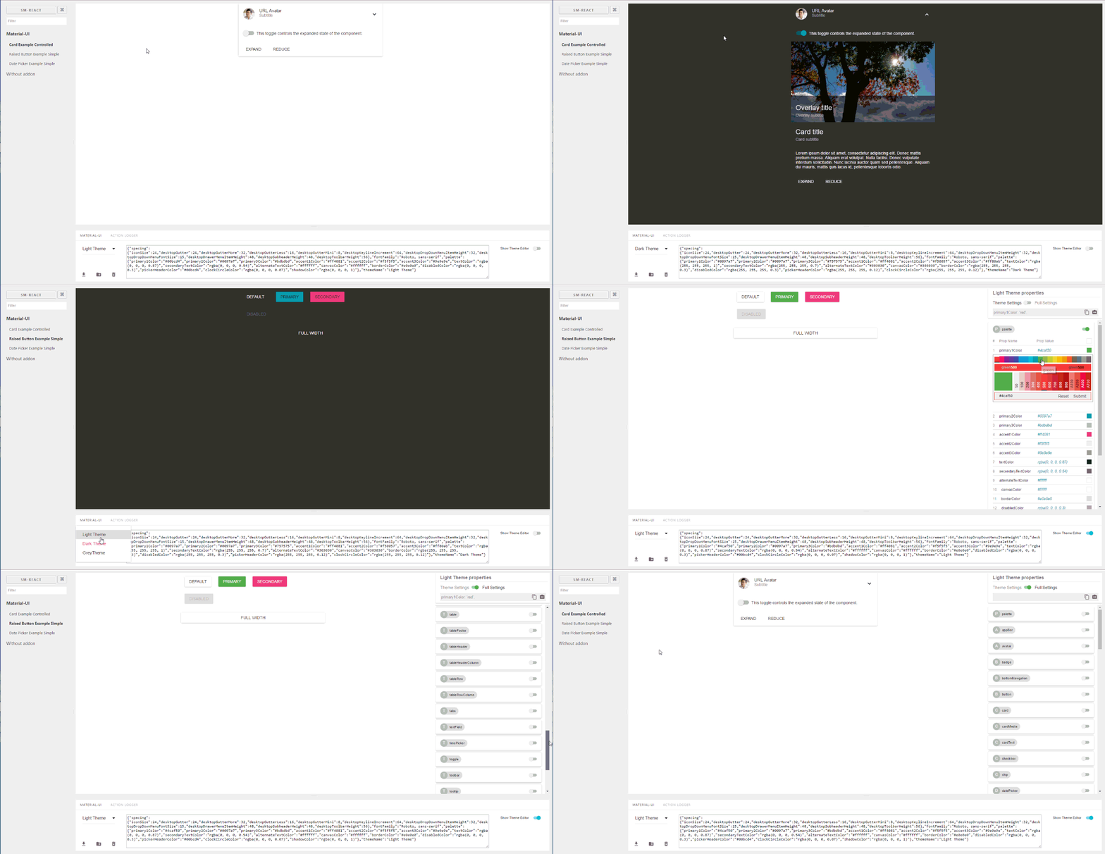](https://raw.githubusercontent.com/react-theming/storybook-addon-material-ui/master/docs/WatchMe.gif)\n\n\n## Features\n\n[](https://sm-react.github.io/storybook-boilerplate/?theme-ind=0&theme-sidebar=false&theme-full=false&knob-Title=Welcome%20to%20React-Theming&knob-Subtitle=Storybook%20Boilerplate%20Project&knob-Label1=Hello%20Button&knob-Label2=Hello%20Button&selectedKind=Material-UI&selectedStory=Components&full=0&down=1&left=1&panelRight=0&downPanel=sm%2Fstorybook-addon-material-ui%2Fmaterial-panel)\n\n- Wrapped in the theme provider. Just start to develop with base light theme.\n- Injected TapEvent Plugin. Test on mobile devices.\n- Switching themes. See how it looks in one click.\n- Creating your custom theme. By code or in visual editor.\n- Dynamic visual themes editing. Discover the all avalibale theme properties.\n- Google [material color](https://material.google.com/style/color.html#color-color-palette) palette [picker](https://github.com/sm-react/react-material-color-picker)\n- Save made changes and download in JSON file\n- Part of [React Theming](https://github.com/react-theming/react-theming). Create themable React Components.\n- Works with Storybook 3.0\n\n## Quick Start\n\nIn order to quick start with the latest `storybook-addon-material-ui` you can check out [create-material-ui-app](https://github.com/react-theming/create-material-ui-app)\n\nIt contains the working setup with:\n\n- create-react-app\n- Storybook\n- Material-UI\n- storybook-addon-material-ui\n\n---\n\n## Getting Started\n\nFirst, install the addon\n\n```shell\nnpm i storybook-addon-material-ui --save-dev\n```\n\n### Storybook 6.1\n\nAdd `storybook-addon-material-ui` to the storybook addons:\n\n```js\n//.storybook/main.js\n\nmodule.exports = {\n stories: ['../stories/**/*.stories.(js|mdx)'],\n addons: [\n 'storybook-addon-material-ui'\n ],\n};\n```\n\nAdd the decorator to storybook preview:\n\n```js\n//.storybook/preview.js\n\nimport { muiTheme } from 'storybook-addon-material-ui'\n\nexport const decorators = [\n\tmuiTheme()\n];\n\n```\n> Note : You can switch between the loaded themes. Out of the box, you have two base themes, but you can simply add your custom themes like this:\n```js\n//.storybook/preview.js\n\nimport { muiTheme } from 'storybook-addon-material-ui'\n\n// Create your own theme like this.\n// Note: you can specify theme name in `themeName` field. Otherwise it will be displayed by the number.\n// you can specify only required fields overriding the `Light Base Theme`\nconst newTheme = {\n themeName: 'Grey Theme',\n palette: {\n primary1Color: '#00bcd4',\n alternateTextColor: '#4a4a4a',\n canvasColor: '#616161',\n textColor: '#bdbdbd',\n secondaryTextColor: 'rgba(255, 255, 255, 0.54)',\n disabledColor: '#757575',\n accent1Color: '#607d8b',\n },\n};\n\n\nexport const decorators = [\n\tmuiTheme([newTheme])\n];\n\n```\nor even import from elsewhere\n```js\n//.storybook/preview.js\n\nimport { muiTheme } from 'storybook-addon-material-ui'\n\nimport theme1 from './src/theme/theme1'\nimport theme2 from './src/theme/theme2'\n\nexport const decorators = [\n\tmuiTheme([theme1, theme2])\n];\n\n```\n\n### Storybook 5 (and older versions)\nNow, write your stories with Material-UI Addon. By default your stories will be provided with [`Light Base Theme`](https://github.com/callemall/material-ui/blob/master/src/styles/baseThemes/lightBaseTheme.js) and [`Dark Base Theme`](https://github.com/callemall/material-ui/blob/master/src/styles/baseThemes/darkBaseTheme.js)\n\n```js\nimport React from 'react';\nimport { storiesOf, addDecorator } from '@storybook/react';\nimport {muiTheme} from 'storybook-addon-material-ui';\n\n// Import some examples from react-theming https://github.com/react-theming/react-theme-provider/blob/master/example/\nimport CardExampleControlled from '../CardExampleControlled.jsx';\nimport RaisedButtonExampleSimple from '../RaisedButtonExampleSimple.jsx';\nimport DatePickerExampleSimple from '../DatePickerExampleSimple.jsx';\n\nstoriesOf('Material-UI', module)\n// Add the `muiTheme` decorator to provide material-ui support to your stories.\n// If you do not specify any arguments it starts with two default themes\n// You can also configure `muiTheme` as a global decorator.\n .addDecorator(muiTheme())\n .add('Card Example Controlled', () => (\n \n ))\n .add('Raised Button Example Simple', () => (\n \n ))\n .add('Date Picker Example Simple', () => (\n \n ));\n```\n> Note : You can switch between the loaded themes. Out of the box, you have two base themes, but you can simply add your custom themes like this:\n\n```js\nimport React from 'react';\nimport { storiesOf, addDecorator } from '@storybook/react';\n\nimport {muiTheme} from 'storybook-addon-material-ui';\n\nimport CardExampleControlled from '../CardExampleControlled.jsx';\nimport RaisedButtonExampleSimple from '../RaisedButtonExampleSimple.jsx';\nimport DatePickerExampleSimple from '../DatePickerExampleSimple.jsx';\n\n// Create your own theme like this.\n// Note: you can specify theme name in `themeName` field. Otherwise it will be displayed by the number.\n// you can specify only required fields overriding the `Light Base Theme`\nconst newTheme = {\n themeName: 'Grey Theme',\n palette: {\n primary1Color: '#00bcd4',\n alternateTextColor: '#4a4a4a',\n canvasColor: '#616161',\n textColor: '#bdbdbd',\n secondaryTextColor: 'rgba(255, 255, 255, 0.54)',\n disabledColor: '#757575',\n accent1Color: '#607d8b',\n },\n};\n\n\n\nstoriesOf('Material-UI', module)\n .addDecorator(muiTheme([newTheme]))\n .add('Card Example Controlled', () => (\n \n ))\n .add('Raised Button Example Simple', () => (\n \n ))\n .add('Date Picker Example Simple', () => (\n \n ));\n\n\n```\n\n## Feedback\n\n**You can left your opinion about this project via anonymous [survey](https://app.qpointsurvey.com/s.aspx?c=**F2VOSpTXOlnHHqMaZKSSV5a1ylaCDoRfhut3oNCox34~**).**\n\n\n## Query string parameters\n\nAs you select themes and other options it stores in adress bar line. So this state is retained when you refresh the page and you can use direct links to the desired states.\n\n```\nhttp://localhost:9001/?theme-ind=0&theme-sidebar=true&theme-full=true\n```\n\n## CONTRIBUTING\n\n[](./.eslintrc)\n\n### Developers:\n\nOur team welcome all contributing, testing, bug fixing. If you would like\nto help contribute to the project feel free to make an issue, PR or get in touch with me.\n\n### Designers:\n\nWe would really welcome the involvement of designers in this project. We are very interested in your opinion about working with this tool, the possibility of joint work of the designer and developer as well as its appearance and capabilities\n\n#### Credits\n\n
](https://material-ui.com/styles/advanced/#theming)\n\nProvides development environment which helps creating [Material-UI Components](http://www.material-ui.com/). This is addon for [React Storybook](https://github.com/storybooks/react-storybook) which wraps your components into MuiThemeProvider. This accelerates and simplifies the [development](#getting-started-bookmark_tabs) process for Material-UI based applications.\n\nYou can use this [project's demo page](https://sm-react.github.io/storybook-boilerplate/?theme-ind=0&theme-sidebar=false&theme-full=false&knob-Title=Welcome%20to%20React-Theming&knob-Subtitle=Storybook%20Boilerplate%20Project&knob-Label1=Hello%20Button&knob-Label2=Hello%20Button&selectedKind=Material-UI&selectedStory=Components&full=0&down=1&left=1&panelRight=0&downPanel=sm%2Fstorybook-addon-material-ui%2Fmaterial-panel) to discover `Material-UI Theme Settings` for any component and create your `own new themes` right online. But to take [full advantage](#features-dizzy) of this project [run it locally](#quick-start) in your work environment.\n\n[](https://raw.githubusercontent.com/react-theming/storybook-addon-material-ui/master/docs/WatchMe.gif)\n\n\n## Features\n\n[](https://sm-react.github.io/storybook-boilerplate/?theme-ind=0&theme-sidebar=false&theme-full=false&knob-Title=Welcome%20to%20React-Theming&knob-Subtitle=Storybook%20Boilerplate%20Project&knob-Label1=Hello%20Button&knob-Label2=Hello%20Button&selectedKind=Material-UI&selectedStory=Components&full=0&down=1&left=1&panelRight=0&downPanel=sm%2Fstorybook-addon-material-ui%2Fmaterial-panel)\n\n- Wrapped in the theme provider. Just start to develop with base light theme.\n- Injected TapEvent Plugin. Test on mobile devices.\n- Switching themes. See how it looks in one click.\n- Creating your custom theme. By code or in visual editor.\n- Dynamic visual themes editing. Discover the all avalibale theme properties.\n- Google [material color](https://material.google.com/style/color.html#color-color-palette) palette [picker](https://github.com/sm-react/react-material-color-picker)\n- Save made changes and download in JSON file\n- Part of [React Theming](https://github.com/react-theming/react-theming). Create themable React Components.\n- Works with Storybook 3.0\n\n## Quick Start\n\nIn order to quick start with the latest `storybook-addon-material-ui` you can check out [create-material-ui-app](https://github.com/react-theming/create-material-ui-app)\n\nIt contains the working setup with:\n\n- create-react-app\n- Storybook\n- Material-UI\n- storybook-addon-material-ui\n\n---\n\n## Getting Started\n\nFirst, install the addon\n\n```shell\nnpm i storybook-addon-material-ui --save-dev\n```\n\n### Storybook 6.1\n\nAdd `storybook-addon-material-ui` to the storybook addons:\n\n```js\n//.storybook/main.js\n\nmodule.exports = {\n stories: ['../stories/**/*.stories.(js|mdx)'],\n addons: [\n 'storybook-addon-material-ui'\n ],\n};\n```\n\nAdd the decorator to storybook preview:\n\n```js\n//.storybook/preview.js\n\nimport { muiTheme } from 'storybook-addon-material-ui'\n\nexport const decorators = [\n\tmuiTheme()\n];\n\n```\n> Note : You can switch between the loaded themes. Out of the box, you have two base themes, but you can simply add your custom themes like this:\n```js\n//.storybook/preview.js\n\nimport { muiTheme } from 'storybook-addon-material-ui'\n\n// Create your own theme like this.\n// Note: you can specify theme name in `themeName` field. Otherwise it will be displayed by the number.\n// you can specify only required fields overriding the `Light Base Theme`\nconst newTheme = {\n themeName: 'Grey Theme',\n palette: {\n primary1Color: '#00bcd4',\n alternateTextColor: '#4a4a4a',\n canvasColor: '#616161',\n textColor: '#bdbdbd',\n secondaryTextColor: 'rgba(255, 255, 255, 0.54)',\n disabledColor: '#757575',\n accent1Color: '#607d8b',\n },\n};\n\n\nexport const decorators = [\n\tmuiTheme([newTheme])\n];\n\n```\nor even import from elsewhere\n```js\n//.storybook/preview.js\n\nimport { muiTheme } from 'storybook-addon-material-ui'\n\nimport theme1 from './src/theme/theme1'\nimport theme2 from './src/theme/theme2'\n\nexport const decorators = [\n\tmuiTheme([theme1, theme2])\n];\n\n```\n\n### Storybook 5 (and older versions)\nNow, write your stories with Material-UI Addon. By default your stories will be provided with [`Light Base Theme`](https://github.com/callemall/material-ui/blob/master/src/styles/baseThemes/lightBaseTheme.js) and [`Dark Base Theme`](https://github.com/callemall/material-ui/blob/master/src/styles/baseThemes/darkBaseTheme.js)\n\n```js\nimport React from 'react';\nimport { storiesOf, addDecorator } from '@storybook/react';\nimport {muiTheme} from 'storybook-addon-material-ui';\n\n// Import some examples from react-theming https://github.com/react-theming/react-theme-provider/blob/master/example/\nimport CardExampleControlled from '../CardExampleControlled.jsx';\nimport RaisedButtonExampleSimple from '../RaisedButtonExampleSimple.jsx';\nimport DatePickerExampleSimple from '../DatePickerExampleSimple.jsx';\n\nstoriesOf('Material-UI', module)\n// Add the `muiTheme` decorator to provide material-ui support to your stories.\n// If you do not specify any arguments it starts with two default themes\n// You can also configure `muiTheme` as a global decorator.\n .addDecorator(muiTheme())\n .add('Card Example Controlled', () => (\n \n ))\n .add('Raised Button Example Simple', () => (\n \n ))\n .add('Date Picker Example Simple', () => (\n \n ));\n```\n> Note : You can switch between the loaded themes. Out of the box, you have two base themes, but you can simply add your custom themes like this:\n\n```js\nimport React from 'react';\nimport { storiesOf, addDecorator } from '@storybook/react';\n\nimport {muiTheme} from 'storybook-addon-material-ui';\n\nimport CardExampleControlled from '../CardExampleControlled.jsx';\nimport RaisedButtonExampleSimple from '../RaisedButtonExampleSimple.jsx';\nimport DatePickerExampleSimple from '../DatePickerExampleSimple.jsx';\n\n// Create your own theme like this.\n// Note: you can specify theme name in `themeName` field. Otherwise it will be displayed by the number.\n// you can specify only required fields overriding the `Light Base Theme`\nconst newTheme = {\n themeName: 'Grey Theme',\n palette: {\n primary1Color: '#00bcd4',\n alternateTextColor: '#4a4a4a',\n canvasColor: '#616161',\n textColor: '#bdbdbd',\n secondaryTextColor: 'rgba(255, 255, 255, 0.54)',\n disabledColor: '#757575',\n accent1Color: '#607d8b',\n },\n};\n\n\n\nstoriesOf('Material-UI', module)\n .addDecorator(muiTheme([newTheme]))\n .add('Card Example Controlled', () => (\n \n ))\n .add('Raised Button Example Simple', () => (\n \n ))\n .add('Date Picker Example Simple', () => (\n \n ));\n\n\n```\n\n## Feedback\n\n**You can left your opinion about this project via anonymous [survey](https://app.qpointsurvey.com/s.aspx?c=**F2VOSpTXOlnHHqMaZKSSV5a1ylaCDoRfhut3oNCox34~**).**\n\n\n## Query string parameters\n\nAs you select themes and other options it stores in adress bar line. So this state is retained when you refresh the page and you can use direct links to the desired states.\n\n```\nhttp://localhost:9001/?theme-ind=0&theme-sidebar=true&theme-full=true\n```\n\n## CONTRIBUTING\n\n[](./.eslintrc)\n\n### Developers:\n\nOur team welcome all contributing, testing, bug fixing. If you would like\nto help contribute to the project feel free to make an issue, PR or get in touch with me.\n\n### Designers:\n\nWe would really welcome the involvement of designers in this project. We are very interested in your opinion about working with this tool, the possibility of joint work of the designer and developer as well as its appearance and capabilities\n\n#### Credits\n\nCreated with ❤︎ to
Storybook and
Material-UI by
Oleg Proskurin [React Theming]\n